Display multiple images and create an interactive image gallery on your WordPress websites using the powerful Image Gallery Widget for Elementor by PowerPack. The widget allows you to categorize the images and display them using filters. You can also display images in impressive layouts and make them more accessible for your website visitors.
The Image Gallery widget has customization and styling options in the Elementor Editor's Content and Style Tab. Let's take a closer look at each tab in detail.
Content Tab of the Image Gallery Widget#
The Content Tab of the Image Gallery widget consists of 4 sections:
- Gallery
- Settings
- Load More Button
- Help Docs
Let us go over each of these sections in more detail.
Gallery#
- Gallery Type: Here, you get an option to select your image gallery type. You can either go for a Standard gallery type or select a Filterable gallery as per your preference.
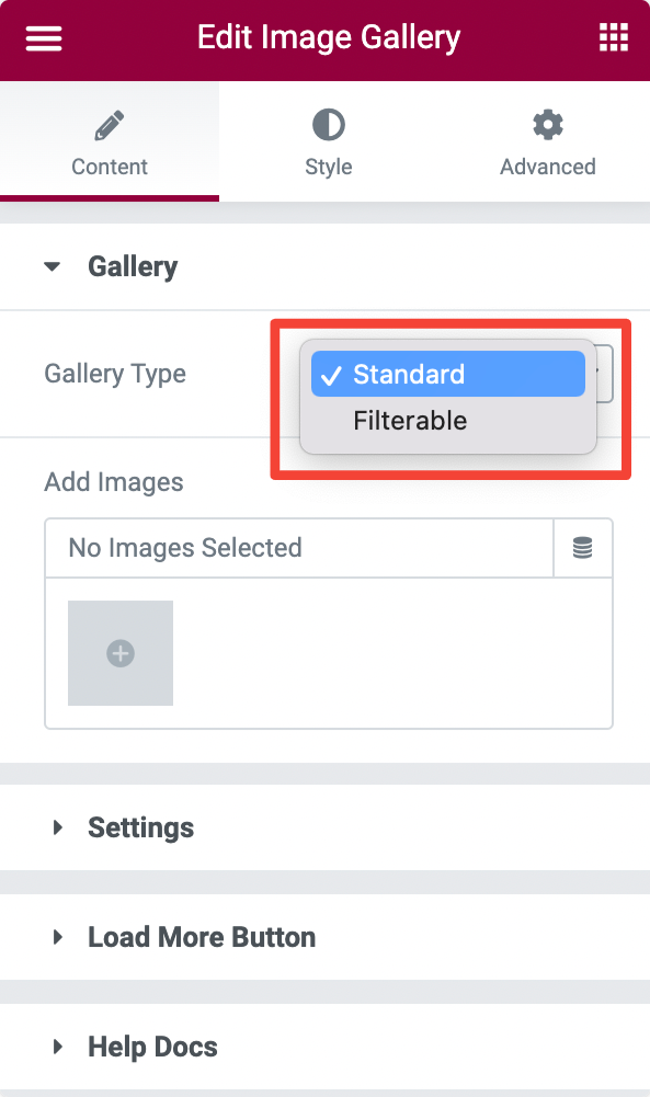
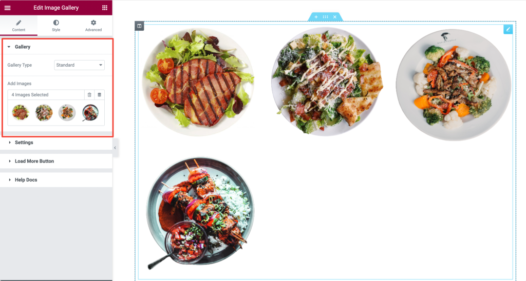
If you choose the gallery type as Standard, you can simply create an image gallery by adding the images from your WordPress site's media library.
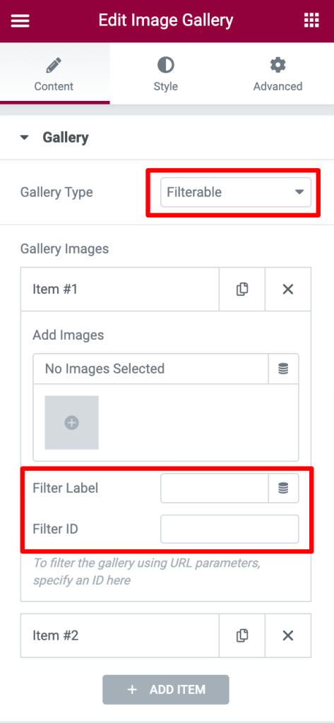
If you want to create a gallery with filters, you can choose the Filterable type. You get can add Filter Label and set the Filter ID to filter the photos in the gallery using URL parameters.
Learn here: How to Filter Images by URL in Gallery Widget?
Filter#
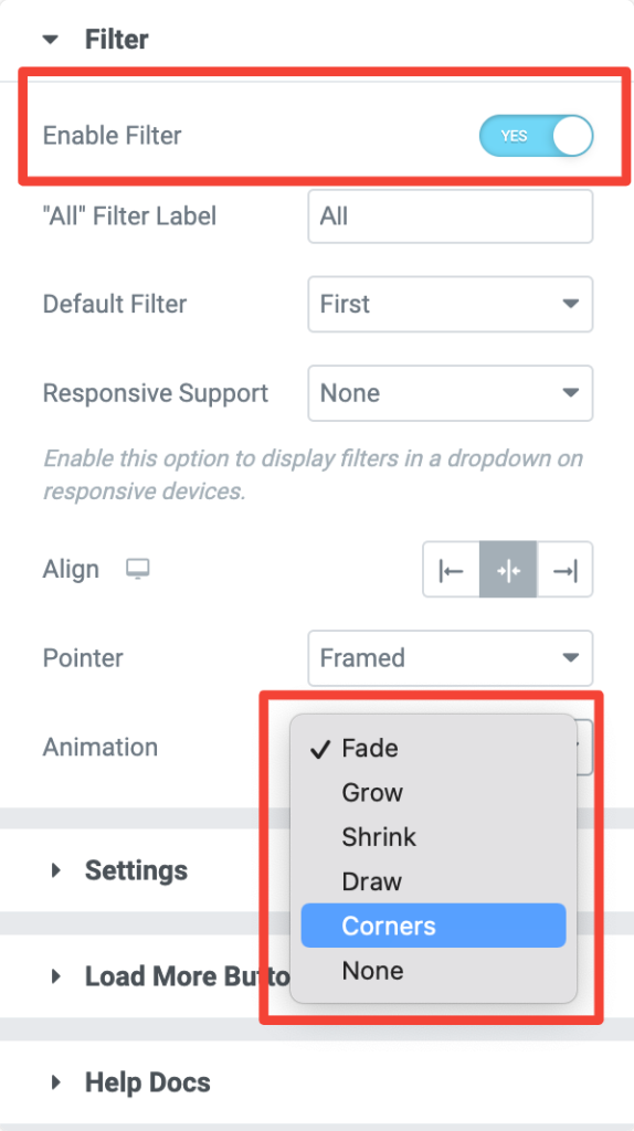
Toggle on the Enable Filter option to view more filter options you get with the Image Gallery widget.
Click here to learn: How to Enable and Use Filters?
As soon as you enabled the filter feature, you'll be displayed with the other options. You can:
- Change the 'All" Filter label.
- Choose the Default Filter to be first.
- Set Responsive Support to display filters in a dropdown on responsive devices.
- Align the filter names to be displayed on the image gallery's left, right, or center.
- Add Pointer and Animation styles to the filters from the options given in the screenshot below.
Settings#
- Image Size: Choose your image sizes to be showcased in the gallery.
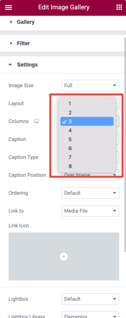
- Layout: Display image galleries in a Grid, Masonary or Justified layout.
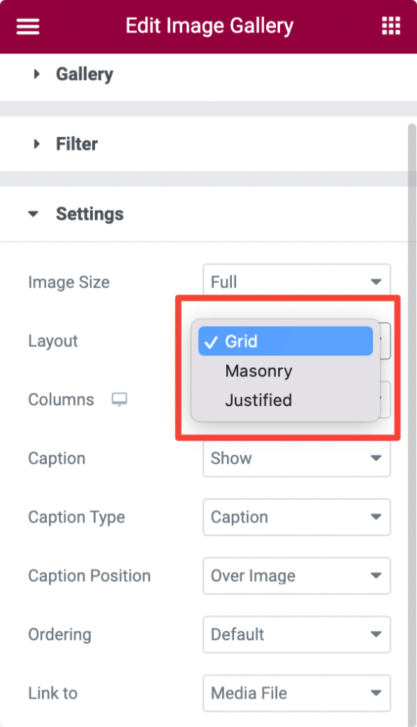
If you choose Grid or Masonry layout, you get an option to select the number of Columns to be displayed in the gallery.
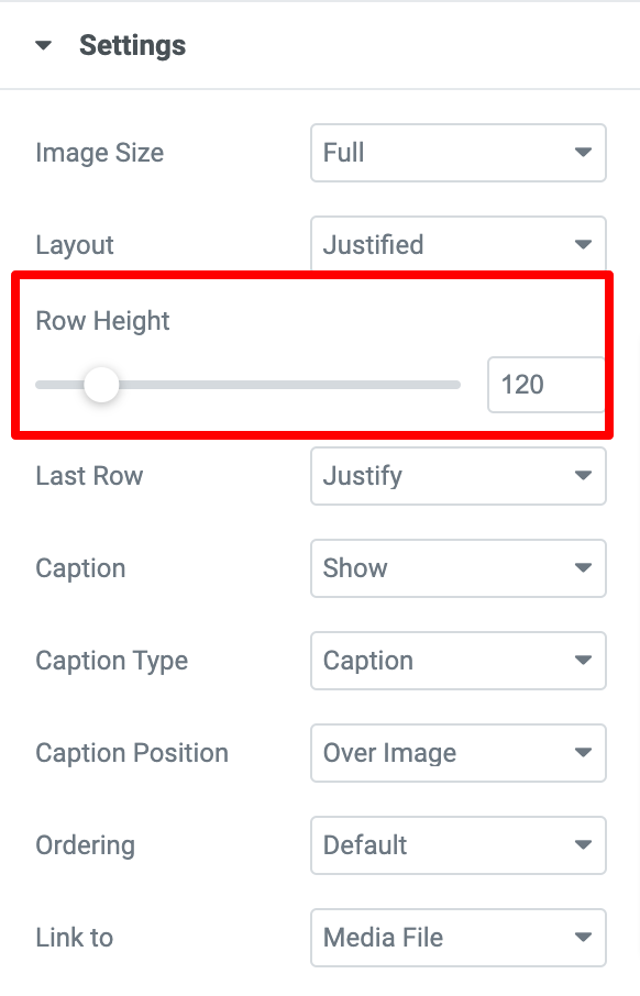
If you choose the Justified layout, You can set the Row Height of the images.
Further, you get options to:
- Show/hide the Caption of the images.
- Choose your image caption type to be Title, Caption, or Description.
- Set Caption's Position below or above the image.
- Display images in random or date-wise Order.
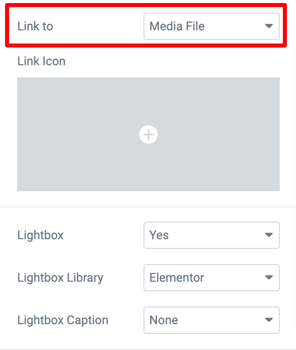
The feature Link To includes 3 options. Let's take a look at each of the options in detail:
Media File: If you choose your image gallery Link To Media File, then you’ll be able to:
- Open the image either in a lightbox or in your browser tab.
- Choose a Link Icon.
- Decide whether you want to show the photos in a Lightbox or not by enabling or disabling the lightbox.
- Choose between 2 Lightbox Libraries, Elementor & FancyBox.
- Enable the Lightbox Caption.
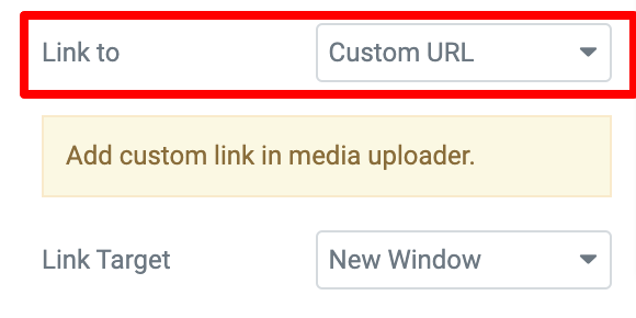
Custom URL: Using this option, you can apply a Custom URL to the images in the Image Gallery Widget. Further, you get the flexibility to open the Custom URL in a new window or the same window.
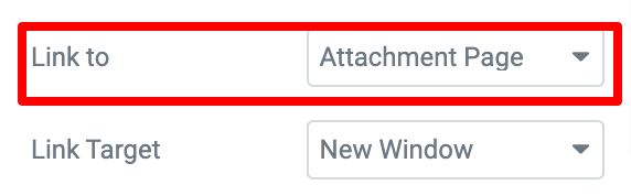
Attachment Page: By default, WordPress creates a single page for every media attachment on your site. This option links that attachment page to your image. Next, you get the option to open the Attachment page in a new window or the same window.
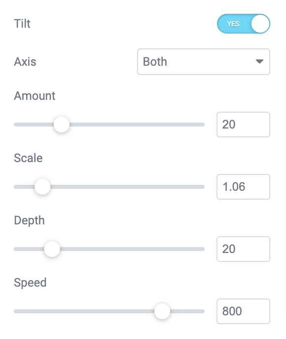
- Tilt: If you enable the Tilt option, you can set the resolution amount, scale, depth, and speed at the X-Axis, Y-Axis, or both the axis of the image.
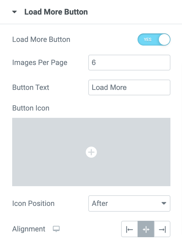
Load More Button#
Enable the Load More Button feature to add a customized load more button on your image galleries. Further, you get options to:
- Add number of images to be displayed per page.
- Add custom button text.
- Set button icon and position.
- Align the load more button to left, center, or right.
Want to learn more about the Load More feature, check out the link: How to add Load More Button?
And these are the options you get in the Content tab of the Image Gallery widget. Let's now look at the Style tab for exciting styling options.
Style Tab of the Image Gallery Widget#
There are 6 sections in the style tab of the Image Gallery Widget:
- Layout
- Thumbnails
- Caption
- Overlay
- Filter
- Load More Button
Let's look at each of these sections in more detail.
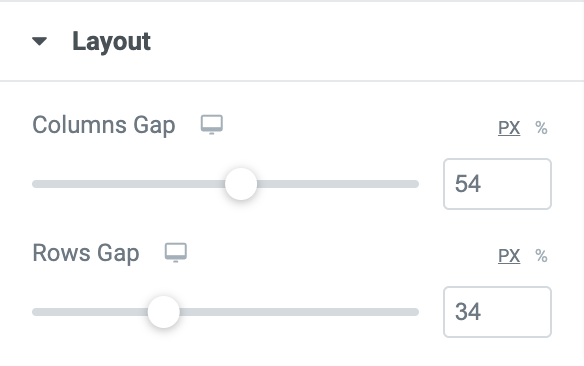
Layout#
- Columns Gap: Allows you set the columns gap.
- Rows Gap: Allows you set the rows gap.
Thumbnails#
- Border Type: Choose a border type from the options such as Solid, Double, Dotted, Dashed, and Grove.
- Width: Add border widget.
- Border Color: Choose the border color for the thumbnail images.
- Border Radius: Set the border radius.
- Scale: Resize thumbnail images by increasing or decreasing the scale.
- Opacity: Increase or decrease the opacity according to the level of transparency required.
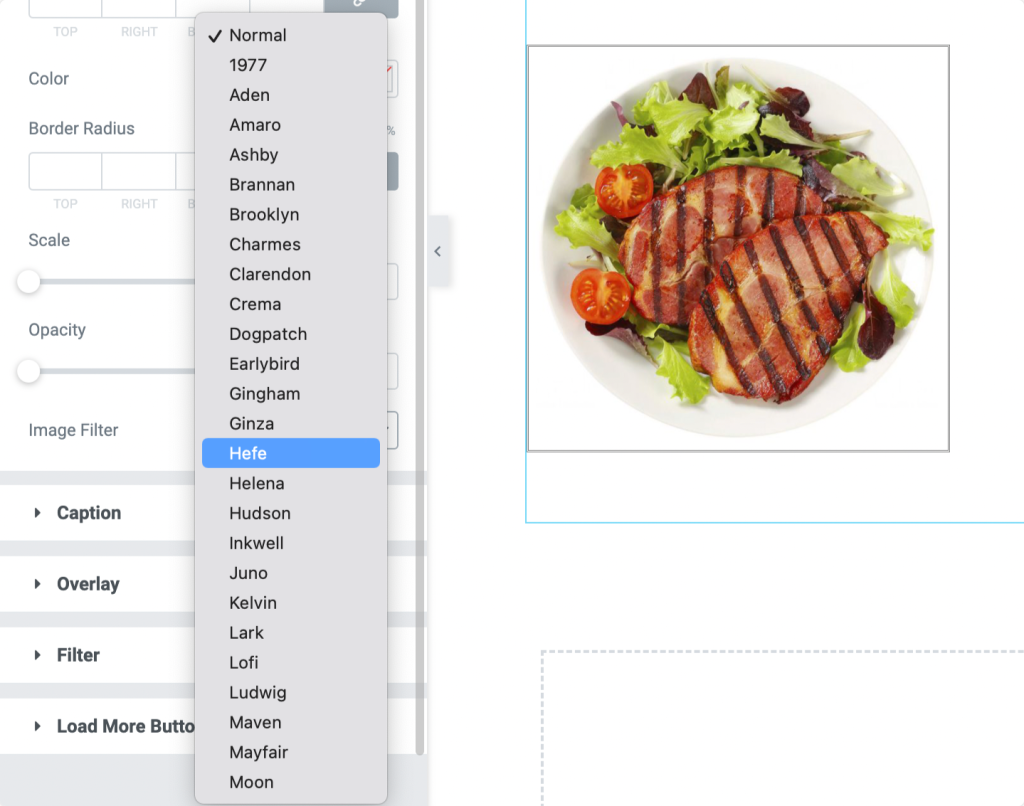
- Image Filter: Choose image filter from the multiple filter options available.
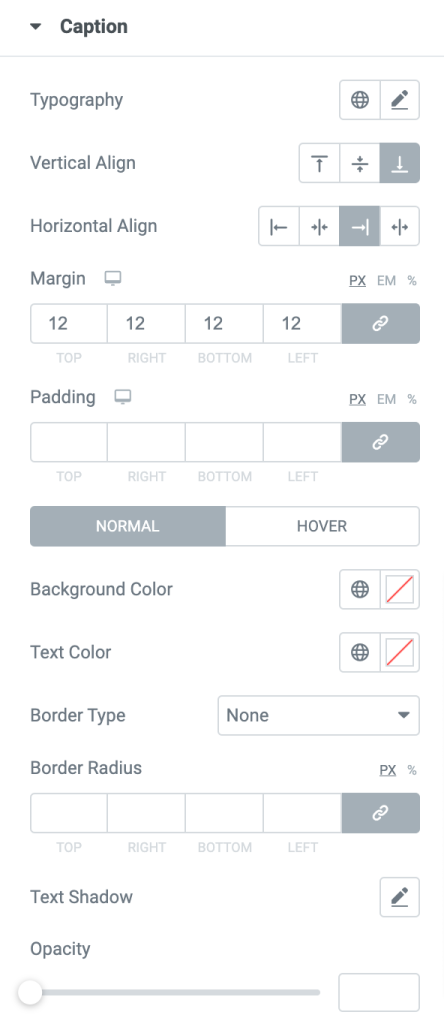
Caption#
- Typograpghy: Change caption font, size and more.
- Vertical Align: Align image captions to be displayed on Top, Center, or bottom vertically.
- Horizontal Align: Align image captions to be displayed on Left, Right, Center, or Justify horizonatally.
- Margin: Adjust caption's margin.
- Padding: Add padding around image captions.
- Background Color: Change caption's background color.
- Text Color: Alter caption's text colour.
- Border Type: Choose the border type.
- Border Radius: Add border radius.
- Text Shadow: Add shadow around caption text.
- Opacity: Adjust opacity.
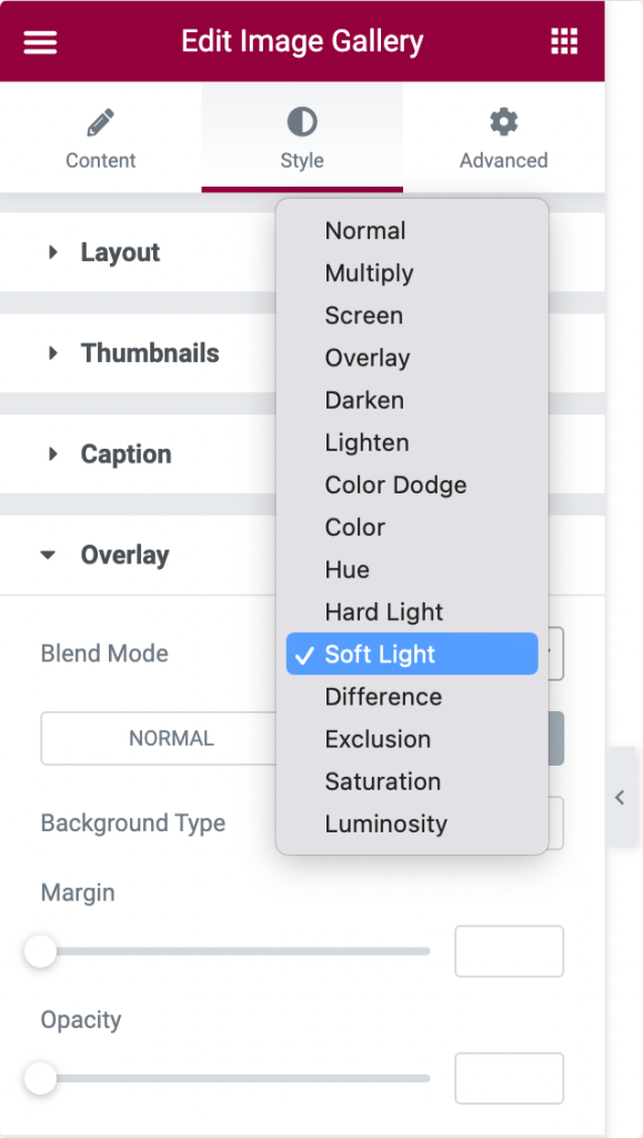
Overlay#
- Blend Mode: Add an overlay to the images by choosing an effect from the list of options.
- Background Type: Choose background type: Claasic or Gradient.
- Margin: Adjust margin of the overlay.
- Opacity: Set opacity of the overlay.
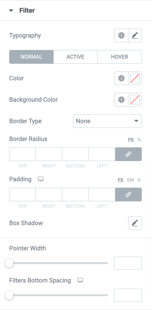
Filter#
- Set the filters' typography, pointer width, and bottom spacing.
- Change the filters' background color, text color, and border color.
- Box shadow can be added horizontally or vertically to the filters.
- Set the border-radius and padding for the filters.
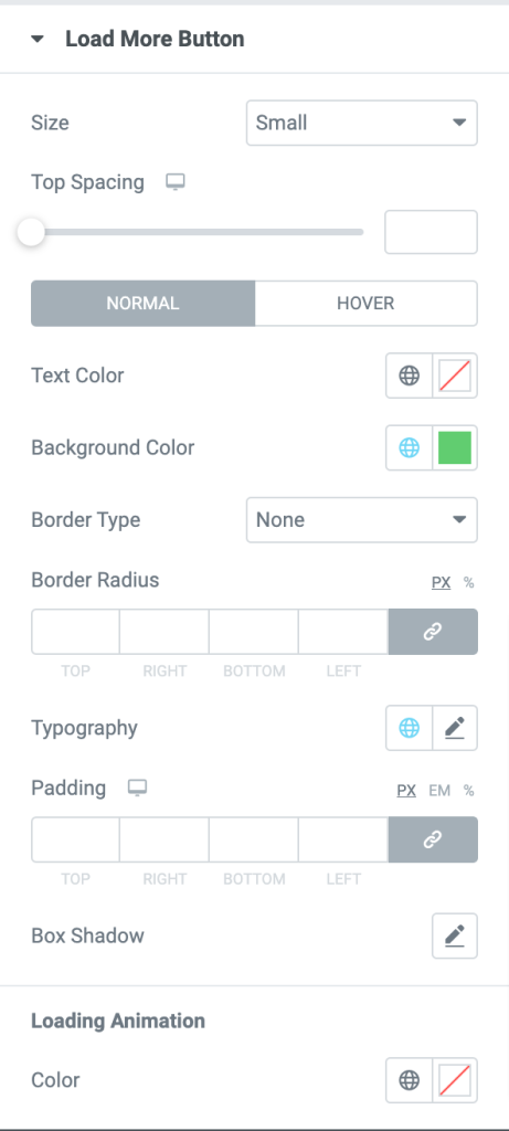
Load More Button#
- Choose the size for the Load More button from the list of options such as Extra Small, Small, Medium, Large, and Extra Large.
- Set the top spacing, add a box-shadow, and change the text color, background color, and border color of the load more button.
- Add color to the animation, which can be displayed while loading the images in the gallery.
- Set the typography, border-radius, and padding for the load more button.
- Choose a border type from the available options.
This was the detailed overview of the Image Gallery Widget for Elementor available in PowerPack Addons.
Hope this helps!