Display impressive CTA buttons on your WordPress websites using the Buttons Widget for Elementor by PowerPack.
The Buttons Widget has customization and styling options in the Elementor Editor's Content and Style Tab. Let's take a closer look at each tab in detail.
Content Tab of the Buttons Widget#
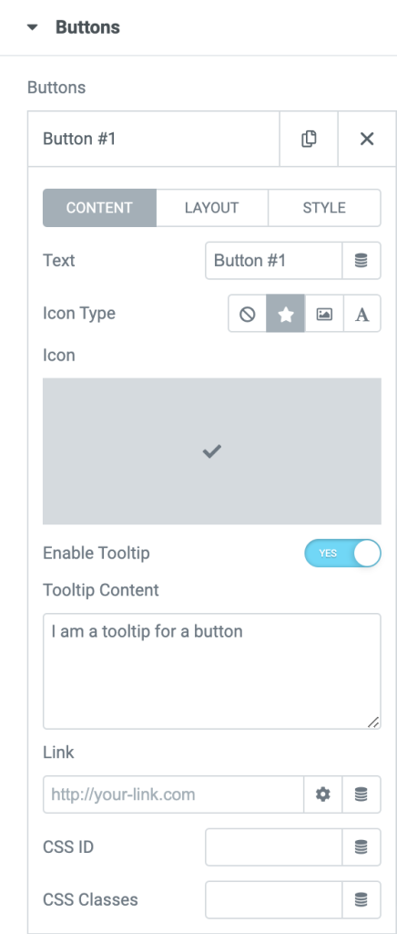
The content tab of the Buttons Widget includes one subsection: Buttons.
Buttons#
Click on the Buttons subsection to view more options:
- Text: Customize the button text.
- Icon Type: Choose your button icon type.
- Enable Tooltip: Toggle this option to display a tooltip over the button.
- Tooltip Content: Customize content for the tooltip.
- Link: Add page/post link to the button.
- CSS ID: You can also define a specific CSS ID.
- CSS Class: If you want, you can CSS Class also.
Check out the link to learn: How to Add two Buttons side by side in Elementor?
Style Tab of the Buttons Widget#
The Style Tab of the Buttons Widget consists of 4 subsections:
- Layout
- Styling
- Icon
- Tooltip
Le's check options of each subsection in brief.
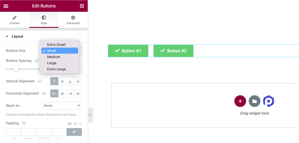
Layout#
- Button Size: Set the button's size to be Extra Small, Small, Large, or Extra Large.
- Button Spacing: If you have added multiple buttons, you can adjust the spacing between them from this option.
- Vertical Alignment: Adjust the vertical alignment of the button.
- Horizontal Alignment: Adjust the horizontal alignment of the button.
- Stack On: Choose a breakpoint where the buttons will stack.
- Padding: Add button padding from this option.
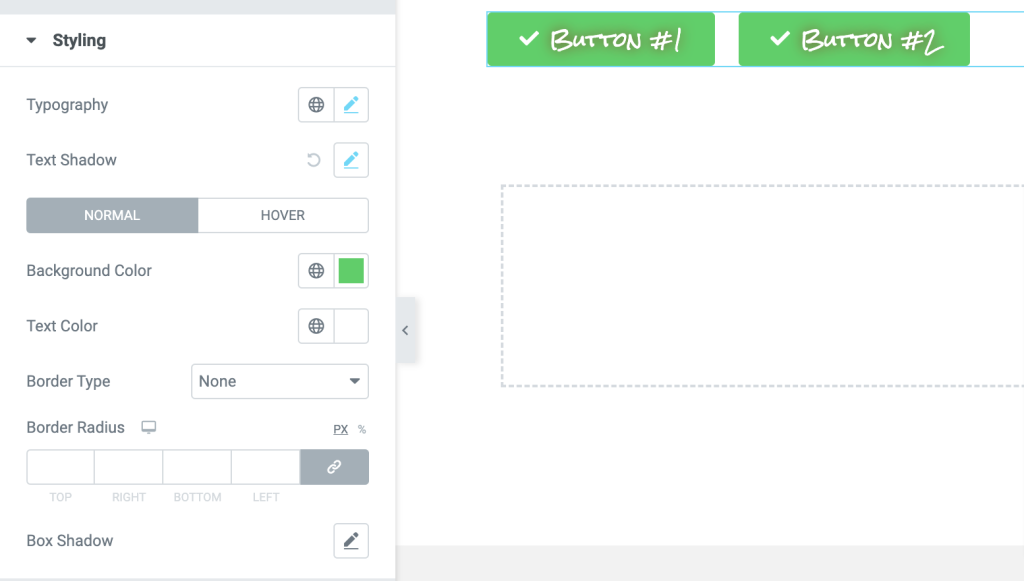
Styling#
- Typography: Customize button text's font.
- Text Shadow: Add a shadow to the button text.
- Background Color: Change text's background color
- Text Color: Alter text color.
- Border Type: Choose border type.
- Border Radius: Add border radius.
- Box Shadow: Add box shadow.
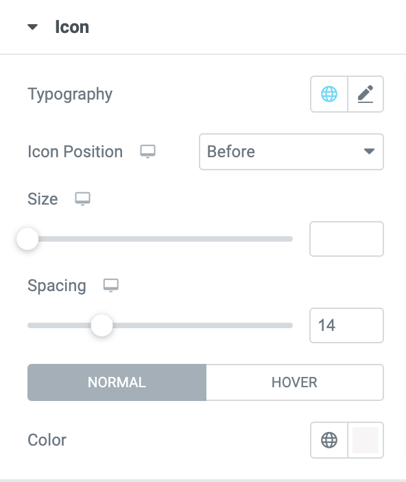
Icon#
Here you get options to customize your button icon. You can change:
- Icon's typography
- Set icon's position
- Adjust icon's size
- Adjust spacing
- Change the icon's color.
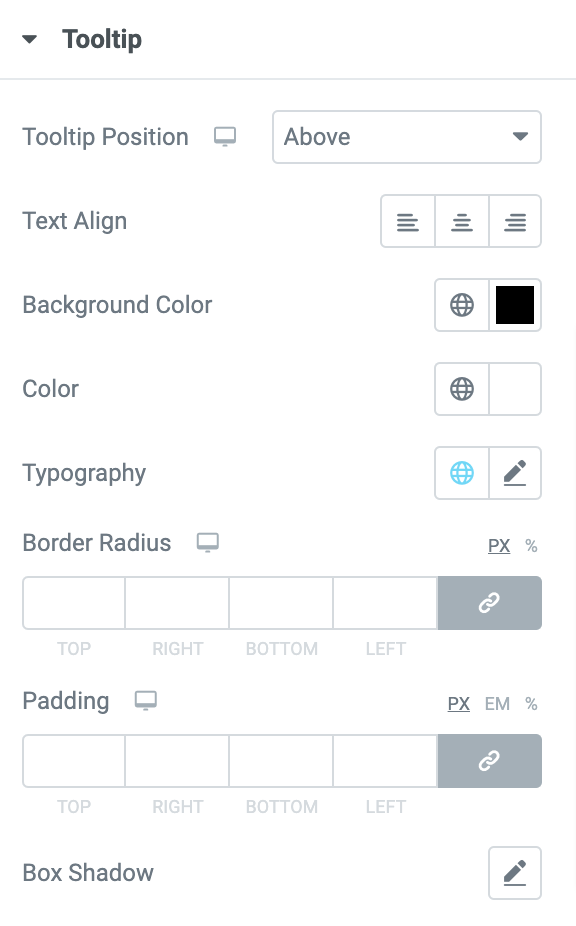
Tooltip#
If you have enabled the Tooltip feature in the Content Tab, you get the styling options to customize tooltips here:
- Tooltip Position: Set position of the tooltips to be displayed Above, Left, Right, or Left.
- Text Align: Set alignment of the tooltip text to Left, Center, or Right.
- Background Color: Change the background color of the tooltip.
- Color: Change tooltip's color.
- Typography: Alter tooltip's typography.
- Border Radius: Gives you the flexibility to add border radius.
- Padding: This allows you to add padding around tooltips.
- Box Shadow: This allows you to add box-shadow.
This was the detailed overview of the Buttons Widget for Elementor available in PowerPack Addons.
Hope this helps!