PowerPack Buttons Widget for Elementor gives you the flexibility to add multiple CTA buttons together. This helps you to add two buttons side by side on a single section or column of your Elementor website.
It is an essential feature nowadays for web designers as it reduces the time spent in designing each button individually and then adjusting the position of the buttons.
Add two Buttons side by side in Elementor#
Firstly, open the page in which you want to add the Call to Action buttons and click on the “Edit with Elementor” button to proceed. Next, search for the “Buttons” widget and drag and drop it to the page.
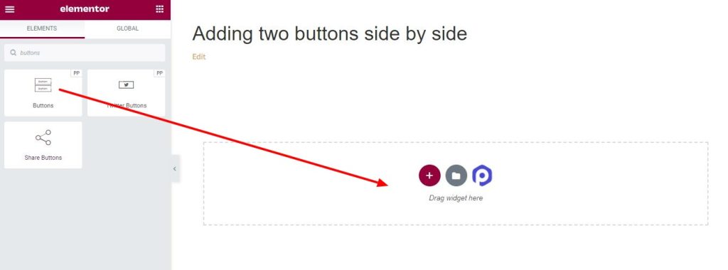
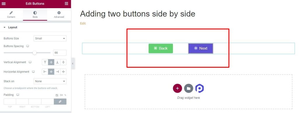
After adding the PowerPack Buttons widget, your page initially looks like the below screenshot with two buttons added side by side.
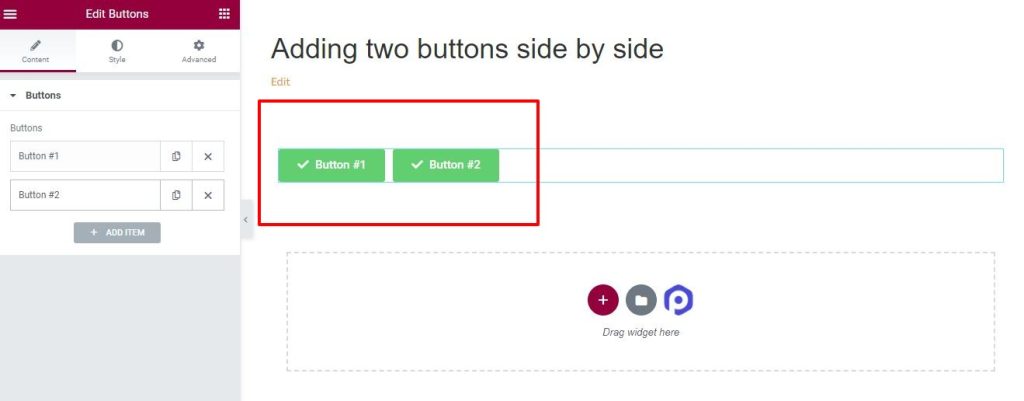
Now, you can individually style each of the buttons in the Buttons widget as per your requirements. Let's see how to do that.
Styling the Buttons Widget#
Buttons widget comes with multiple styling options to make buttons look stunning on your Elementor website. Below mentioned are all the styling options of the buttons widget.
Icon/Image#
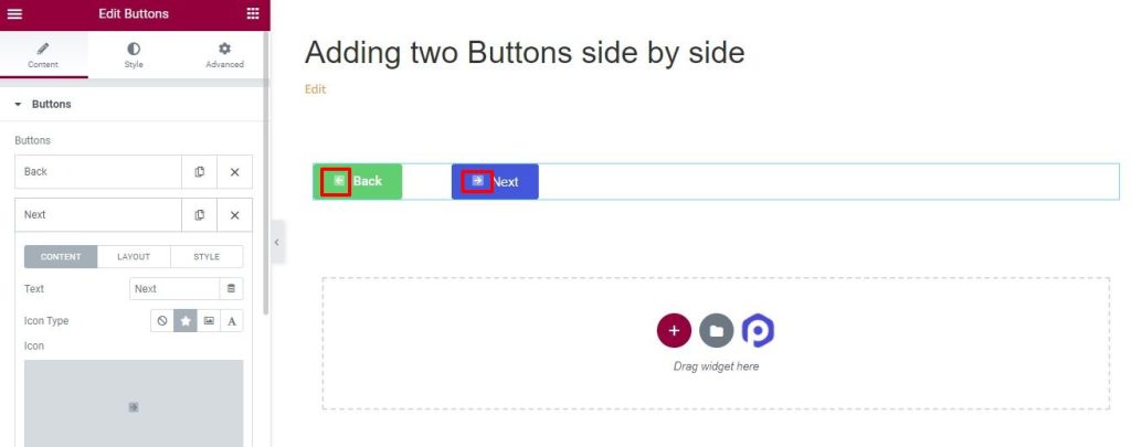
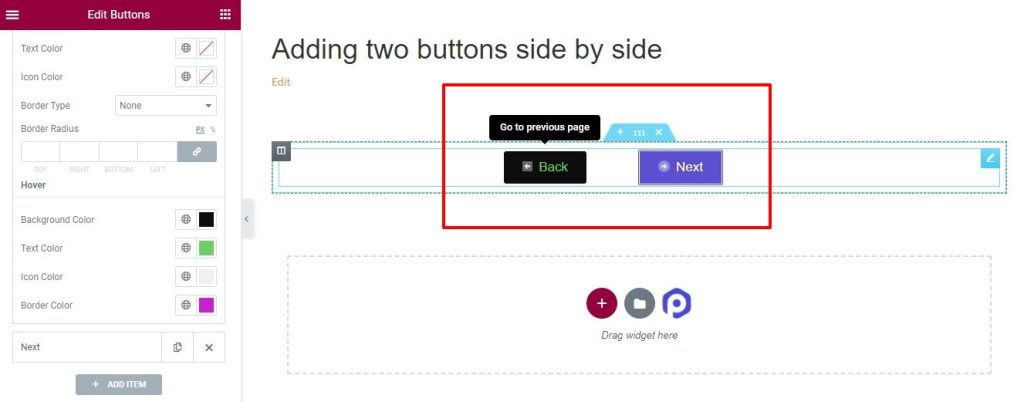
Adding an icon or image to the button makes them stand out. PowerPack allows you to enhance the look of your buttons by giving you the flexibility to add a stylish icon or an interactive image. You can add the icons from the icon library or choose images from the media library. For example, in the below screenshot, an arrow icon is added and the button looks like this.
Tooltips#
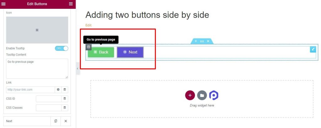
Tooltips improve the user interface by making it easy to understand the purpose of a button. It is possible to customize the tooltip by changing the position, aligning the text, changing the background color, adjusting the border radius, padding, and adding the box shadow the way you like. After adding a tooltip, the buttons look like this.
Spacing and Alignment#
You should position the buttons in the right location that will attract the user's attention. You can align the position vertically and horizontally. It is also possible to adjust the spacing between the 2 buttons. If you choose center as alignment and increase the spacing, your buttons look like this.
Hover Effects#
Animation effects can be added to the buttons both on normal and hover modes. These effects will be visible once you hover on the button. Further, there are options to change the background color, text color, size, and spacing of the buttons that can be displayed on hover.
This was all about adding two buttons side by side effortlessly in the PowerPack Buttons Widget. In case of questions or concerns, please do not hesitate to contact us.