Registration Form Widget from PowerPack Addons for Elementor enables you to create fully customized and functional user registration forms directly within the Elementor editor. This widget is designed to give you greater control and flexibility by allowing you to add a variety of form fields using an intuitive drag-and-drop interface.
With support for fields like First Name, Last Name, Phone Number, Website, Consent, and more, you can collect detailed information from users during the registration process. You can build these forms visually inside Elementor without writing a single line of code.
This guide will walk you through each setting and option available in the Registration Form Widget, helping you create professional and user-friendly registration forms with ease.
Getting Started: Using the Registration Form Widget#
To get started:
- Open the page in the Elementor editor.
- Search for the "Registration Form" widget in the PowerPack widgets panel.
- Drag and drop the widget onto the page where you want the form to appear.
Also Check: How to Enable User Registration?
Once the widget is added, you'll find two primary tabs in the Elementor editor:
- Content Tab
- Style Tab
Each tab contains specific sections for configuring the form's functionality and appearance. Let's go through these in detail.
Content Tab#
Content Tab contains all the settings related to the structure and behavior of your registration form. It is divided into the following seven sections:
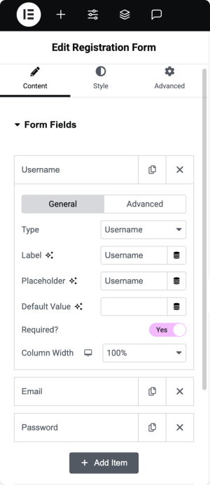
1. Form Fields#
This section allows you to build and manage the form fields users will interact with.
- Click the "Add Item" button to add a new form field.
- The form includes the following fields by default:
- Username
- Password
Click on any field to expand and configure its individual settings. The available options are:
- Type: Choose the type of field you want to add. Available types include:
- Username, Password, Confirm Password, Email, Phone,
- First Name, Last Name, Website, Consent
- Static Text (useful for adding instructional or non-editable content within the form)
- Label: This is the text displayed above or beside the field to describe its purpose.
- Placeholder: Optional text displayed inside the field that disappears when the user starts typing.
- Default Value: Pre-fill the field with a default value, which users can edit if needed.
- Required?: Enable this toggle to make the field mandatory. Users will not be able to submit the form unless they fill this field.
- Column Width: Set the field's width to control its layout. For example, use 50% width to place two fields side-by-side on a single row.
Learn More: How to Add Custom Validation Messages to Registration Form Fields?
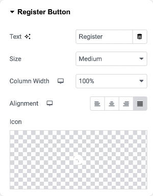
2. Register Button#
This section allows you to customize the appearance and behavior of the form's submit button.
- Text: Define the label that appears on the button. Example: "Register," "Sign Up," or "Create Account."
- Size: Choose the size of the button. Options include Small, Medium, Large, and others, depending on your design preference.
- Column Width: Adjust the width of the button to fit the form layout.
- Alignment: Align the button to the left, right, or center, or make it span the full width of the container.
- Icon: Optionally, add an icon to the button. This can enhance the visual appeal or indicate the action clearly.
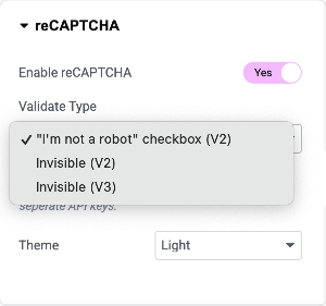
3. reCAPTCHA#
Use this section to add Google reCAPTCHA to your form to protect it from spam and bot submissions.
- Enable reCAPTCHA: Toggle this switch to activate the reCAPTCHA feature.
- Validate Type: Choose how the reCAPTCHA should appear and behave. Available types include:
- "I'm not a robot" checkbox (reCAPTCHA V2)
- Invisible reCAPTCHA (V2)
- Invisible reCAPTCHA (V3)
- Theme: Select the visual theme for reCAPTCHA to match your site design. Options include Light and Dark.
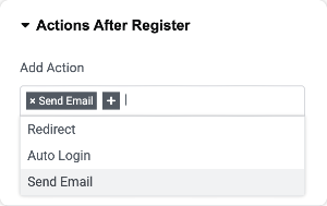
4. Actions After Register#
Specify what should happen after a user successfully submits the registration form.
- Add Action: You can choose one or more actions from the following:
- Send Email: Automatically send a notification email upon successful registration.
- Redirect: Redirect the user to a specific URL (such as a welcome page or dashboard).
- Auto Login: Log the user into their new account immediately after registration without requiring them to log in manually.
Each selected action may display additional configuration options specific to that action.
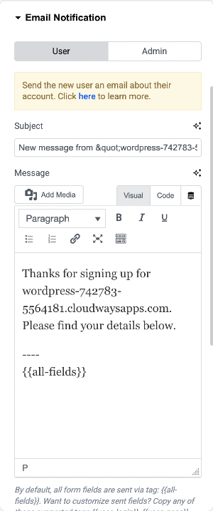
5. Email Notification#
This section allows you to configure email notifications for both the user who registers and the admin of the website.
For User
- Subject: Set the subject line for the email sent to the user.
- Message: Define the message body that the user will receive. This could include a welcome note, login instructions, or any other helpful information.
For Admin
- Enable Admin Notification: Toggle this option to send a notification email to the admin when a new user registers.
- Send to Email: Enter the email address where admin notifications should be sent. You can add multiple addresses separated by commas.
- Email Subject: Set the subject line of the admin email.
- Email Content: Write the body of the email that will be sent to the admin. You can include user details or other relevant information.
Also Check: How to Configure Admin and User Email in Registration Form?
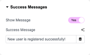
6. Success Messages#
Control the confirmation message displayed to users after a successful registration.
- Enable Show Message: Enable this option if you want to display a message instead of redirecting the user.
- Show Message Text: Enter the custom message to display. Example: "Thank you for registering. Please check your email for further instructions."
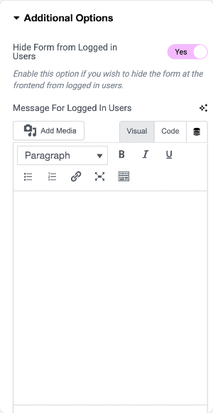
7. Additional Options#
This section offers extra settings to enhance the form experience based on user roles and login status.
- Hide Form from Logged-in Users: Enable this toggle to prevent logged-in users from seeing the registration form on the frontend. This ensures the form is only visible to new or logged-out users.
- Message for Logged-in Users: Enter the message to be shown in place of the form for logged-in users. Example: "You are already logged in. Registration is not required."
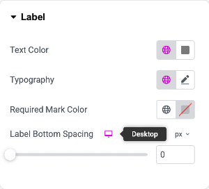
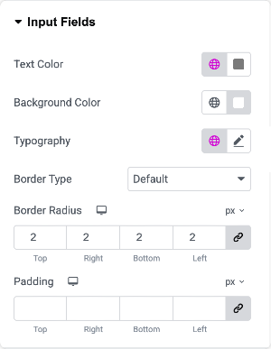
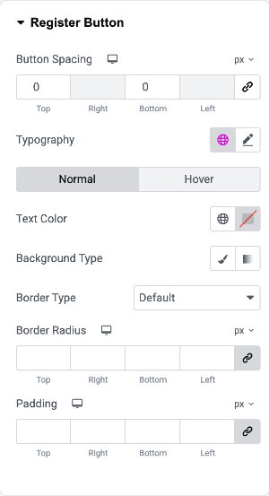
Style Tab#
Style Tab provides complete control over the visual appearance of your registration form. All the styling options are intuitive and easy to configure, even if you are using the widget for the first time.
You can customize the following:
- Typography, font size, and color for form labels, placeholders, and field inputs
- Field background color, border styles, spacing, and alignment
- Submit button color, hover effects, border radius, and shadow.
- Success message color and layout
- reCAPTCHA container styling
- Responsive layout controls for desktop, tablet, and mobile devices
Each styling section is clearly labeled, allowing you to modify the design in real-time and match it perfectly with your site's look and feel. Screenshots of all available styling sections are attached below for your reference.
That was a comprehensive overview of the PowerPack Registration Form widget for Elementor! Hope this helps.