With the PowerPack Woo - Off Canvas Cart Widget, you can create impressive sliding panels to display the cart items on your WordPress sites built with WooCommerce and Elementor.
Let’s take a closer look at the content and style tab of the Woo - Off Canvas Cart widget.
Content Tab of the Woo - Off Canvas Cart Widget#
The Content Tab of the Woo - Off Canvas Cart widget consists of 5 sections:
- General
- Cart Button
- Off Canvas Panel
- Close Button
- Help Docs
Let us now go over each of these sections in more detail.
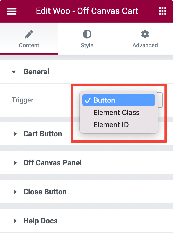
General#
In the General section, you can choose the trigger option for your off canvas cart.
- If you choose Button, you can open/trigger the off canvas cart by clicking the button.
- If you choose Element Class, you can add a CSS element class name that opens/trigger the off canvas cart.
- If you choose Element ID, you can add a custom CSS class ID that opens/triggers the off canvas cart.
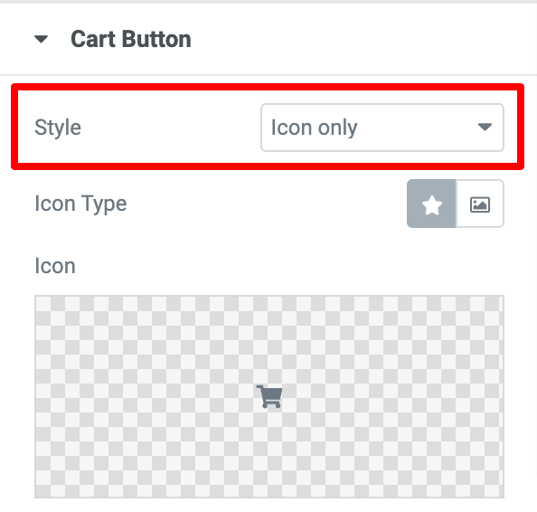
Cart Button#
This section can be available if you choose the trigger as Button.
If you choose the style as Icon Only, you get customization options to choose:
- Icon Type - Choose an icon or image.
- Icon - Choose an icon from the icon library or media library.
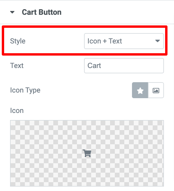
If you choose the style as Icon + Text, you get customization options to choose:
- Text - Enter the text to be added to the button.
- Icon - Choose an icon from the icon library or media library.
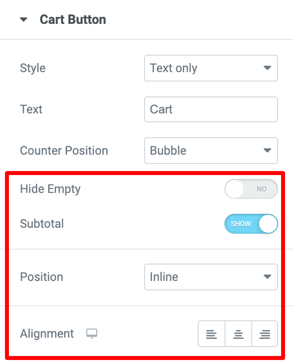
If you choose the style as Text Only, you get customization options to choose:
- Text - Enter the text to be added to the button.
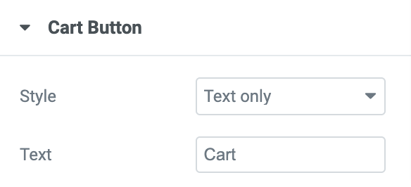
- Counter Position - Choose the counter as “Bubble” or add “After Button.”
- Hide Empty - Enable this to hide the counter of the cart when left empty.
- Subtotal - Enable to show the subtotal on the cart.
- Position - Choose between Inline or Floating.
- Alignment - Align the cart to the page's left, right, or center.
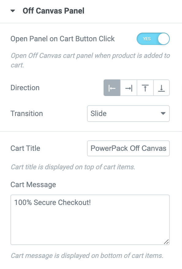
Off Canvas Panel#
- Open Panel on Cart Button Click - Enable this to open the cart panel on a click when a product is added to it.
- Direction - Set the direction to open panel at the Top, Right, Left, or Bottom to the cart.
- Transition - Add a transition effect such as Slide, Reveal, Push, and Slide Along to the panel.
- Cart Title - Add a title for the cart that can be displayed on the top of the items added to the cart.
- Cart Message - Add a notification message that can be displayed on the bottom of the items added to the cart.
Close Button#
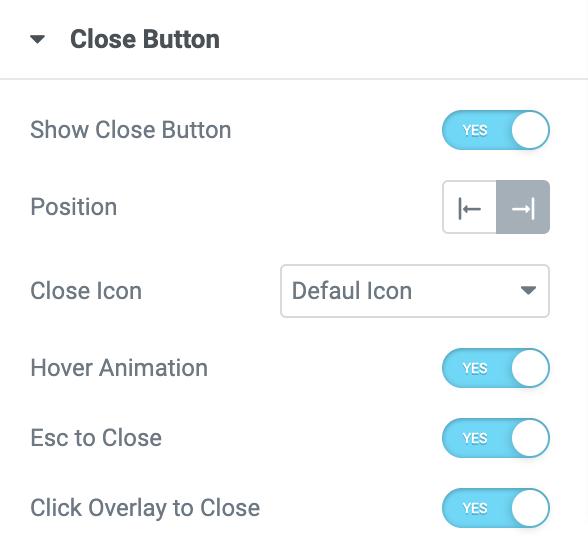
- Show Close Button - Enable this to show the close button on the cart.
- Position - Add the close button to the left or right of the cart page.
- Close Icon - Choose a Default close button icon or select an icon from the Icon Library.
- Hover Animation - Enable this to add an animation to the button on a mouse hover.
- Esc to Close - Enable this to close the cart by clicking the Esc key.
- Click Overlay to Close - Enable this to close the cart by clicking on the overlay.
Style Tab of the Woo - Off Canvas Cart Widget #
There are 7 sections in the style tab of the Woo - Off Canvas widget:
- Cart Button
- Off Canvas Panel
- Item
- Empty Cart Message
- Subtotal
- Buttons
- Close Button
Let's look at each of these sections in more detail:
Cart Button#
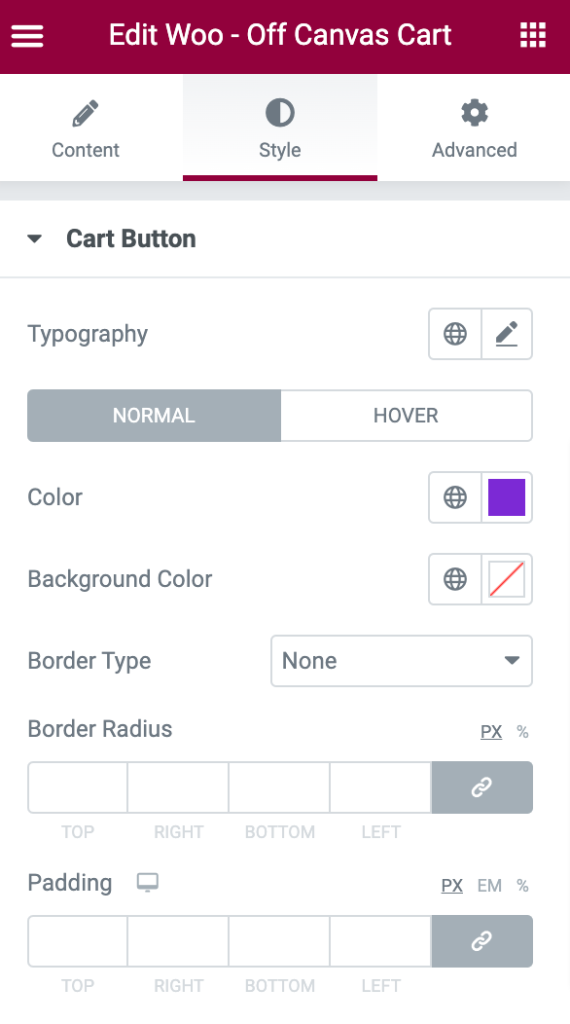
- Typography - Set the typography for the cart button.
- Color - Set the color for the cart button.
- Background Color - Set the background color for the cart button.
- Border Color - Set the border color for the cart button.
In Normal mode:
- Border Type - Choose any border type from the options such as Solid, Double, Dotted, Dashed, and Groove.
- Border Radius - Displays the cart button with soft edges.
- Padding - Creates space between the text and the cart button.
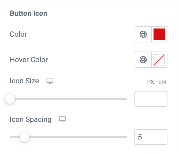
If you want to customize the Button Icon:
- Color - Set the color for the button icon.
- Hover Color - Set the color that can be displayed on a mouse hover.
- Icon Size - Set the size of the button icon.
- Icon Spacing - Set the spacing between the icon and the cart total.
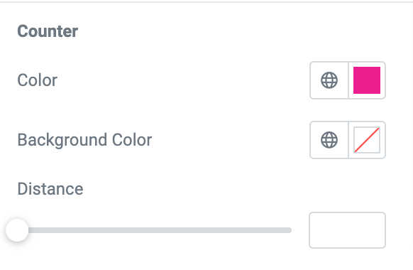
If you want to customize the Counter:
- Color - Set the color for the counter.
- Background Color - Set the background color for the counter.
- Distance - Creates space between the counter and the cart button.
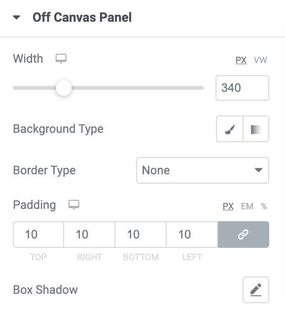
Off Canvas Panel#
- Width - Set the width for the panel.
- Background Type - Choose between Classic or Gradient backgrounds.
- Border Type - Choose any border type from the options such as Solid, Double, Dotted, Dashed, and Groove.
- Padding - Creates space between the panel and the close button.
- Box Shadow - Set the box-shadow for the Off Canvas panel.
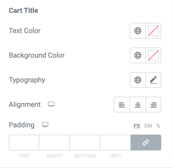
If you want to customize the Cart Title:
- Text Color - Set the color for the cart title.
- Background Color - Set the background color for the cart title.
- Typography - Set the typography for the cart title.
- Text Alignment - Align the title to the left, right, or center.
- Padding - Creates space between the title and the items added to the cart.
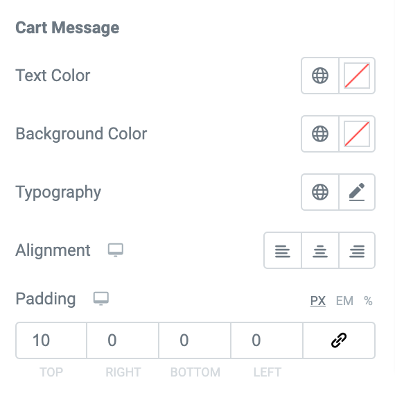
If you want to customize the Cart Message:
- Text Color - Set the color for the Cart Message.
- Background Color - Set the background color for the Cart Message.
- Typography - Set the typography for the Cart Message.
- Text Alignment - Align the Cart Message to the left, right, or center.
- Padding - Creates space between the Cart Message and the view cart option.
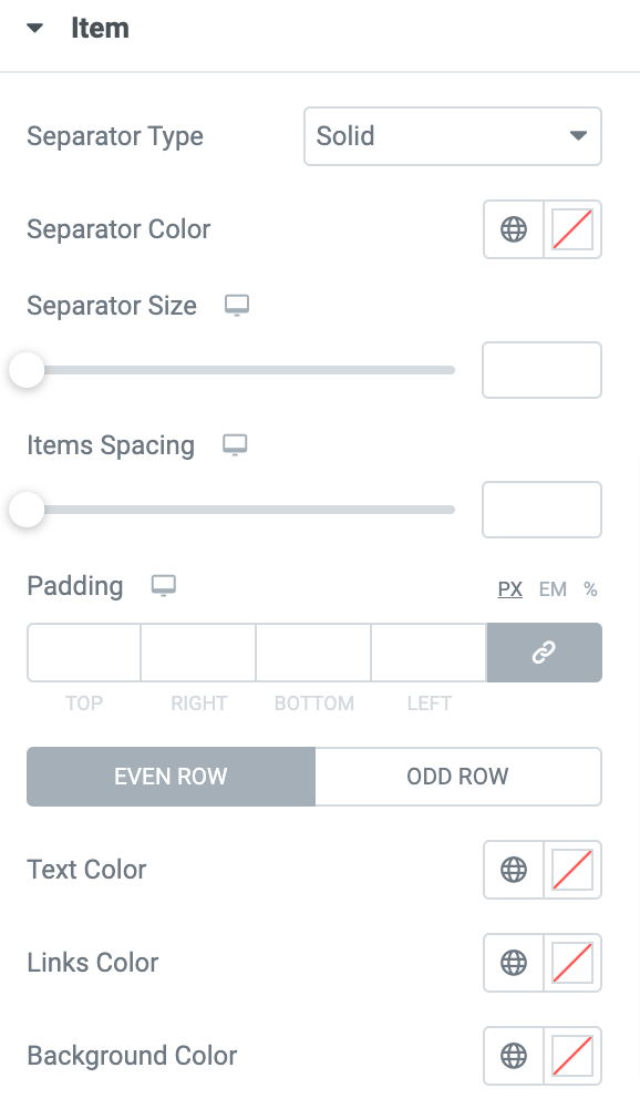
Item#
In this section, you can add a Separator between the items added to the cart. You can set the color size and choose a type from the options such as Solid, Dotted, Dashed, and Double for the separator. Further, you can adjust the spacing between the items and set the padding.
You can also set the links color, text color, and background color for the items added to the Odd and Even rows of the Off Canvas Cart.
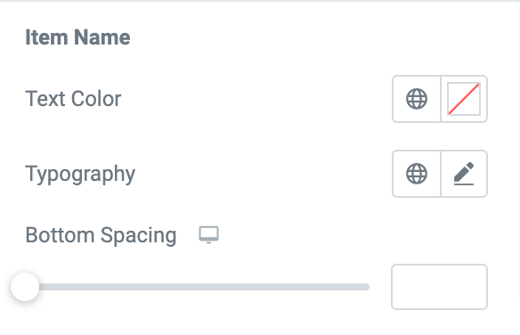
If you want to customize the Item Name:
- Text Color - Set the color for the item name.
- Typography - Set the typography for the item name.
- Bottom Spacing - Set the spacing at the bottom of the items.
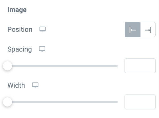
If you want to customize the Image:
- Position - Set the image to the left or right of the items.
- Spacing - Set the spacing between the images of the items.
- Width - Set the width for the images.
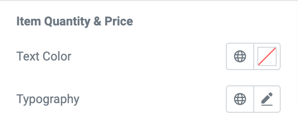
If you want to customize the Item Quantity and Price:
- Text Color - Set the color for the item quantity and price text.
- Typography - Set the typography for the text.
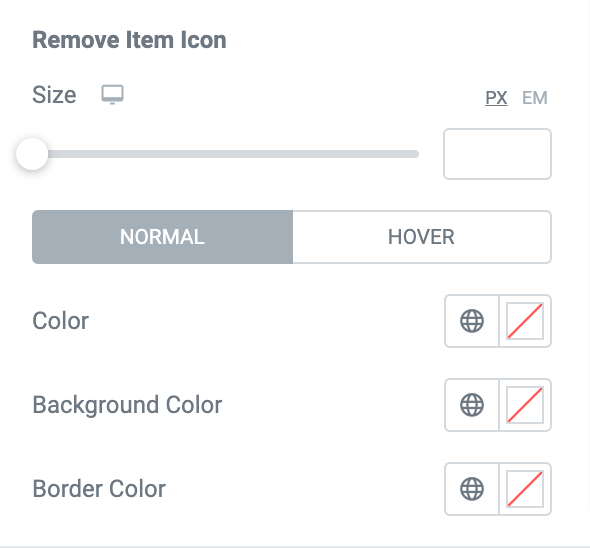
If you want to customize the Remove Item Icon:
- Size - Set the size for the icon.
- Color - Set the color for the icon.
- Background Color - Set the background color for the icon.
- Border Color - Set the border color for the icon.
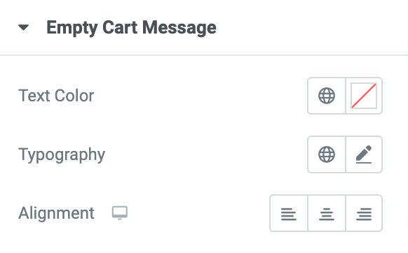
Empty Cart Message#
The Empty Cart Message appears when you remove all the products from the cart and make it empty. If you want to customize the Empty Cart Message:
- Text Color - Set the color for the “No products in the cart” message.
- Typography - Set the typography for the empty cart message.
- Alignment - Align the empty cart message to the left, right, or center.
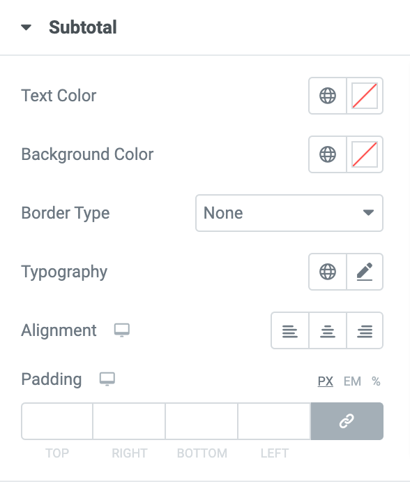
Sub Total#
- Text Color - Set the color for the Subtotal.
- Background Color - Set the background color for the Subtotal.
- Typography - Set the typography for the Subtotal.
- Border Type - Choose any border type from the options such as Solid, Double, Dotted, Dashed, and Groove.
- Text Alignment - Align the Subtotal to the left, right, or center.
- Padding - Creates space between the Subtotal and the cart message.
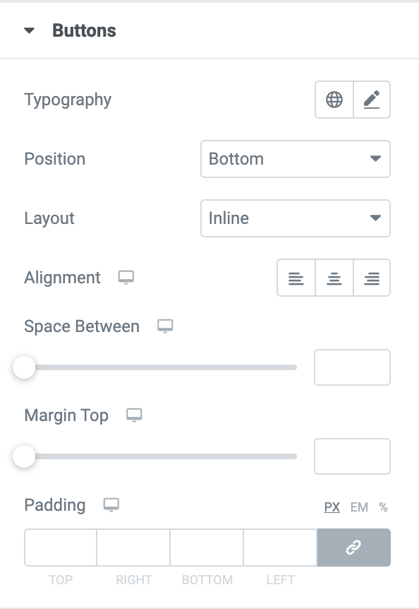
Buttons#
- Typography - Set the typography for the buttons.
- Layout: If you choose the layout as:
- Inline - Set the buttons to the left, right, or center.
- Stacked - Displays the buttons one after the other.
- Space Between - Creates space between the buttons.
- Margin Top - Creates a space at the top of the button.
- Padding - Set the padding between the buttons.
- Alignment - Align the buttons to the left, right, or center.
You can also set the background color, text color, border color, and box-shadow for the View Cart Button and the Checkout Button. In the normal mode, you can choose the border type and set the border radius for both the buttons.
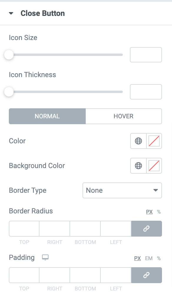
Close Button#
In this section, you can set the Size, Color, and Background color for the close button. In the normal mode, you can set the border-radius padding and choose a border type from the list of options such as Solid, Double, Dotted, Dashed, and Groove.
This was the detailed overview of the Woo - Off Canvas Cart Widget available in PowerPack Addons for Elementor.
Hope this helps!