With the PowerPack Woo - Checkout Widget, you can customize the default checkout page of your WooCommerce website using the Elementor page builder in a few easy steps.
Customizing the standard checkout page of your eCommerce site helps you enhance your customers' shopping experience and checkout process.
Let's take a closer look at the content and style tab of the Woo - Checkout widget.
Content Tab of the Woo - Checkout Widget#
The Content Tab of the Woo - Checkout Widget consists of 2 sections:
- Layout
- Help Docs
Now go over each of these sections in more detail:
Layout#
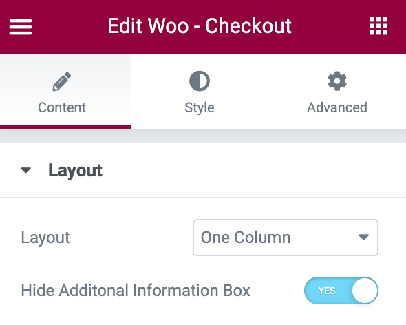
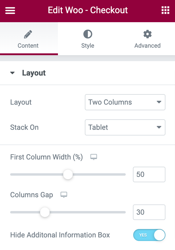
- Layout: Choose your cart page layout to be One Column or Two Column.
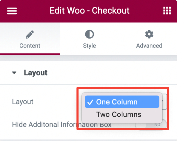
If you select the layout as One Column:
- The checkout table will be displayed with options in a Single Column.
If you select the layout as Two Columns:
- Stack On - Displayed responsive columns on smaller-sized screens like mobile and tablet.
- First Column Width - Set width of the first column.
- Columns Gap - Set the space between first and the second column.
- Hide Additonal Information Box - Enable this option to hide additional information like Order Notes.
Style Tab of the Woo - Checkout Widget#
PowerPack Woo - Checkout Widget provides styling options to customize every single element of your WooCommerce cart page. From altering typography to changing colors to adding border & padding, you get options to customize all.
There are 12 sections in the style tab of the Woo - Checkout Widget:
- Sections
- Columns
- Inputs
- Returning Customer Box
- Coupon Bar
- Headings
- Billing Details
- Additional Information
- Review Order
- Payment Method
- Privacy Policy
- Button
Now let's look at each of these sections in more detail.
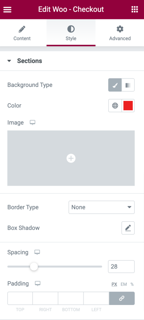
Sections#
- Background Type - Choose Classic or Gradient background for the Sections.
- Border Type - Choose any border type from the options such as Solid, Double, Dotted, Dashed, and Groove.
- Box-Shadow - Set the box-shadow for the Sections.
- Spacing - Set the spacing between the Sections.
- Padding - Creates space between the content and the box of the Sections.
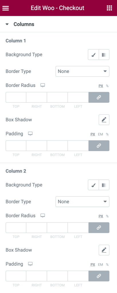
Columns#
Options for both Column 1 and Column 2:
- Background Type - Choose between Classic or Gradient backgrounds.
- Border Type - Choose any border type from the options such as Solid, Double, Dotted, Dashed, and Groove.
- Border Radius - Displays the columns with soft edges.
- Box Shadow - Set the box-shadow for the columns.
- Padding - Creates space between the table and the columns.
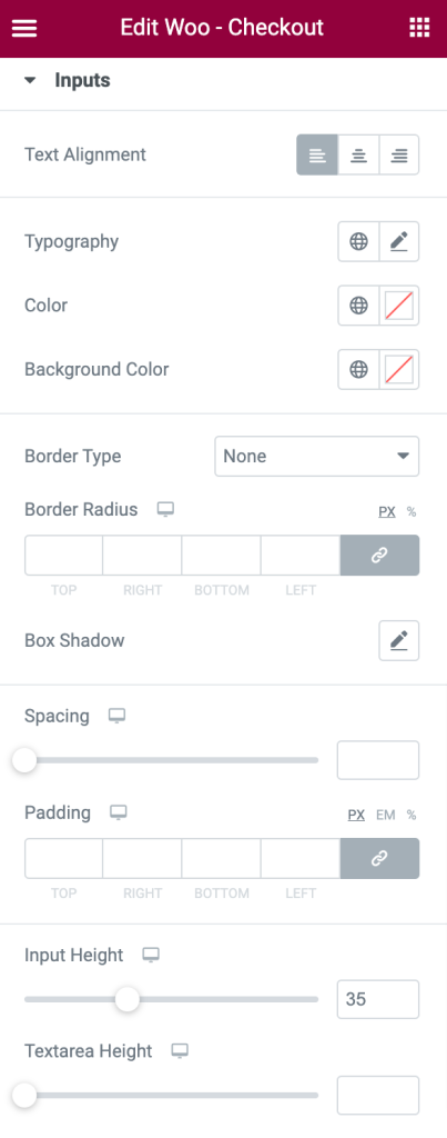
Inputs#
- Text Alignment - Align the input text to the left, right, or center.
- Typography - Set the typography for the input text.
- Color - Set the color for the input text.
- Background Color - Set the background color for the inputs.
- Border Type - Choose any border type from the options such as Solid, Double, Dotted, Dashed, and Groove.
- Border Radius - Displays the input box with soft edges.
- Box Shadow - Set the box-shadow for the inputs.
- Spacing - Set the spacing between the inputs.
- Padding - Creates space between the text and the input box.
- Input Height - Set the height of the input box.
- Textarea Height - Set the height of the input text area.
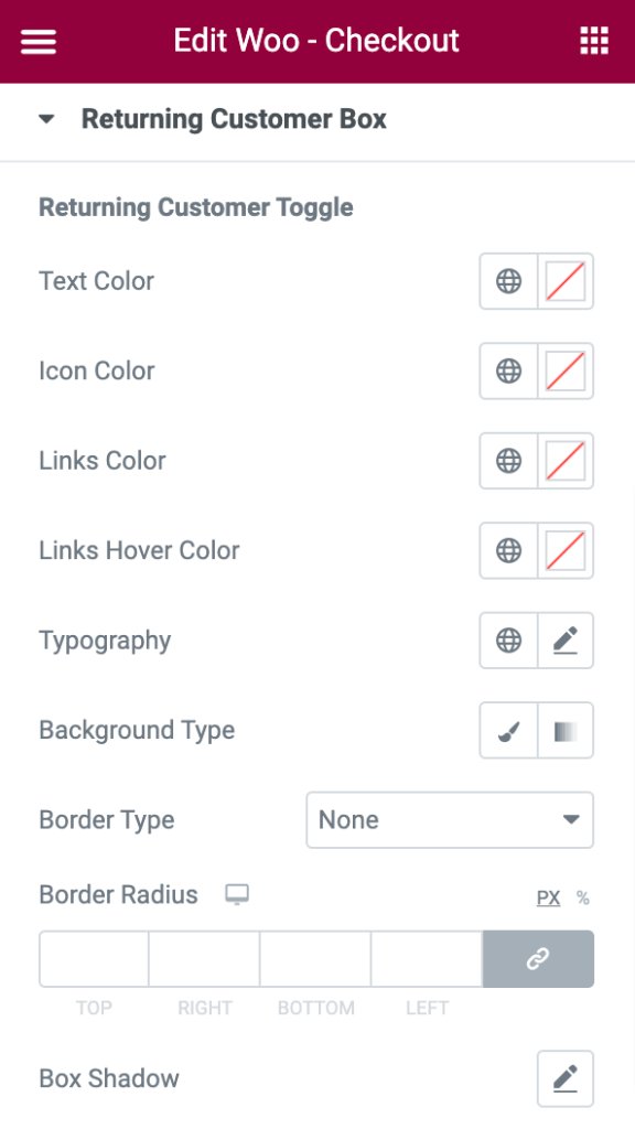
Returning Customer Box#
Returning Customer Toggle#
In this section you styling options to customize the Returning Customer Toggle element of the WooCommerce Checkout Widget:
- Text Color - Set the color for the text added to the returning customer box.
- Icon Color - Set the icon for the box.
- Links Color - Set the color for the links of the box.
- Links Hover Color - Set the color for the links displayed during mouse hover.
- Typography- Set the typography for the text added to the box.
- Background Type - Choose between Classic or Gradient backgrounds.
- Border Type - Choose any border type from the options such as Solid, Double, Dotted, Dashed, and Groove.
- Border Radius - Displays the box with soft edges.
- Box-Shadow - Set the box-shadow horizontally or vertically to the box.
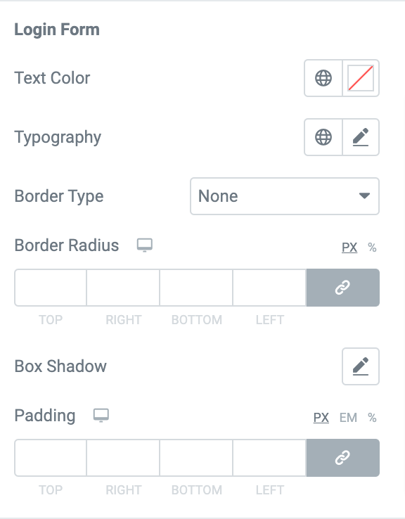
Login Form#
If you want to customize the Login Form of your WooCommerce checkout page, you get multiple options to do that:
- Text Color - Set the color for the text added to the login form.
- Typography - Set the typography for the text.
- Border Type - Choose any border type from the options such as Solid, Double, Dotted, Dashed, and Groove.
- Border Radius - Displays the login form box with soft edges.
- Box Shadow - Set the box-shadow for the login form box.
- Padding - Set the padding between the text and the login form box.
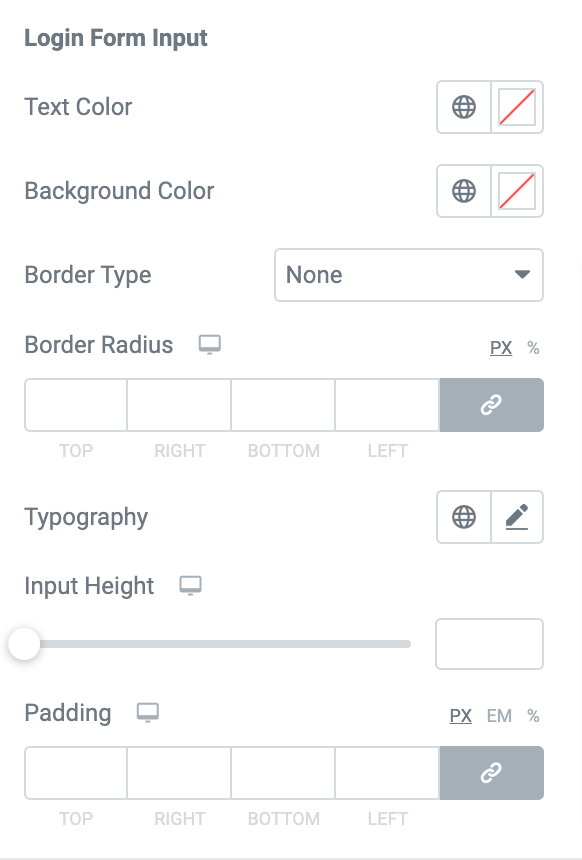
Login Form Input#
If you want to customize the Login Form Input:
- Text color - Set the color for the input text added to the login form.
- Background Color - Set the background color for the inputs.
- Border Type - Choose any border type from the options such as Solid, Double, Dotted, Dashed, and Groove.
- Border Radius - Displays the input box with soft edges.
- Typography - Set the typography for the input text.
- Input Height - Set the height for the input box of the login form.
- Padding - Set the padding between the input text and the box.
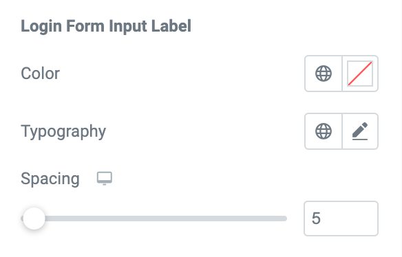
Login Form Input Label#
For the Input Label, you can set the text color, typography, and spacing between the texts.
You can further set the typography, text color, background color, border color, and box-shadow for the button of the login form. You can set the border type, border radius, and padding for the button in the normal mode.
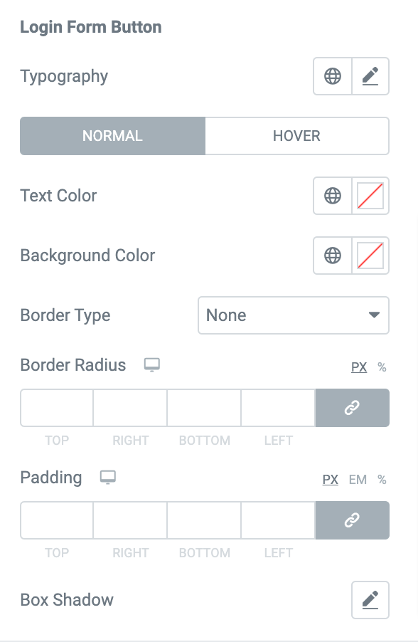
Login Form Button#
Lastly, you get options to customize the login form button. You can alter the typography, change text and background color and choose border type for the button.
Further, if you want you can also set border radius, adjust padding, and add a box shadow to the login form button.
Coupon Bar#
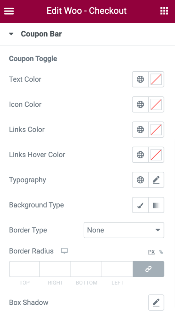
Coupon Toggle#
In this section, you can set the text color, Icon color, Link color, Link hover color, typography, border radius, and box-shadow for the coupon bar. You can also choose a background type between Classic or Gradient and also select a border type from the list of options shown in the below screenshot.
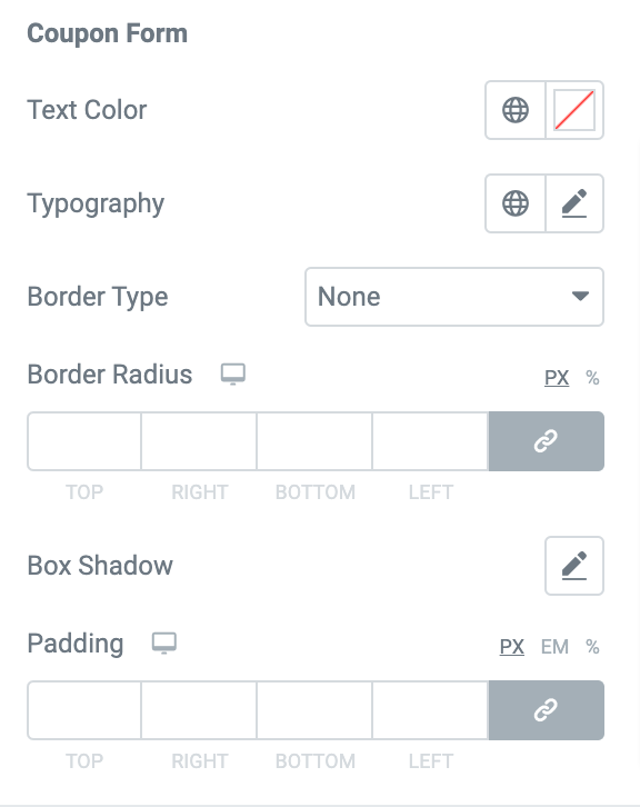
Coupon Form#
If you want to customize the Coupon Form, you get options:
- Text Color - Set the color for the text of the coupon form.
- Typography - Set the typography for the text added to the form.
- Border Type - Choose any border type from the options such as Solid, Double, Dotted, Dashed, and Groove.
- Border Radius - Displays coupon form box with soft edges.
- Box Shadow - Set the box-shadow for the input box.
- Padding - Creates space between the coupon form text and the box.
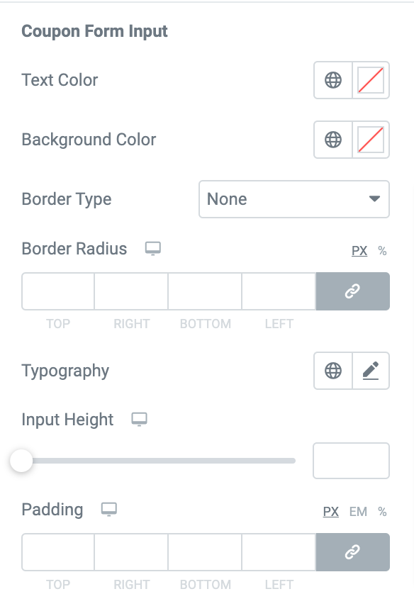
Coupon Form Input
If you want to customize the Coupon Form Input:
- Text Color - Set the color for the input text added to the Coupon Form.
- Background Color - Set the background color for the inputs.
- Border Type - Choose any border type from the options such as Solid, Double, Dotted, Dashed, and Groove.
- Border Radius - Displays the input box with soft edges.
- Typography - Set the typography for the input text.
- Input Height - Set the height for the input box of the Coupon Form.
- Padding - Set the padding between the input text and the box.
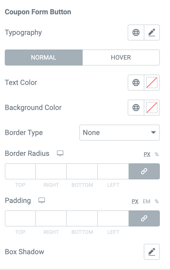
Coupon Form Button#
You can further set the typography, text color, background color, border color, and box-shadow for the button of the Coupon form. You can set the border type, border radius, and padding for the button in the normal mode.
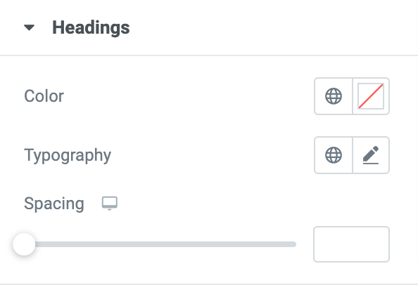
Headings#
In this section, you can set the color, typography, and spacing for the headings of the sections in the checkout table.
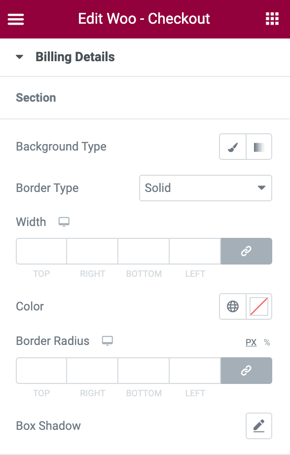
Billing Details#
Section#
If you want to customize the billing details Section:
- Background Type - Choose between Classic or Gradient backgrounds.
- Border Type - Choose any border type from the options such as Solid, Double, Dotted, Dashed, and Groove.
- Width - Set the width for the billing details box.
- Color - Set the color for the border of the box.
- Border Radius - Displays the box with soft edges.
- Box Shadow - Set the box-shadow for the billing details box.
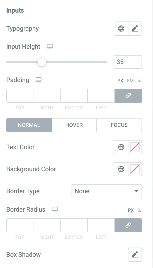
Inputs#
If you want to customize the Inputs:
- Typography - Set the typography for the input text added to the box.
- Input height - Set the height of the input box in the billing details section.
- Padding - Creates space between the text and the input box.
In the Normal, Hover, and Focus modes:
- Text color - Set the color of the input text.
- Background Color - Set the background color for the inputs.
- Border Type - Choose any border type from the options such as Solid, Double, Dotted, Dashed, and Groove.
- Border Radius - Displays each input box with soft edges. This is available only in normal mode.
- Box Shadow - Set the box-shadow for the input box.
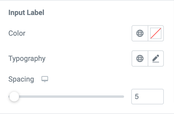
Input Label#
If you want to customize the Input Label:
- Color - Set the color for the input labels.
- Typography - Set the typography for the labels.
- Spacing - Set the spacing between the labels and the input box.
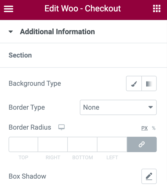
Additional Information#
Section#
If you want to customize the Order Notes section:
- Background Type - Choose between Classic or Gradient backgrounds.
- Border Type - Choose any border type from the options such as Solid, Double, Dotted, Dashed, and Groove.
- Width - Set the width for the order notes box.
- Color - Set the color for the border of the box.
- Border Radius - Displays the box with soft edges.
- Box Shadow - Set the box-shadow horizontally or vertically to the box.
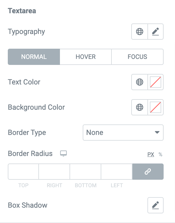
Text Area#
If you want to customize the Textarea:
- Typography - Set the typography for the labels.
In Normal, Hover, and Focus modes:
- Text Color - Set the color for the input text of the order notes.
- Background Color - Set the background color for the text area.
- Border Type - Choose any border type from the options such as Solid, Double, Dotted, Dashed, and Groove. This is available only in normal mode.
- Border Radius - Displays the text area box with soft edges. This is available only in normal mode.
- Box Shadow - Set the box-shadow horizontally or vertically to the text area box.
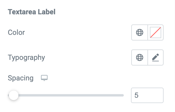
Textarea Label#
If you want to customize the Textarea Label:
- Color - Set the color for the label.
- Typography - Set the typography for the label.
- Spacing - Creates a spacing between the text area and the input box.
Review Order#
In the Review Order section, you get plenty of styling options to customize each element of your review order table:
Table#
If you want to customize the Table:
- Typography - Set the typography for the text added to the table.
- Background Type - Choose between "Classic" or "Gradient" backgrounds.
- Border Type - Choose any border type from the options such as Solid, Double, Dotted, Dashed, and Groove.
- Width - Set the width for the table.
- Color - Set the color for the border of the table.
- Border Radius - Displays the table with soft edges.
- Box Shadow - Set the box-shadow horizontally or vertically to the table.
- Padding - Creates space between the text and the table.
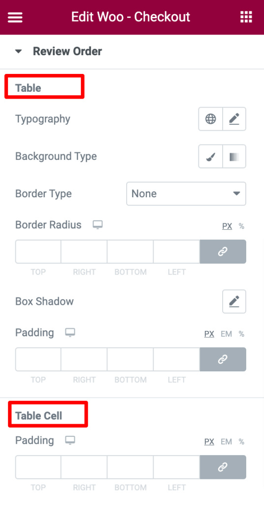
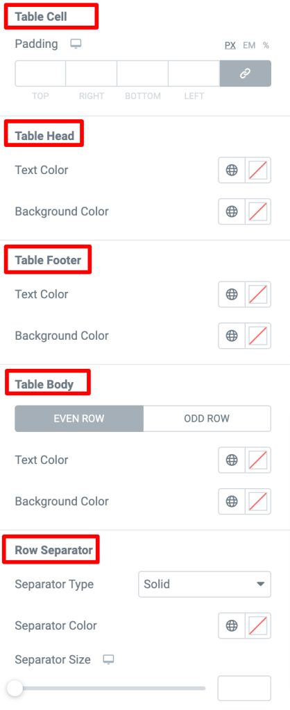
Table Cell#
If you want to customize the Table Cell:
- Padding - Creates space between each cell of the table.
Table Head#
If you want to customize the Table Head:
- Text Color - Set the color for the heading.
- Background Color - Set the background color for the table head.
Table Footer#
If you want to customize the Table Footer:
- Text Color - Set the color for the footer.
- Background Color - Set the background color for the table footer.
Table Body#
If you want to customize the Table body:
- Even Row - Set the text color and background color for the content in the even row of the table.
- Odd Row - Set the text color and background color for the content in the Odd row of the table.
Row Separator#
If you want to customize the Row Separator:
- Separator Type - Choose a type from the options such as Solid, Dotted, Dashed, and Double.
- Separator Color - Set the color for the separator.
- Separator Size - Set the size for the separator between the rows of the table.
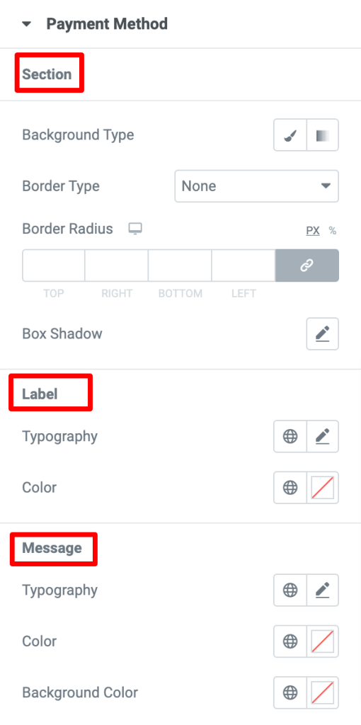
Payment Method#
If you want to customize the Section:
- Background Type - Choose between Classic or Gradient backgrounds.
- Border Type - Choose any border type from the options such as Solid, Double, Dotted, Dashed, and Groove.
- Width - Set the width for the payment method box.
- Color - Set the color for the border of the box.
- Border Radius - Displays the box with soft edges.
- Box Shadow - Set the box-shadow horizontally or vertically to the box.
Label#
If you want to customize the Label:
- Typography - Set the typography for the label.
- Color - Set the color for the label.
Message#
If you want to customize the Message:
- Typography - Set the typography for the message.
- Color - Set the color for the message text.
- Background Color - Set the background color for the message box.
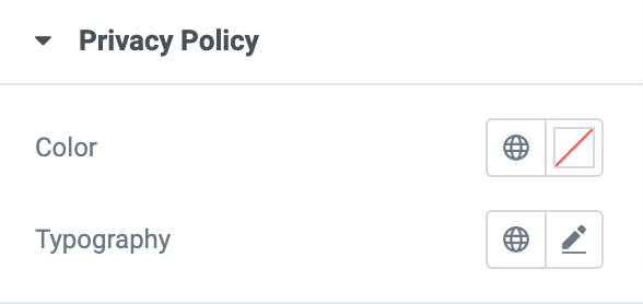
Privacy Policy#
In this section, you can set the color and typography for the privacy policy content added below the payment method.
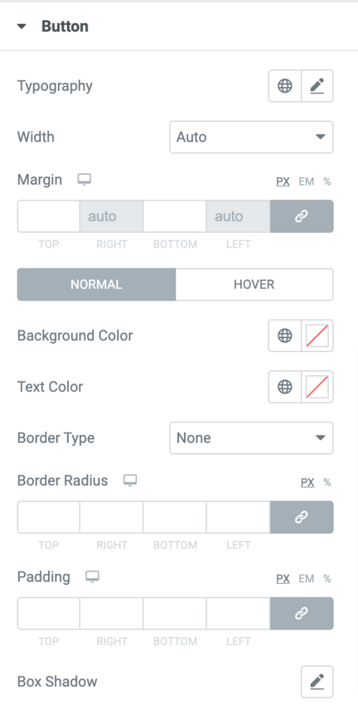
Button#
Here, you can set the typography, width, margin, background color, text color, border color, and box-shadow for the Place Order button. In the normal mode, you can set the border radius and choose a border type from the list of options such as Solid, Double, Dotted, Dashed, and Groove.
This was the detailed overview of the Woo - Checkout Widget available in PowerPack Addons for Elementor.
Hope this helps!