Display collapsible Mini WooCommerce Cart on your WordPress website’s header with PowerPack Woo Mini Cart Widget for Elementor. This widget helps you enhance your customers' store experience by displaying a cart button on the product page.
Let’s take a closer look at the Content and Style tab of the Woo - Mini Cart Widget.
Content Tab of the Woo - Mini Cart Widget#
The Content Tab of the Woo - Mini Cart widget consists of 3 sections:
- Cart Button
- Cart
- Help Docs
Let us now go over each of these sections in more detail.
Cart Button#
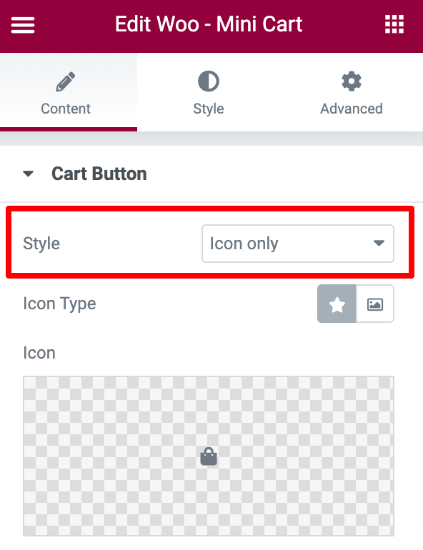
- If you choose the style as Icon Only:
- Icon Type - Choose an icon or image.
- Icon - Choose an icon from the icon library or media library.
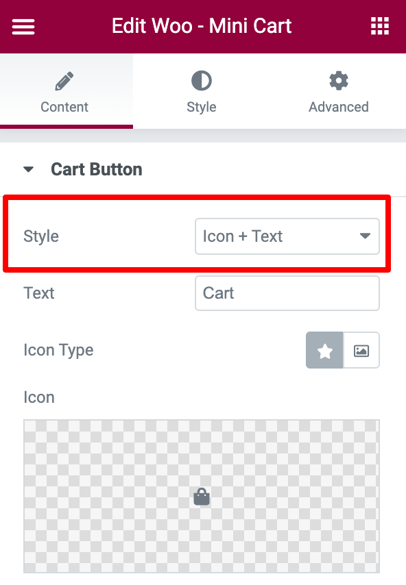
- If you choose the style as Icon + Text:
- Text - Enter the text to be displayed over the button.
- Icon - Choose an icon from the icon library or media library.
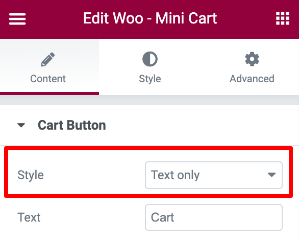
- If you choose the style as Text Only:
- Text - Enter the text to be dislayed over the button.
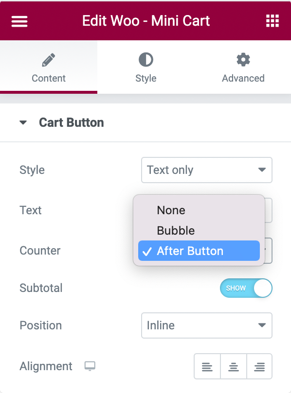
- Counter - Choose counter style as Bubble, After Button or None.
- Subtotal - Enable to show the Subtotal on the cart.
- Position - Choose between Inline or Floating.
- Alignment - Align the cart to the Left, Right, or Center.
Cart#
- Show Cart On - Shows the cart on a Click or Hover.
- Preview Cart - This shows the preview of the cart below the Mini Cart.
- Cart Title - Set the title for the cart.
- Cart Message - This shows the notification below the Mini Cart.

Style Tab of the Woo - Mini Cart Widget#
There are 4 sections in the style tab of the Woo - Mini Cart Widget:
- Cart Button
- Items Container
- Item
- Buttons
Let's look at each of these sections in more detail.
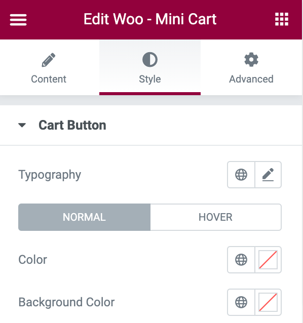
Cart Button#
- Typography - Set the typography for the mini cart button.
- Color - Set the color for the mini cart button.
- Background Color - Set the background color for the mini cart button.
- Border Color - Set the border color for the cart button.
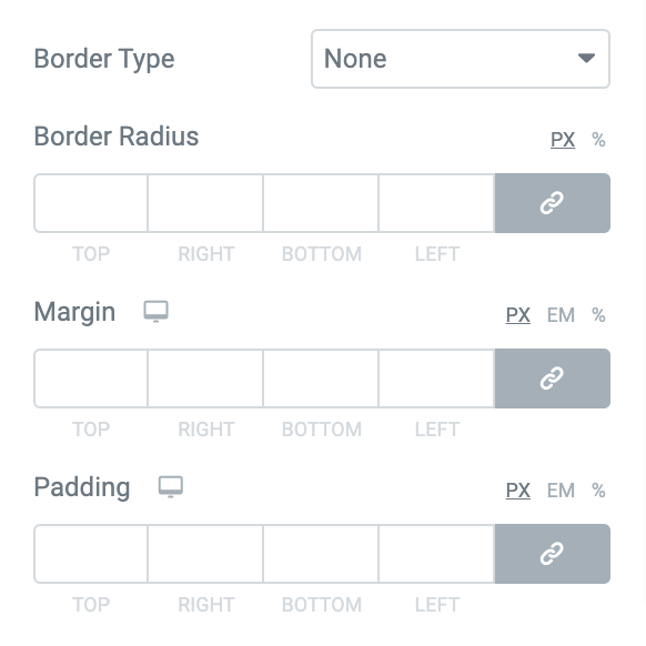
- In Normal mode:
- Border Type - Choose any border type from the options such as Solid, Double, Dotted, Dashed, and Groove.
- Border Radius - Displays the cart button with soft edges.
- Margin - Creates space between the margin and the cart button.
- Padding - Creates space between the text and the cart button.
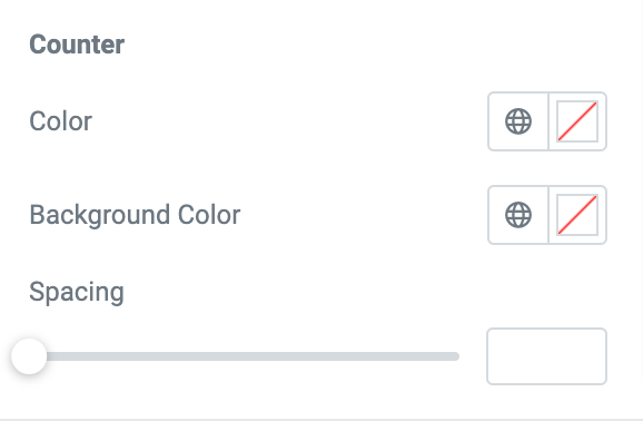
- If you want to customize the Counter, you get follwoing options:
- Color - Set the color for the counter.
- Background Color - Set the background color for the counter.
- Spacing - Creates space between the counter and the cart button.
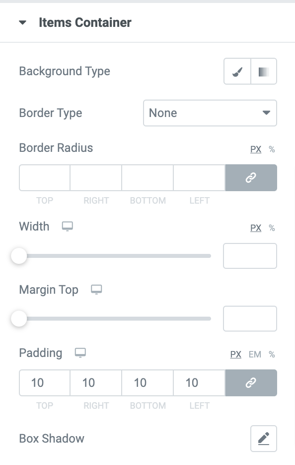
Items Container#
Following are the styling options you get to style Items Container in the Woo Mini Cart Widget of PowerPack.
- Background Type - Choose between Classic or Gradien” backgrounds.
- Border Type - Choose any border type from the options such as Solid, Double, Dotted, Dashed, and Groove.
- Border Radius - Displays the container with soft edges.
- Width - Set the width of the items added to the cart.
- Margin Top - Create a space between the cart button and the container.
- Box-Shadow - Set the box-shadow for the sections.
- Padding - Creates space between the content and the container.
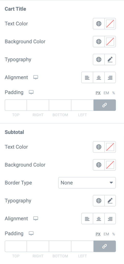
- If you want to customize the Cart Title:
- Text Color - Set the color for the cart title.
- Background Color - Set the background color for the cart title.
- Typography- Set the typography for the cart title.
- Text Alignment - Align the title to the left, right, or center.
- Padding - Creates space between the title and the items added to the cart.
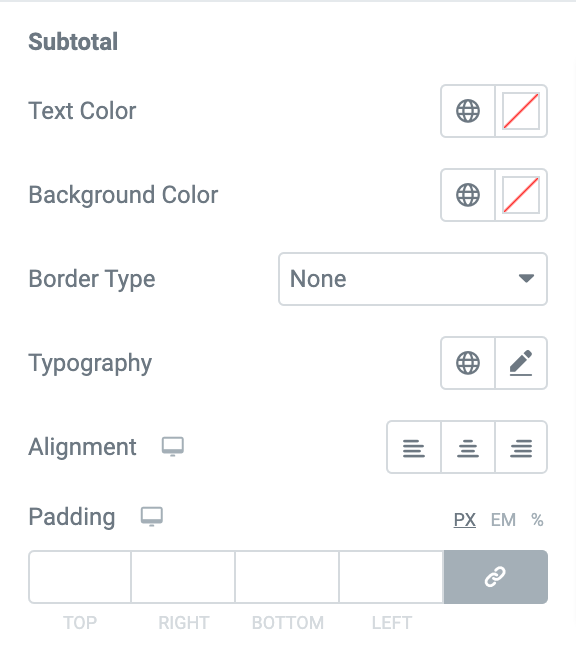
- If you want to customize the Subtotal:
- Text Color - Set the color for the Subtotal.
- Background Color - Set the background color for the Subtotal.
- Typography- Set the typography for the Subtotal.
- Border Type - Choose any border type from the options such as Solid, Double, Dotted, Dashed, and Groove.
- Text Alignment - Align the Subtotal to the left, right, or center.
- Padding - Creates space between the Subtotal and the cart message.
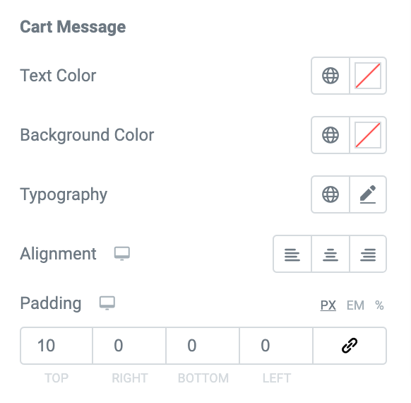
- If you want to customize the Cart Message:
- Text Color - Set the color for the Cart Message.
- Background Color - Set the background color for the Cart Message.
- Typography- Set the typography for the Cart Message.
- Text Alignment - Align the Cart Message to the left, right, or center.
- Padding - Creates space between the Cart Message and the view cart option.
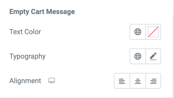
- The Empty Cart Message appears when you remove all the products from the cart and make it empty. If you want to customize the Empty Cart Message.
- Text Color - Set the color for the “No products in the cart” message.
- Typography- Set the typography for the empty cart message.
- Alignment - Align the empty cart message to the left, right, or center.
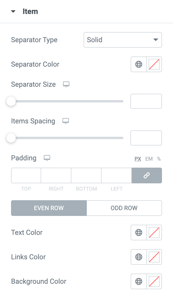
Items#
In this section, you can add a Separator between the items added to the cart. You can set the color, size and choose a separator type from the options such as Solid, Dotted, Dashed, and Double. Further, you can adjust the spacing between the items and set the padding.
You can also set the links color, text color, and background color for the items added to the Odd and Even rows of the mini cart table.
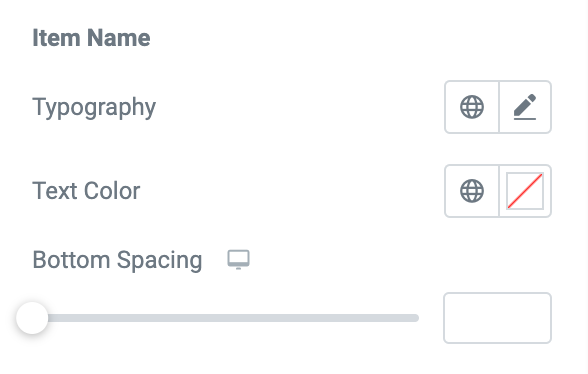
- If you want to customize the Item Name:
- Typography- Set the typography for the name of the item.
- Text Color - Set the color for the item name.
- Bottom Spacing - Set the space at the bottom of the items.
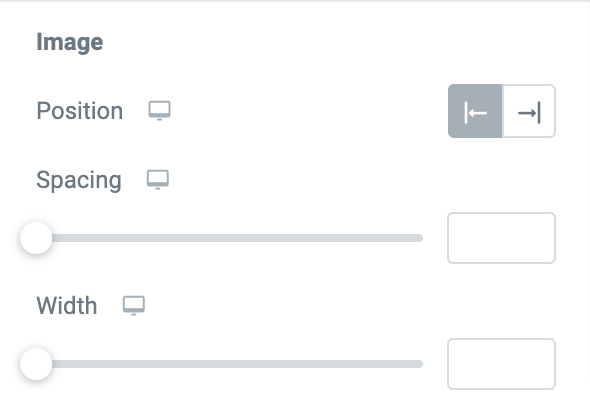
- If you want to customize the Image:
- Position - Set the image to the left or right of the items.
- Spacing - Set the spacing between the images.
- Width - Set the width of the images.
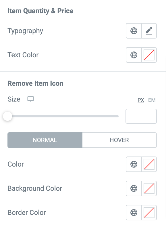
- If you want to customize the Item Quantity and Price:
- Typography- Set the typography for the Item Quantity and Price.
- Text Color - Set the color for the Item Quantity and Price.
You can further set the Size, Color, Background Color, and Border Color for the Remove Item Icon on normal and hover modes.
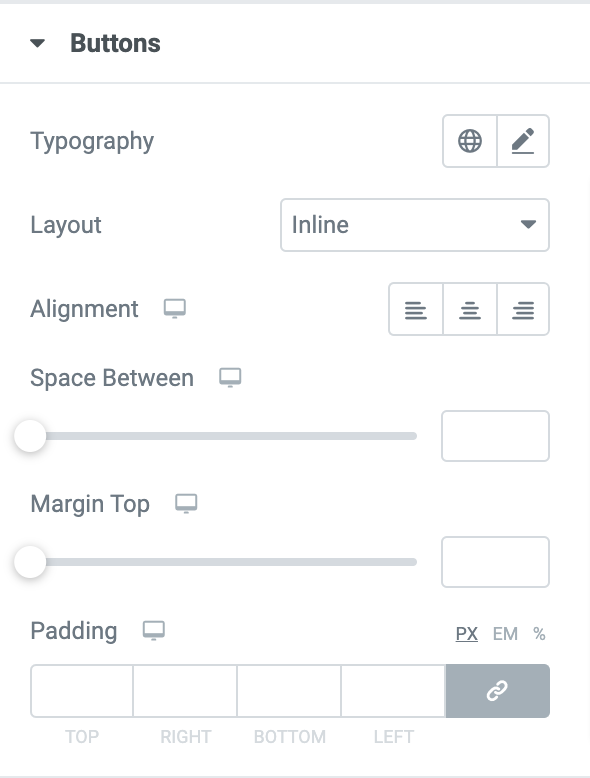
Buttons#
- Typography- Set the typography for the buttons.
- If you choose the layout as:
- Inline - Set the buttons to the left, right, or center.
- Stacked - Displays the buttons one after the other.
- Space Between - Creates space between the buttons.
- Margin Top - Creates a space at the top of the button.
- Padding - Set the padding between the buttons.
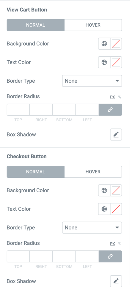
You can also set the background color, text color, border color, and box-shadow for the View Cart Button and the Checkout Button. In the normal mode, you can choose the border type and set the border radius for both the buttons.
If styling options of the Mini Cart not working, check out our doc on the Styling Options not Working in Mini-Cart Widget for more info!
This was the detailed overview of the Woo - Mini Cart Widget available in PowerPack Addons for Elementor.
Hope this helps!