PowerPack Tabbed Gallery Widget for Elementor provides a seamless way to showcase images on your WordPress websites. You can categorize your photos and display them using tabs or filters.
Tabbed Gallery Widget is the best tool to create tabbed content in Elementor without even touching a single line of code. If you have multiple photos in different categories, you can display them all on a single page.
This widget has customization and styling options in the Elementor Editor's Content and Style Tab. Let's take a closer look at each tab in detail.
Content Tab of the Tabbed Gallery Widget#
The Content Tab of the Tabbed Gallery widget consists of 4 sections:
- Gallery
- Settings
- Additional Options
- Help Docs
Let us now go over each of these sections in more detail.
Gallery#
The Gallery section includes options that allow you to create tabs and gives you multiple options to customize them.
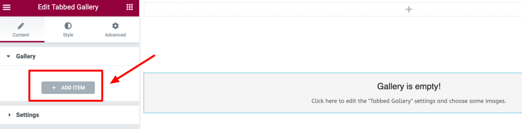
This section initially looks like the one given in the below screenshot. You need to click on the "Add Item" button to add images and create a tabbed gallery on your page.
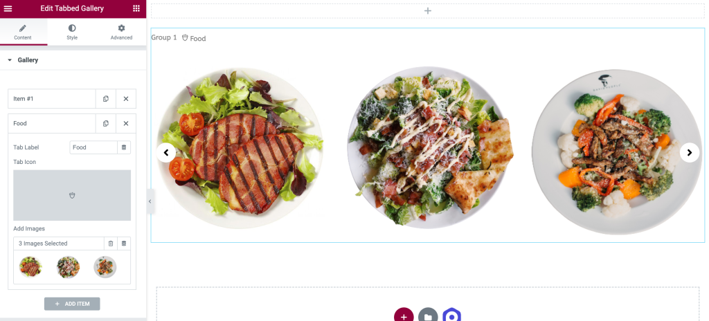
Clicking the "Add Item" button will display more options. You can:
- add the images from the media library by clicking on the "+" button under the "Add Images" option.
- change the Tab Label of the item.
- add a Tab Icon from the icon library or upload a custom one.
Settings#
As shown in the above screenshot in the Settings Section of the Elementor Tabbed Gallery widget, there are several options. Let us go through each of the options:
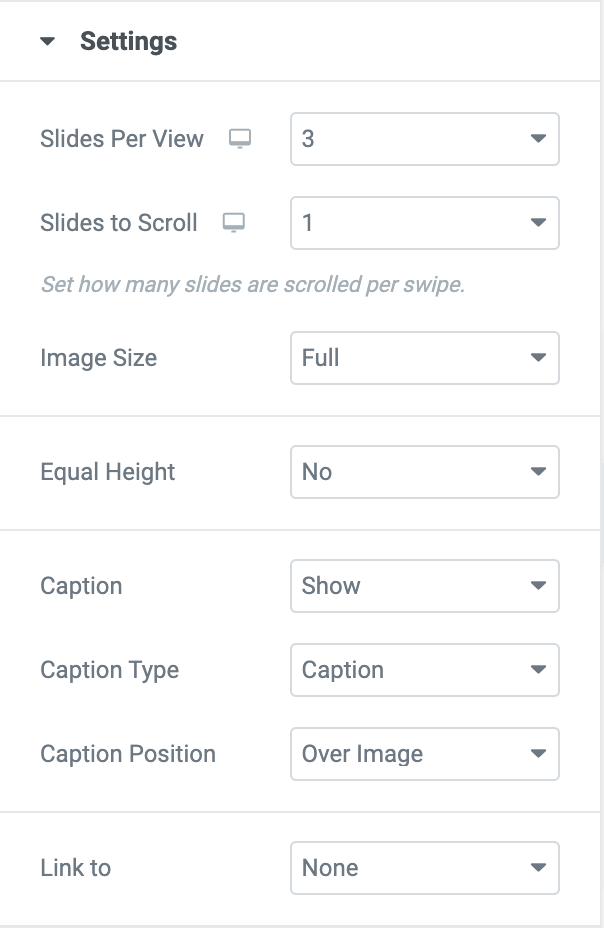
- Slides Per View: You can choose the number of slides to be viewed in the gallery.
- Slides to Scroll: Using this option, you can select the number of slides to be scrolled in a swipe.
- Image Size: You can choose the image size from the list of options given in the below screenshot.
- Equal Height: If you need all the images to be the same height, you can choose "Yes"; otherwise, you can select "No."
- Caption: You can enable or disable this option to show or hide the caption added to the Image.
- Caption Type: Select the caption type as Title or Caption.
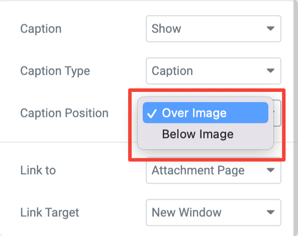
- Caption Position: Display the caption Over the image or Below the image.
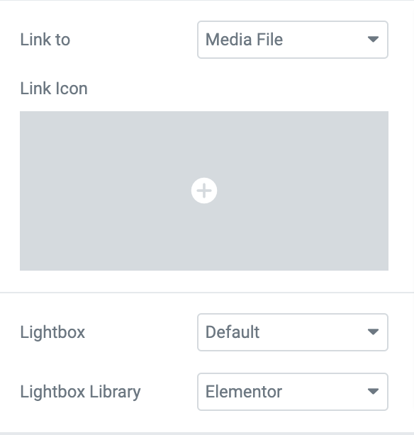
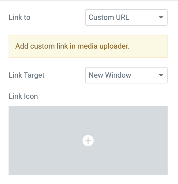
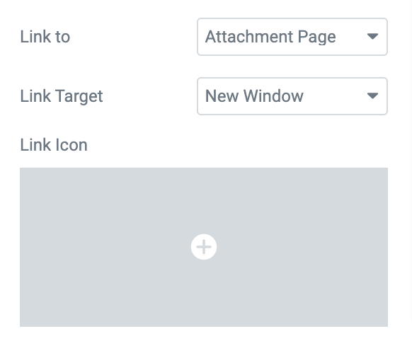
- Link To: This feature consists of 3 options: Media File, Custome URL and Attachement Page.
- Media File: This option gives you the flexibilty to open an enlarged version of the image either in a lightbox or in your browser tab. Further you get an option to choose a Link Icon. Next, you can choose whether you want to show the photos in a lightbox or not by enabling/disabling the Lightbox option. Finally, you can choose between 2 Lightbox Libraries: Elementor and FancyBox.
- Custom URL: Using this option, you can apply a Custom URL to the images in the Tabbed Gallery Widget. Further, you have the option to open the Custom URL in a new window or the same window.
- Attachement Page: By default, WordPress creates a single page for every media attachment on your site. This option links that attachment page to your image. Next, you get the option to open the target link in a new window or the same window.
Additional Options#
There are also additional options available in the Tabbed Gallery widget. These options provide more granular controls for your tabbed gallery.
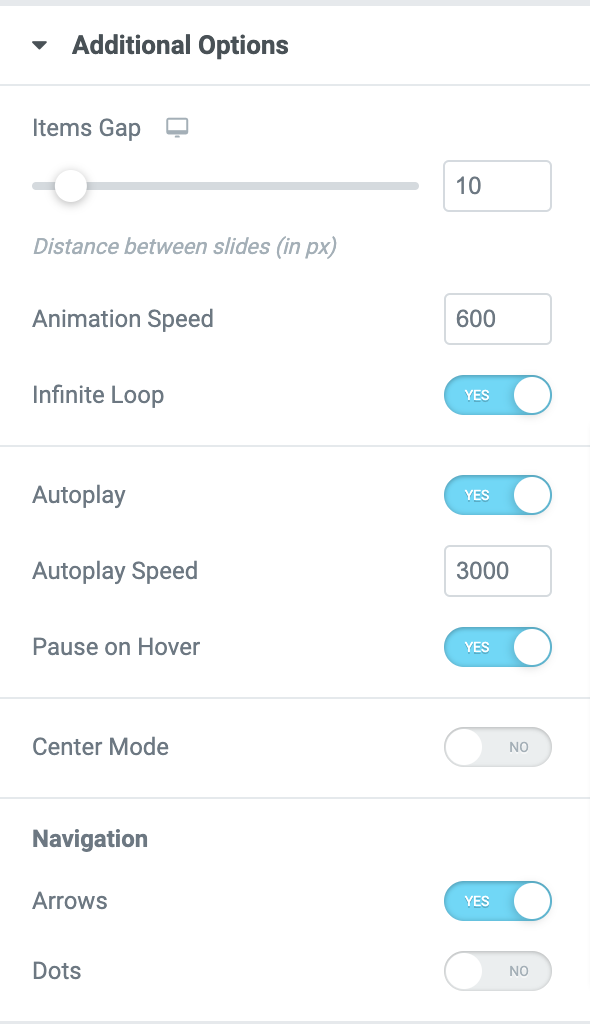
- Animation Speed: Allows you to set the tab navigation speed.
- Infinite Loop: You can enable this option to view the images in a loop.
- Autoplay: This option is enabled by default, allowing you to set the speed of the autoplay images. You can also pause the autoplay of the images on a hover.
- Center Mode: If this option is enabled, you can adjust the padding of the images viewed in the gallery's center. To blur the rest of the images not , you can also enable the Side Blur option.
- Navigation: You need to enable the Arrows and Dots options to add navigational arrows and dots to your tabbed gallery.
Now, let's go through the style tab of the Tabbed Gallery widget.
Style Tab of the Tabbed Gallery Widget#
There are 7 sections in the style tab of the Tabbed Gallery Widget:
- Layout
- Images
- Caption
- Overlay
- Tabs
- Arrows
- Dots
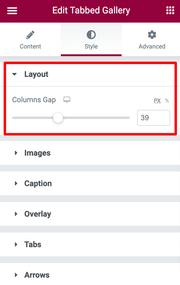
Layout#
In the Layout section, you get option to adjust the space between the columns of the images in the gallery.
Images#
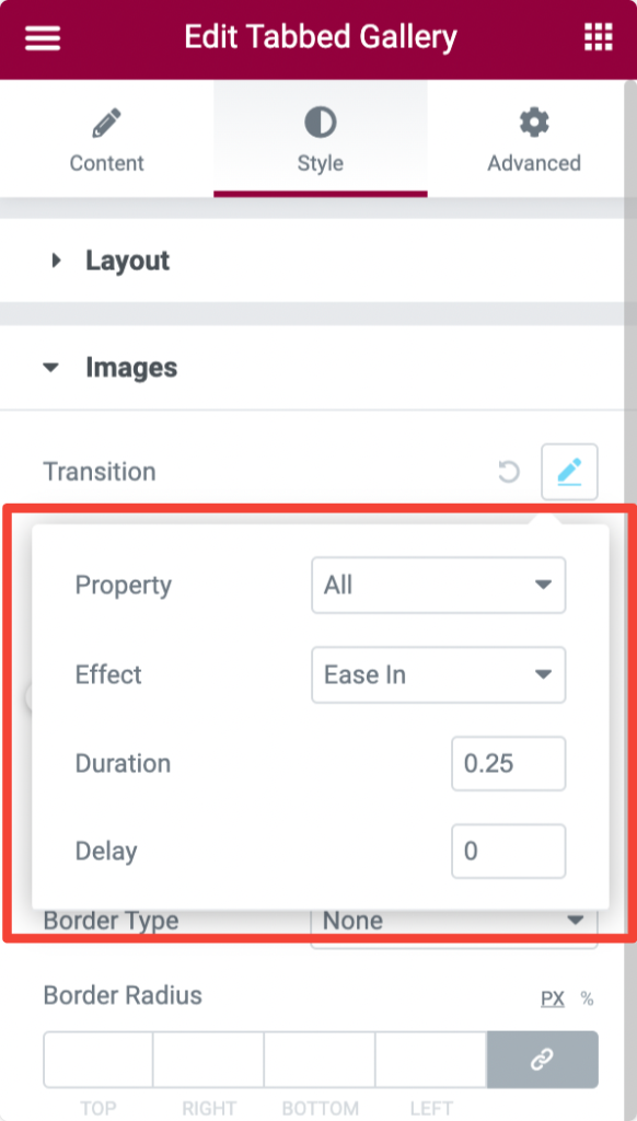
In the Images subsection, you get plenty of option to style the images of the tabbed gallery.
- Transition: Add image transition effects like Linear, Ease, Ease In, Ease Out, and Ease In Out. Further you can choose the duration for the transitions to display and select several seconds to delay the transitions.
- Scale: Resize images by increasing or decreasing the scale.
- Opacity: If you want the images to look transparent, you can increase or decrease the opacity according to the level of transparency required.
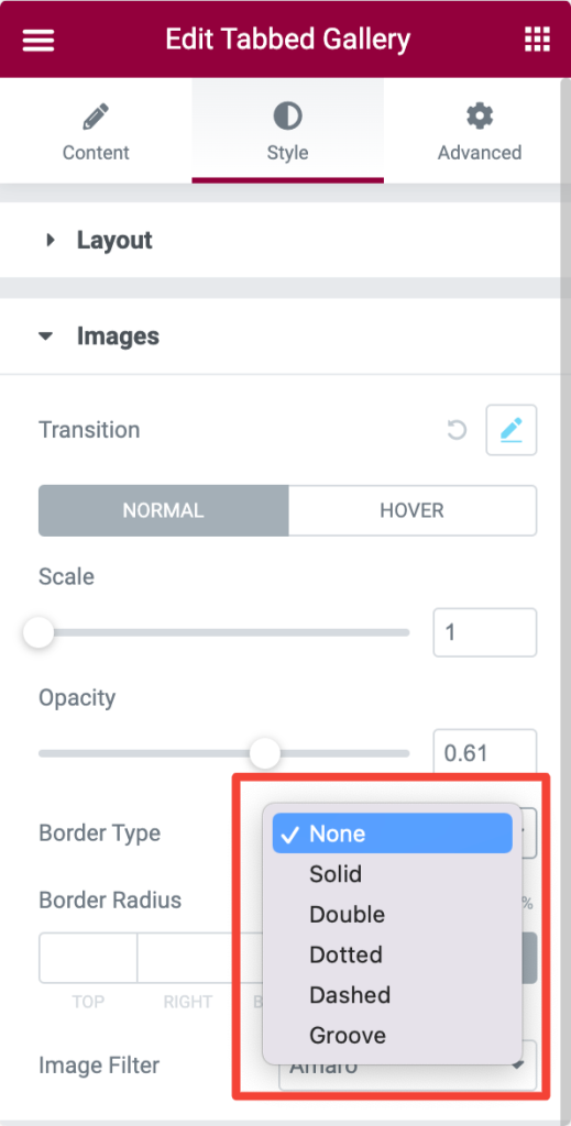
- Border Type: Choose the border type from the list of options given in the below-added screenshot.
- Border Radius: Set border radius for the images.
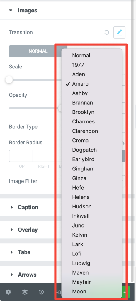
- Image Filter: There are several image filters available in the Tabbed Gallery Widget. Here is the list of filters we attached below.
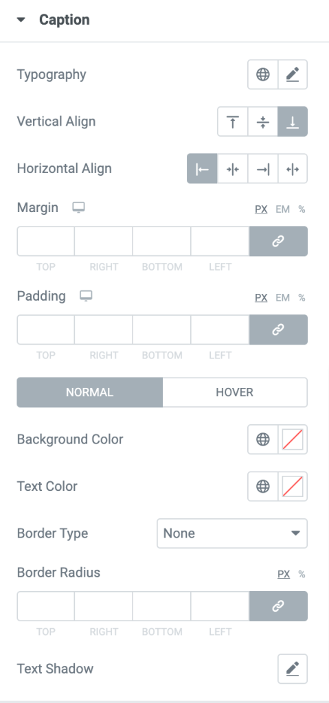
Caption#
- Typography: You can customize the image caption by changing its font and size using the Typography section.
- Vertical Align: If you have added the captions vertically to the image, you can align them to the top, center, and bottom.
- Horizontal Align: If you have added the captions horizontally to the image, you can align them to Left, Right, Center, and Justify to the images.
- Margin: Adjust the margin.
- Padding: Add padding to the caption element.
- Background Color: Add a background color.
- Text Color: Change text color to the caption.
- Border Type: Choose the border type for the caption.
- Border Radius: Set border radius.
- Text Shadow: Add shadow to the caption text.
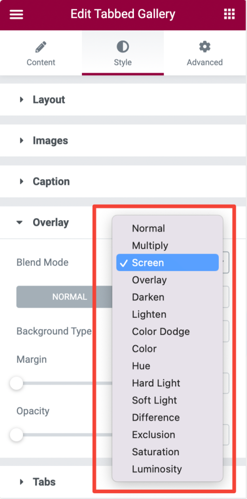
Overlay#
You can add an overlay to the images by choosing an effect from the list of options given in the Blend Mode.
Tabs#
This section consists of various options to customize the tabs in the Tabbed Gallery widget. Let's go through each of the options one by one.
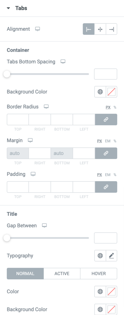
- Alignment: You can align the tabs to the gallery's Left, Right, and Center the gallery.
- Container: Using this option, you can set the bottom spacing, border-radius, margin, and padding for the tabs. You can also choose a background color for the tabs.
- Title: Here, you can customize the title. You get options to:
- adjust the space between the title of the tabs.
- customize the title in normal, active, and hover modes.
- choose a background color and add a box shadow to the title of the tabs.
- choose a border type and set the border radius and padding for the title, applicable only in normal mode.
- Icon: Using this option, you can choose the icon's position as "Inline" or "Block" and adjust the spacing between them.
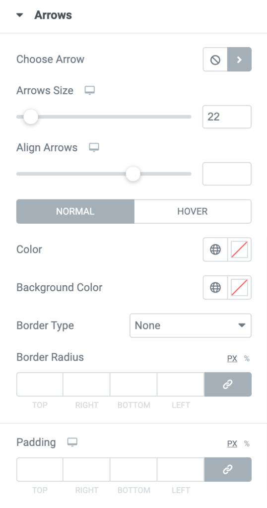
Arrows#
In the Arrows subsection, you get styling option to customize the arrows. You can:
- change the arrows' icons and adjust their size in this section.
- adjust the position of the arrows using the horizontal and vertical alignment options.
- add a background color to the arrows and adjust their padding.
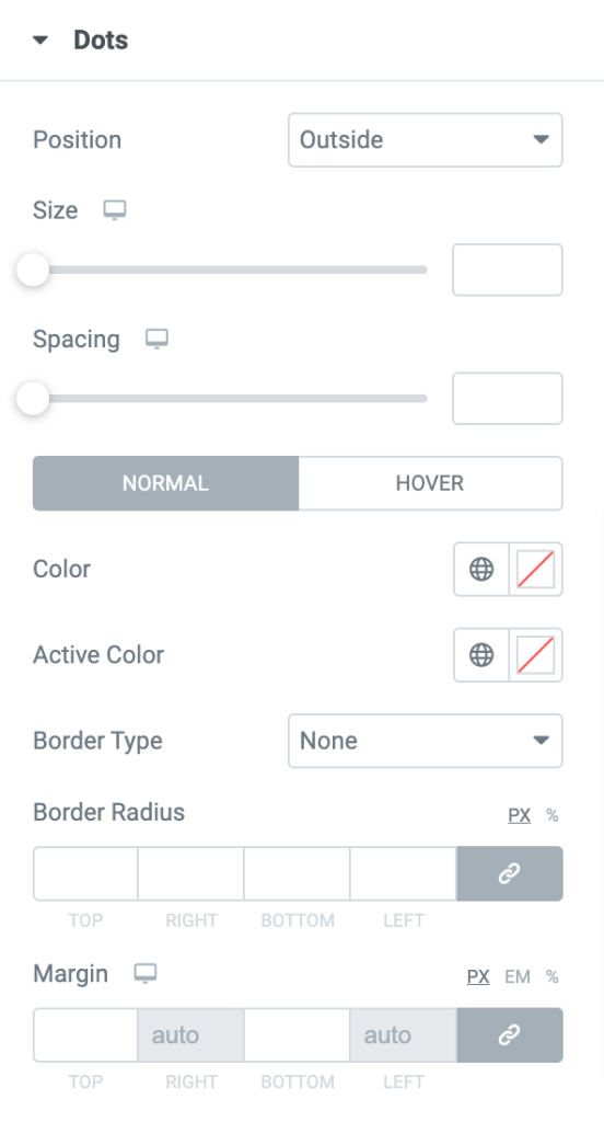
Dots#
You can adjust the size and spacing of the dots in this section. If you choose an active color for the dots, it displays the Image dot with the selected color that appears in the center.
Also you get option to choose a border type from the given options: Solid, Dotted, Double, Dashed, and Groove. It is also possible to choose a border color for the dots.
Further, you can set a margin and padding for the dots.
This was the detailed overview of the Tabbed Gallery Widget available in PowerPack Addons for Elementor.
Hope this helps!