With the PowerPack Countdown Timer Widget for Elementor, you can create impressive countdown timers on your WordPress websites and alter them to look the way you want.
You can either display a Fixed Countdown Timer or an Evergreen Countdown Timer per your business preferences.
Let's take a closer look at the Elementor Editor's Content and Style tab of the Countdown Timer widget.
Content Tab of the Countdown Timer Widget#
The Content Tab of the Countdown Timer widget consists of 4 sections:
- Countdown
- Action
- Structure
- Help Docs
Let us now go over each of these sections in more detail.
Countdown#
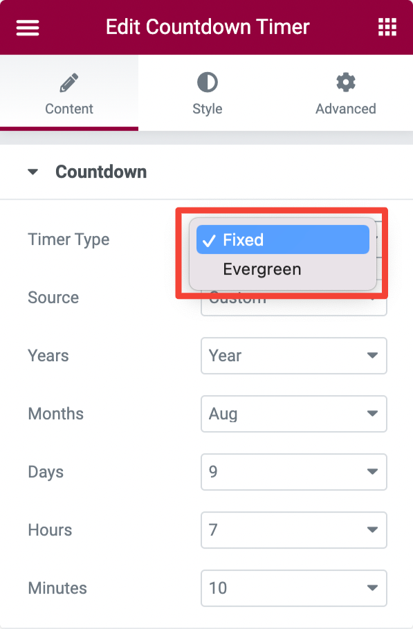
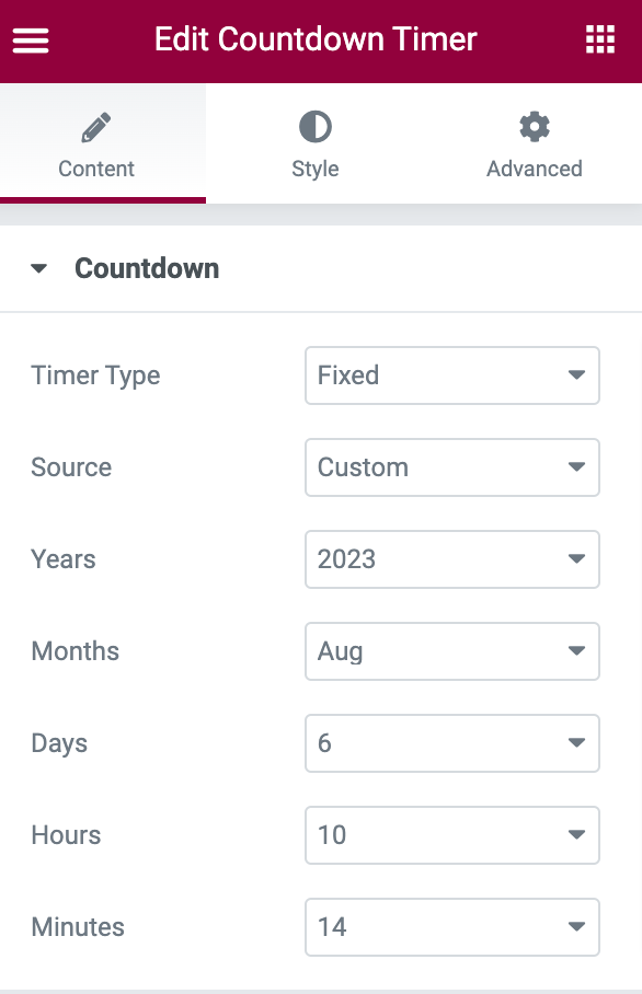
- If you choose the Fixed Timer type, you'll get more options to select the countdown source as Custom or ACF.
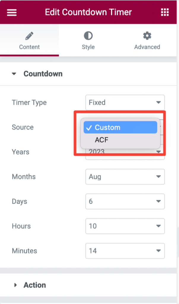
- Selecting the timer source as Custom gives you the flexibility to create a fully customized countdown timer by defining custom Years, Months, Days, Hours, and Minutes.
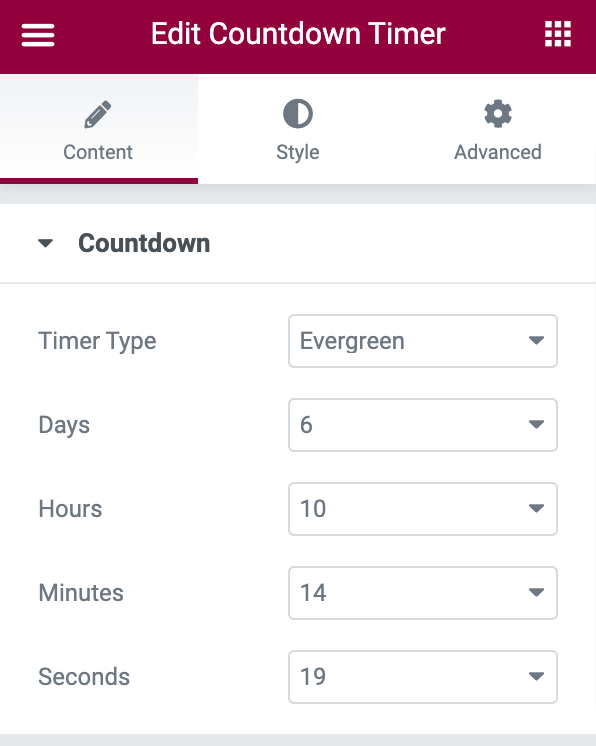
- If you choose the Evergreen Time type, you get options to create timers with custom Days, Hours, Minutes, and Seconds.
Action#
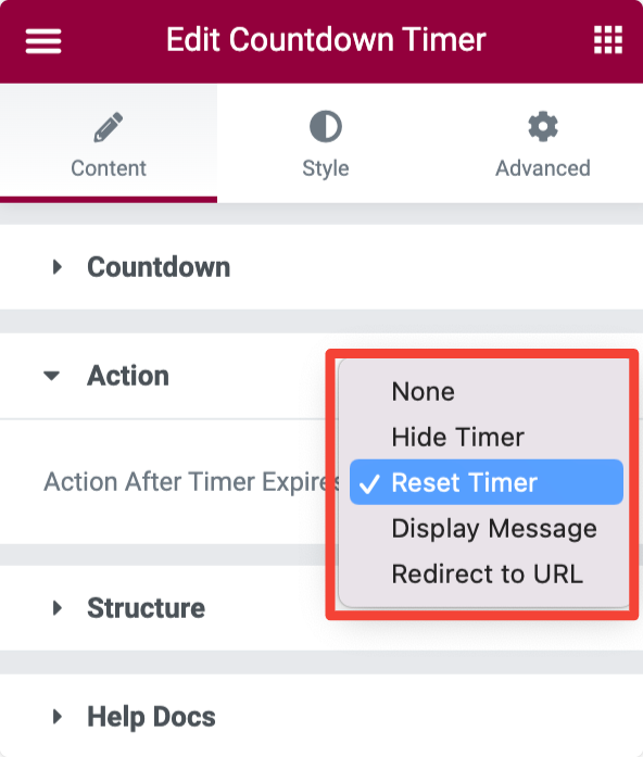
- Action After Time Expires: From the given options, choose the action that will get triggered when the countdown timer is completed.
- Hide Timer: This option will hide the timer upon completion.
- Reset Timer: This will reset the timer.
- Display Message: Once the countdown timer is completed, this option will display a custom message in place of the countdown timer.
- Redirect to URL: This option will redirect the users to a different page upon completion. You can add the URL in the field below.
Structure#
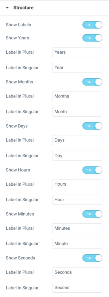
In the Structure subsection, you get options to:
- Enable/disable the labels
- Add custom labels.
- Add the Years, Months, Days, Hours, Minutes, and seconds in singular or plural format.
Style Tab of the Countdown Timer Widget#
There are 5 sections in the style tab of the Countdown Timer Widget:
- General
- Separator
- Boxes
- Labels
- Typography
General#
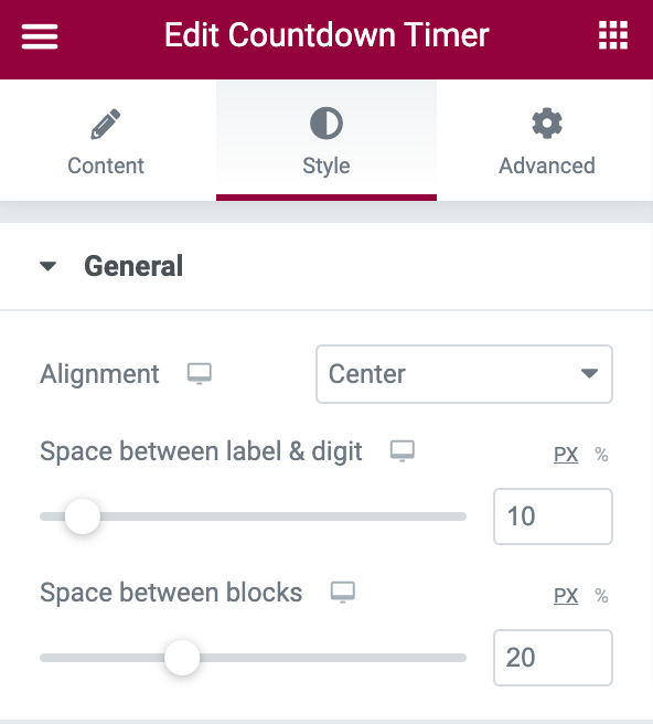
- Alignment: Align the Countdown Timer to the Left, Right, and Center.
- Space between label & digit: Set the space between the label and the timer digits.
- Space between label & digit: Set the space between each block of the countdown timer.
Separator#
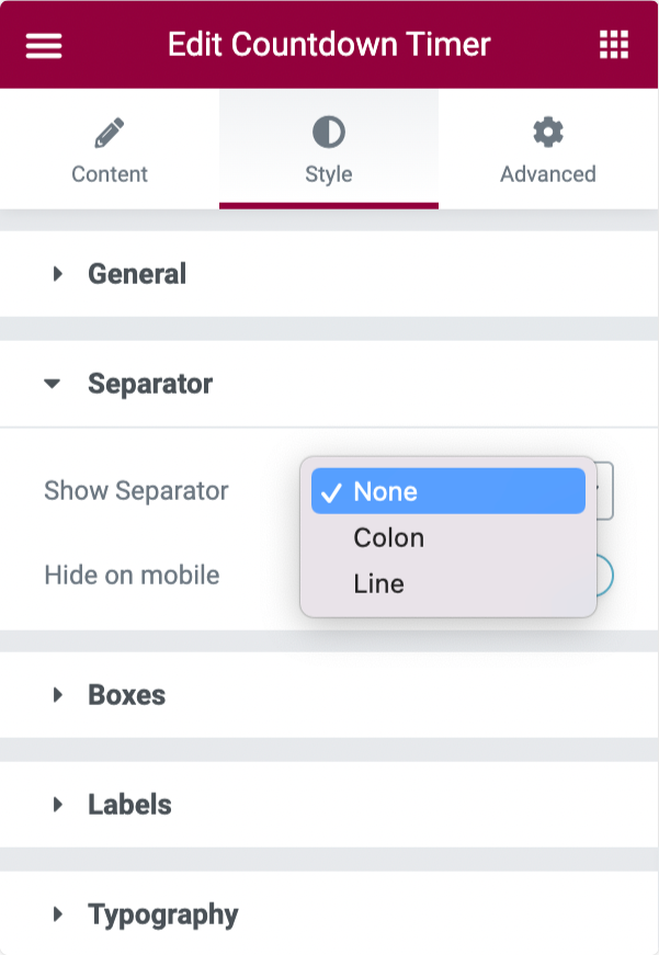
- Show Separator: Choose a Line or Colon as a separator between each block of the Countdown Timer.
- Separator Color: select color for the separtor.
- Hide on mobile: Show/hide the separator on the mobile.
Boxes#
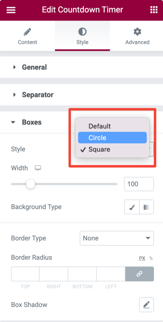
- Style: If you would like to change the default style of the Countdown Timer, you can choose a Circle or Square type.
- Width: Set width of the box.
- Background Type: Choose background type.
- Border Type: Select border type
- Border Radius (for Square style): Add border-radius.
Labels#
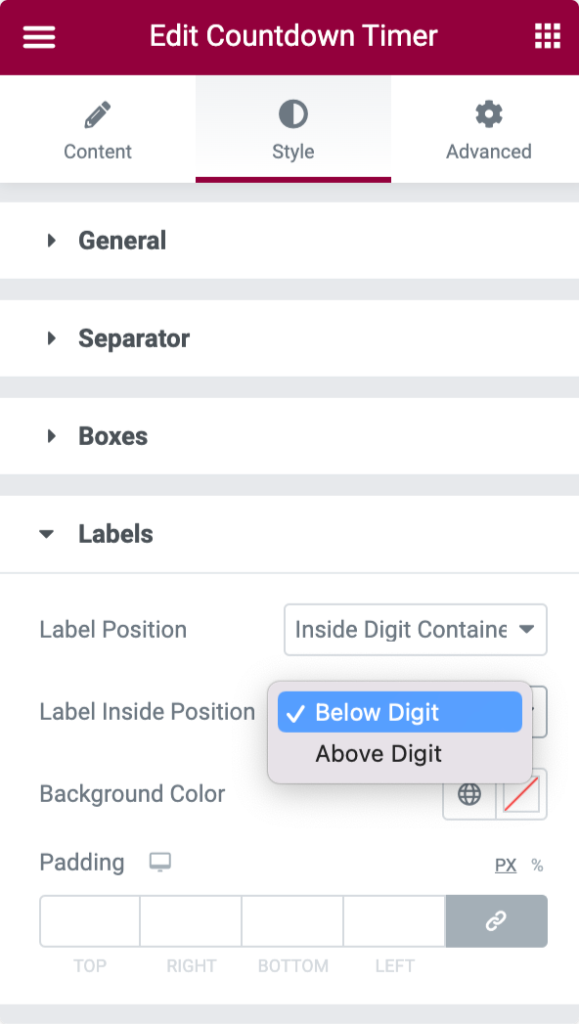
- Label Position: Display label Inside or Outside the digital container.
- Label Inside/Outside Position: Set the label's inside/outside position.
- Background Color: Add a background color to the labels
- Padding: set the padding to resize the labels.
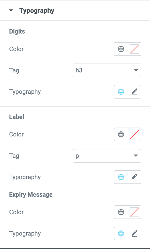
Typography#
In this subsection, you'll get multiple options to customize the typography of Digits, Label, and Expiry Message.
You can choose a color and font for the digits, labels, and expiry message of the Countdown Timer. You can further select a heading tag from the drop-down list for the digits and labels, as shown below.
This was the detailed overview of the Countdown Timer Widget available in PowerPack Addons for Elementor.
Hope this helps!