Accordions help in displaying content-heavy pages in less space. With PowerPack Elementor's Advanced Accordion widget, you can create a stylish set of Accordions for your website. You can check out the demo of the Advanced Accordion widget here. Here, in this doc, we will have a look at the detailed overview of the Advanced Accordion widget.
Firstly, drag and drop the Advanced Accordion widget on the page that you are editing with Elementor. The Advanced Accordion widget has customization and styling options in the Elementor Editor’s Content and Style Tab.
Let us go through the Content tab of the Elementor Editor for the Advanced Accordion widget.
Content Tab#
There are 3 sections in the Content Tab of the Advanced Accordion widget:
- Accordion
- Toggle Icon
- Settings
Let us go through each of the sections one by one.
Accordion#
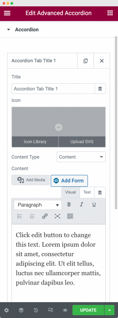
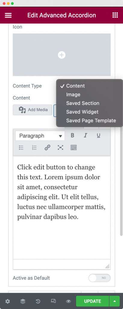
Here, you can add any number of accordions that you wish to display on your webpage. You can write up a title for your accordion, choose the icon of your accordion, and add the content to your accordion. With PowerPack's Advanced Accordion widget, you can display different content types in accordion, such as simple text content, image, saved section, saved widget, or saved page template.
Further, you can set any accordion as "Active as Default". It means that whenever you load the webpage containing the accordion, it'll open a single accordion that you have selected by default.
Toggle Icon#
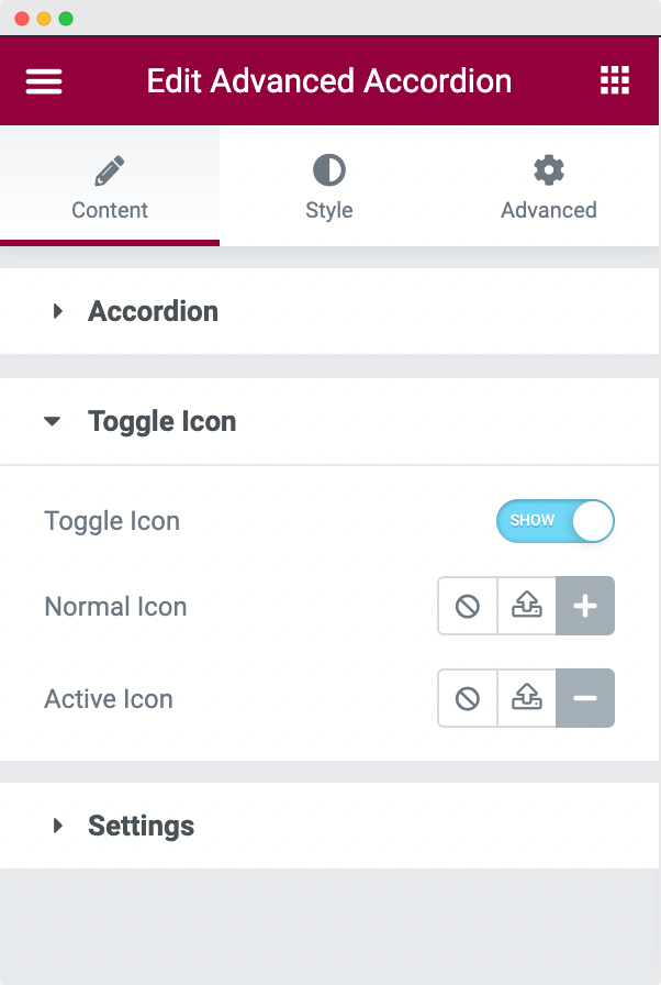
As the name suggests, in the Toggle Icon section, you can choose the Icon that is displayed beside the accordion. You can choose a "Normal Icon" that is displayed when the accordion is closed and an "Active Icon" that is displayed when the Accordion is open.
Settings#
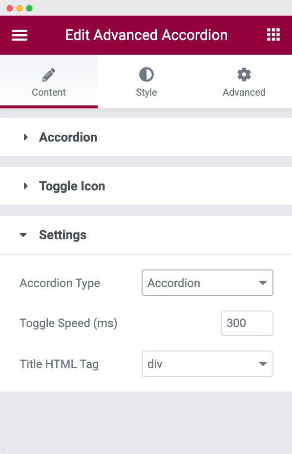
In this section, you can choose the HTML tag of the Title, speed at which the Toggle opens, and the Type of Accordion. There are two types of Accordions that you can choose from: Accordion and Toggle.
This was all about the Content Tab of the Advanced Accordion widget. Now, let us go through the Style Tab of the Advanced Accordion widget.
Style Tab#
There are 4 sections in the Style Tab of the Advanced Accordion widget:
- Items
- Title
- Content
- Toggle Icon
Let us see the available styling options in each of the sections.
Items#
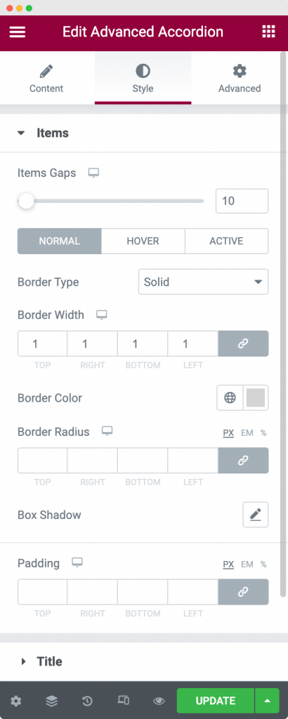
In this section, you can style the Accordions as per your requirement. You can set the Border type, width, color, and radius for the Normal mode, Hover mode, and Active mode. Further, you can set the gap between the Accordions, add Box Shadow to Accordion boxes, and set paddings between them.
Title#
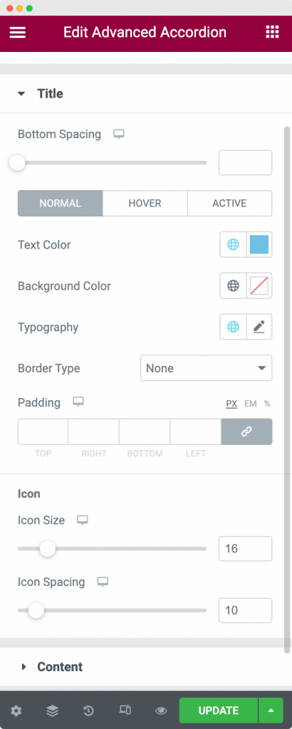
In the Title section, you can set up typography, text color, background color, and borders for the Accordion Title in Normal, Hover, and Active mode. Further, you can set the size of the icon that is displayed beside the Title. Apart from that, you have the options to choose spacing between Title and Content using the "Bottom Spacing" option.
Content#
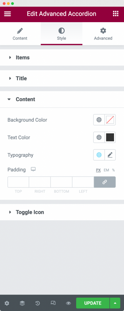
As the name suggets, you can style the content of the accordions using the Content section. You can set background color, text color, typography, and padding for the content that appears inside the accordions.
Toggle Icon#
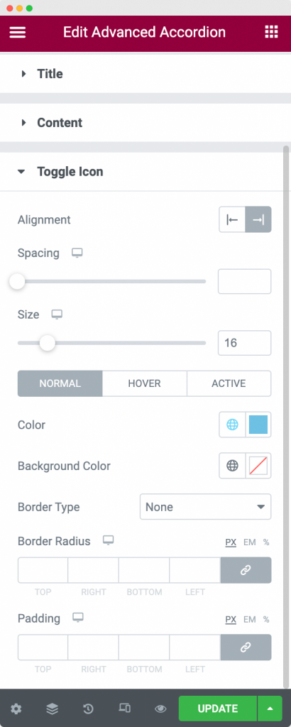
Here, you can style the Toggle Icon that appears with the Accordion. You can set the alignment, icon size, padding, and spacing for the Toggle Icon. Further, you can style the Toggle Icon by changing the text color, background color, and borders of the Toggle Icon for Normal, Active, and Hover modes.
This was all about the Advanced Accordion widget available in PowerPack Addons for Elementor. Feel free to get in touch with us in case of any queries or concerns. 🙂