PowerPack Elementor's Image Accordion widget can be used to display images inside an Accordion. You can check out the demo of the Image Accordion widget here. Here, in this doc, we will have a look at the detailed overview of the Image Accordion widget.
Firstly, drag and drop the Image Accordion widget on the page that you are editing with Elementor. The Image Accordion widget has customization and styling options in the Elementor Editor’s Content and Style Tab.
Let us go through the Content tab of the Elementor Editor for the Image Accordion widget.
Content Tab of Image Accordion Widget#
There are 2 sections in the Content Tab:
- Items
- Settings
Let us go through each of the sections one by one.
Items#
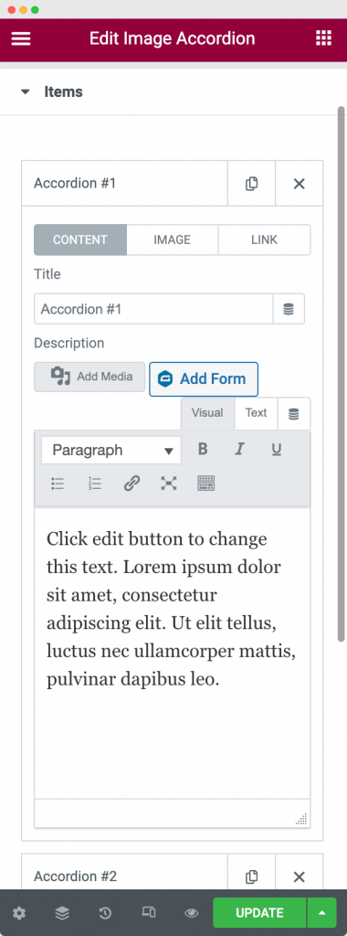
Here, you can add any number of image accordions that you wish to display on your webpage. You can write up a title for your accordion, choose the image for your accordion, and add the content to your accordion. You can further display a button link on each of the image accordions from the "Link" tab inside the "Items" section. Finally, you can set any accordion as “Default Active Item”. It means that whenever you load the webpage containing the image accordion widget, it’ll open the image accordion that you have selected as "Default Active Item".
Settings#
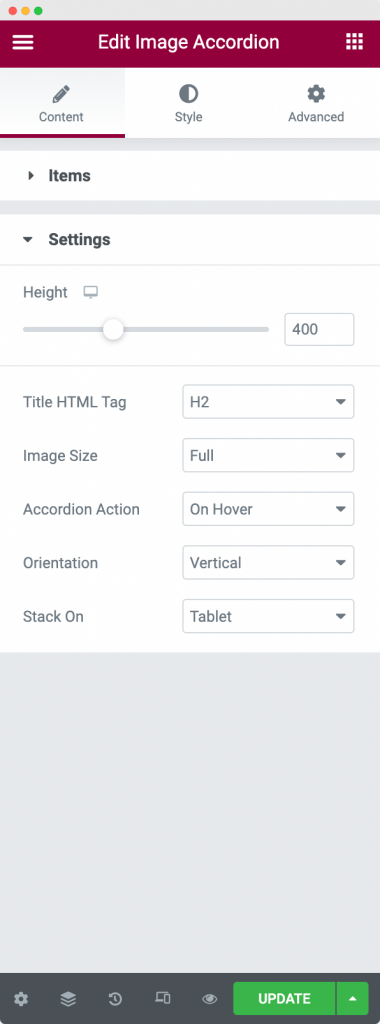
In this section, you can set up the Height of the Image Accordion and the HTML tag of the Title. Further, you can choose the hover or click action at which the Image Accordion will open up. You can choose to display the Image Accordion in a Vertical or Horizontal manner. You can also stack the Image Accordion on Tablet or Mobile to make it responsive.
This was all about the Content Tab. Now, let us go through the Style Tab of the Image Accordion widget.
Style Tab of the Image Accordion Widget#
There are 3 sections in the Style Tab:
- Items
- Content
- Button
Items#
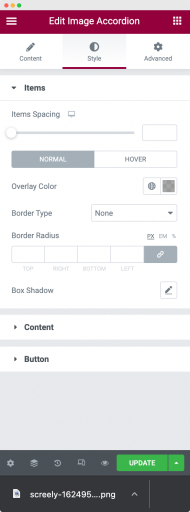
In this section, you can style the Image Accordions as per your requirement. You can set the Border type, width, color, and radius for the Normal mode, Hover mode, and Active mode. Further, you can set the gap between the Images and add Box Shadow to Image boxes.
Content#
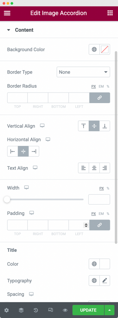
Here, you can set background color and border properties for the content that you added to the Image Accordion. Next, you can align the content Horizontally (top, middle, and bottom) and vertically (left, right, and center). You can also set the width of the content for each responsive mode and similarly set the padding of the content.
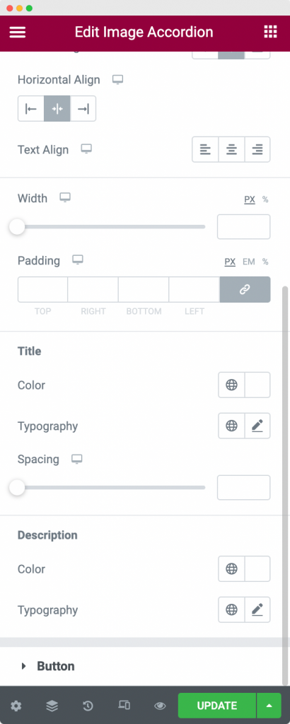
You can also set the color and typography for the title and description in the content section and set the spacing between title and description in the content section styling.
Button#
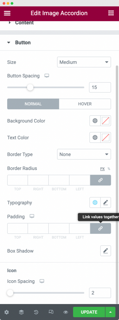
The button link section appears below the description. You can set the size of the button, spacing between the description and button, background color, text color, and border properties for the Normal and Hover modes of the button. Further, you can set the Typography and padding of the button.
We can also add an icon to the button link. From the style tab, you can also set the spacing between the button icon and button text.
This was all about the Image Accordion widget available in PowerPack Addons for Elementor. Feel free to get in touch with us in case of any queries or concerns. 🙂