With PowerPack Elementor's Scroll Image widget, you can add amazing scrolling effects to your images. With the Scroll Image widget, you can add images on your website which scrolls when the user hovers over the image. You get two different effects, hover and mouseover. You can even select the direction of the animation from horizontal and vertical.
Have a look at the demo of the Scroll Image widget here. Now, let us go through the detailed overview of the Scroll Image widget.
Firstly, drag and drop the Scroll Image widget on the page that you are editing with Elementor. The Scroll Image widget has customization and styling options in the Elementor Editor’s Content and Style Tab.
Content Tab#
There are 2 sections in the Content Tab of the Scroll Image widget:
- Image
- Settings
Let us go through each of the sections one by one.
Image#
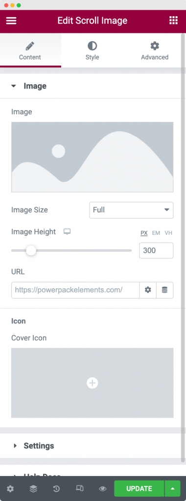
As visible in the screenshot, the Image section consists of an Image tab where you would add the image that you want to be scrollable, choose the size and height of the image, link the image to a URL, and add an icon over the image.
Settings#
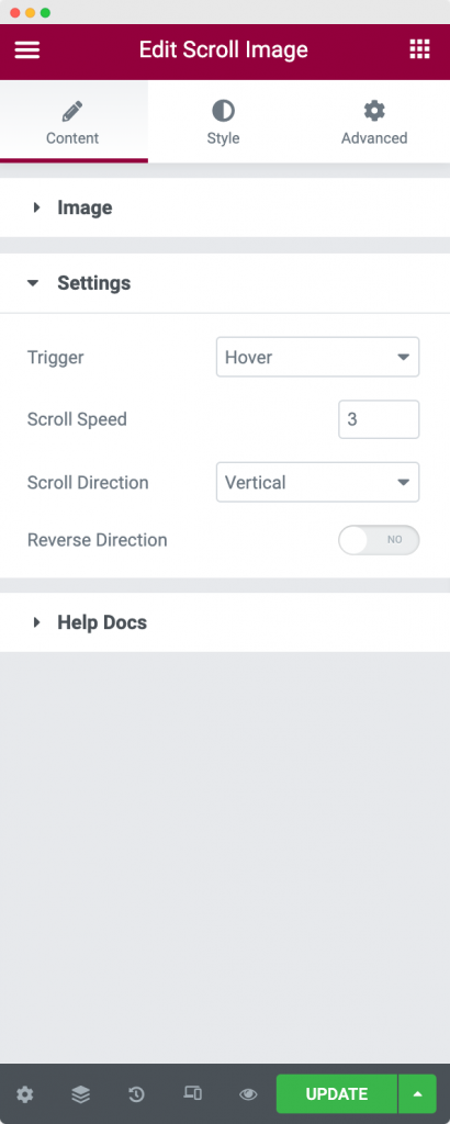
In the Settings section, you can firstly, choose the trigger option for the scrolling to begin. The 2 trigger options available are Hover and Click. You can further choose the speed at which you want the image to scroll. Next, you can choose the scroll to happen either horizontally or vertically using the "Scroll Direction" tab. Finally, using the "Reverse Direction" tab, you can reverse the direction of scroll.
This was all about the Content tab of the Scroll Image widget. Let us now go through the Style tab.
Style#
The Style tab of the Scroll Image widget consists of 2 options:
- Image
- Overlay
Let us understand each of the options one by one.
Image#
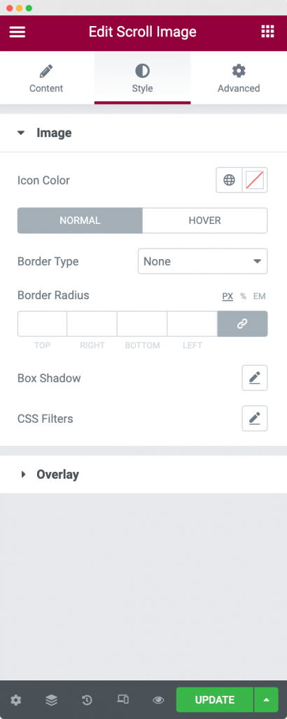
In the Image section of the Style tab, you can choose the color of the icon that you selected in the Content tab. You can further add borders and other border properties like width and radius to the Image in Normal and Hover modes. Finally, you can select the Box Shadow and CSS Filters for the image.
Overlay#
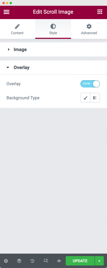
You can choose to display an Overlay on the image that you selected in the content tab. You can choose the Background type of Overlay as Classic or Gradient. In Classic, you can choose a simple overlay color for the image whereas in Gradient you can choose a primary and a secondary color and decide the ratio in which these colors will appear.
This was all about the Scroll Image widget available in PowerPack Addons for Elementor. Feel free to get in touch with us in case of any queries or concerns. 🙂