PowerPack Elementor’s Team Member Carousel widget can be used to create a carousel of stylish “Our Team” section for your website. Our Team Member Carousel widget comes with all the customization and styling options that will help you to create a fantastic team section displayed in a carousel layout for your website.
Have a look at the demo of PowerPack Elementor’s Team Member Carousel widget here. In this doc, we will have a look at the detailed overview of the Team Member Carousel widget.
Content Tab of Team Member Carousel Widget#
There are 3 sections in the Content Tab of the widget:
- Team Members
- General Settings
- Carousel Settings
Team Members#
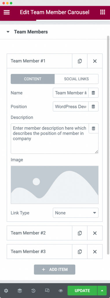
In this section, you can add the Team Members that you want to display in a Carousel. You can add the Name, Position, Description, and Image of your Team Member here. Further, you can link either Image or the Name of your Team Member anywhere using the "Link Type" option. Apart from this, you can add the Social Links of your Team Members using the "Social Links" tab.
General Settings#
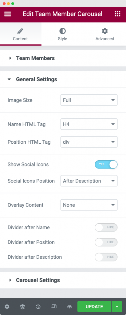
In the General Settings section, you can set the HTML tags for the Name and Position of your Team Member. Apart from that, you can set the display position for the Social Links, and choose to display either Social Links or Description or both as Overlay Content. Further, you have the option to set a divider after Name or Position or Description or all of these three.
Carousel Settings#
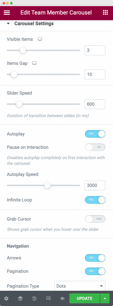
As the name suggests, the Carousel Settings section is used to customize the carousel in which the Team Members will be displayed. You can customize the Slider speed, the number of Team Members visible at the same time, the gap between each team member, turn on/off the Slider Autoplay and Infinite Loop, adjust the Autoplay speed, and Pause the Carousel on Interaction.
Apart from that, you choose the Pagination Type for the Carousel. You can choose to show Arrows and Dots or Fraction.
This was all about the Content Tab of the Team Member Carousel widget. Now, let us go through the Style Tab.
Style Tab of the Team Member Carousel Widget#
The Style Tab consists of 9 sections:
- Box Style
- Content
- Image
- Name
- Position
- Description
- Social Links
- Arrows
- Pagination
Let us discuss each of these sections one by one.
Box Style#
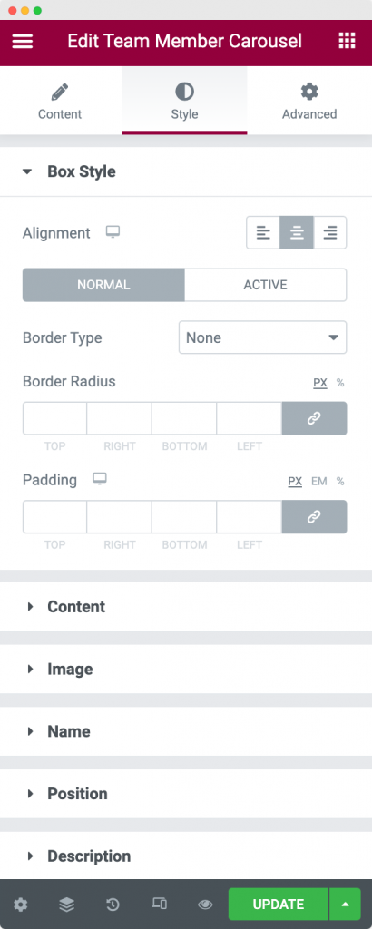
The Box Style section is used to style the Team Member Box. You can align the Team Member box left, right, or center. You can further apply the borders (Normal and Hover), border radius, and paddings on the Team Member box using the Team Member Box section.
Content#
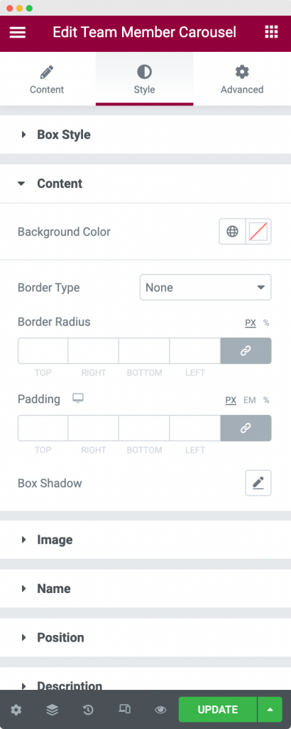
The Content Section in the Style Tab can be used to set a Background and Border to the box and also add Paddings to the same.
Image#
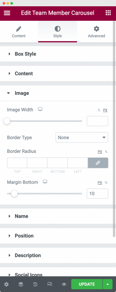
In the Image Section of the Style Tab, you can set the Image Width, Border type, width, color, and radius for the Team Member.
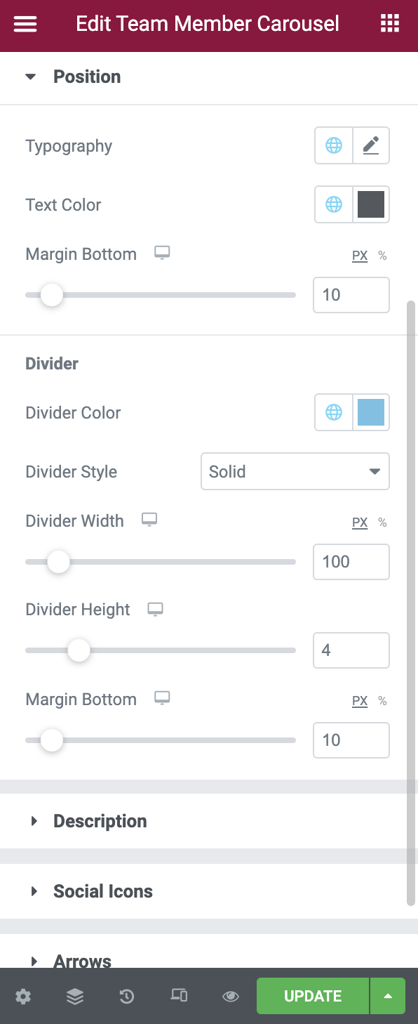
Name, Position and Description#
-
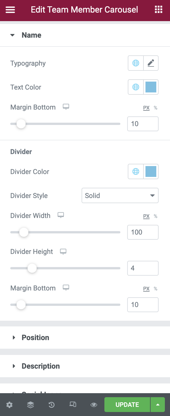
Name Section in the Style Tab -
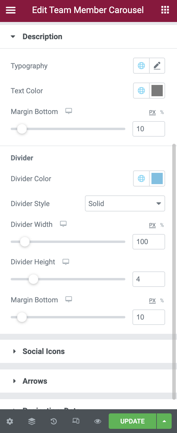
Description Section in the Style Tab -
Position Section in the Style Tab
The Name, Position, and Description sections have options to set the Typography, Text Color, and Margin for each of the sections respectively. Further, you can style the Divider by changing its color, width, height, margin, and style. You can style the Divider for Name, Position, and Description from their respective sections.
Social Links#
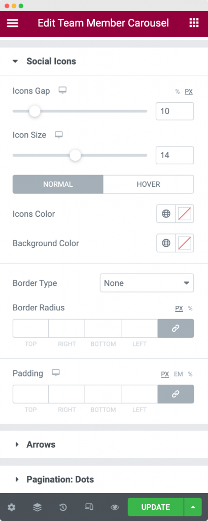
The Social Links section in the Style Tab can be used to set the icon size of the social link, set the gap between multiple icons, choose the Normal and Hover colors, and finally, set the Borders and Padding for the Social Links.
Arrows#
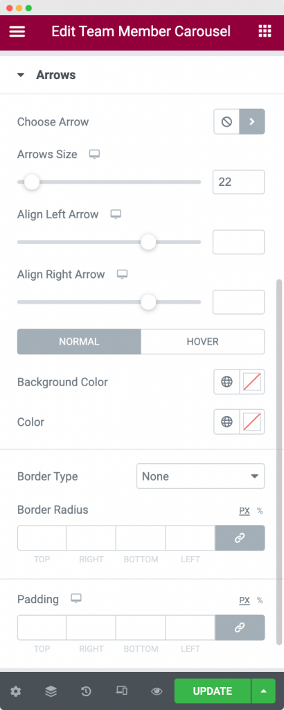
In the Arrows section, you can first choose the Arrow Icon from the Icon Library. Next, you can set the Arrow size and alignment of both left and right Arrows. Finally, you can set the Arrow color for Normal and Hover modes, choose the Border type, color, and radius, and Paddings for the Arrow.
Pagination#
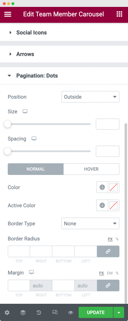
In this section, you can style the Pagination Dots. You can set the position of the Pagination Dots, size of the Dots, and spacing between each Dots. Further, you can choose the Color, Active, and Hover colors for the Dots. Next, you can apply a Border to the Dots and set their radius and color. Finally, you can even set the Paddings between the Pagination Dots.
This was all about the Team Member Carousel widget available in PowerPack Addons for Elementor. Feel free to get in touch with us in case of any queries or concerns. 🙂