PowerPack Elementor’s Team Member widget can be used to create a stylish “Our Team” section on the Meet the Team or About Us page of your website. Our Team Member widget comes with all the features that will help you to create a fantastic team section on your website.
Have a look at the demo of PowerPack Team Member widget. Here, in this doc, we will have a look at the detailed overview of the Team Member widget.
Firstly, drag and drop the Team Member widget on the page that you are editing with Elementor. The Team Member widget has customization and styling options in the Elementor Editor’s Content and Style Tab.
Let us go through the Content tab of the Elementor Editor for the Team Member widget.
Content Tab#
There are 4 sections in the Content Tab of the Team Member widget:
- Image
- Details
- Social Links
- Settings
Let us discuss each of the sections available in the Content Tab of the Team Member widget.
Image#
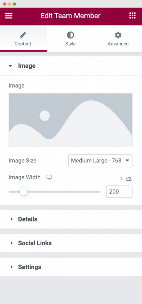
There are 3 tabs in the Image Section:
- Image: Here, you need to choose the image of your Team Member.
- Image Size: As the name suggests, you can choose the size of the image you uploaded previously.
- Image Width: Here, you can choose the width of the image that you uploaded.
Details#
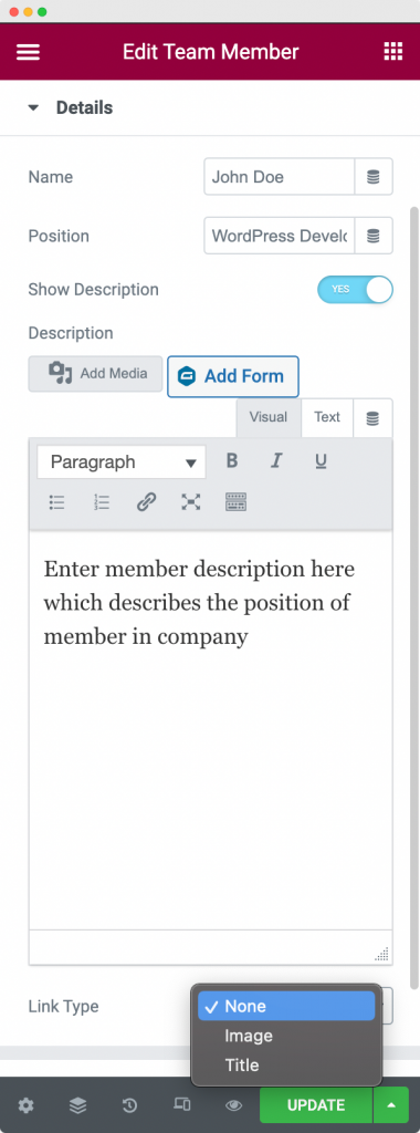
In the Details tab, you can add the Name, Position, and Description of your Team Member. Further, you can link either Image or the Name of your Team Member anywhere using the Link option in the Details tab.
Social Links#
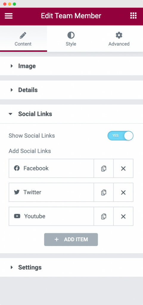
As the name suggests, using Social Links section, you can add any Social Link for your Team Member.
Settings#
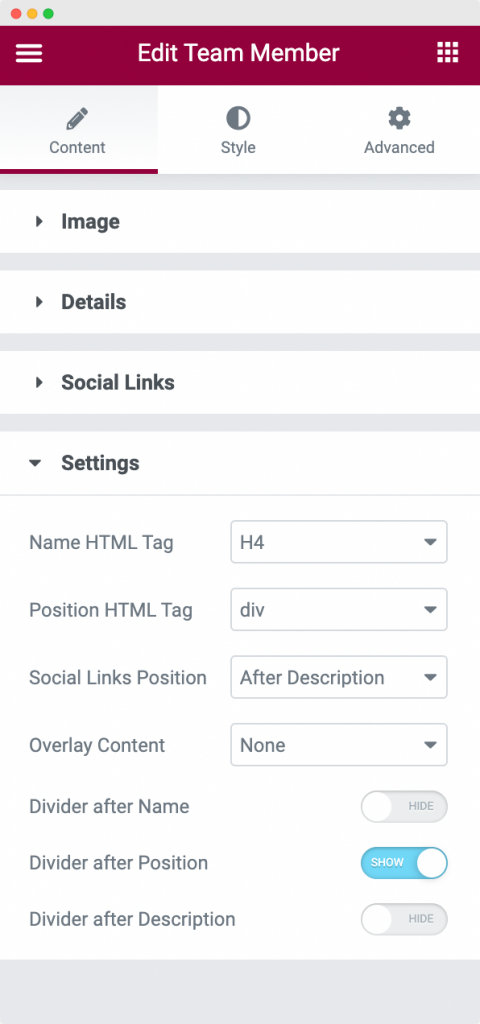
In the Settings section, you can set the HTML tags for the Name and Position of your Team Member. Apart from that, you can set the display position for the Social Links, and choose to display either Social Links or Description or both as Overlay Content. Further, you have the option to set a divider after Name or Position or Description or all of these three.
This was all about the Content Tab of the Team Member widget. Now, let us go through the Style Tab of the Team Member widget.
Style Tab#
The Style Tab consists of 6 sections for the Team Member widget:
- Content
- Image
- Name
- Position
- Description
- Social Links
Let us discuss each of these sections one by one.
Content#
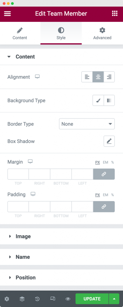
The Content Section in the Style Tab can be used to align the Team Member box to the right, left, or center. Further, you can set a Background and Border to the box and also add Margins and Padding to the same.
Image#
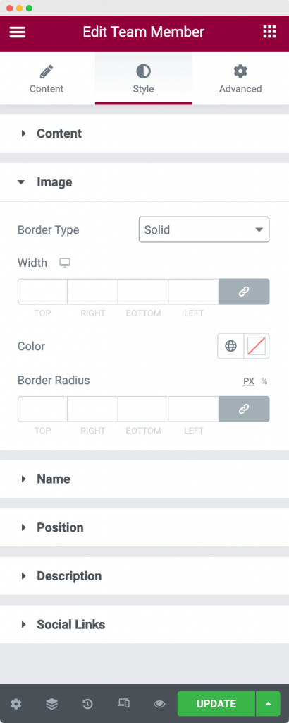
In the Image Section of the Style Tab, you can set the Border type, width, color, and radius for the Team Member.
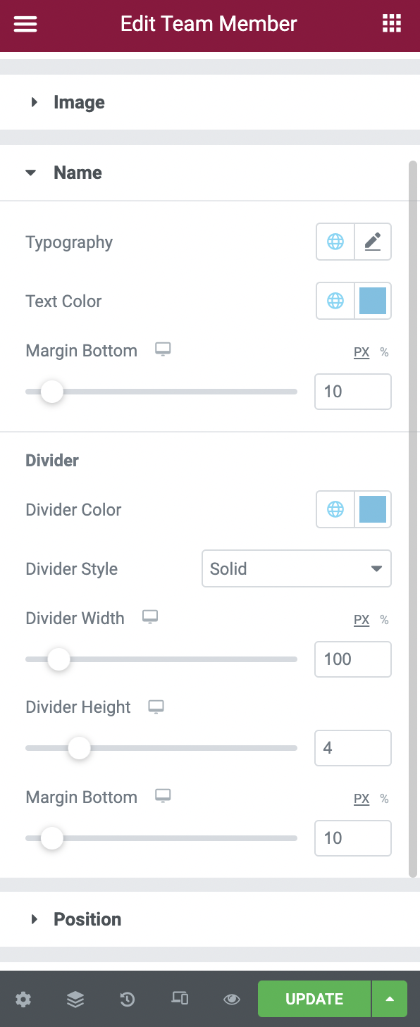
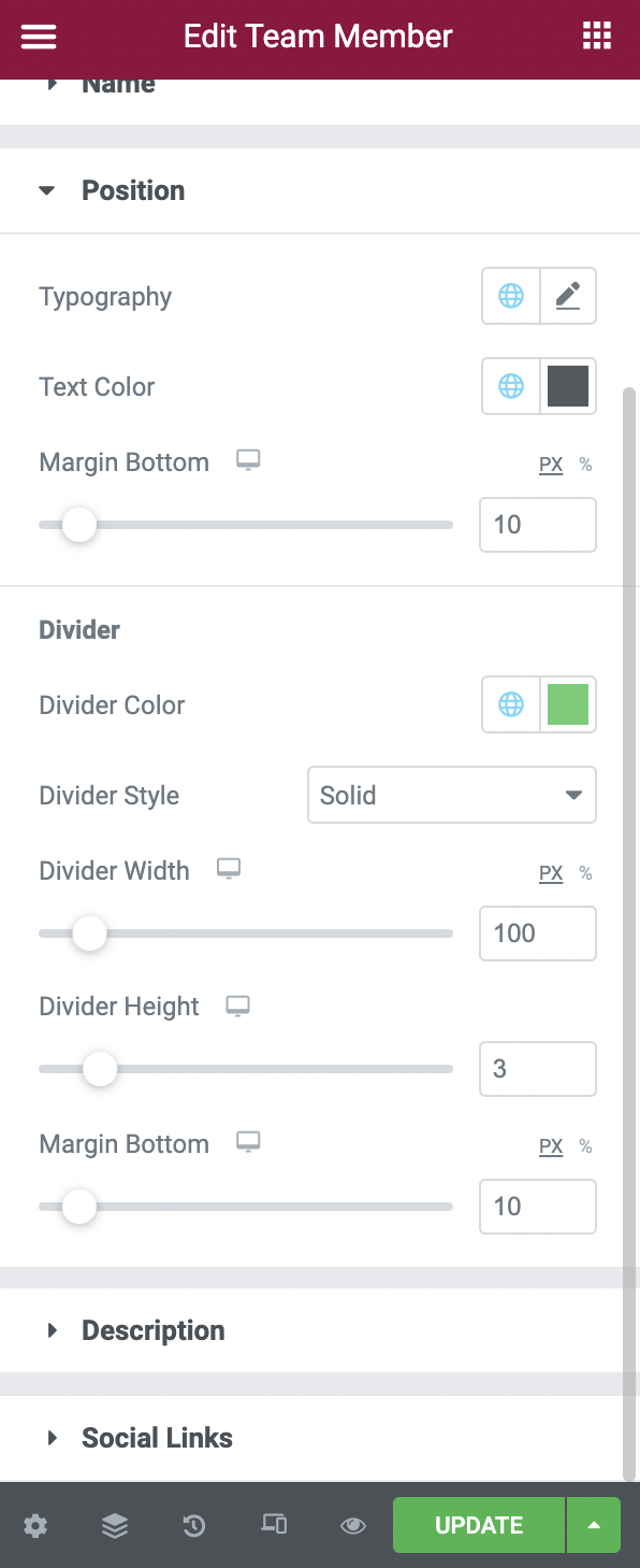
Name, Position and Description#
-
Name Section in the Style Tab of the Team Member Widget -
Position Section of the Style Tab in the Team Member Widget -
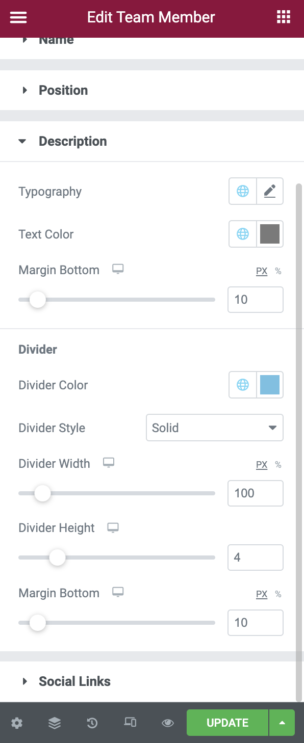
Description Section of the Style Tab in the Team Member Widget
The Name, Position, and Description sections have options to set the Typography, Text Color, and Margin for each of the sections respectively. Further, you can style the Divider by changing its color, width, height, margin, and style. You can style the Divider for Name, Position, and Description from their respective sections.
Social Links#
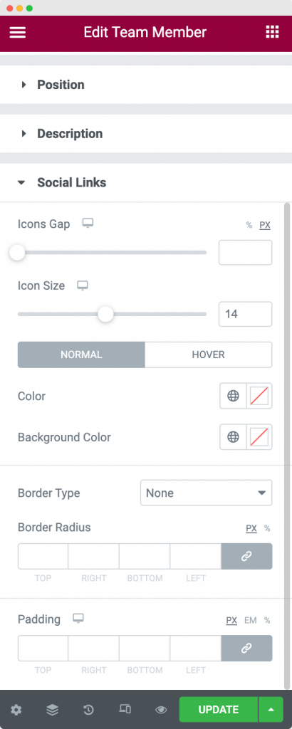
The Social Links section in the Style Tab can be used to set the icon size of the social link, set the gap between multiple icons, choose the Normal and Hover colors, and finally, set the Borders and Padding for the Social Links.