
Load More button is very useful when there are a lot of images to display. It reduces the page's first load size by allowing images to be loaded on user demand. PowerPack's Image Gallery provides a one-click way to enable the Load More option to the Gallery.
Go to Content > Load More Button > Enable It.
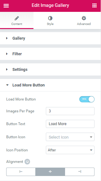
Once enabled, you'll see the following options for setting up Load More:
1. Images per page: This sets the number of images to be loaded at a time.
2. Button Text: The default text is Load More, but you can alter the text content.
3. Button Icon: Add an icon to the button.
4. Icon Position: Add an icon either before or after the button's text.
5. Alignment
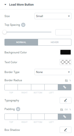
Now the second part of styling the Load More button comes. Go to Style > Load More Button to style the button according to your requirements.
You can check the complete demo of the PowerPack Image Gallery Widget here.