PowerPack Elementor Addons come with a beautiful feature-packed WP Fluent Forms widget for WordPress and Elementor page builder, which can be used to enhance and style the native WP Fluent Forms.
This widget includes features like text typography, text & background colors, layouts, borders, alignment, spacing, height and width, and many more.
To customize and style WP Fluent Forms by PowerPack Addons, you need to make changes in the Content and Style tab of the Fluent Forms widget.
Let’s explore these tabs in detail.
Content Tab#
The Content Tab of the WP Fluent Forms widget consists of two sections:
- WP Fluent Forms
- Errors
WP Fluent Forms#
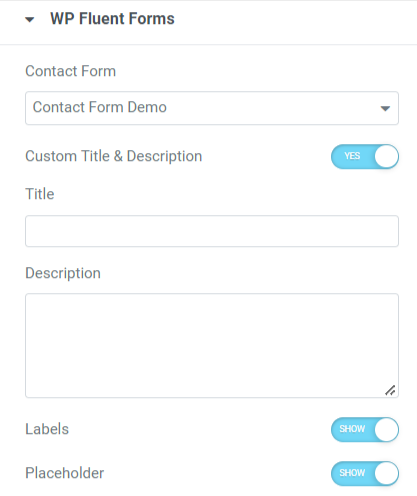
Let’s see the features included in this section:
- Contact Form: Select a contact form that you want to style using fluent forms by PowerPack.
- Custom Title & Description: Toggle on this option if you display a custom title & description on your contact form.
- Title: Add a contact form title using this option.
- Description: Similarly, add a contact form description using this option.
- Labels: Toggle on this option to show labels in the contact form.
- Placeholders: Enable this option to display placeholders on the contact form.
Errors#
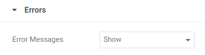
This section allows you a particular feature, “Error Messages,” using which you can show or hide any error messages in the contact form.
Making all these changes, we can move further to customize the Style Tab of the WP Fluent Forms widget.
Style Tab#
The Style Tab of the WP Fluent Forms widget consists of nine sections:
- Title & Description
- Labels
- Input & Textarea
- Field Description
- Placeholder
- Radio & Checkbox
- Submit Button
- Errors
- Confirmation Messages
Let’s explore each of these sections in detail.
Title & Description#
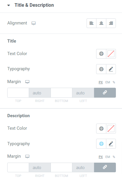
Let’s see what features are included in this section:
- Alignment: Using this option, you can set the alignment of the title and description text.
Title
- Text Color: Set the title text color using this option.
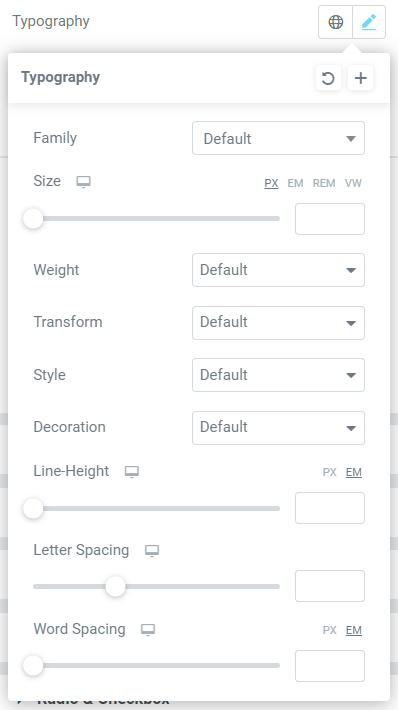
- Typography: You can customize the title text typography with all these features such as text font, letter spacing, text weight, line height, text size, word spacing, text style, etc.
- Margin: You can set the title text margin here.
Description
- Text Color: Choose a description text color using this option.
- Typography: Use this option to customize the description text typography.
- Margin: Using this option, you can set the margin for the description text.
Labels#
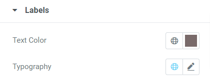
This section allows you to customize the label Text Color and Typography.
Input and Textarea#
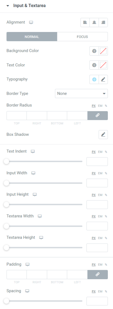
Let’s see what all features this section offers:
- Alignment: This option allows you to align the input text fields in the contact form.
- Background Color: This option can customize the background color for input text fields.
- Text Color: Choose an input text color using this option.
- Typography: You can customize the input text typography with this option.
- Border Type: Use this option to select a border for the input text fields.
- Width: If you’ve applied the input text border, you can set its width using this option.
- Color: You can choose a border color with this option.
- Border Radius: Adjust the border radius using this option.
- Box Shadow: If you want to apply a shadow effect to the input field boxes, use this option.
- Text Indent: This option lets you adjust the positioning of input texts by simply indenting the text to the right side.
- Input Width: You can set the width of the input text boxes using this option.
- Input Height: You can set the input text height with this option.
- Textarea Width: Adjust the textarea width using this option.
- Textarea Height: Use this option to adjust the height of the textarea.
- Padding: You can adjust the padding for input texts with this option. The padding feature maintains the spacing between the text and the border applied.
- Spacing: You can create spacing between the input fields using this option.
Field Description#
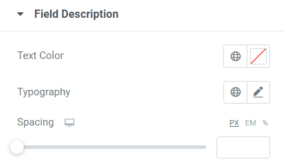
This section allows you to customize the Text Color, Typography, and Spacing for field descriptions.
Placeholder#
This section allows you to choose the Text Color for Placeholder text fields.
Radio & Checkbox#
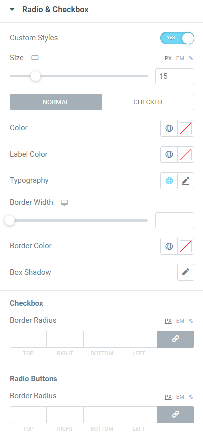
Let’s look at the available features in this section:
- Custom Styles: Enable this option to allow customizing all the available features for radio & checkbox.
- Size: You can adjust the checkbox size using this option.
- Color: Select a color for the radio button using this option.
- Label Color: You can choose the checkbox text color with this option.
- Typography: This option allows you to customize the typography of the checkbox text.
- Border Width: You can adjust the checkbox border width using this option.
- Border Color: You can choose a border color with this option.
- Box Shadow: Use this option to apply a box shadow to the checkbox area.
Checkbox
- Border Radius: You can adjust the checkbox border radius using this option.
Radio Buttons
- Border Radius: This option can adjust the radio button border radius.
Submit Button#
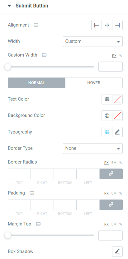
Let’s see what all options are available in this section:
- Alignment: You can set the submit button alignment using this option.
- Width: This option allows you to choose the submit button width as either ‘full width’ or ‘custom width.’
- Custom Width: If you select custom width, you can adjust the submit button width with this option.
- Text Color: Choose a submit button text using this option.
- Background Color: This option allows you to customize the background color for submit button.
- Typography: You can customize the entire typography of the submit button with this option.
- Border Type: Choose a border type for the submit button from border options such as solid, double, dotted, dashed, or groove.
- Border Radius: This option allows you to adjust the submit button border radius.
- Padding: Adjust the padding for submit button using this option.
- Margin Top: This option lets you adjust the margin on the top area of the submit button.
- Box Shadow: This option lets you customize the submit button box shadow.
Errors#
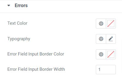
Let’s see what all options you’ll get in this section:
- Text Color: Customize the error message text color with this option.
- Typography: You can customize the error message typography using this option.
- Error Field Input Border Color: This option lets you choose a color for the error field border.
- Error Field Input Border Width: Use this option to adjust the error field border width.
Confirmation Message#
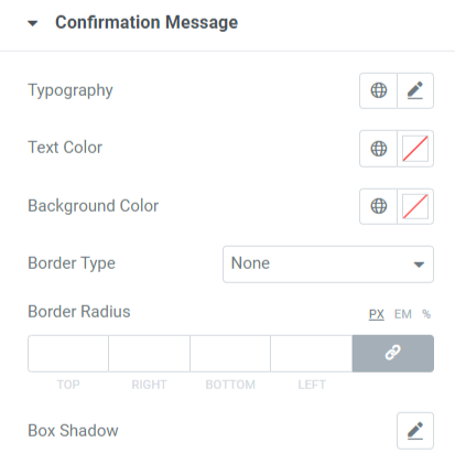
Let’s see all the available options included in this section:
- Typography: You can customize the entire typography for the confirmation message text.
- Text Color: With this option, you can choose a text color for the confirmation message.
- Background Color: This option allows you to customize the background color for confirmation text that appears after the form is filled.
- Border Type: Choose a border type for a confirmation message from available options like solid, dotted, doubled, dashed, and groove.
- Border Radius: This option lets you adjust the border radius for confirmation text borders if applied.
- Box Shadow: This feature can add a shadow effect for the confirmation message text area.
So this was all about customizing and styling the WP Fluent Forms widget by PowerPack Addons for Elementor. Use all these options according to your preference and needs.
We hope you find the above information helpful.