Display toggle buttons on your WordPress websites and allow your users to easily compare two contents using the Content Toggle Widget for Elementor by PowerPack.
Using the PowerPack Toggle Widget, you can create a content switcher using Custom Content, Image, or Saved Templates.
Let's take a closer look at the Elementor Content Toggle Widget in detail:
Content Tab of the Toggle Widget#
The content tab of the Toggle widget consists of 4 sections:
- Primary
- Secondary
- Settings
- Help Docs
Let us now go over each of these sections in more detail:
Using PowerPack Content Toggle Widget, you can customize both toggle switches separately. You'll find customization settings under Primary and Secondary options. Later you'll also select which toggle's content is displayed by default.
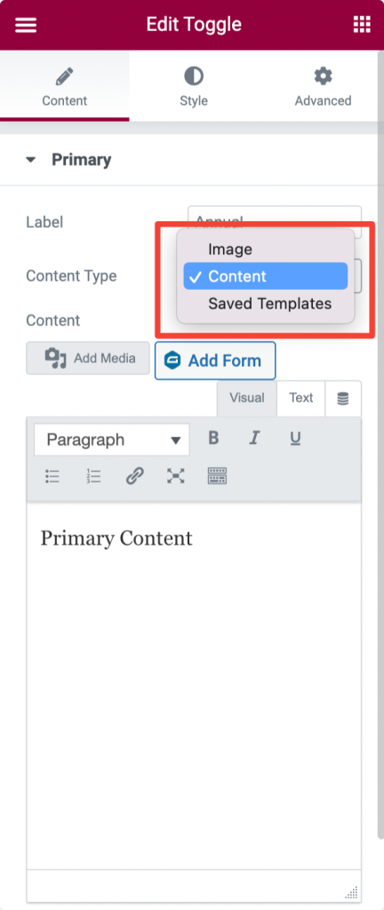
Primary#
In the Primary section, you get options to customize the first toggle switch.
- Label - Add a label name.
- Content Type - Choose the content type.
- If you choose Image as a content type, you can add a custom image and set image size.
- If you choose Content as a content type, you can add custom text content.
- Selecting Saved Template as a content type, you can display any previously saved template.
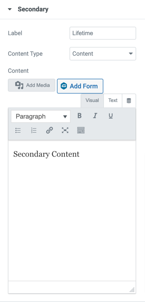
Secondary#
In the Secondary section, you get options to customize the second toggle switch. Like the Primary options, you also get options to add label names and choose content type.
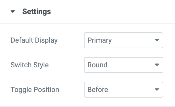
Settings#
- Default Display - Choose which toggle switch, Primary or Secondary, you want to open by default on your open.
- Switch Style - Choose your switch style. You can either select a Round or Rectangular type.
- Toggle Position - Set your toggle switch position. You can display the switch Before, After, or Before + After the content toggle's content.
Style Tab of the Content Toggle Widget#
The Style Tab of Content Toggle Widget consist 3 sections:
- Switch
- Labels
- Content
Let's take a closer look at all the styling options:
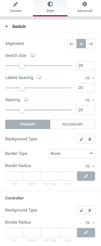
Switch#
In the Switch section, you get plenty of options to style the toggle switch. You can:
- set alignment to left, center, or right
- define switch size
- adjust labels spacing
- change background color
- add border type
- and more.
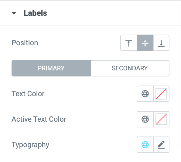
Labels#
Here you get options to style the Labels. You get options to:
- set the position of the labels
- change text color
- set active label text color and
- alter typography.
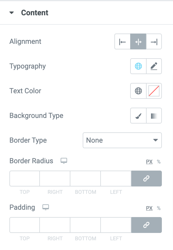
Content#
To customize and style the Content elements, you get multiple options:
- set alignment
- change typography
- add text color
- change background color
- choose background type
- and more!
This was the detailed overview of the Content Toggle Widget for Elemenrtor by PowerPack.
Hope this helps!