PowerPack Slide Menu Widget for Elementor lets you create interactive, multi-level navigation menus that slide in from different directions. It’s perfect for mobile menus, off-canvas navigation, or compact site menus with sub-items.
This widget gives you full control over how your menu behaves and looks: from animation effects to spacing, colors, and icons.
Getting Started: Using the Slide Menu Widget#
Follow these steps to add the Slide Menu to your page:
- Open the page where you want to add the menu in the Elementor editor.
- In the widgets panel, search for “Slide Menu”.
- Drag and drop the Slide Menu Widget onto your page.
Once added, you’ll see two main tabs in the left panel:
- Content Tab: Controls how the menu works
- Style Tab: Controls how the menu looks
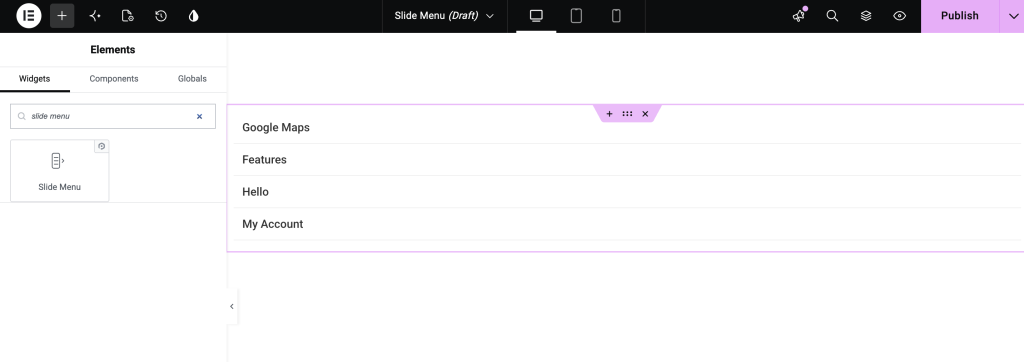
Let’s go through each setting in detail.
Content Tab#
Content tab allows you to configure the menu’s structure and behavior.
Slide Menu#
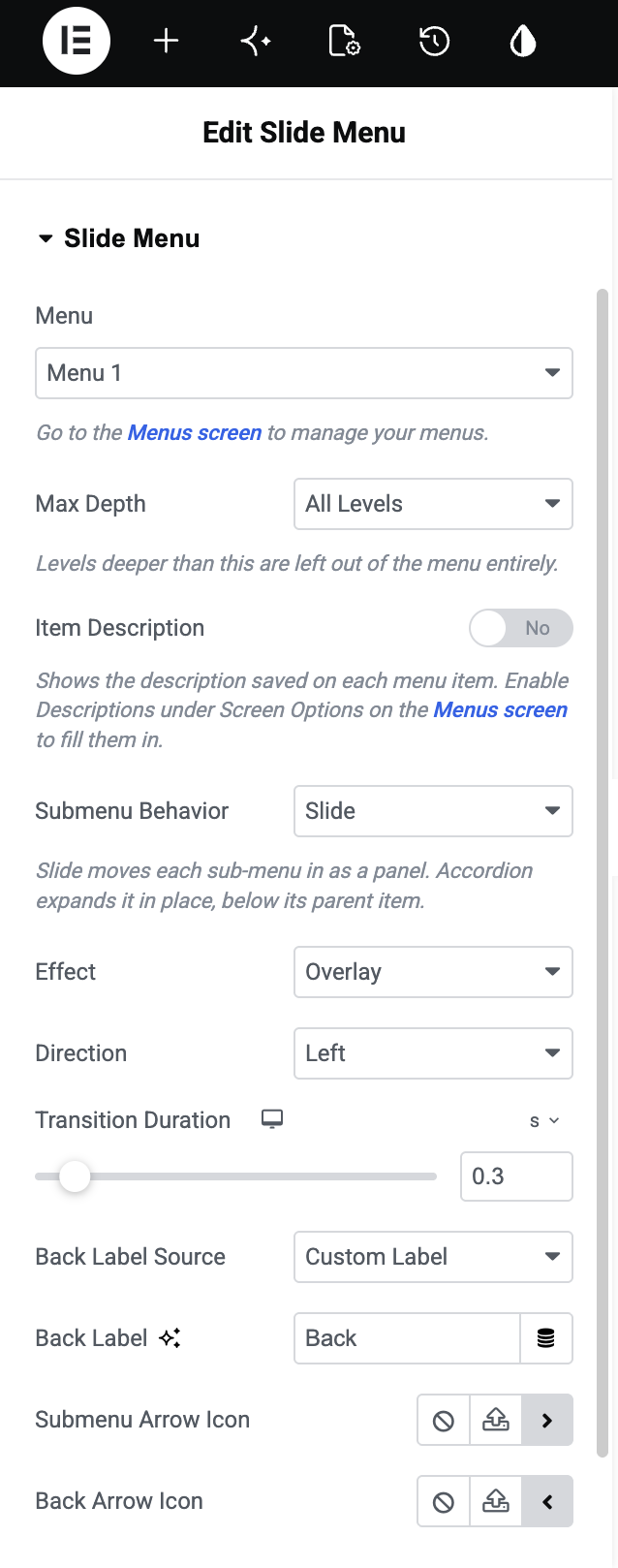
- Menu: Select the WordPress menu you want to display in the Slide Menu widget. The available menus are pulled from the menus you have created on your WordPress website.
- Max Depth: Choose how many levels of your menu should be displayed. You can show:
- All Levels: Displays the complete menu hierarchy.
- Top Level Only: Displays only the main menu items.
- 2 Levels: Displays the main menu and one level of submenus.
- 3 Levels: Displays up to three levels of the menu.
- 4 Levels: Displays up to four levels of the menu.
- Item Description: Enable this option to display the description added to each WordPress menu item. To add descriptions to menu items, go to Appearance >> Menus, open Screen Options, enable Description, and then add a description to your menu items.
- Submenu Behavior: Choose how submenus should open when a user interacts with a menu item.
- Slide: Submenus open with a sliding animation and replace the current menu view.
- Accordion: Submenus expand within the current menu without moving to a separate view.
When Slide is selected as the Submenu Behavior, additional options are available.
- Effect: Choose how the menu appears when it opens.
- Push: The main menu content moves aside as the submenu opens.
- Overlay: The submenu opens over the existing menu content.
- Direction: Choose the direction from which the menu slides into view. You can select Left, Right, Top, or Bottom.
- Transition Duration: Set how quickly the slide animation happens. A shorter duration makes the transition faster, while a longer duration creates a slower animation.
- Back Label Source: Choose how the Back button label should be generated inside submenus.
- Custom Label: Lets you enter your own text for the Back button.
- Parent Item Label: Automatically uses the name of the parent menu item as the Back button label.
- Back Label Text: Enter the text you want to display on the Back button when Custom Label is selected. For example, you can use Back, Go Back, or any other text that fits your navigation.
- Link Navigation: Enable this option to let users open a submenu by clicking the menu item's link itself. When disabled, users can use the submenu arrow to open the submenu.
- Submenu Arrow Icon: Choose the icon used to indicate that a menu item has a submenu. You can select an existing icon or customize it based on your design.
- Back Arrow Icon: Choose the icon displayed alongside the Back button inside the submenus.
Settings#
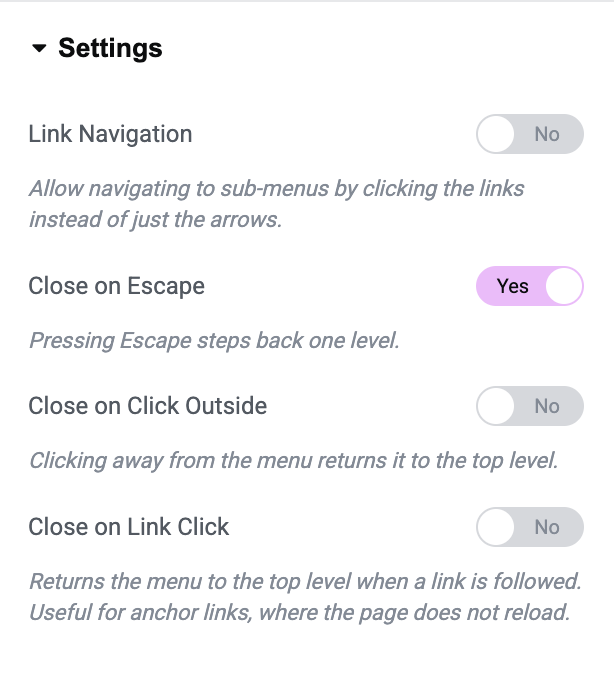
- Link Navigation: Enable this option to allow users to open submenus by clicking the menu item link, instead of having to click only the submenu arrow.
- Close on Escape: When enabled, pressing the Escape key takes the user back one level in the menu.
- Close on Click Outside: When enabled, clicking outside the menu takes the user back to the top-level menu.
- Close on Link Click: Enable this option to return the menu to the top level after a menu link is clicked. This is especially useful for anchor links, where clicking a link moves the user to another section of the same page without reloading it.
Style Tab#
The Style tab lets you fully customize the appearance of your Slide Menu. It is divided into 4 sections:
- Menu
- Links
- Sub - Menu Links
- Arrows
Menu Section#
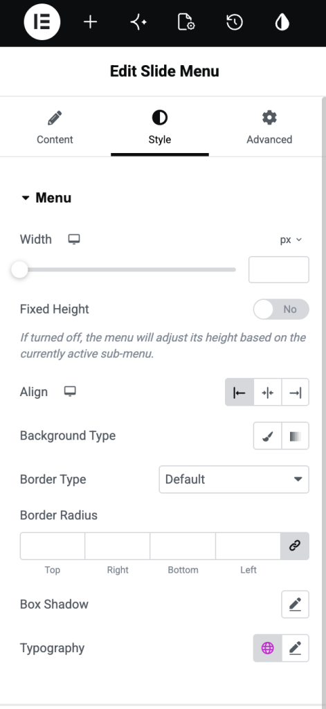
- Width: Set the menu's width.
- Fixed Height: enable or disable as per your preference.
- If ON, the menu height stays fixed.
- If OFF, the menu height adjusts based on submenu content.
- Alignment: Align the menu content: Left, Center, or Right
- Background Type: Choose a background style: Solid color or Gradient
- Border Type: Add borders around the menu container.
- Border Radius: Control how rounded the menu corners are.
- Box Shadow: Add shadow around the menu for depth.
- Typography: Customize font styles for menu text: Font family, Size, Weight, Line height, and more.
Links Section#
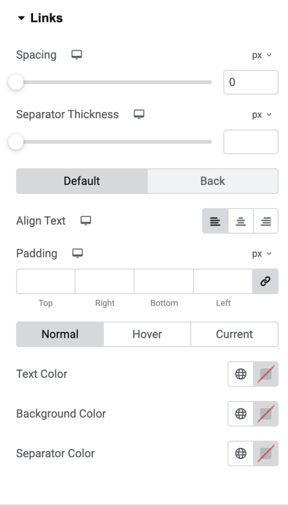
- Spacing: Adjust the space between menu items.
- Separator Thickness: Controls the thickness of the line between menu items.
- Align Text: Align menu item text: Left, Center, or Right
- Padding: Add space inside each menu item.
- Text Color: Set the color of menu text.
- Background Color: Set the background color for each menu item.
- Separator Color: Change the color of the divider lines between items.
Sub-menu Links#
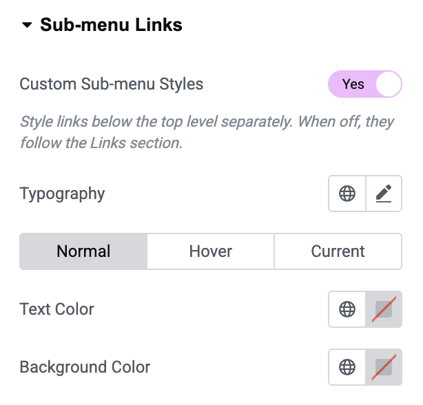
- Custom Sub-menu Styles: Enable this option to apply separate styling to sub-menu links. When disabled, sub-menu links use the styles defined in the Links section.
- Typography: Customize the typography of the sub-menu links, including options such as font family, size, weight, line height, and letter spacing. You can apply different typography settings for each link state:
- Normal: The default appearance of the sub-menu link.
- Hover: The appearance when a user moves their cursor over the link.
- Current: The appearance of the currently active menu item.
- Text Color: Set the color of the sub-menu link text. You can define different colors for the Normal, Hover, and Current states.
- Background Color: Set the background color of the sub-menu links. You can also use different background colors for the Normal, Hover, and Current states.
Arrows#
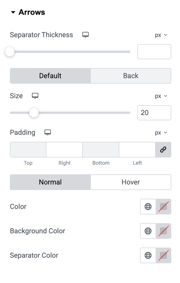
- Separator Thickness: Adjust spacing/divider appearance around arrows.
- Size: Control the size of the arrow icons.
- Padding: Add spacing around arrow icons.
- Color: Set the color of the arrow icon.
- Background Color: Add a background behind the arrows.
- Separator Color: Set the color of separators around arrow elements.
Wrapping Up!#
Slide Menu Widget is a flexible tool for creating modern navigation experiences in Elementor. With its customizable animations, layout options, and styling controls, you can easily design menus that match your website’s look and improve user navigation.