PowerPack Event Calendar Widget for Elementor is a drag-and-drop widget that lets you display events, schedules, and important dates directly on your WordPress website. Instead of using static lists or tables, you can present information in an interactive calendar layout that is easy to browse and visually engaging.
You can create event calendars, business schedules, class timetables, webinar listings, appointment calendars, and more, all without writing code. Simply add the widget to your Elementor page, choose your event source, customize the design, and publish your calendar in minutes.
In this guide, we'll walk you through all the customization and styling options available in the Event Calendar Widget for Elementor.
So let's get started!
Event Calendar Widget for Elementor: Getting Started#
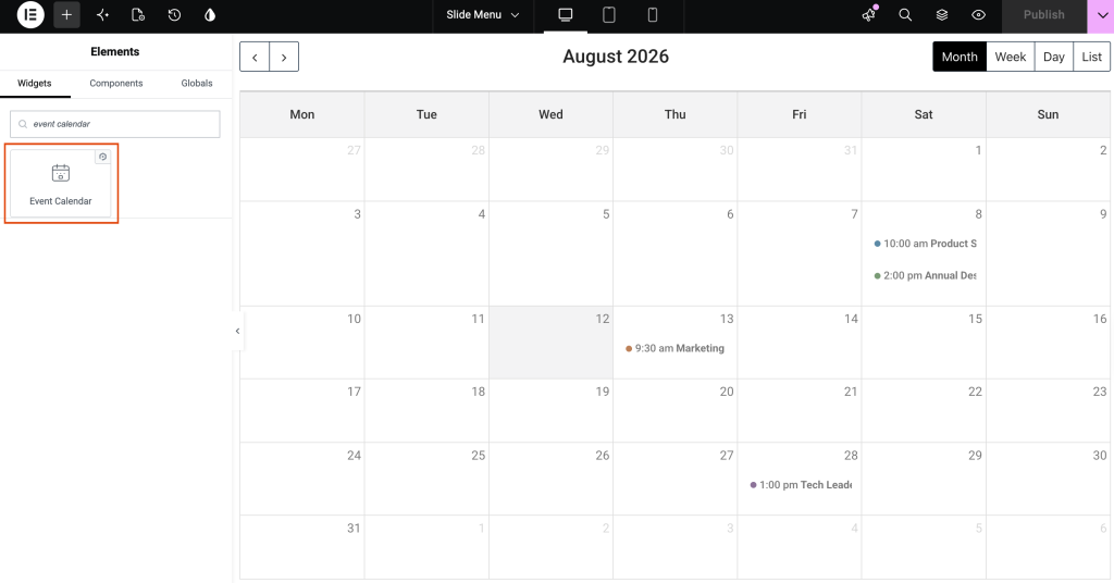
- Open the page you want to edit in Elementor editor.
- Search for "Event Calendar" in the widgets panel.
- Drag and drop widget onto page.
- Once placed, two tabs appear in the left panel: Content and Style.
Content Tab#
Content tab is organized into six sections:
- Events
- Header Toolbar
- Footer Toolbar
- Event Click
- Navigation
- Settings
Events#
- Source: Events section controls where the calendar pulls event data from. Source field offers three options: Custom, Posts, and Google Calendar.
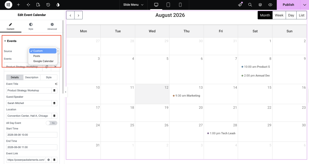
Choosing Custom lets you add and manage multiple events directly inside the widget. Each event is built using three sub-tabs: Details, Description, and Style.
- Details sub-tab covers:
| Field | Purpose |
|---|---|
| Event Title | Name Shown for Event |
| Guest/Speaker | Person associated with event |
| Location | Venue or address |
| All Day Event | Toggle for events without specific start/end time |
| Start Time | When event begins |
| End Time | When event ends |
| Event Link | URL visitors are taken to (used when click action is set to Open Link) |
| Add Image | Upload image representing event |
| Image Resolution | Size used for uploaded image |
- Description sub-tab simply holds custom text describing events.
- Style sub-tab lets you enable custom styling for a single event, with options to set Text Color and Event Color independently from the rest of the calendar.
Header Toolbar#
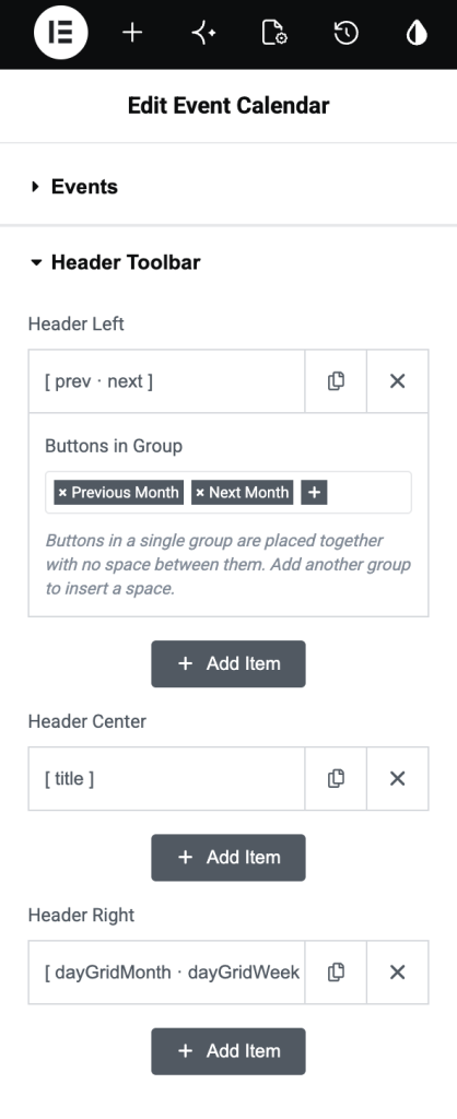
Header Toolbar lets you customize the top section of the calendar. You can choose which navigation buttons, calendar title, and view-switching options appear in the header and where they are displayed.
The toolbar is divided into three sections:
- Header Left
- Header Center
- Header Right
Each section can contain one or more button groups.
Header Left
Use this section to display navigation controls on the left side of the calendar header. In the default layout, it contains:
- Previous Month: Moves the calendar to the previous month.
- Next Month: Moves the calendar to the next month.
Header Center
This section displays the Calendar Title in the center of the header.
The title updates automatically based on the current view. For example:
- July 2026
- July 2026 – August 2026
- Jul 5 – Jul 11, 2026
Header Right
Use this section to display buttons that let visitors switch between different calendar views.
The available view buttons include:
| Option | Description |
|---|---|
| Day Grid Month | Displays the calendar in a traditional monthly grid view. |
| Day Grid Week | Displays one week in a grid layout. |
| Day Grid Day | Displays a single day in a grid view. |
| List Month | Displays all events for the current month in a list format. |
Buttons in Group
Each Header Toolbar section contains a Buttons in Group field.
A group determines how the buttons are arranged.
- Buttons added to the same group are displayed together without any spacing.
- Click the + icon inside the group to add more buttons to that group.
- Click Add Item below the group to create a new button group. A new group is separated from the previous group by a small space, making it easier to organize the toolbar.
Footer Toolbar#
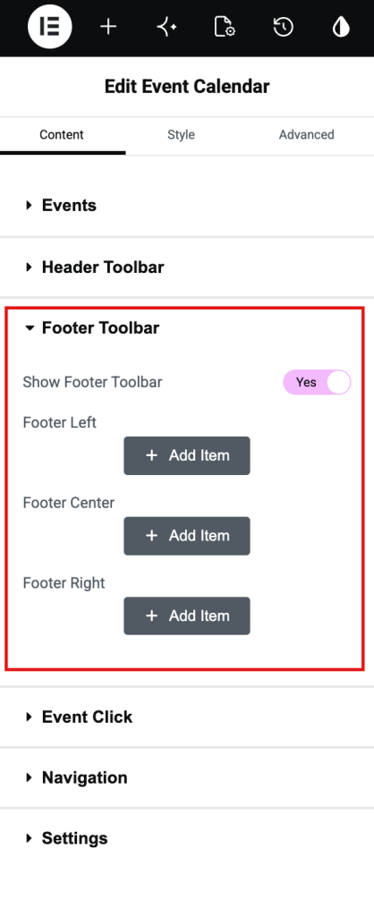
The Footer Toolbar lets you display an additional toolbar at the bottom of the calendar. You can add navigation buttons, the calendar title, or view-switching buttons to the footer, just like the Header Toolbar.
- Show Footer Toolbar: Enable this option to display the footer toolbar below the calendar.
- Footer Left: Use this section to add buttons or controls to the left side of the footer. You can:
- Click the + icon inside a button group to add more buttons to the same group.
- Click Add Item to create a new button group.
- Add multiple groups to organize the footer layout.
- Footer Center: Use this section to display buttons or controls in the center of the footer. Like the other sections, you can create multiple button groups and arrange the controls as needed.
- Footer Right: Use this section to add buttons or controls to the right side of the footer. You can add navigation buttons, the calendar title, view-switching buttons, or any other available toolbar controls.
Buttons in Group
Each footer section supports one or more button groups.
- Buttons added to the same group appear together without spacing.
- Click the + icon to add more buttons to the current group.
- Click Add Item to create another group. Separate groups are displayed with spacing between them, making the toolbar easier to organize.
Event Click#
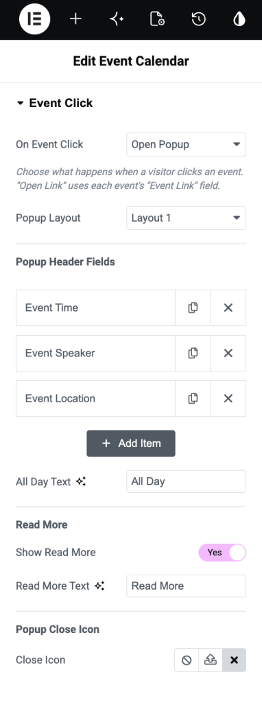
Event Click section lets you define what happens when a visitor clicks an event on the calendar. You can choose to open a popup with event details, redirect users to a custom link, or disable any click action.
- On Event Click: Choose the action to perform when an event is clicked.
- Open Popup: Displays a popup containing the event details. You can customize the popup layout and choose which event information to display.
- Open Link: Redirects visitors to the event's URL when they click the event. This option uses the URL added to each event.
- Do Nothing: Disables the click action. Clicking an event will not trigger a popup or redirect visitors to another page.
- Popup Layout: Choose the layout used to display event information inside the popup. The available layouts determine how the event details are organized. Select the layout that best matches your website design.
- Popup Header Fields: Use this section to customize the information displayed at the top of the event popup.
- Click Add Item to add additional fields, reorder them using drag and drop, duplicate an existing field, or remove fields you don't want to display. Each field includes the following options:
- Field Type: Select the type of information to display. Depending on the event data, available field types may include; Event Time, Event Speaker, Event Location, Event Organizer, Event Category, Event Description & Custom Fields (if supported)
- Field Title: Enter a custom label for the selected field. For example, instead of Event Time, you can display Schedule or Time.
- All Day Text: This option is available for the Event Time field. Specify the text to display when an event lasts all day. For example, you can display All Day instead of showing a time.
- Field Icon: Choose an icon to display alongside the field.
- Click Add Item to add additional fields, reorder them using drag and drop, duplicate an existing field, or remove fields you don't want to display. Each field includes the following options:
- Read More: Enable this option to display a Read More button in the event popup.
- Popup Close Icon: Choose the icon displayed for closing the popup. You can:
- Hide the close icon.
- Use the default close icon.
- Select a custom icon that matches your website's design.
Navigation#
Navigation section lets you customize how visitors navigate through the calendar. You can enable clickable date links and choose the display style for the Previous and Next navigation buttons.
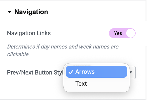
- Navigation Links: Enable this option to make the day names and week names clickable.
- Yes: Visitors can click day names or week names to navigate directly to the corresponding view.
- No: Day names and week names are displayed as plain text and are not clickable
Note: This setting works only when the corresponding calendar views are available in the toolbar.
- Prev/Next Button Style: Choose how the Previous and Next navigation buttons appear in the calendar toolbar.
- Arrows: Displays icon-based navigation buttons using left and right arrows.
- Text: Displays text labels such as Prev and Next instead of arrow icons.
Settings#
Settings section lets you configure the calendar's default view, localization, display options, event appearance, and time-based settings.
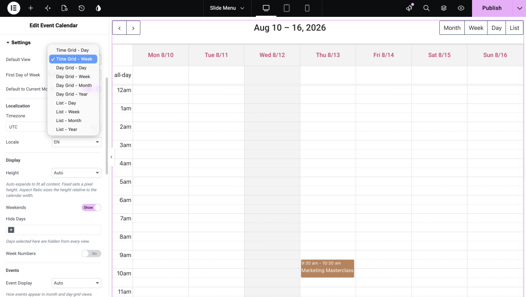
Default View: Choose the view that is displayed when the calendar first loads. Available options depend on the enabled calendar views and may include:
- Day Grid - Month
- Day Grid - Week
- Day Grid - Day
- List - Month
First Day of Week: Select the day that should appear as the first day of the week in the calendar. For example, choose Monday or Sunday based on your regional preference.
Default to Current Month: Enable this option to open the calendar on the current month when the page loads.
- Yes: Displays the current month by default.
- No: Opens the calendar based on the configured initial date or view.
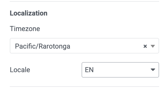
Localization: Customize the calendar to match your preferred language and timezone.
- Timezone: Select the timezone used for displaying event dates and times. For example:
- UTC
- Local
- Named timezones (if supported)
- Locale: Select the language and regional formatting for the calendar. Changing the locale updates text such as month names, day names, button labels, and date formats.
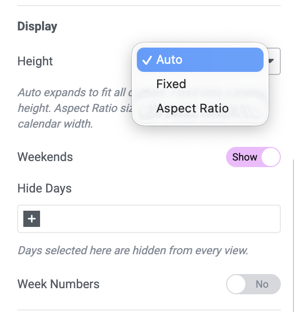
Display: Configure how the calendar is displayed.
- Height: Choose how the calendar height is calculated.
- Auto: Automatically adjusts the height to fit all calendar content.
- Fixed: Sets a fixed height for the calendar.
- Aspect Ratio: Calculates the height based on the calendar's width to maintain a consistent layout.
- Weekends: Show or hide Saturdays and Sundays in the calendar.
- Hide Days: Select one or more days to hide from every calendar view. For example, you can hide Sundays or weekends if your business operates only on weekdays.
- Week Numbers: Display the week number alongside each week in the calendar.
- Yes: Shows week numbers.
- No: Hides week numbers.
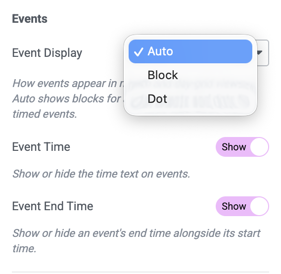
Events: Control how events appear in the calendar.
- Event Display: Choose how events are displayed. Common options include:
- Auto: Automatically displays events in the most appropriate style for the selected view.
- Event Time: Show or hide the event start time.
- Event End Time: Show or hide the event end time alongside the start time.
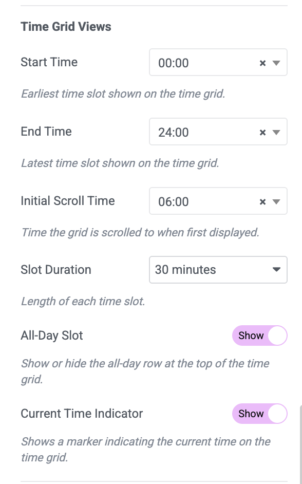
Time Grid Views: These settings apply to time-based calendar views, such as Day Grid - Week and Day Grid - Day.
- Start Time: Set the earliest time displayed in the calendar's time grid. For example, setting 08:00 displays the schedule starting at 8:00 AM.
- End Time: Set the latest time displayed in the time grid. For example, setting 18:00 limits the visible schedule to 6:00 PM.
- Initial Scroll Time: Choose the time the calendar automatically scrolls to when it first loads. For example, setting 09:00 opens the time grid around 9:00 AM.
- Slot Duration: Set the length of each time slot in the calendar. Common values include:
- 15 minutes
- 30 minutes
- 60 minutes
- All-Day Slot: Show or hide the All-Day row at the top of time grid views.
- Current Time Indicator: Display a horizontal line indicating the current time in time grid views.
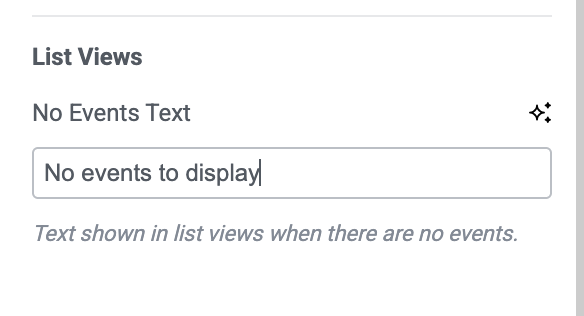
- List Views: These settings apply to the List calendar view.
- No Events Text: Enter the message displayed when no events are available in the selected date range. For example:
- No events to display
- No upcoming events
- There are currently no scheduled events.
- No Events Text: Enter the message displayed when no events are available in the selected date range. For example:
Style Tab#
The Style tab lets you customize the overall appearance of the calendar, toolbar, event cards, and popup so the calendar matches your website design.
It includes the following sections:
- Calendar
- Toolbar
- Header
- Rows
- Days
- Event
- Event Popup
Calendar#
Calendar section lets you customize the overall appearance of the calendar container.
- Background Color: Choose a background color for the calendar.
- Border Type: Select a border style for the calendar. Available options depend on Elementor's border controls and may include None, Solid, Double, Dotted, Dashed, or Groove. After selecting a border type, you can customize its width and color.
- Box Shadow: Add a shadow around the calendar to make it stand out from the page background. You can adjust shadow position, blur, spread, and color.
Toolbar#
Toolbar section controls the appearance of the header and footer toolbars.
- Toolbar Spacing: Adjust spacing between the calendar and the header or footer toolbar.
- Title: These options apply to the calendar title displayed in the toolbar.
- Color: Choose a color for the calendar title.
- Typography: Customize font family, size, weight, transform, style, line height, and letter spacing.
- Buttons: Customize the appearance of toolbar buttons in different states.
- Typography: Change typography for all toolbar buttons.
The following styling options are available under Normal, Hover, and Active states.
- Text Color: Choose text color for each button state.
- Background Color: Select a background color for toolbar buttons.
- Border Type: Choose a border style for the buttons.
- Border Radius: Adjust button corner radius to create square or rounded buttons.
- Box Shadow: Add a shadow effect to the buttons.
- Padding: Control spacing inside each button for a comfortable clickable area.
Header#
Header section controls the appearance of day and date headers displayed in the calendar.
- Text Align: Align header text to the left, center, or right.
- Typography: Customize font settings for header text.
- Text Color: Choose text color for header labels.
- Background Color: Set background color for the header.
- Border Type: Select a border style for the header.
- Padding: Add spacing inside each header cell.
Rows#
Rows section lets you style calendar rows.
- Striped Rows: Choose how alternating rows should appear. This helps improve readability, especially in larger calendars.
- Background Color: Choose background color for rows.
- Text Color: Set text color for row content.
- Border Type: Select a border style for rows.
Days#
Days section lets you customize appearance of individual day cells.
- All Days: Style all day cells using Normal and Hover states.
- Text Color: Choose text color for day numbers.
- Background Color: Set background color for day cells.
- Today: Highlight current day using custom colors.
- Text Color: Choose text color for today's date.
- Background Color: Choose the background color for today's cell.
- Past Day: Customize appearance of previous dates.
- Text Color: Choose text color for past dates.
- Background Color: Choose background color for past day cells.
- Adjacent Days: Style dates displayed from previous or next month.
- Text Color: Choose text color for adjacent days.
- Background Color: Choose background color for adjacent day cells.
Event#
Event section controls appearance of events displayed inside the calendar.
- Event Color: Choose default color for all events.
- Typography: Customize typography used for event titles.
- Text Color: Choose text color for event titles.
- Padding: Adjust spacing inside each event card.
Event Popup#
Event Popup lets you customize the appearance of the popup that opens when a visitor clicks an event in the calendar.
- Popup Width: Set the width of the event popup. You can adjust the width separately for desktop, tablet, and mobile devices.
- Content Padding: Adjust the spacing between the popup content and its edges. Increase the padding to give content more breathing room inside the popup.
- Overlay Background: Choose the background color of the overlay that appears behind the popup. This helps separate the popup from the rest of the page.
- Popup Background: Set the background color of the popup window where event information is displayed.
- Border Radius: Adjust the roundness of the popup corners. A higher value creates more rounded corners.
- Border Type: Choose a border style for the popup, such as solid, dashed, dotted, or other available options.
- Image: Customize the featured image displayed inside the event popup.
- Height: Set the height of the event image. Adjust it to control how much space the image takes up inside the popup.
- Title: Customize the appearance of the event title displayed in the popup.
- Typography: Adjust font family, size, weight, line height, letter spacing, and other available typography settings.
- Color: Choose a color for the event title.
- Margin Bottom: Adjust the space between the event title and the content that follows it.
- Description: Customize the appearance of the event description.
- Typography: Adjust the font family, size, weight, line height, and other typography settings for the description.
- Color: Choose a color for the event description text.
- Event Details: Customize the appearance of event information such as time, speaker, location, and other details displayed in the popup.
- Text Typography: Adjust typography settings for event detail text.
- Text Color: Choose a color for event detail text.
- Icon Color: Choose a color for the icons displayed alongside event details.
- Icon Size: Adjust the size of icons displayed beside event details.
- Items Gap: Set the spacing between individual event detail items.
- Read More Button: Customize the appearance of the Read More button displayed in the event popup.
- Typography: Adjust the font family, size, weight, and other typography settings for the button text.
- Color: Choose a color for the button text.
- Margin Top: Adjust the space between the event details and the Read More button.
- Close Button: Customize the appearance of the button visitors use to close the event popup.
- Icon Size: Adjust the size of the close icon.
- Color: Choose the color of the close icon.
- Background: Set a background color for the close button.
- Box Shadow: Add and customize a shadow around the close button to make it stand out from the popup.
Wrapping Up!#
PowerPack Event Calendar Widget makes it easy to create interactive and fully customizable calendars in Elementor. From displaying custom events and Google Calendar events to styling every part of the calendar, you have complete control over both functionality and design.
With flexible layout options, customizable toolbars, event popups, and extensive styling controls, you can build calendars for business schedules, events, webinars, appointments, classes, and much more.
If you need additional help while using this widget, feel free to reach out through our support team or explore other PowerPack documentation to get the most out of your Elementor website.