Display your blog posts/pages or any website content in a beautiful magazine layout using the Magazine Slider Widget for Elementor by PowerPack.
Let's take a closer look at the content and style tab of the Magazine Slider widget.
Content Tab of the Magazine Slider Widget#
The Content Tab of the Magazine Slider widget consists of 4 sections:
- Layout
- Query
- Post Meta
- Slider Options
Let us now go over each of these sections in more detail.
Layout#
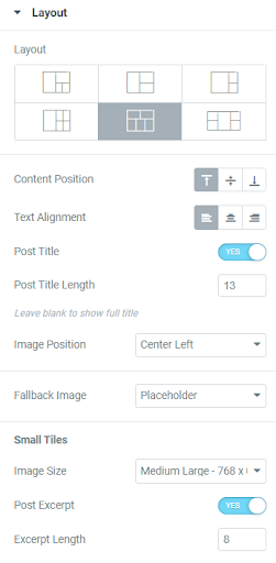
In the Layout subsection, you see the following options:
- Layout - Choose between 6 types of layouts available.
- Content Position - Set the content to the Top, Middle, or Bottom of the slider post.
- Text Alignment - Align the text to the Left, Right, or Center.
- Post Title - Enable this to set the number of characters to be displayed in the title. You can leave it blank to display the full title.
- Image Position - Set the position of the image added to the slider.
- Fallback Image - Displays a fallback image if in case no post thumbnail is found. You can either choose to add a placeholder image or add a custom image from the media library.
- Small Tiles - Set the size for the images added to the small tiles.
- Large Tiles - Set the size for the images added to the large tiles.
- Excerpt Lenght - Set excerpt lenght for the text content displayed tiles.
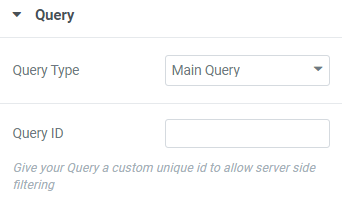
Query#
Choose between “Main Query” or “Custom Query”.
- If you choose Main Query as query type:
- Query ID - Add the query ID that is available for a particular query.
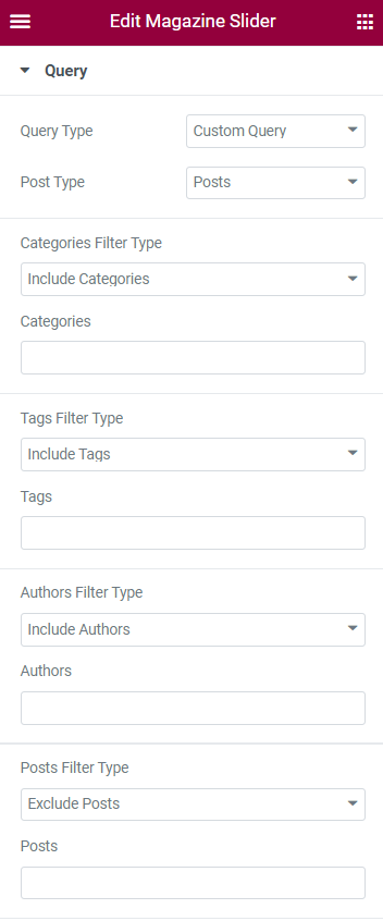
- If you choose Custom Query as query type:
- Post Type - Select a post type from which you want to display the slider content.
- Include / Exclude - You can include or exclude categories, tags, authors, or custom taxonomies by adding their slug or name.
- Date - Choose the date from the options such as Past day, Past week, Past month, Past Quarter, Past year, and Custom.
- Order - Display the post in ascending or descending order.
- Order By - Sort the posts by Date, Last modified date, Random, Comment count, Title, Post ID, Post Author, Menu Order, and Relevance.
- Sticky Post - Enable this to show sticky posts in the Magazine Slider.
- Offset - Enables you to start displaying the posts from the given offset position.
- Exclude Current Post - Remove the current post added to the Magazine Slider.
Post Meta#
If you enable the Post Meta feature, you will find the options:
- Post Meta Divider - Displays a divider(- or /) between the post content.
- Post Author -Displays the Author name to the post.
- Post Category - Displays the category of the post.
- Post Date - Displays the date on which the post was published.
- Date Type - Choose what date should be shown - Published Date, Time Ago, Last Modified Date, or from Custom Meta Key.
- Date Format - Choose what format you want to keep for the date.
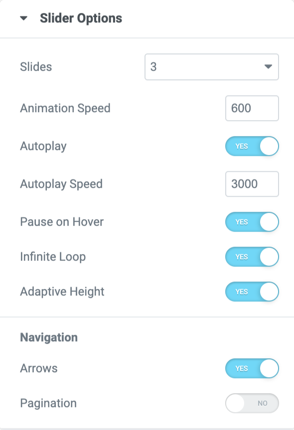
Slider Options#
In the Slider Options sub-section, you get plenty of options to set the slider of the layout as per your preferences.
- Slides - Choose the number of slides to be displayed in the Magazine Slider.
- Animation Speed - Set the speed of the animation added to the slides.
- Autoplay - Enable this to autoplay Magazine slides.
- Pause on Hover - Enable this to pause the slides on a mouse hover.
- Infinite Loop - Magazine slides can be displayed in a loop.
- Adaptive Height - Enable this to set a responsive height for all the slides.
- Arrows - Displays the arrows in the left and right of the Magazine Slider.
- Pagination - Enable this to display the “Dots” or “Fraction” for the slides.
Style Tab of the Magazine Slider Widget#
There are 9 sections in the style tab of the Magazine Slider Widget:
- Layout
- Content
- Title
- Post Category
- Post Meta
- Post Excerpt
- Overlay
- Arrows
- Pagination: Dots
Let's look at each of these sections in more detail:
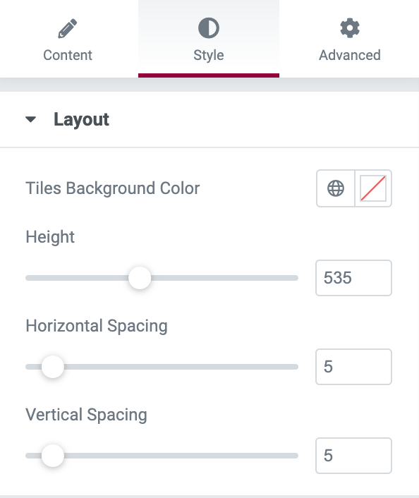
Layout#
In this section, you can set the height of the images added to the Magazine Slider. It is also possible to set the horizontal and vertical spacing between the slides.
Content#
Here, you can choose between the "Classic" and "Gradient" backgrounds for the content. Further, you can set the padding to create a space between the content and the border of the slides.
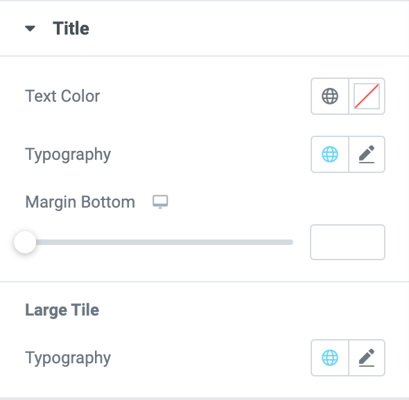
Title#
In this section, you can set the typography and color for the title. Also, you can set the space between the title and content in the slide.
Post Category#
This section can be available only if you enable the "Post Category" option. There are 2 styles available for the post category.
- Style 1 - Set the text color, typography, and spacing between the post category and the content of the slider.
- Style 2 - Set the background color, text color, typography, text color, padding, and spacing between the post category and the content of the slider.
Post Meta#
This section can be available only if you enable the "Post Meta" option. You can set the color of the text, typography, space between the meta items, and space between the post meta and the content in the Magazine slider.
Post Excerpt#
This section can be available only if you enable the "Post Excerpt" option. Here, you can set the color and typography for the excerpt added to the Magazine slider.
Overlay#
You can choose between the "Classic" or "Gradient" backgrounds and increase or decrease the opacity for the overlay of the images added to the slider.
Arrows#
This section can be available only if you enable the "Arrows" option.
- Choose Arrow - Choose an arrow from the icon library.
- Arrow Size - Set the size of the arrows.
- Align Arrows - Set the alignment of the arrows.
- Background Color - Set the background color for the arrows.
- Color - Set the color for the arrows.
- Border Type - Choose any border type from the options such as Solid, Double, Dotted, Dashed, and Groove.
- Border Color - Set the border color for the arrows.
- Border Radius - Displays the arrows with soft edges. This is available only in normal mode.
- Padding - Creates space between the arrow icon and the edges.
Pagination: Dots#
This section can be available if you enable the "Pagination" option.
- Position - Displays the dots inside or outside the slider.
- Size - Set the size of the dots.
- Spacing - Set the space between each dot.
- Normal Mode and Hover Mode:
- Color - Set the color for the dot.
- Border Color - Set the border color for the dots.
- Active Color - Set the color for the dot which is actively displayed in the slider.
- Border Type - Choose any border type from the options such as Solid, Double, Dotted, Dashed, and Groove.
- Border Radius - Displays the dots with soft edges. This is available only in normal mode.
- Margin - Creates space between the dots and the bottom of the slider.
This was the detailed overview of the Magazine Slider Widget for Elementor available in PowerPack Addons.
Hope this helps!