Create how-to guides, tutorials, and walk-throughs on your WordPress website using the creative How To widget for Elementor by PowerPack.
Let's take a closer look at the Elementor How To widget in detail.
Content Tab of How To Widget#
The Content Tab of the "How To" widget consists of 3 sub-sections:
- Schema Markup
- How To
- Steps
Let's check the options of each subsection in detail:
Schema Markup#
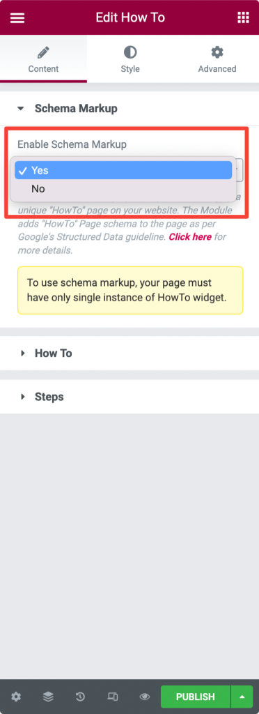
In the PowerPack How To widget, you get an option to enable or disable the schema markup for your page. If you're creating a specific "how-to" page/section on your website, we suggest you select "Yes" and enable the Schema Markup option.
How To#
In the How To sub-section, you get options to customize the Hero section of your how-to page.
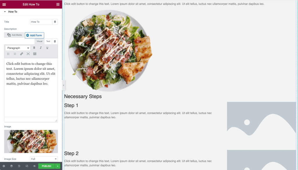
- Title: Define your how-to page's title
- Description: Add a description
- Image: Add an image to be displayed header of your how-to page.
- Image Size: Choose your image size.
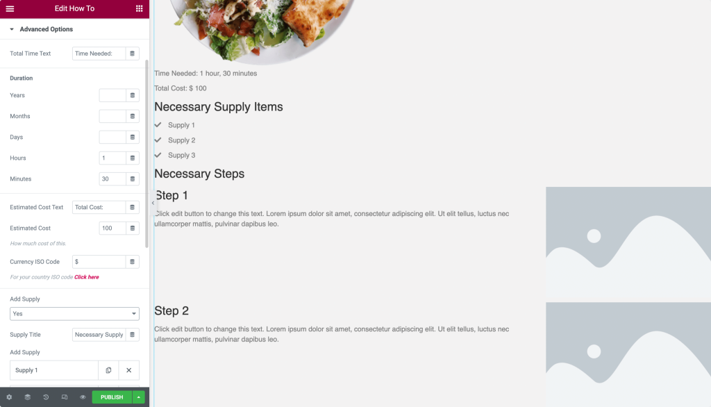
- Show Advanced Options: Enable this feature to add estimated time duration, cost, supplies, and other elements to your how-to page.
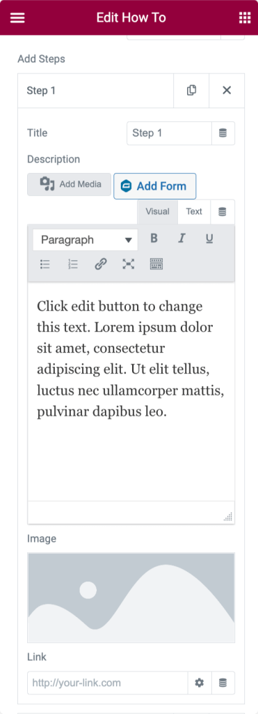
Steps#
In the Steps sub-section, you get options to define the steps of your how-to element.
- Section Title: Define a title for the step's section.
- Add Steps: Define steps by adding a custom title, description, image, and link. You create how-tos with as many steps as you want.
- Lightbox: Choose the option "Yes" to display steps' images in the lightbox.
Style Tab of How To Widget#
There are 6 sections in the Style tab of the How To Widget:
- Box
- Title
- Description
- Image
- Advanced Options (This option is only displayed if you have enabled the Advanced Options in the Content tab)
- Steps
Now let's look at each of these sections in more detail.
Box#
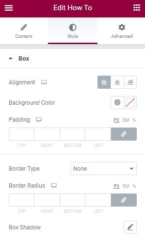
The Box section includes various options to nicely set up your How To widget. The options are:
- Alignment: You can align the “How To” content to the Left, Right, Top, and Center of the box.
- Background Color: You can further choose a background color for the box.
- Padding: You can add padding between the "How To" content and the box.
- Border Type: You can further change the border of the “How To” box by choosing any one option from Solid, Double, Dotted, Dashed, and Groove. This option allows you to adjust the border width and change the color of the border.
- Border Radius: This option helps you to adjust the edge of the border from the Left, Right, Top, and Bottom of the “How To” box.
- Box Shadow: You get the flexibility to add a shadow effect to the box.
Title#
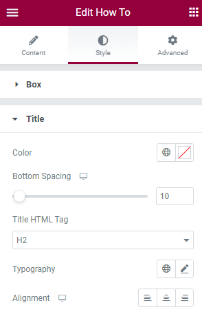
Here you get multiple options to customize the title of your How To widget. You can:
- Change Title Colour.
- Add Bottom Spacing.
- Choose Title HTML Tag.
- Alter title Typography and change font.
- Set Title Alignment to the Left, Right, and Center.
Description#
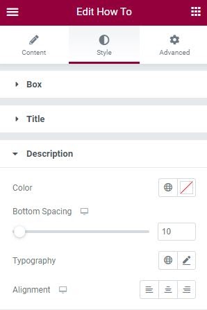
- Colour: You can change the color description.
- Bottom Spacing: Adjust bottom spacing.
- Typography: Alter typography and choose your preferred font.
- Alignment: Set description alignment to the Left, Right, and Center.
And just like the above-mentioned options, you get styling options to customize Image, Additional options, and Steps of your How To widget. All options are self-explanatory and easy to understand.
So this was the detailed overview of the How To widget available in PowerPack Addons for Elementor. Feel free to get in touch with us in case of any queries or concerns.