Create customized nested tabs and display custom content or saved templates impressively in tab format using the Advanced Tabs widget for Elementor by PowerPack.
Let's take a closer look at the Elementor Advanced Tabs widget in detail.
Content Tab of the Advanced Tabs Widget#
The content tab of the Advanced Tabs widget consists of 3 sub-sections:
- Advanced Tabs
- Layout
- Help Docs
Let us now go over each of these sections in more detail:
Advanced Tabs#
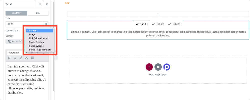
In the advanced tabs sub-section, you get options to customize the content of the Advanced Tab widget. The options are:
- Title: Here, you can add the Title for your tabs.
- Content-Type: Choose the your content type for the Advanced Tabs widget. You can choose the Content option to add customized text content in your tabs or you can go with the Images, Links, Saved Widgets, Sections, or Page Templates options.
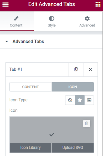
Icon: In this section, you can add an icon to the tab from the media or icon library. You have an option to choose between icon or image, or you can even opt for no icon.
Layout#
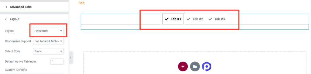
Here, you can change the layout: Horizontal or Vertical.
If you choose the Horizontal option, the tabs will be displayed as per the below screenshot.
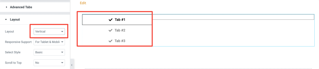
If you choose Vertical, the tabs will be displayed in the screenshot below.
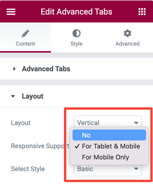
Responsive Support#
The Responsive Support option lets you make the tabs responsive to small screen devices like mobiles and tablets.
Custom ID Prefix#
The custom ID can be added as a prefix to the attribute of tabs in HTML. You can further choose the tab which needs to be indexed as default in the "Default Active Tab Index."
Style Tab of the Advanced Tabs Widget#
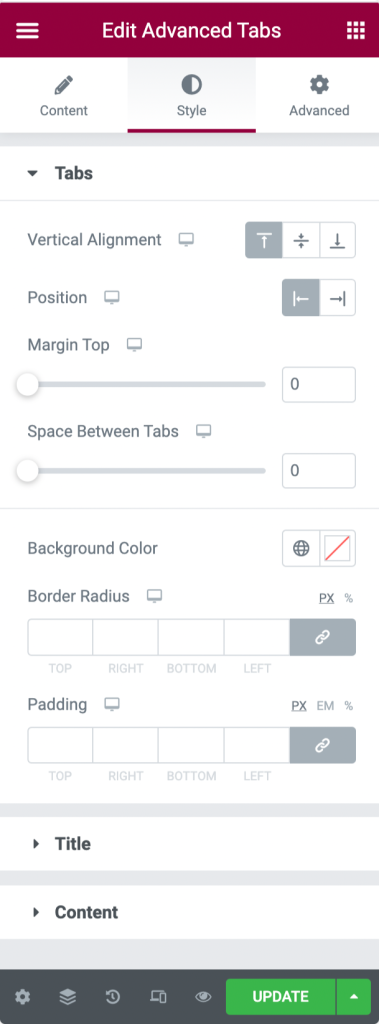
There are 3 sections in the Style tab of the Advanced Tab Widget:
- Tabs
- Title
- Content
Let's look at each of these sections in more detail:
Tabs#
This section allows you to move the tabs to the left, right, and center. In this sub-section, you get plenty of options to customize the tabs, such as:
- adjust space between the tabs
- add the background color
- further adjust the border radius and padding of the tabs.
Title#
This section is used to customize the Title of the tabs. You can choose the icon's position to left, right, top, and bottom. You can further change the size of the icon and the width of the icon image. Also, you get an option to adjust the border radius and padding of the tab's title.
Besides changing the color and background of the Title, you can also enable or disable the hover effect for the Title. Once you select the hover effect as "Yes," you can find the tabs to hover when you keep the cursor on it.
Content#
You can align the tab's content to the left, right, and center. You can choose between classic or gradient backgrounds and change the color and size of the text.
Several border types are available for the content, such as Solid, Double, Dotted, Dashed, and Groove. You can also change the border's color, and it is also possible to adjust the border radius and padding for the content.
This was a detailed overview of the Advanced Tabs widget available in PowerPack Addons for Elementor. If you have questions or concerns, please feel free to contact us.