PowerPack Elementor Logo Grid Widget displays logos and images in a grid manner with impressive layout options. You can use this widget to show multiple logos of sponsors, customers, subscribers, etc. There are numerous customization options available with this widget.
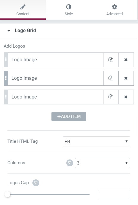
Content Tab of Logo Grid Widget#
The content tab allows you to change the logo images as well as the title of the respective logos. You can change the gap between individual logos and the number of columns in this section.
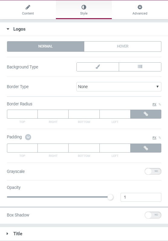
Style Tab of Logo Grid Widget#
The Style Tab takes care of all the design of the logo grid. You can change the border, alignment, and padding and align the logo. You can change the typography and color of the title. You can change the opacity of the image as well.
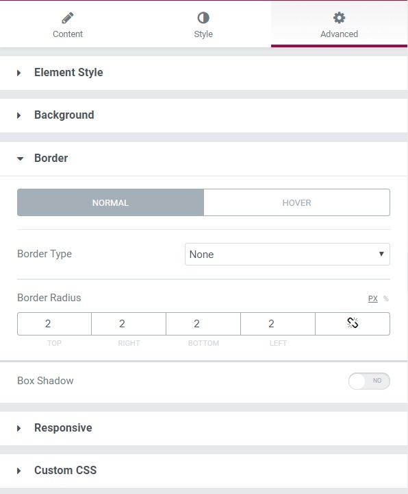
Advanced Tab of Logo Grid Widget#
This Tab has five subsections:
- Element Style - You can change the margin, padding, z-index, and entrance animation and add CSS ID and classes here.
- Background - Here, you can set the background as classic or gradient and add hover effects.
- Border - Here, the properties related to the border are defined as border type, radius, box shadow, and hover effects.
- Responsive - Here, you set the responsiveness of the different devices to be active or not.
- Custom CSS lets you add CSS code to the widget, and you can see it render live right in the editor.