PowerPack Elementor Table Widget is used to show data in tabular form and more organized way. You can easily set up a table on your page, and there are many modifications that you can make to your table.
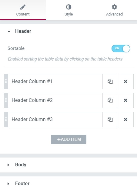
Content Tab#
The content tab takes care of the header, body, and footer text. You can enter the cell details, change the row span and col span, and give an icon to the cell as well. You can also give a custom CSS class and ID to the cell.
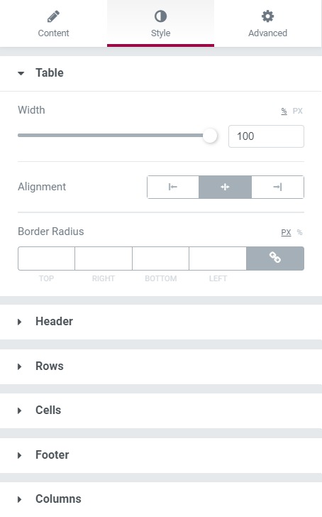
Style Tab#
All the customization related to the width, alignment, and border radius can be done for the table. You can change the cell's background, text color, alignment, and border from this section.
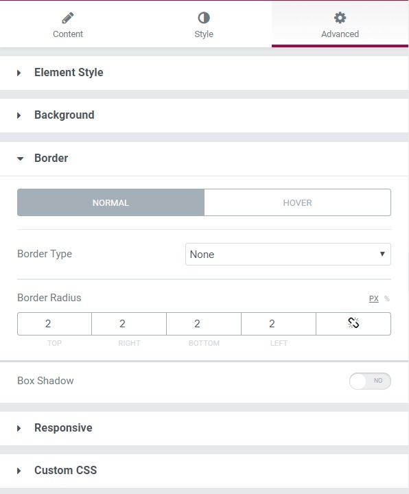
Advanced Tab#
This Tab has five subsections-
- Element Style - You can change the margin, padding, z-index, and entrance animation and add CSS ID and classes here.
- Background - Here, you can set the background as classic or gradient and add hover effects.
- Border - Here, the properties related to the border are defined as border type, radius, box shadow, and hover effects.
- Responsive - Here, you set the responsiveness of the different devices to be active or not.
- Custom CSS lets you add CSS code to the widget and see it rendered live in the editor.