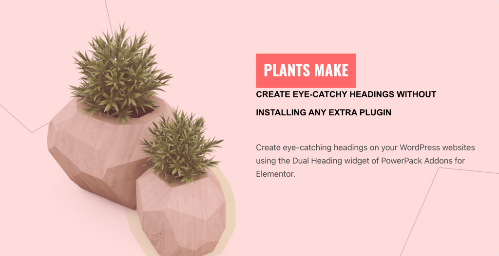
Dual Heading Widget allows you to break your page heading into 2 parts and gives you the freedom to edit and format the typography of both of them separately. You can style your heading to put more emphasis on one part of the heading.
What is Dual Heading?#
Dual heading refers to using two separate heading elements displayed side by side within a section or column of your webpage. This feature allows you to create visually appealing designs by combining two headings with different styles, fonts, sizes, or colors to highlight important information or make a specific visual hierarchy. Dual headings are commonly used in landing pages, hero sections, or anywhere you want to draw attention to multiple pieces of text simultaneously.
Adding a dual heading helps to improve visual appeal and readability and create a clear visual hierarchy. It breaks up content effectively, making it easier for visitors to digest and engage with the information showcased.
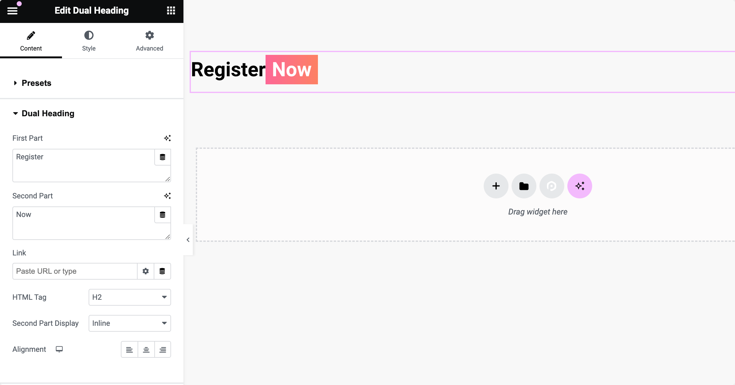
Content Tab of the Dual Heading Widget#
In the Content tab, you can customize the textual content of the Dual Heading widget. You can input text for both the first and second parts of the heading, add hyperlinks, select HTML tags for semantic structure, and adjust alignment settings.
Additionally, it allows you to choose from preset designs to apply predefined layouts to their dual headings quickly.
The options in the Content Tab are as follows:
- Choose from Preset Designs: This option allows you to select predefined designs/layouts for the dual heading widget, providing quick styling options without needing to customize each aspect individually.
- First Part: In this field, type in the desired text, which will appear as the primary heading or title.
- Second Part: This option allows users to input the text or content for the second part of the dual heading.
- Link: Make your entire heading clickable by adding a hyperlink. Enter the URL you want your heading to link to, improving user experience by allowing visitors to navigate to relevant pages or sections.
- HTML Tag: Choose the HTML tag for your dual heading to impact its semantic meaning and SEO. Select from different HTML tags, such as H1, H2, H3, etc., to define the heading's hierarchy and significance within your webpage's structure.
- Second Part Display: Based on your design preferences and layout needs, decide how the second part of your dual heading appears in relation to the first part. Choose whether the second part displays on a new line (block) or the same line as the first part (inline).
- Alignment: Set the alignment of your dual heading widget within its container or column. Align your heading to the left, center, or right, or justify it within its designated space, ensuring it fits well with other elements on the page.
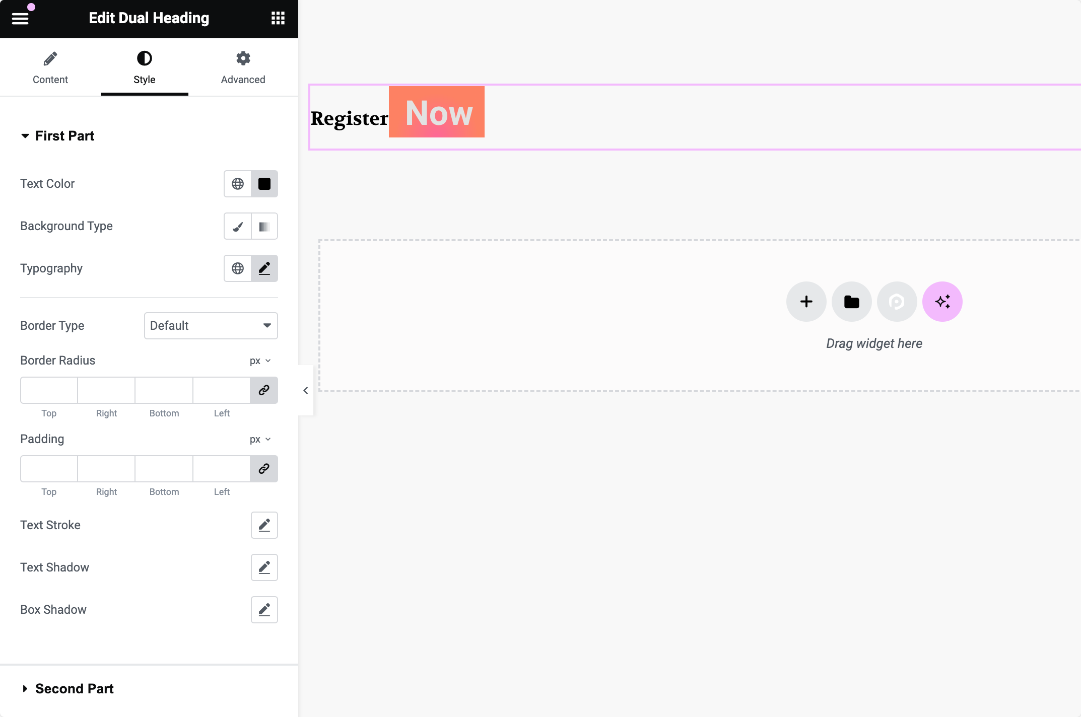
Style Tab of the Dual Heading Widget#
In the Style tab, you have a wide range of options to customize the visual appearance of the Dual Heading widget's first and second parts.
You can control aspects such as text color, background type (solid color, gradient, or image), typography settings (font family, size, weight, letter spacing, and line height), border styles, padding, text stroke, text shadow, and box-shadow.
These options allow users to create visually appealing dual headings that match their website's design theme.
This was the detailed overview of the Dual Heading for Elementor available in PowerPack Addons.
Hope this helps!