PowerPack Advanced Menu Widget for Elementor helps you create responsive and customizable navigation menus for your website. You can display menus in horizontal or vertical layouts, add hover effects, create dropdown menus, and switch to Off Canvas or Full Screen menus on smaller devices.
Getting Started: Using the Advanced Menu Widget#
Follow these steps to add the Advanced Menu Widget to your page:
- Open the page where you want to add the Advanced Menu Widget in the Elementor editor.
- In the widgets panel, search for Advanced Menu.
- Drag and drop the widget onto your page.
- Once the widget is added, you’ll see two tabs in the left panel: Content & Style
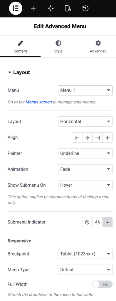
Let’s explore all available options.
Content Tab#
Content tab allows you to select a menu, configure layout, customize submenu behavior, and control responsive settings.
Layout#
- Menu: Select the WordPress menu you want to display using the Advanced Menu Widget.
- Layout: Choose how menu items should be displayed: Horizontal or Vertical
- Align: Control alignment of menu items within available space.
- Pointer: Choose a pointer style to highlight active or hovered menu items. Available options include: None, Underline,Overline, Double Line, Framed, Background, Text, and more
- Animation: Add animation effects to the menu pointer. Available effects include: Fade, Slide, Grow, Drop In, Drop Out and more
- Show Submenu On: Choose how dropdown menus should open: Hover or Click
- Submenu Indicator: Enable or disable the indicator icon for menu items that contain submenus.
Responsive#
Responsive section helps you customize menu behavior for tablets and mobile devices.
- Breakpoint: Choose the screen size at which the menu switches to responsive mode.
- Menu Type: Select responsive menu style:
- Default: Displays standard responsive menu.
- Off Canvas: Opens the menu inside a sliding panel from the side of the screen.
- Full Screen: Displays menu in a full-screen overlay.
- Full Width: Enable this option to make the responsive menu stretch across the available width.
- Toggle Button: Show or hide the menu toggle button on responsive devices.
- Toggle Icon Type: Choose an icon style for the menu toggle button.
- Toggle Align: Set the alignment of the toggle button.
- Show Submenu On: Choose how submenu items behave on mobile devices:
- Icon Click: Opens the submenu only when the submenu icon is clicked.
- Link Click: Opens the submenu when the menu link is clicked.
Style Tab#
Style tab gives complete control over the menu appearance. You can customize menu items, dropdowns, toggle buttons, typography, and submenu indicators.
Main Menu#
This section controls the styling of primary menu items.
Menu Item States
You can style menu items separately for: Normal, Hover and Active. Available styling options include:
- Text Color: Set text color for menu items in each state.
- Divider: Enable divider lines between menu items.
- Horizontal Padding: Add spacing on the left and right sides of menu items.
- Vertical Padding: Add spacing on top and bottom of menu items.
- Space Between: Control the distance between menu items.
- Pointer Width: Adjust the width of the selected pointer style
Dropdown#
This section controls the appearance of the dropdown and submenu items.
Note: On desktop, these settings affect submenu dropdowns. On mobile devices, they affect the entire responsive menu.
Customize the dropdown menu for: Normal, Hover and Active. Available options include:
- Text Color: Set the color of the submenu text.
- Background Color: Choose a background color for the dropdown menu.
- Border Type: Add a border around the dropdown menu.
- Border Radius: Round dropdown corners.
- Box Shadow: Apply shadow effect to the dropdown container.
- Minimum Width: Define the minimum width of the dropdown menu.
- Horizontal Padding: Adjust left and right spacing inside dropdown items.
- Vertical Padding: Adjust top and bottom spacing inside dropdown items.
Divider#
Customize divider lines displayed between submenu items.
- Border Type: Select a divider style such as solid, dashed, dotted, or other supported border types.
Toggle Button#
This section controls the appearance of the responsive menu toggle button. Customize button styling for: Normal and Hover. Available options include:
- Color: Set the icon color for the toggle button.
- Background Color: Set button background color.
- Border Type: Add a border around the toggle button.
- Border Radius: Adjust the roundness of the button corners.
- Box Shadow: Apply shadow effect to the button.
- Size: Control the size of the toggle icon.
- Padding: Add spacing around the toggle icon.
Label
If the toggle button includes a label, you can customize its appearance.
- Typography: Control font family, size, weight, line height, letter spacing, and other typography settings.
Typography#
Typography section allows you to customize fonts used across the menu.
Main Menu / Off Canvas / Full Screen
- Typography: Customize typography for: Main navigation menu, Off Canvas menu and Full Screen menu
Dropdown / Submenu
- Typography: Customize typography for dropdown and submenu items independently.
Submenu Indicator#
Submenu Indicator section controls the appearance of submenu arrow icons.
- Color: Set the default color of the submenu indicator.
- Hover Color: Set the color displayed when the menu item is hovered.
- Size: Adjust the size of submenu indicator icons.
Wrapping Up!#
This was a complete overview of the Advanced Menu Widget for Elementor. Using options available in the Content and Style tabs, you can create fully responsive navigation menus that match your website design and improve the user navigation experience.