PowerPack Table Widget for Elementor can be used to create multiple Table layouts for your website. In this doc, we will go through the steps involved in adding a Table Header with the Table Widget.
What is a Table Header?#
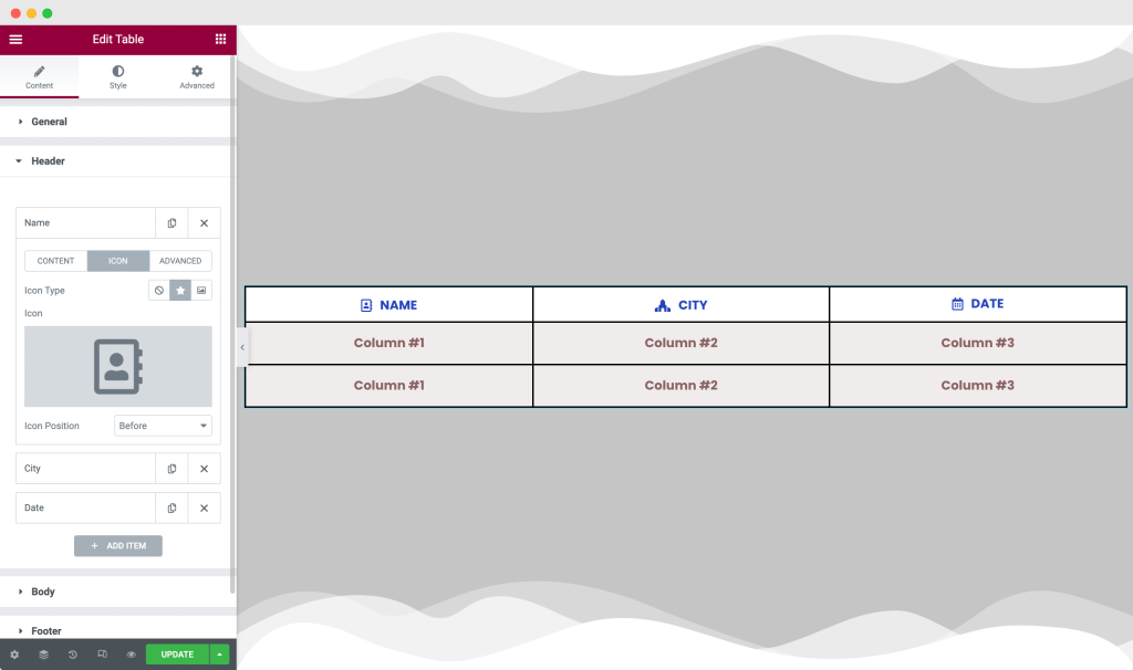
A Table Header is a row used at the top of a table to label each column. The table header is defined with the <th> tag. For example, in the below table, we have a Table Header with 3 columns - Name, City, and Date.
Add Table Header#
With PowerPack, it is really simple to add a Table Header to your Table. Please follow the below-mentioned steps to do so:
- Add PowerPack Table Widget to your Elementor page.
- Head over to the Header section in the Content tab of the Table widget.
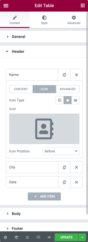
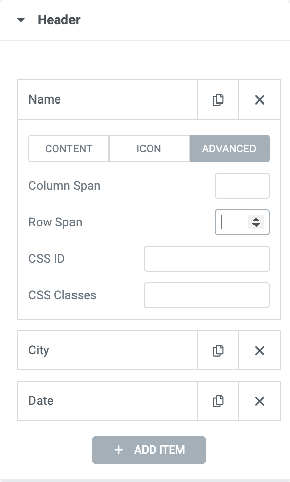
- By default, 3 headers will be added in the Header section, so that you can get started without any delays. You can further add or delete Headers depending on the number of columns you want in your Table.
Customize Table Header#
Once you have added the Table Header, you can customize it with 3 options available:
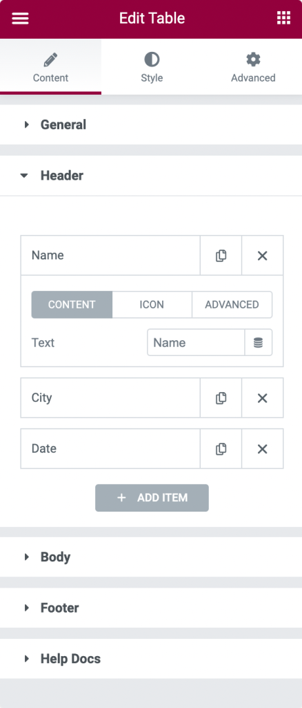
- Content: Using this option, you can add a "Title" to your Table Header.
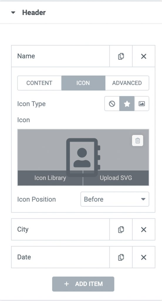
- Icon: The "Icon" option allows you to add an icon or image before or after the Header title. You can either choose an icon from the list of predefined icons or upload your own SVG icon.
- Advanced: The Advanced option comes with 4 sub-options:
- Column Span: Column Span gives you an option to merge 2 or columns together into a single cell. By default, the value of Column Span is set as "1".
- Row Span: Row Span allows you to merge 2 or more rows together into a single cell. The default value of Row Span is set as "1".
- CSS ID and CSS Classes: You can enter your custom CSS ID and Class here, and then use it to style the particular Table Header as per your requirement.
This was a detailed guide on how you can Table Header in the Table Widget of PowerPack Addons for Elementor.