Using PowerPack Woo - Add To Cart widget for Elementor, you can display the Add to Cart button on any page of your Elementor website. This allows your users to add products to the cart in just one click.
Let’s take a closer look at the Elementor Woo - Add To Cart widget by PowerPack.
Content Tab#
The Content Tab of the Woo - Add To Cart widget consists of 2 sections:
- Product
- Button
Let us now go over each of these sections in more detail.
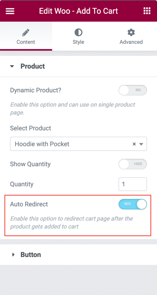
Product Section in Woo - Add To Cart Widget#
The Product section contains various options to nicely set up your Add to Cart button. Let us go through each of the options below:
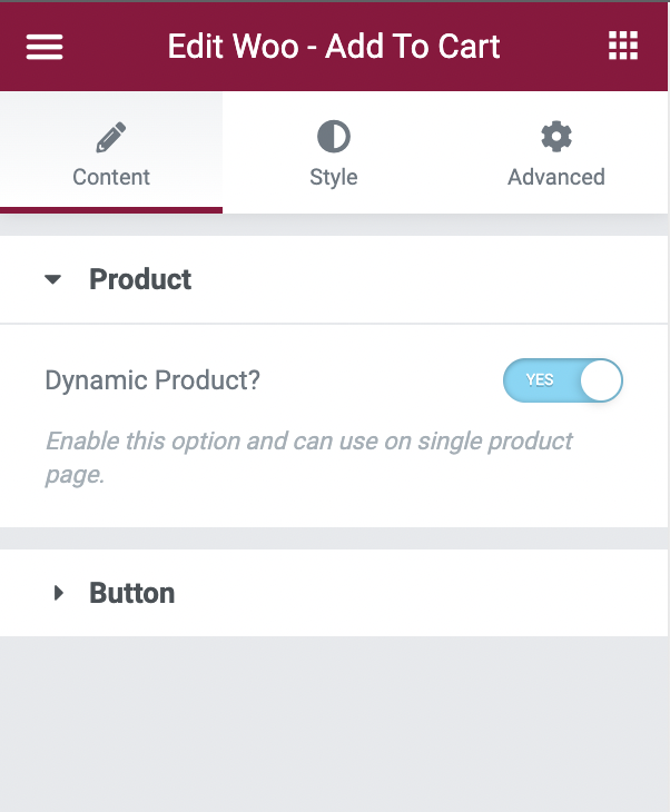
- Dynamic Product: If you are using the Woo - Add to Cart widget on a single product page, then you can enable the "Dynamic Product" option to automatically add that particular product to cart.
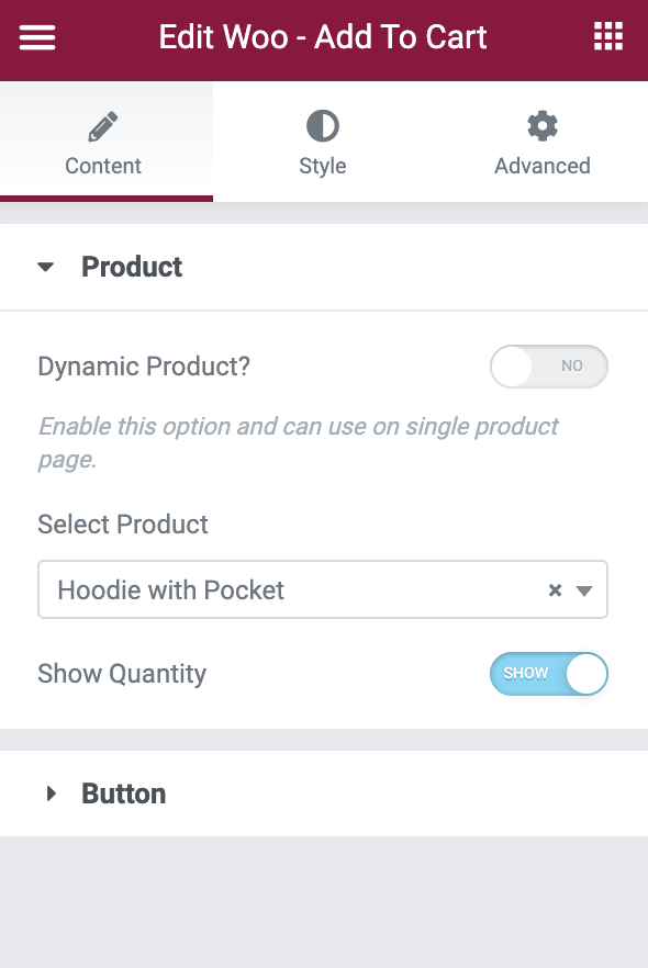
- Select Product: This option can be used when the "Dynamic Product" is disabled. You can use this option to select any product and that product will be linked to the Add to Cart button. Now, whenever someone clicks on the "Add to Cart" button, this product will be added to the cart.
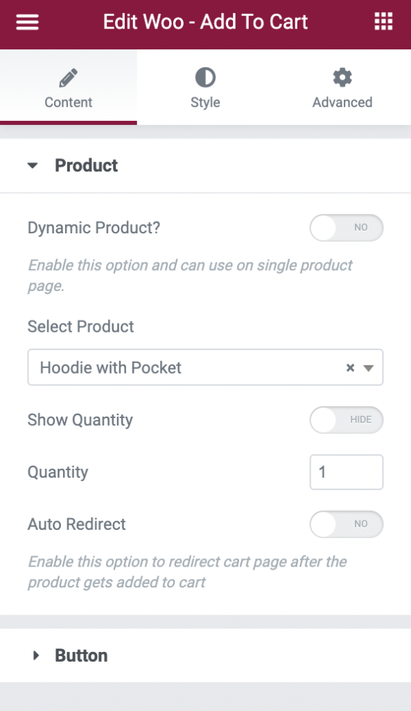
- Show Quantity: As the name suggests, this option displays the quantity field beside the "Add to Cart" button. This allows your users to add as many quantities of products as they wish.
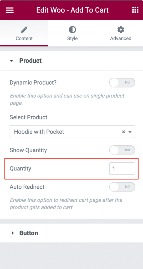
- Quantity: If the "Show Quantity" option is disabled, then you can use the "Quantity" field in the Product section to specifically define the quantity of products that will be added to cart when your audience clicks on "Add to Cart".
- Auto Redirect: Post enabling this option, your users will be redirected to the cart page of your site automatically once they add the product to the cart.
This was all about the Product section in the Content tab of the Woo - Add to Cart widget. The next section in the Content tab is Button, so let's go ahead and understand how that works.
Button Section in Woo - Add To Cart Widget#
The Button section consists of several options that can be used to customize the Woo - Add to Cart widget. Let's go over these options one by one.
- Text: This option can be used to replace the default "Add to Cart" text on the Woo - Add to Cart widget.
- Alignment: As the name specifies, this can be used to align the Add to Cart Button to the left, right, or center of the page.
- Size: If you want to change the size of the Add to Cart Button, then this option could be really useful.
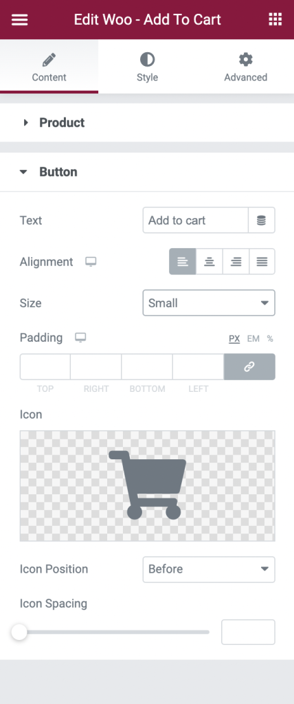
- Padding: Apply padding to your Cart button with this setting available in the Button section.
- Icon, Icon Position, and Icon Spacing: The Woo - Add to Cart button displays an icon beside the "Add to Cart" text. You can select the icon from the icon library or choose an SVG file as per your wish, set the icon position before or after the text, and choose the spacing between the icon and text using these options available in the Button section of the Woo - Add to Cart widget.
This was all about the options available in the Content tab of the Woo - Add to Cart widget. Now, let's see how we can best style the widget using the styling options available in the Style tab.
Style Tab#
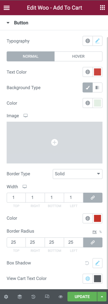
We can use the various typography options available in the Woo - Add to Cart widget to set the font size, font family, and font-weight of the Add to Cart text.
Next, we can style the text color, background color, and border properties for the Add to Cart button in Normal and Hover modes. Further, we have the option to set the color of the "View Cart" text that appears when your users have added the product to the cart. We can set different "View Cart" text colors for Normal and Hover modes.
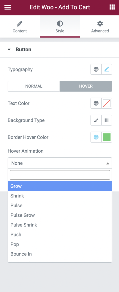
Finally, Woo - Add to Cart widget gives you an option to set the Hover Animation for the Cart button. There are various animation properties available such as Grow, Shrink, Pulse, Bounce, etc as visible in the below screenshot.
This was the detailed overview of the Woo - Add to Cart Widget of PowerPack Addons for Elementor.