PowerPack Hotspot Widget for Elementor allows you to add interactive hotspots to images on your website. With this widget, you can create engaging and informative experiences for your users by placing hotspots on an image that can display tooltips when hovered or clicked.
How to Use the Hotspot Widget#
To get started, simply drag and drop the Hotspot Widget from the Elementor panel onto your page. Once the widget is placed on your page, you'll notice two main tabs for customization and styling: Content and Style.
Content Tab of the Hotspot Widget#
Content Tab contains all the essential options for customizing the hotspots on your image. It includes three main sections:
- Image
- Hotspot
- Tooltip
Image #
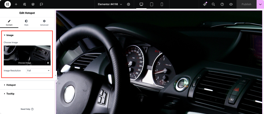
This section allows you to set the image on which you want to place your hotspots.
- Choose Image: Select the image you want to use for the hotspot interaction.
- Image Resolution: Choose the image resolution for optimal display on your website.
Hotspot#
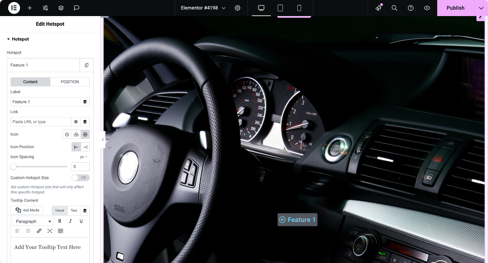
In this section, you can customize each hotspot you place on the image.
- Hotspot: Item#1 [Click this tab to open the settings for each individual hotspot.]
- Content
- Label: Set the label that will appear when the user hovers or clicks on the hotspot.
- Link: Add a link to the hotspot.
- Icon: Choose an icon to appear next to the hotspot.
- Custom Hotspot Size: Enable this option to set a custom size for the hotspot that will only affect this specific hotspot.
- Tooltip Content: Enter the content that will appear in the tooltip when the user interacts with the hotspot.
- Position
- Horizontal Orientation: Choose whether the tooltip will appear to the Left or Right of the hotspot.
- Vertical Orientation: Choose whether the tooltip will appear Top or Bottom of the hotspot.
- Offset: Adjust the tooltip's position using offset values to fine-tune its placement.
- +ADD ITEM: Use this button to add more hotspots to your image.
- Animation: Choose an animation for your hotspot. You can select from the following options:
- Soft Beat
- Expand
- Overlay
- None
- Sequenced Animation: If enabled, you can set the Sequence Duration in milliseconds for the animation to appear in a sequence.
Tooltip#
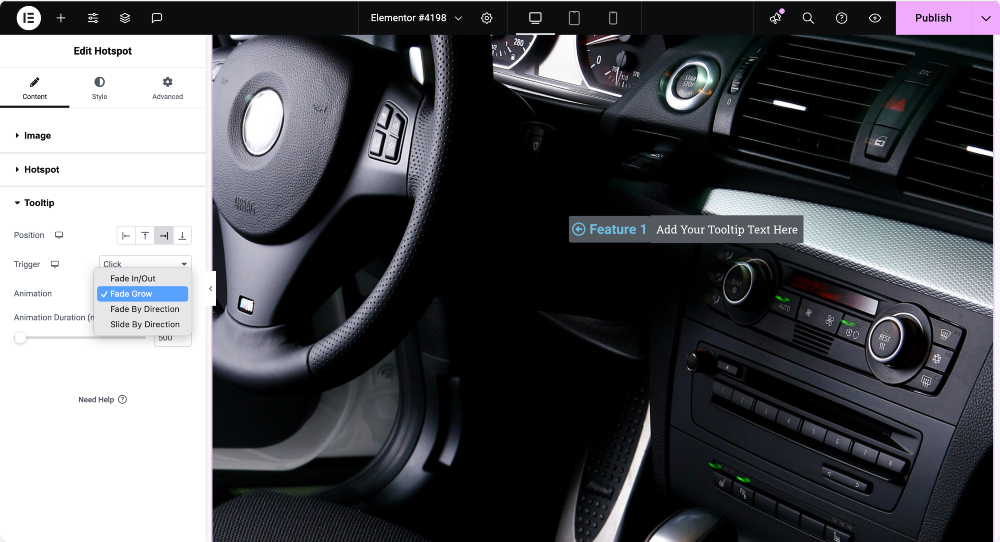
Here, you can control the tooltip's behavior when interacting with the hotspot.
- Position: Choose the tooltip's position (Left, Top, Right, or Bottom).
- Trigger: Choose how the tooltip will appear—on Hover, Click, or None.
- Animation: Select the animation for the tooltip. The available options include:
- Fade In/Out
- Fade Grow
- Fade By Direction
- Slide By Direction
Style Tab of the Hotspot Widget#
Style Tab gives you control over the visual appearance of the hotspot widget. It is divided into three sections: Image, Hotspot, and Tooltip.
Image#
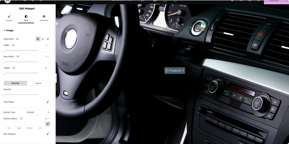
In the Image section, you can adjust how the image looks on your page.
- Alignment: Set the alignment of the image (Start, Center, or End).
- Width: Define the width of the image.
- Max Width: Set the maximum width the image can take.
- Height: Define the height of the image.
- Opacity: Adjust the opacity to make the image more transparent.
- CSS Filters: Apply CSS filters to the image for effects like blur, contrast, brightness, etc.
- Border Type: Choose a border style for the image (Solid, Dashed, Dotted, etc.).
- Border Radius: Set the radius for rounded corners of the image.
- Box Shadow: Add a shadow effect around the image to make it stand out.
Hotspot#
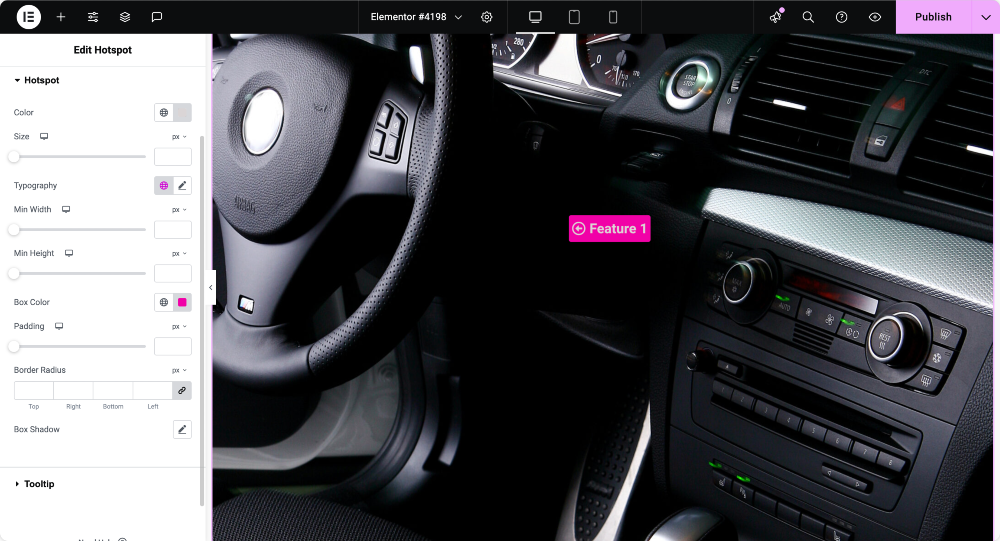
In the Hotspot section, you can style the appearance of the individual hotspots.
- Color: Set the color of the hotspot.
- Size: Define the size of the hotspot.
- Typography: Control the font style, weight, and size for any text within the hotspot.
- Min Width: Define a minimum width for the hotspot.
- Min Height: Define a minimum height for the hotspot.
- Box Color: Choose a color for the box that surrounds the hotspot.
- Padding: Adjust the padding inside the hotspot box.
- Border Radius: Set the radius for rounded corners around the hotspot.
- Box Shadow: Add shadow effect to the hotspot to make it pop.
Tooltip#
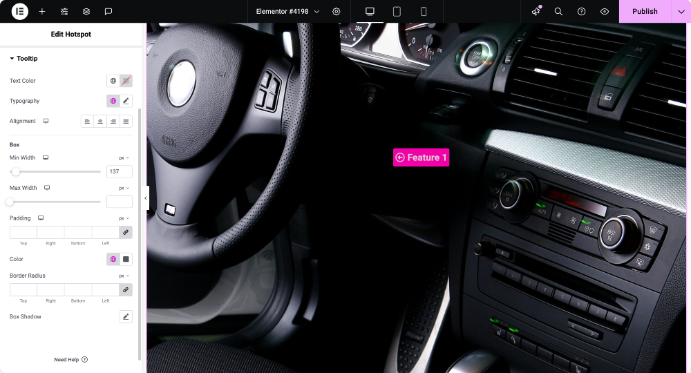
In the Tooltip section, you can adjust the style of the tooltip that appears when users interact with the hotspot.
- Text Color: Set color of the text inside the tooltip.
- Typography: Control the font style, size, and weight for the tooltip content.
- Alignment: Set the alignment of the tooltip content (Left, Center, Right).
Box Settings for Tooltip#
- Min Width: Define the minimum width for the tooltip box.
- Max Width: Define the maximum width for the tooltip box.
- Padding: Adjust the padding inside the tooltip box.
- Color: Choose background color for the tooltip box.
- Border Radius: Define the border radius for rounded corners around the tooltip box.
- Box Shadow: Add a shadow effect around the tooltip box.
We hope this overview helps you get started with the Hotspot widget.