Image comparison widget allows you to compare 2 images with a slider on the page which the user can move to reveal one picture and, at the same time, hide the other one.
Content Tab#
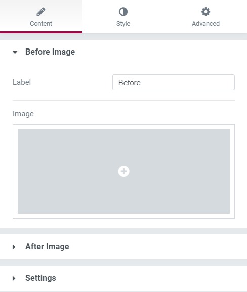
The Content tab is where you get to choose the pictures that you want in your image comparison. You can even change the text of the image. In the settings subsection, you can change what action will move the slider and change the slider direction from vertical to horizontal as well.

Style Tab#
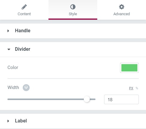
Here you can do all the designing settings, such as you can change the handle's appearance and you can change the layout of your text as well. Apart from this, you can change the divider's width as well as its color.

Advanced Tab#
This Tab has five subsections-
- Element Style - Here, you can change the margin, padding, z-index, and entrance animation and add CSS ID and classes.
- Background - Here, you can set the background as classic or gradient and can even add the hover effects.
- Border - Here, the properties related to the border are defined as border type, radius, box-shadow, and hover effects.
- Responsive - Here, you set the responsiveness of the different devices to be active or not.
- Custom CSS - This lets you add CSS code to the widget, and you can see it render live right in the editor.