Flip Box is a very eye-catching element that can fit anywhere on any website, and it helps in displaying information to the user. It works as an infobox, but when a user hovers over it, it triggers an animation, and another piece of information can be displayed on the backside. There are many alterations that you can do to the flip box.
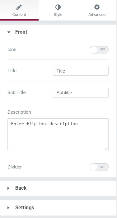
Content Tab#
Here you can change the contents of the front as well as the backside of the box, such as Title, Subtitle, Icon, Description, Button, and Divider. Under the Effects subsection, you can change the animation effect and direction of the animation, height as well as duration of the animation.
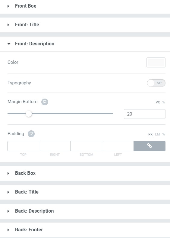
Style Tab#
Here you can make the typography as well as other styling changes such as border, background, alignment, spacing color, and button changes to the Box, title, description, and the footer of both the front and back sides of the box.
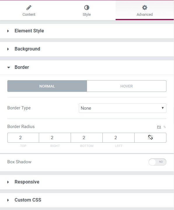
Advanced Tab#
This Tab has five subsections-
- Element Style - Here, you can change the margin, padding, z-index, and entrance animation and add CSS ID and classes.
- Background - Here, you can set the background as classic or gradient and can even add the hover effects.
- Border - Here, the properties related to the border are defined as border type, radius, box-shadow, and hover effects.
- Responsive - Here, you set the responsiveness of the different devices to be active or not.
- Custom CSS - This lets you add CSS code to the widget, and you can see it render live right in the editor.