The counter widget is used to show a number with emphasis on how sizeable it is. This widget is most efficiently used to display sales records, customers, subscriptions, visitors, $$ amounts, and any numeric figure that needs to be exhibited.
Content Tab#
The content tab allows the user to change the icon, counter value, value prefix, and suffix. A proper title to the counter can be given via this section. If the user wants, they can enable the divider and can change the counter speed as well.
Style Tab#
Regarding the styling, you can change the alignment, color, border, padding, and margins of the counter. You can change the icon's style layout as well.
Advanced Tab#
This Tab has five subsections-
- Element Style - Here, you can change the margin, padding, z-index, and entrance animation and add CSS ID and classes.
- Background - Here, you can set the background as classic or gradient and can even add the hover effects.
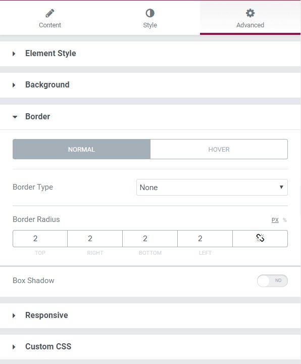
- Border - Here, the properties related to the border are defined as border type, radius, box-shadow, and hover effects.
- Responsive - Here you set the responsiveness of the different devices to be active or not.
- Custom CSS - This lets you add CSS code to the widget, and you can see it render live right in the editor.