PowerPack Elementor's Content Ticker widget can be used to display important updates, announcements, latest posts, and sale discounts on your website. Have a look at the demo of the Content Ticker widget here. Now, let us go through the detailed overview of Content Ticker widget in detail.
Firstly, drag and drop the Content Ticker widget on the page that you are editing with Elementor. The Content Ticker widget has customization and styling options in the Elementor Editor’s Content and Style Tab.
Content Tab#
The Content Tab of Content Ticker widget consists of 5 sections:
- General
- Post Meta
- Query
- Header
- Ticker Settings
Now, let us go through each of these sections in detail.
General#
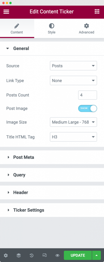
The General section contains various options to set up your Content Ticker nicely. Let us go through each of the options below:
- Source: Here, you can choose the source from where the content of the Content Ticker widget will be fetched. You can either choose to display content from Posts or choose to add Custom Content for the Ticker.
- Link Type: In this tab, you can link either Title or Image or both Title + Image to the original URL of the post that is displayed in the Ticker.
- Posts Count: As the name suggests, you can choose the number of posts that you want to display here.
- Post Image: In case you want to display the featured image of the post, then you will have to enable this option.
- Image Size: If you have enabled the Post Image, then you can choose the size of the image using this tab.
- Title HTML Tag: Here you can choose the HTML tag of your post title that is displayed in the ticker.
Post Meta#
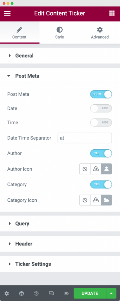
If you have chosen the source as "Posts", then Content Ticker gives you the option to display "Post Meta". When you enable the option, you can choose to display the date, time at which the post was published along with the Author name and Category of the post. You also have the option to choose an icon for the Author and Category terms.
Query#
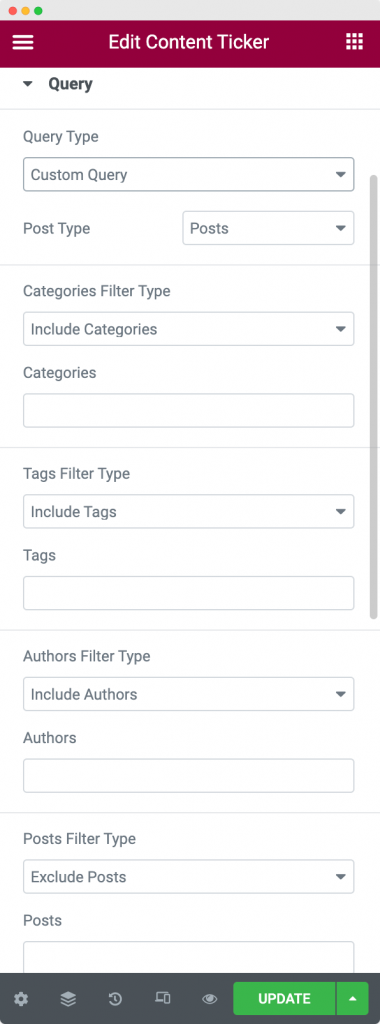
Now that you have selected the source as "Posts", you further have the option to display posts from either Main Query or a Custom Query using the Query Type tab. The Main Query fetches all the posts having Post Type as "Posts" whereas using Custom Query, you can choose to display any Custom Post Type in the Content Ticker.
If you've selected the Query Type as "Custom Query", then in the next step you can choose the "Post Type". WordPress consists of multiple post types such as Pages, Posts, Products, and any other Custom Post Type that you might have created seperately. You can choose any one of these post types in the "Post Type" option.
Once that is done, you can further filter the posts by Categories, Tags, and Authors. You can also exclude or include Posts from the filter by defining the Post ID. In the next step, you further filter the posts by choosing the dates on which the posts were published. You can choose between Past Day, Past Week, Past Quarter, Past Month, Past Year, or you can define your custom date from the "Date" tab.
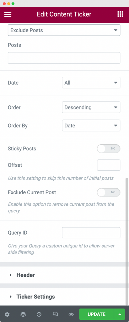
Now that you've filtered out the posts that you want to display in the Content Ticker, you can order the Posts in Ascending or Descending order. You can order the posts by various parameters defined in the WordPress Handbook. Have a look at all the parameters here.
Header#
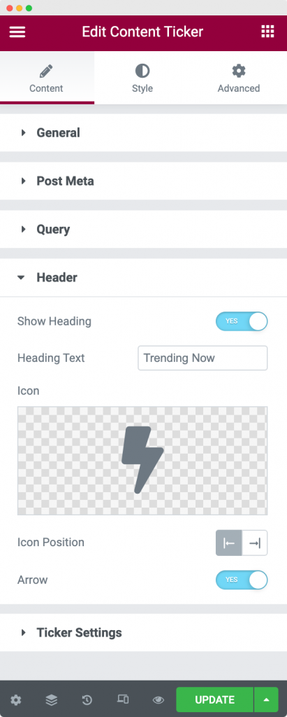
Here, you can choose if you want to display a Heading for your Content Ticker or not. If you enable the Header option, you can further customize the Header Text, Header Icon, position of the icon, and arrow for the Header.
Ticker Settings#
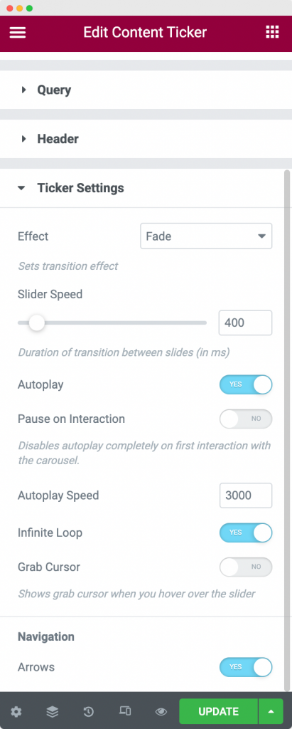
Ticker Settings section consists of various options that we'll discuss below:
- Effect: Here, you can choose the animation effect that occurs when you switch the post from one to another. There are 2 types of Effects available: Slide and Fade.
- Slider Speed: Here, you can define the speed of the Content Ticker slider.
- Autoplay: You can choose to enable or disable the autoplay of the Content Ticker slider here.
- Pause on Interaction: If you enable this option, the Content Ticker slider will be paused when you hover over it.
- Autoplay Speed: In case you enabled the Content Ticker Slider autoplay, then you can define the speed of the autoplay here.
- Infinite Loop: If you want the Content Ticker Slider to keep sliding in a loop forever, then you can use this option.
- Grab Cursor: As the name suggests, this option shows grab cursor when you hover over the slider.
- Arrows: If you want to enable the navigation for the slider, then you can enable the arrows.
This was all about the Content Tab of the Content Ticker widget. Now, let us go through the Style Tab of the Content Ticker widget.
Style Tab#
There are 4 sections in the Style tab of the Content Ticker Widget:
- Header
- Content
- Image
- Arrows
Let us go through each of the sections one by one.
Header#
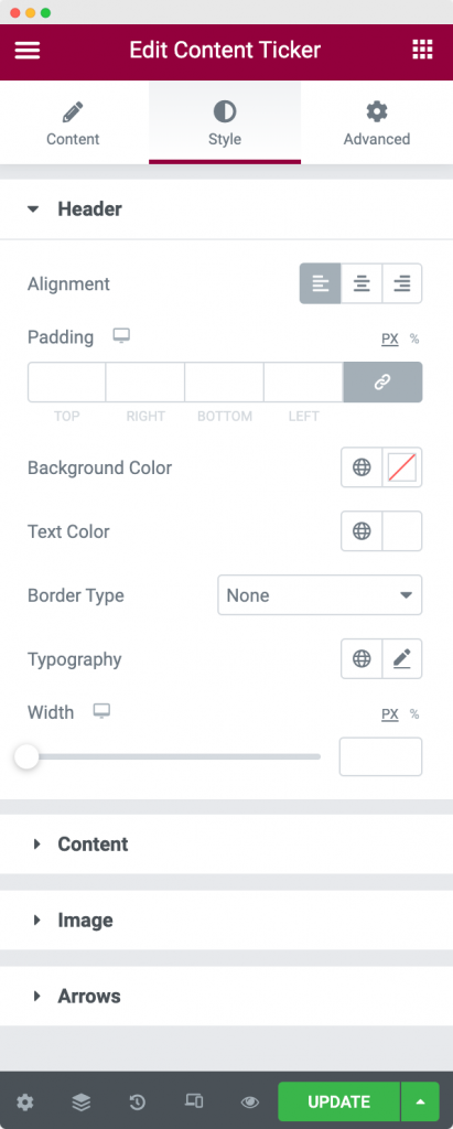
As the name suggests, this section is used to style the "Header" of the Content Ticker widget. You can align the header to left, right, or center, add paddings, change background colors and text color of the header, apply border properties and play with the width and typography of the Header using the styling options available.
Content#
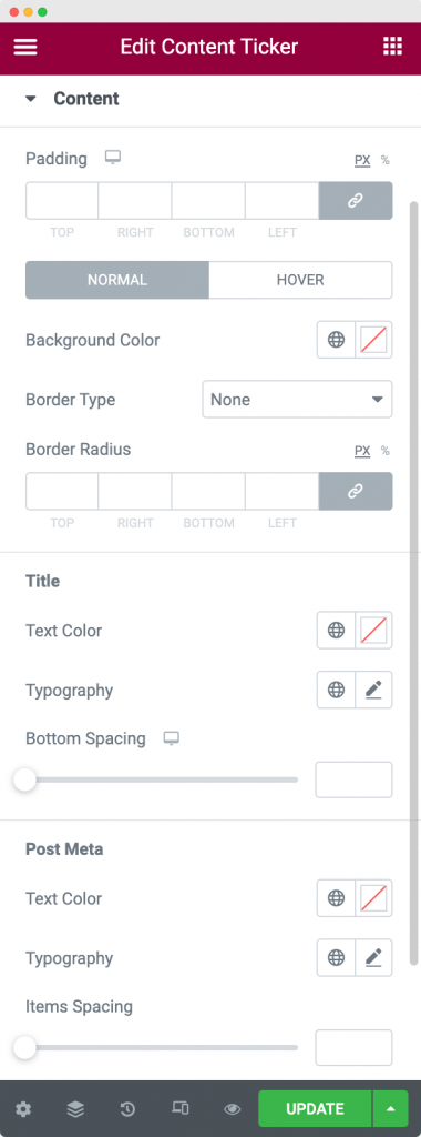
The Content Section is used to style the content in the Content Ticker. You can apply different text colors, typography to the Post Titles and Post Meta and add spacing between Post Titles and Post Meta. You can further apply background color to the Ticker in Normal and Hover modes. Finally, you can set the border type, border width, border radius, and border color for the Content section.
Image#
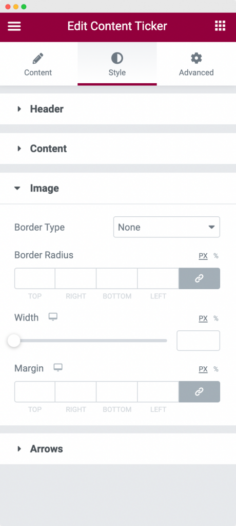
In the Image Section of Style tab, you can set the width of the Image, apply border properties to the image, and add margins around the image in order to make it look much attractive.
Arrows#
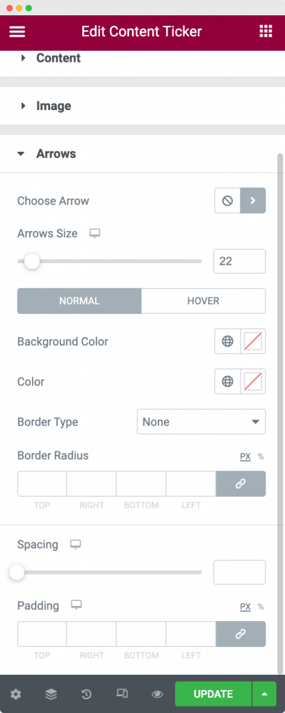
The Arrows Section styling is used to style the arrow pagination that appears beside the Ticker content. You can choose the Arrow icon from the Font Awesome library, define arrow size, set background color, normal color, and border properties for the Normal and Hover modes of the Arrows. You can further set the spacing between the arrows and padding around them.
This was the detailed overview of Content Ticker widget available in PowerPack Addons for Elementor. Feel free to get in touch with us in case of any queries or concerns. 🙂