Advanced Posts Widget by PowerPack allows you to display blog posts in beautiful and engaging layouts without writing any code. You can showcase recent posts, featured articles, custom post types, or categorized content using Grid, Masonry, or Carousel layouts.
The widget also includes advanced features such as filters, search functionality, pagination, and extensive styling controls, making it easy to create a fully customized blog section for your website.
Getting Started: Using the Advanced Posts Widget#
Follow these steps to add the Advanced Posts Widget to your page:
- Open the page where you want to add the widget in Elementor.
- In the Elementor widgets panel, search for Advanced Posts.
- Drag and drop the Advanced Posts Widget onto your page.
- Once added, you will see two tabs in the left panel:
- Content
- Style
Content Tab of the Advanced Posts Widget#
Content tab includes the following sections:
- Layout
- Query
- Filters (available for Grid and Masonry layouts)
- Search Form (available for Grid and Masonry layouts)
- Carousel Options (available for Carousel layout)
- Post Terms
- Image
- Title
- Content
- Meta
- Read More Button
- Pagination
- Order
Let's look at each section in detail.
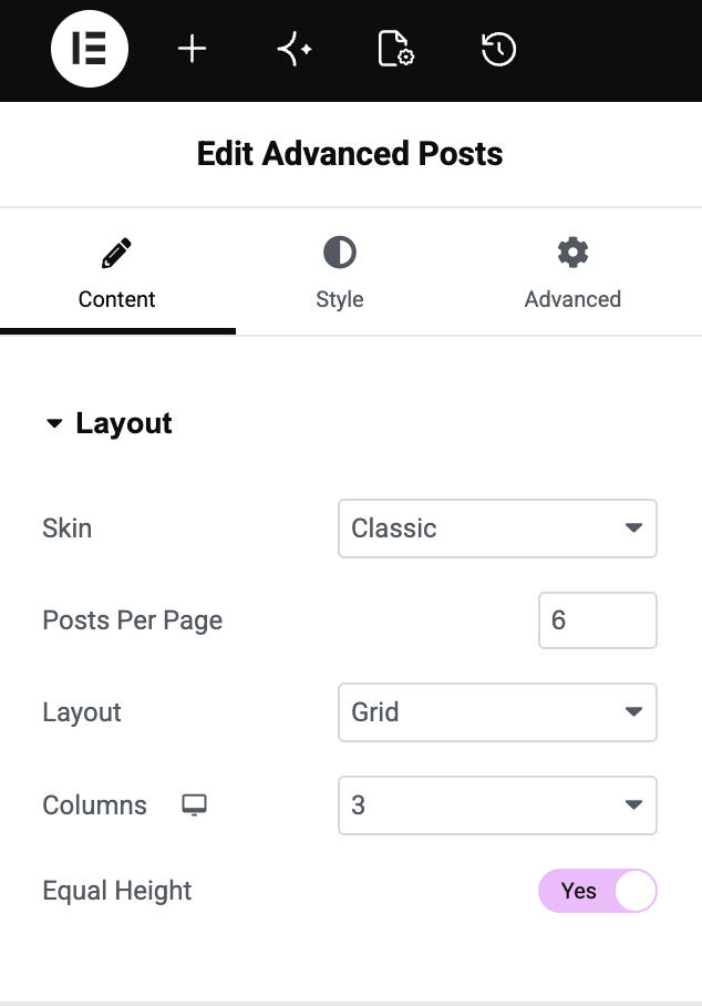
Layout#
Layout section helps you define how posts are displayed on your page.
- Skin: Choose from multiple pre-designed skin layouts to instantly change the appearance of your posts. PowerPack offers several beautifully designed skins such as Classic, Card, Checkerboard, Event and more to help you create unique blog layouts.
- Posts Per Page: Set the number of posts you want to display on a single page.
- Layout: Select a layout style for your posts: Grid, Masonry, and Carousel
- Columns: Choose the number of columns to display posts.
- Equal Height: Enable this option to make all post boxes in a row appear at equal heights for a cleaner, more consistent layout. Learn here: How to Enable Equal Height and Full Width for Posts in Elementor?
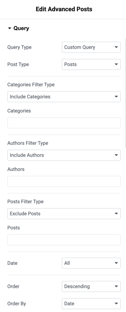
Query#
Query section controls which posts are displayed in the widget.
- Query Type: Choose one of the following options: Main Query & Custom Query
- Main Query: If you select Main Query, you can add a Query ID to display content from a specific query.
- Custom Query: Custom Query gives you complete control over displayed posts.
- Post Type: Select the post type you want to display, such as Posts, Pages, or any custom post type.
- Include / Exclude: Include or exclude content based on:
- Categories
- Tags
- Authors
- Specific Posts
- Date: Choose date-related filtering options.
- Order: Display posts in:
- Ascending order
- Descending order
- Order By: Sort posts based on:
- Date
- Last Modified Date
- Random
- Comment Count
- Title
- Post ID
- Author
- Menu Order
- Relevance
- Sticky Posts: Enable this option to display sticky posts in the widget.
- Offset: Skip a specified number of posts from the beginning of the query.
- Exclude Current Post: Enable this option to hide the currently viewed post from the listing.
- Nothing Found Message: Display a custom message when no posts match your query settings.
- Search Form: You can also enable a Search Form to help visitors search for other posts if no matching content is found.
Filters#
Filters make it easy for visitors to browse posts by category or tag.
- Show Filters: Enable this option to display filter buttons above posts.
- Filter By: Choose filter source: Categories & Tags
- Order By: Arrange filter terms by: Name, Term ID, Post Count, Slug, Description, Parent Term, Menu Order
- Order: Display filters in ascending or descending order.
- "All" Filter Label: Customize the label used for the "All" filter button.
- Default Active Filter: Enable this option to set a default active filter when the page loads.
- Show Post Count: Display the number of posts available under each filter.
- Dropdown Filters: Convert filter buttons into a dropdown menu for better responsiveness on smaller screens.
- Alignment: Align filter buttons to: Left, Center, Right
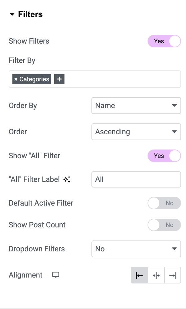
Note: Filters are available only when using Grid or Masonry layouts.
Search Form#
Search Form allows visitors to quickly search posts displayed in the widget.
- Show Search Form: Enable this option to display the search field.
- Search Action On: Choose how search should work: Instant Search or Button Click.
- Placeholder: Enter custom placeholder text for the search field.
- Button Type: Choose a button type: Text or Icon
- Icon / Text: Depending on the selected button type, choose an icon or enter custom text for the search button.
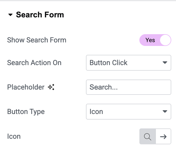
Note: Search Form is available only for Grid and Masonry layouts.
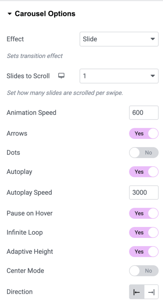
Carousel Options#
Carousel Options are available when the Carousel layout is selected.
- Animation Speed: Control slide transition speed.
- Arrows: Display navigation arrows for moving between slides.
- Dots: Show pagination dots below the carousel.
- Autoplay: Automatically rotate through posts.
- Autoplay Speed: Control the delay between automatic slide transitions.
- Pause on Hover: Pause autoplay when visitors hover over the carousel.
- Infinite Loop: Continuously loop through slides.
- Adaptive Height: Automatically adjust carousel height based on content.
- Center Mode: Highlight the active slide by positioning it in the center.
- Direction: Select carousel direction.
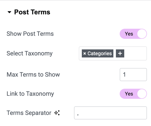
Post Terms#
Post Terms allow you to display categories or tags associated with each post.
- Show Post Terms: Enable this option to display post categories or tags.
- Link to Taxonomy: Make terms clickable and redirect visitors to taxonomy archive pages.
- Taxonomy: Choose to display: Categories or Tags
- Maximum Terms: Limit the number of terms displayed for each post.
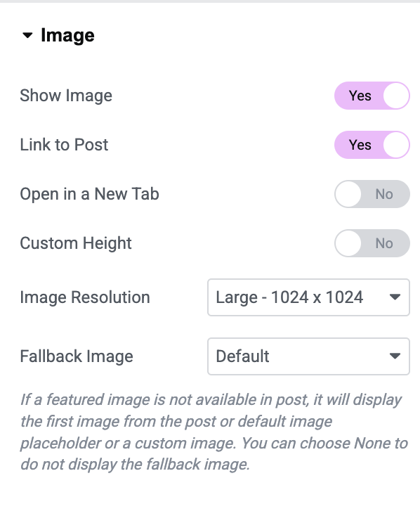
Image#
Image section controls featured images displayed for posts.
- Show Image: Enable this option to display featured images.
- Link to Post: Make images clickable.
- Open in New Tab: Open linked posts in a new browser tab.
- Custom Height: Set a consistent height for all featured images.
- Image Size: Select image size.
- Image Location: Choose if the image should be displayed inside or outside the content container.
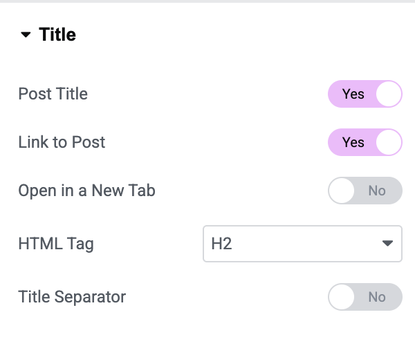
Title#
Customize how post titles appear.
- Show Title: Enable or disable post titles.
- Link to Post: Make post titles clickable.
- Open in New Tab: Open linked posts in a new browser tab.
- HTML Tag: Select the HTML tag for the title.
- Title Separator: Enable this option to display a separator below the title.
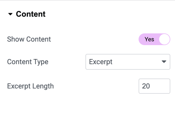
Content#
Display excerpts or content from posts.
- Show Content: Enable this option to display post content.
- Content Type: Select content source.
- Content Length: Control the number of words displayed in the excerpt.
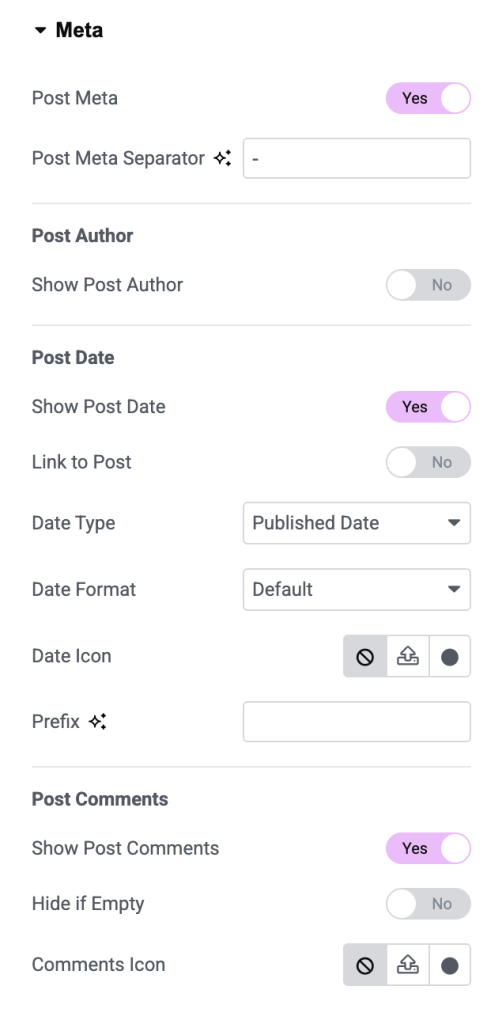
Meta#
Meta section allows you to display additional post information.
- Show Post Author: Display author's name.
- Link to Author: Link author's name to the author archive page.
- Show Post Date: Display post publication date.
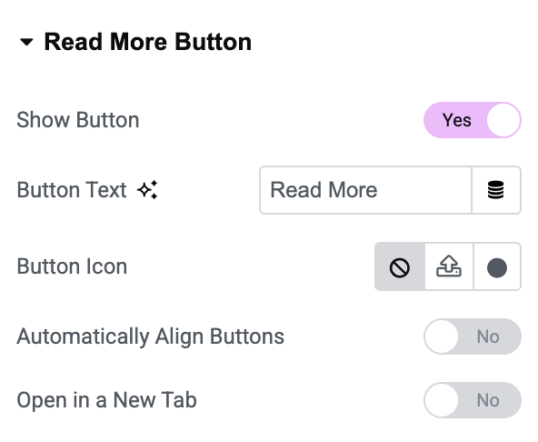
Read More Button#
Add a call-to-action button below each post.
- Button Text: Customize button label.
- Button Icon: Add an icon to the button.
- Icon Position: Display icon before or after button text.
- Open in New Tab: Open posts in a new browser tab when the button is clicked.
Pagination [For Grid Layout]#
Pagination helps visitors navigate through multiple pages of posts.
Depending on the selected layout, you can choose different pagination styles to improve user experience and make browsing easier.
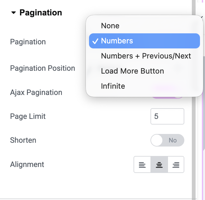
Checkout: How to Enable Infinite Load Pagination for Posts?
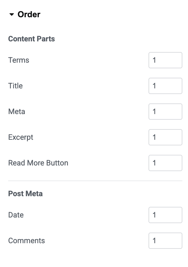
Order#
Order section allows you to rearrange content elements displayed inside each post.
Content Parts: Reorder:
- Terms
- Title
- Meta
- Excerpt
- Read More Button
Post Meta: Reorder:
- Author
- Date
Style Tab of the Advanced Posts Widget#
Style tab contains the following sections:
- Layout
- Box
- Content Container
- Image
- Post Terms
- Title
- Content
- Meta
- Read More Button
- Arrows
- Dots
Let's explore each styling section.
Layout#
Use this section to adjust spacing between columns and rows to create a balanced and organized layout.
Box#
Box section controls the overall appearance of each post container. Available Styling Options:
- Background Color
- Border Type
- Border Width
- Border Color
- Border Radius
- Padding
- Box Shadow
You can choose from border styles such as: Solid, Double, Dashed, Dotted, Groove.
Content Container#
Customize the content area inside each post box. Available Options:
- Alignment
- Background Color
- Border Radius
- Padding
Image#
Style featured images displayed in posts. Available Options:
- Border Radius
- Spacing
- CSS Filters
- Hover Transition
CSS Filters: Apply image effects such as:
- Blur
- Brightness
- Contrast
- Saturation
- Hue Rotation
Post Terms#
Customize the appearance of categories and tags displayed on posts. Available Options:
- Typography
- Bottom Spacing
- Terms Gap
- Background Color
- Text Color
- Border Radius
- Padding
Title#
Style post titles and separators. Available Options:
- Typography
- Text Color
- Hover Color
- Bottom Spacing
- Separator Alignment
- Separator Width
- Separator Height
- Separator Background Type
Content#
Customize the appearance of post excerpts. Available Options:
- Typography
- Text Color
- Bottom Spacing
Meta#
Style author names, dates, and other meta information. Available Options:
- Text Color
- Link Color
- Link Hover Color
- Typography
- Meta Items Spacing
- Bottom Spacing
Read More Button#
Read More Button section provides extensive styling controls. Available Options:
- Button Size
- Typography
- Text Color
- Background Color
- Border Type
- Border Radius
- Margin
- Padding
- Box Shadow
Button Icon: Adjust the spacing between the icon and the button text.
Arrows#
Arrow styling options are available when the Carousel layout is enabled. Available Options:
- Arrow Size
- Arrow Color
- Arrow Alignment
- Background Color
- Border Type
- Border Radius
- Padding
Dots#
Customize carousel navigation dots. Available Options:
- Position
- Size
- Color
- Spacing
- Border Type
- Border Radius
- Margin
Wrapping Up!#
This is the detailed overview of the Advanced Posts Widget for Elementor available in PowerPack Addons. Using extensive content and styling options available, you can easily create attractive, responsive, and highly customizable post layouts for your website.