The PowerPack Woo - Cart widget for Elementor allows you to customize the default WooCommerce cart page without adding CSS code. The widget has multiple styling options that help you create a cart page that perfectly matches your existing web design and look.
Let's take a closer look at the content and style tab of the Elementor Woo - Cart widget by PowerPack.
Content Tab of the Woo - Cart Widget#
The Content Tab of the Woo - Cart widget consists of 5 sub-section.
- General
- Order Summary
- Coupon
- Totals
- Additional Options
Let's take a look at the sub-section one by one.
General#
The General subsection includes two options:
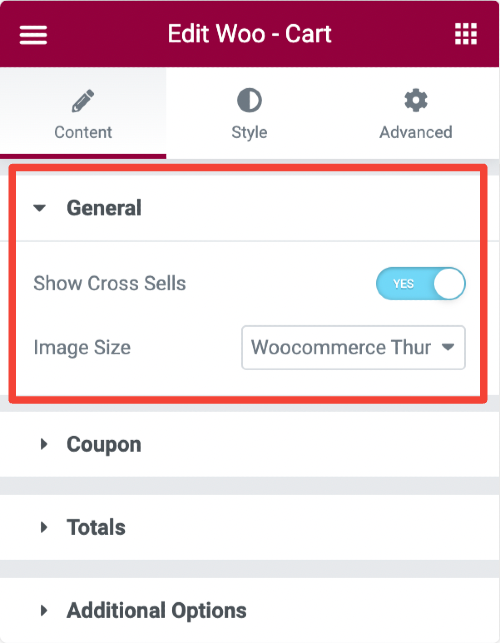
- Show Cross Sells - Enabling this option will display the related products below the cart to buy along with the products added to the cart.
- Image Size - Once you enable the Show Cross Sells feature, you get an option to choose the size of the displayed cross-sells image.
Order Summary#
The Order Summary subsection includes an option that allows you to update your cart button text.
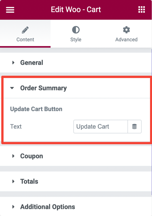
Update Cart Button
- Text - From this, you can change the default text of the Update Cart button.
Coupon#
The Coupon subsection includes the following options:
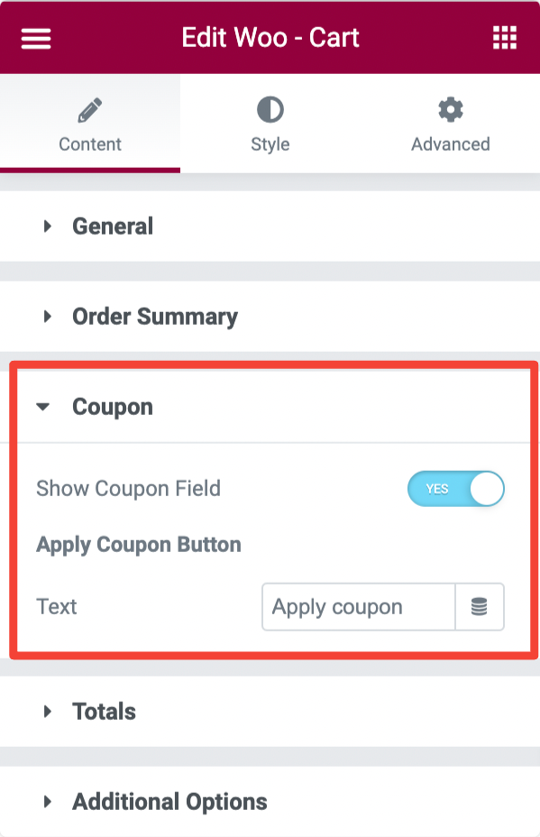
- Show Coupon Field - Enable this option to display a coupon field on the cart page.
Apply Coupon Button
- Text - This option allows you to add the custom text for the Apply Coupon button.
Totals#
In the Totals sub-section, you get the following customization options:
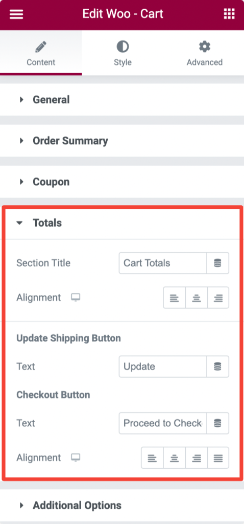
- Section Title - This option allows you to change the default Cart Totals button text.
- Alignment - This will enable you to set the alignment of the text.
Update Shipping Button
- Text - This allows you to add custom text for the Update Shipping button.
Checkout Button
- Text - This option lets you change and add custom text for the Checkout button.
- Alignment - This allows you to set the alignment of the text.
Additional Options#
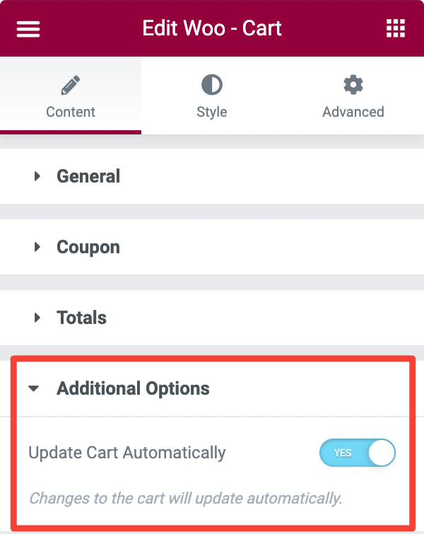
- Update Cart Automatically - Toggle on this option will automatically update changes to the cart.
Style Tab of the Woo - Cart Widget#
There are 8 sections in the style tab of the Woo - Cart Widget:
- Headings
- Sections
- Cart Table
- Update Cart Button
- Coupon
- Cart Totals
- Checkout Button
- Return to Shop Button
- Cross Sells
Let's look at each of these sections in more detail.
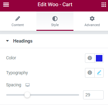
Headings#
- You can change the font, size, and color of the Cart Totals heading in this section.
- Further, you can set the space between the cart totals heading and the table.
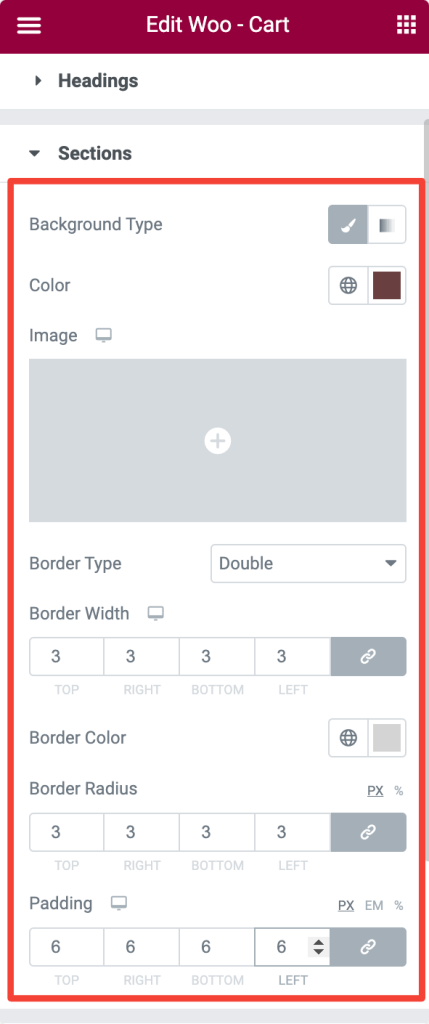
Sections#
- This section allows you to customize the different sections of your cart page simultaneously. Check the styling options in the below image.
Cart Table#
Several styling options are available in the Cart Table section of the Woo - Cart widget. Here you get the flexibility to style every element of the cart table.
Section
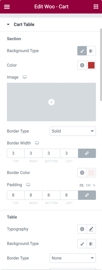
- Here you get multiple styling options to customize the main section of your Cart Table. You can choose the Background Type, set Background Color, add a Border, and further set border Color, Width, and Padding.
Table
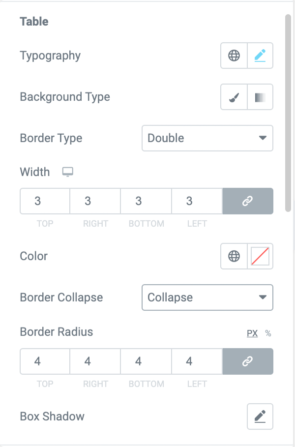
This section allows you to customize the table of your Cart page. You get the following options:
- Typography - Change your text Font, Size, Color, and more.
- Background Type - Choose table background type, Classic or Gradient.
- Border Type - Choose table Border Type from multiple options such as Solid, Double, Dotted, etc.
- Width - This allows you to set the border Width.
- Color - You can choose the border Color from this option.
- Border Collapse - Gives you the option to select Border Collapse type.
- Border Radius - Set Border Radius from this option.
- Box Shadow - Lets you add a Box Shadow to the table.
Table Head
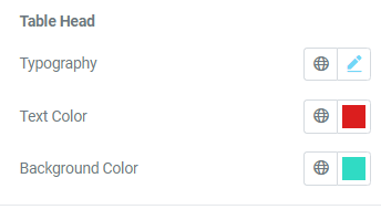
- Next, you get styling options to customize the table head. You can alter typography and change text and background color.
Cart Items
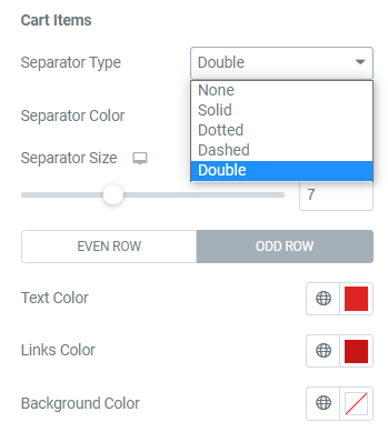
- Add a separator between cart items to make your cart more interactive. You can choose the Separator Type, Colour and Size.
- Further, you can add Text, Links, and Background Color.
Image
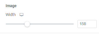
- From this section, you can set the Width of the product images added to the cart.
Quantity Input
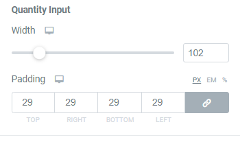
- You can style the Quantity Input element from this option. You get options for the set width and padding.
Product Remove Icon
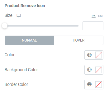
- You can set the size, background color, and border color for the Remove Icon element.
Update Cart Button#
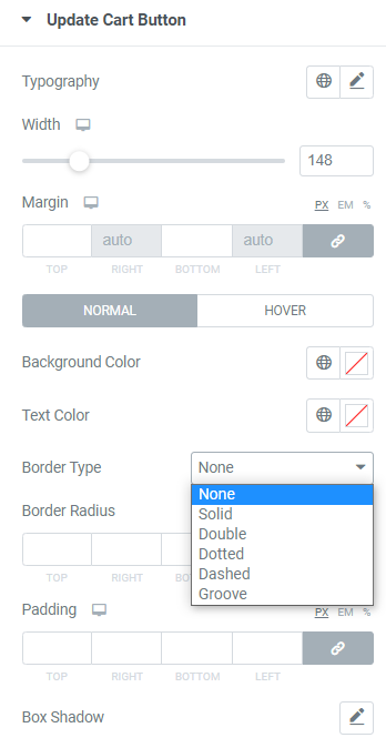
- Set the typography, Width, text color, background color, box shadow, and margin for the Update Cart button.
- It is possible to choose a border type from the list of options given in the below screenshot in the normal mode.
Coupon#
You can customize the Coupon field of your Cart page from this section.
Section
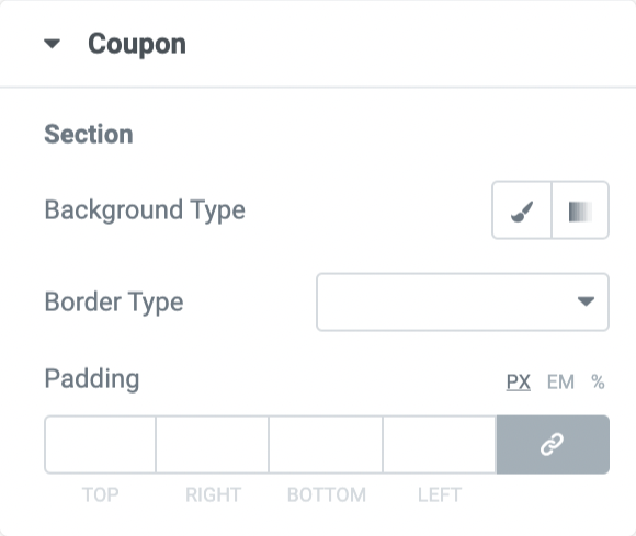
- Background Type - Choose Background Type for your Coupon field.
- Border Type - Select Border Type.
- Padding - Add padding around the Coupon section.
Input
From here, you get options to customize the Input of the coupon code section.
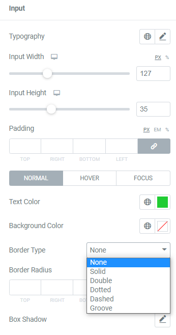
- You can set the typography, width/height, padding, text color, background color, and box shadow for the "Coupon Code."
- In the normal mode, you can choose a border type from the options given in the screenshot below and set the border radius for the coupon code.
Coupon Button
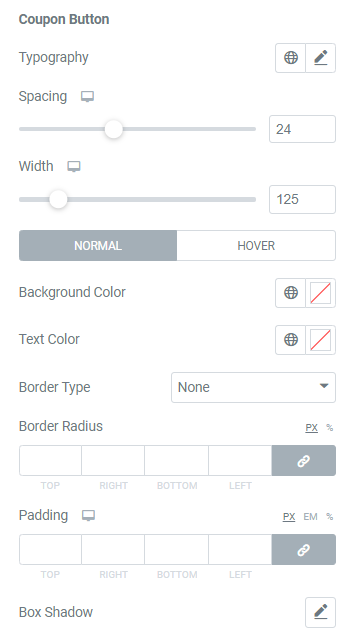
- Set the typography, Width, text color, border color, background color, and box shadow for the "Apply Coupon" button.
- Further, you can set the spacing between the coupon code field and the button. In the normal mode, you can select the border-radius and padding for the button and choose a border type from the list of options such as Solid, Double, Dotted, Dashed, and Groove.
Cart Totals#
There are four options available in this section. Let's go through each option in detail.
Section
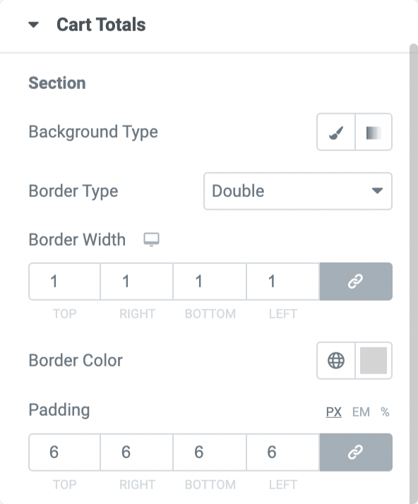
- The background of the Cart Totals' Section can be set as "Classic" or "Gradient," and the box shadow can be added to the box.
- Also, you can set the Width, color, and border radius for the box. You can further choose a border type from the list of options, such as Solid, Double, Dotted, Dashed, and Groove.
Table
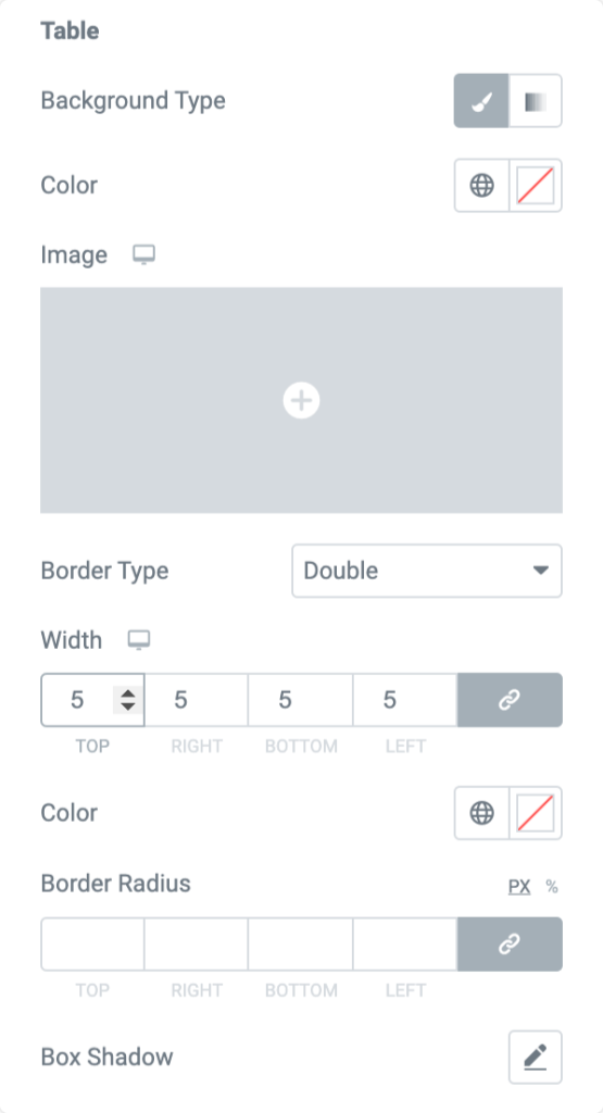
- From the option available in this section, you can choose the Background Type for the table, change the table Color, add Border Type, and many more,
Table Text
- The typography and color can be set for the text of the cart totals table.
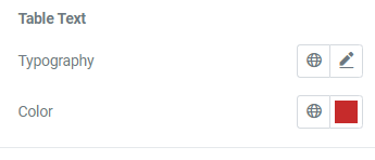
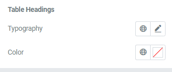
Table Headings
- You can set the typography and color for the cart totals heading.
Checkout Button#
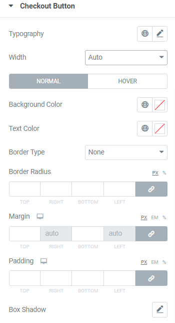
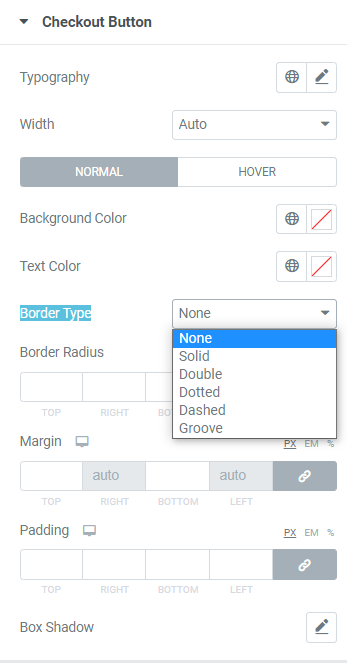
- You can set the typography, auto/full/custom width, background color, border color, text color, and box shadow in this section for the "Proceed to checkout" button.
- You can set the border radius and padding for the checkout button and choose the border type from the list of options shown below.
Return to Shop Button#
This button will be displayed after you complete the checkout.
- You can customize the appearance of the Return to Shop button by setting typography, Width, background color, border color, text color, as well as box-shadow,
- You can also set the border-radius and padding for the button if you want.
Cross Sells#
In this section, you can customize the image of the suggested item under the items added to the cart. Let's take a look at the options available in this section.
Title
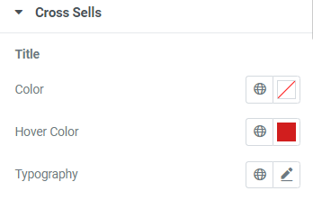
- You can set the typography and the normal and hover color for the title of the cross-sell product.
Price
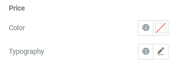
- In this section, you can set the color and typography for the price of the cross-sell product.
Button
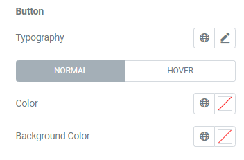
- You can set the typography, color, and background color for the "Add to cart" button below the cross-sell product.
Sale Badge
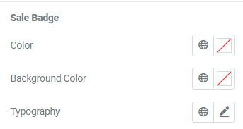
The color, background color, and typography can be set for the "S"le" badge on the cross-sell product.
This was the detailed overview of the Woo - Cart widget available in PowerPack Addons for Elementor.
Hope this helps!