PowerPack Interactive Circle Widget for Elementor lets you create visually engaging circular content layouts without any additional coding.
In this doc, we will walk through all the options and settings available within the Interactive Circle Widget!
How to Use the Interactive Circle Widget#
To get started, drag and drop the Interactive Circle widget onto your Elementor page. Once the widget is placed, you'll find customization and styling options in two tabs in the Elementor editor: the Content Tab and the Style Tab.
Content Tab of the Interactive Circle Widget#
Content tab of the Interactive Circle includes 3 main sections:
- General
- Items or Query
- Additional Options
Let's go through each section one by one.
General#
The first set of options in the General section gives you control over the content source and layout:
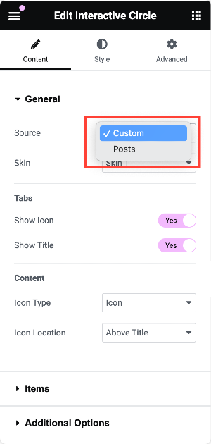
- Source: Choose between:
- Custom: Manually define the content of each tab.
- Posts: Dynamically pull in posts from your WordPress site.
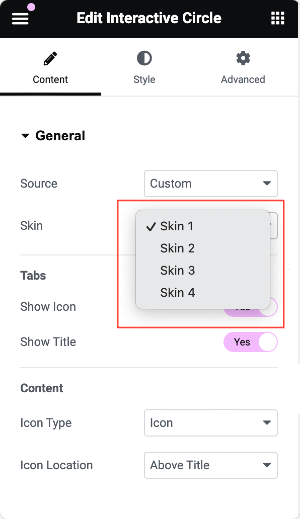
- Skin: Choose from 4 pre-built skin designs for your circle, allowing you to achieve different styles quickly.
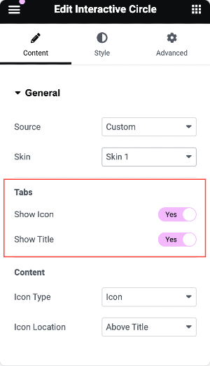
- Tabs: The Tab section offers several options for defining how each tab looks and feels:
- Show Icon: Enable this to display an icon within each tab.
- Show Title: Display a title for each tab.
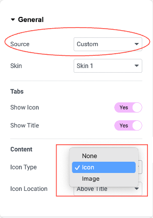
- Content (When Source is Custom): If you've chosen Custom as your content source, you'll have more granular control over the content and layout for each tab:
- Icon Type: Choose from:
- Icon: Use an icon in the tab.
- Image: Use an image for the tab's content.
- None: Opt not to display an icon or image.
- Icon Type: Choose from:
- Icon Location: Choose where the icon will appear:
- Above Title: Place the icon above the tab title.
- Below Content: Display the icon underneath the tab's content.
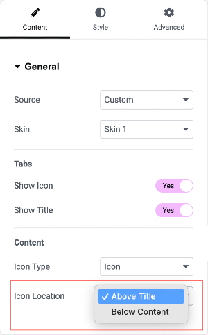
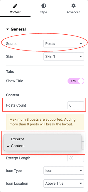
- Content (When Source is Posts): If you've chosen Posts as your content source, you'll get the following options:
- Posts Count: Define how many posts will be shown inside the circle.
- Content Type: Choose to display either the post's Excerpt or full Content.
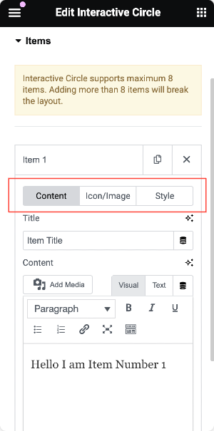
Items (If Source is Custom)#
When using Custom content, you'll see up to 6 predefined tabs. Each tab can be customized independently, allowing you to:
- Add custom content for each tab.
- Choose a unique icon for each tab.
- Style each tab individually to suit your design.
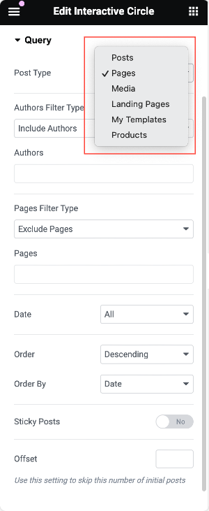
Query (If Source is Posts)#
When using Posts as your source, this section gives you options to refine your content:
- Post Type: Choose the type of content to display, such as Pages, Posts, Media, and more.
Based on your selection, additional filtering options will appear to help you fine-tune the content displayed in your interactive circle.
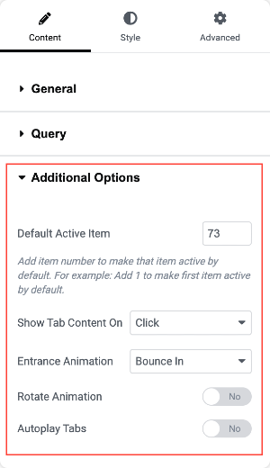
Additional Options#
To make your interactive circle even more engaging, you have a set of additional customization options:
- Default Active Item: Choose which tab should be active by default when the page loads.
- Show Tab Content On: Select whether tab content should display on Click or Hover.
- Entrance Animation: Choose from animations such as Bounce In, Rotate, or Spin for when the tabs load.
- Rotate Animation: Enable or disable the rotating effect on the circle.
- Autoplay Tabs: Automatically cycle through the tabs if this option is enabled.
Style Tab of the Interactive Circle#
The Style Tab allows you to control the appearance of your interactive circle. It is divided into 3 sections:
- Circle
- Tabs
- Content
Let's see all the styling options you get in each section.
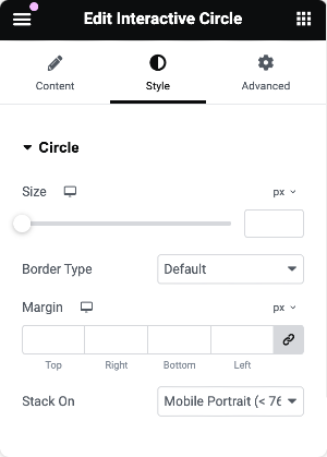
Circle#
This section helps you style the overall circle structure:
- Size: Define the size of the entire circle.
- Border Type: Customize the border around the circle.
- Margin: Control the space around the circle.
- Stack On: Choose when the tabs should stack based on screen size (useful for responsive designs).
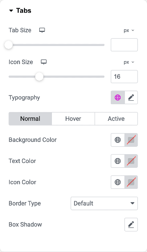
Tabs#
This section lets you style the individual tabs:
- Tab Size: Adjust the tab size within the circle.
- Icon Size: Define how large the icons should be.
- Typography: Alter the font, size, and style of the text.
- Background Color: Set each tab's background color.
- Text Color: Customize the color of the tab text.
- Icon Color: Choose a color for the icons in the tabs.
- Border Type: Define borders around each tab.
- Box Shadow: Add shadow effects to the tabs for depth and style.
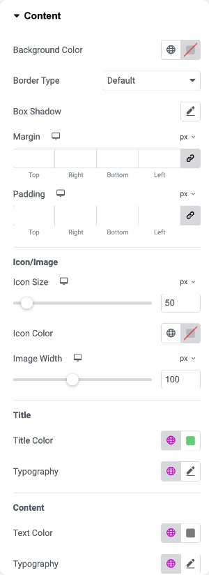
Content#
Style the content that appears within each tab:
- Background Color: Set the background color of the content area.
- Border Type: Customize the border around the content section.
- Box Shadow: Apply shadow effects for a modern, elevated look.
- Margin: Control the spacing outside the content area.
- Padding: Adjust the space inside the content area.
- Icon/Image Size: Adjust the size of the icon or image used within the content.
- Icon/Image Color: Choose the color of the icon or image.
- Image Width: Define the image width within the tab.
- Title Color: Set the color of the tab title.
- Title Typography: Adjust the typography for the title text.
- Text Color: Customize the color of the content text.
- Content Typography: Set the typography for the content text.
This was the detailed overview of the PowerPack Interactive Circle Widget for Elementor.
Hope this helps!