Info Box Carousel widget is used to display multiple information boxes in a sider or carousel manner. There are multiple alterations that you can do to the infobox to make them look impressive and increase its functionality.
Content Tab#
There are 2 subsections in the content tab-
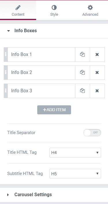
- Info Boxes - Here, you can alter the individual infoboxes and alter their properties like icon, title, text, and content. You can add multiple Infoboxes and give them proper title tags as well.
- Carousel Settings - Carousel settings have the option to choose the transition effect, the number of visible items, Items Gap, Navigation settings, etc.
Style Tab#
Here you can make multiple changes to the page, which will style the page. There are 7 subheadings in this section-
- Info Box - Helps in changing the alignment.
- Icon Style - Helps in hanging the icon settings - Size, Background color, icon color, icon rotation, padding, margin, and border-radius.
- Title - Helps in changing the title settings - Color, typography, margin settings, etc.
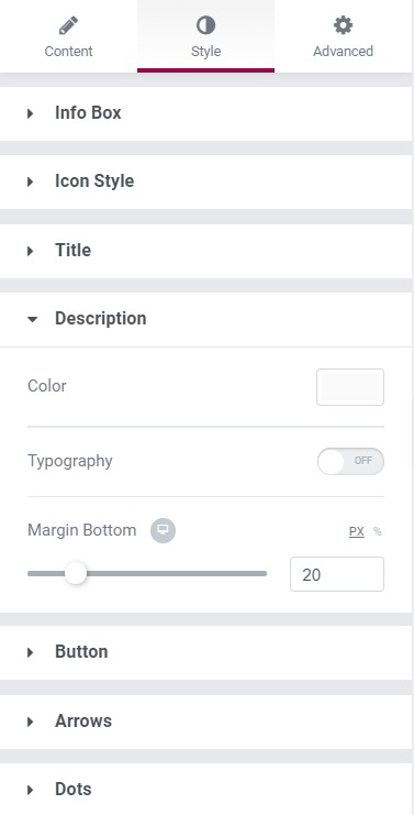
- Description - You can change the typography, margin-bottom, and color of the description.
- Button - Here, you can change the button size and change the background color, text color, border type, border radius, typography, and padding.
- Arrows - Here, you can change the arrow style, arrow size, align the left arrow, align the right arrow, background color, and the border radius and padding.
- Dots - Here, you can change the position of the dots, size, spacing, color, radius, margin, and border-radius.
Advanced Tab#
This Tab has five subsections-
- Element Style - Here, you can change the margin, padding, z-index, and entrance animation and add CSS ID and classes.
- Background - Here, you can set the background as classic or gradient and can even add the hover effects.
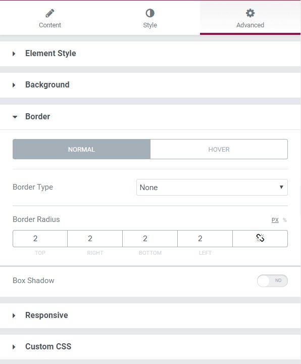
- Border - Here, the properties related to the border are defined as border type, radius, box-shadow, and hover effects.
- Responsive - Here, you set the responsiveness of the different devices to be active or not.
- Custom CSS - This lets you add CSS code to the widget, and you can see it render live right in the editor.