Display more content in less space on your WordPress sites using the Content Reveal Widget for Elementor by PowerPack.
Let's take a closer look at the Content and Style tab of the widget.
Content Tab of the Content Reveal Widget#
The Content Tab consists of 3 sections:
- Content
- Settings
- Button
Let us now go over each of these sections in more detail.
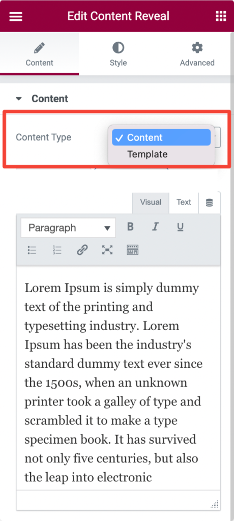
Content#
- Content - Choose the content type to be displayed in the Content Reveal Widget. You can either add the custom text Content or choose a pre-built previously saved Template.
- Show Separator - Toggle On/Off to show/hide the separator.
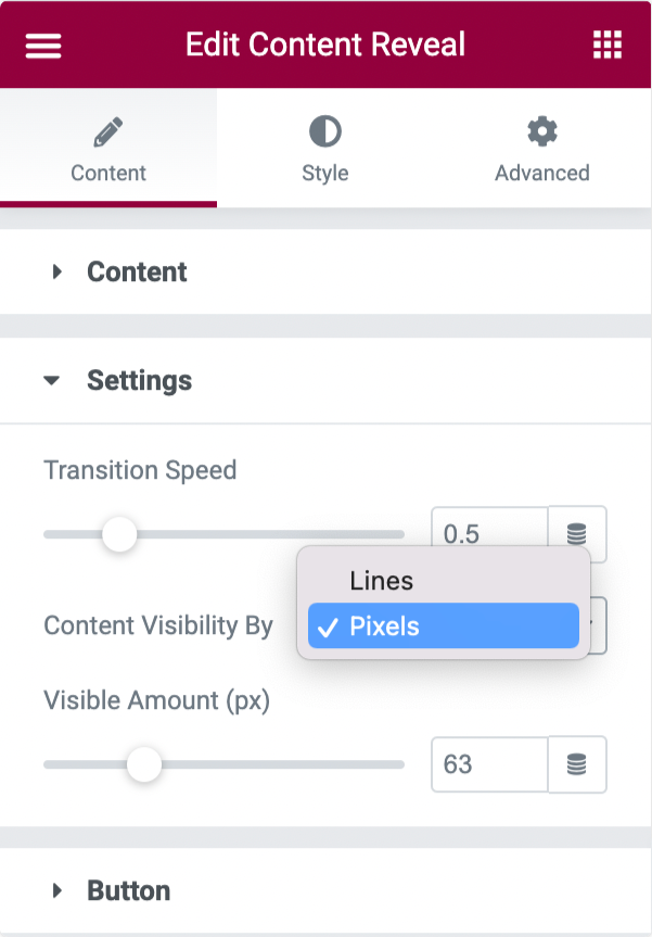
Settings#
- Transition Speed - Set the transition speed for revealing/displaying the content.
- Content Visibility - Choose the content visible in Pixels or Lines.
- Visible Amount - Set the amount of the visible content to be displayed.
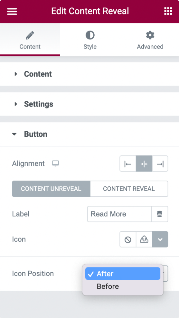
Button#
- Alignment - Align the button to Left, Centre, or Right.
- Label - Add custom button label.
- Icon - Choose your button icon.
- Icon Position - Set button icon's position Before or After the button text.
Style Tab of the Content Reveal Widget#
There are 2 sections in the style tab:
- Content
- Button
Let's check the styling option of each section.
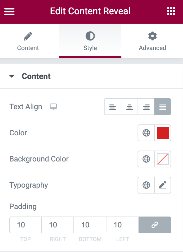
Content#
- Text Align - Align Left, Center, Right, or Justify the text.
- Color - Choose a text color.
- Background Color - Add background color to the text content.
- Typography - Choose font, set size and many more options.
- Padding - Add padding to the text content.
Button#
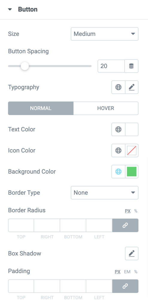
Button#
- Size - Choose button size to be Extra Small, Small, Medium, Large or Extra Large.
- Button Spacing - Define button spacing from the content.
- Typography - Alter typography for the button label.
- Text Color - Choose the button text's color.
- Icon Color - Choose the button's icon color.
- Background Color - Add the button's background color.
- Background Color - Choose the button's border type.
- Border Radius - Add border radius.
- Box Shadow - Add shadow around the button.
- Padding - Add padding around the button.
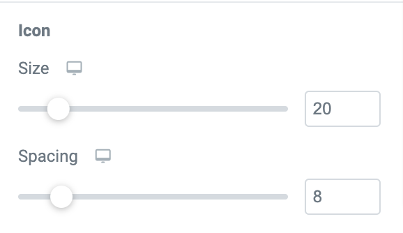
Icon#
- Size - Choose Icon size.
- Spacing - Adjust the spacing between the button's icon and the text label.
This was the detailed overview of the Content Reveal Widget for Elementor by PowerPack.
Hope this helps!