PowerPack Categories Widget for Elementor can be used to display all custom taxonomies, including default WordPress posts and WooCommerce. You can easily exclude/include the taxonomy terms and can also display empty categories. Have a look at the demo of the Categories Widget here. Now, let us go through the detailed overview of the Categories widget in detail.
Firstly, drag and drop the Categories widget on the page that you are editing with Elementor. The Categories widget has customization and styling options in the Elementor Editor’s Content and Style Tab.
Content Tab#
The Content Tab of the Categories widget consists of 2 sections:
- Content
- Layout
Now, let us go through each of these sections in detail.
Content#
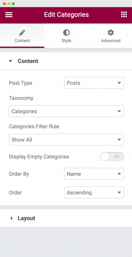
The Content section contains various options to set up your Categories widget nicely. Let us go through each of the options below:
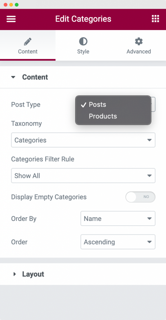
- Post Type: Here, you can choose the type of the categories that you would like to display with the Categories widget. You can choose to display the default categories with Post Type as "Posts" and Product Categories with Post Type as "Products".
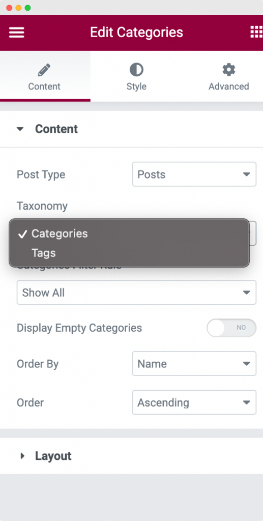
- Taxonomy: As we know there are 2 types of Taxonomies by default in WordPress - Categories and Tags. PowerPack Elementor's Categories widget allows you to display any one of them. You can either choose to display all the categories of the Post Type that you have selected or you can choose to display all the tags of the Post Type that you had chosen earlier.
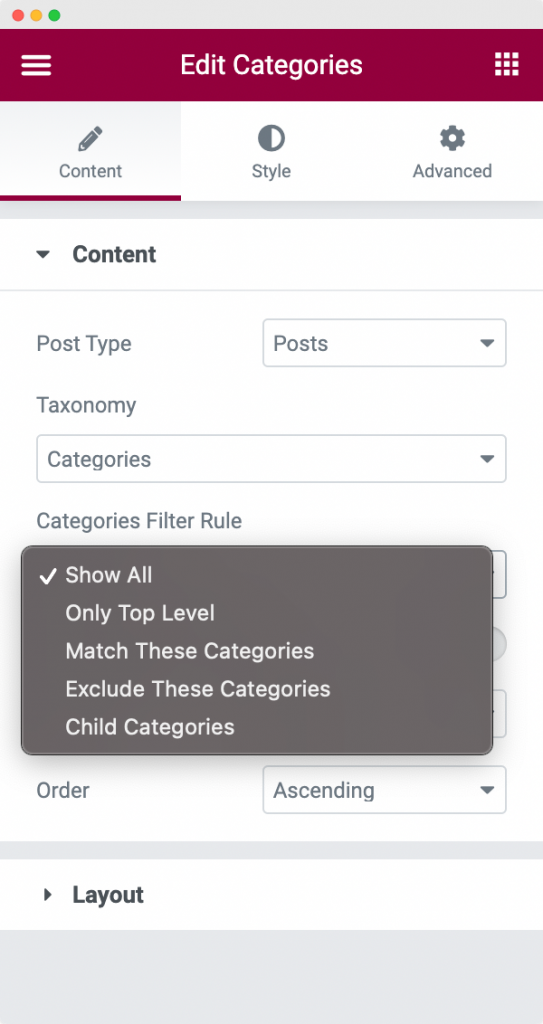
- Categories Filter Rule: As the name suggests, this options allows you to filter the categories that you want to display using the Categories widget. You can choose to display Only Top Level categories, display categories by their name, exclude categories that you might want to hide, or simply display child categories of the parent category.
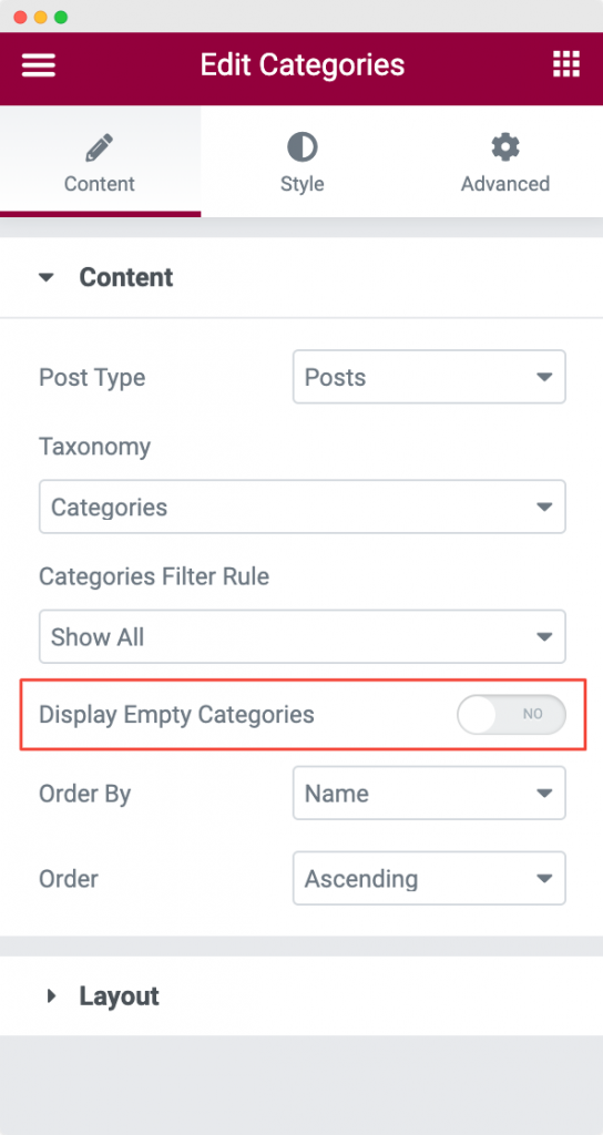
- Display Empty Categories: This is a toggle option which you can toggle on in case you want to display empty categories on your page. By default, this option is turned off.
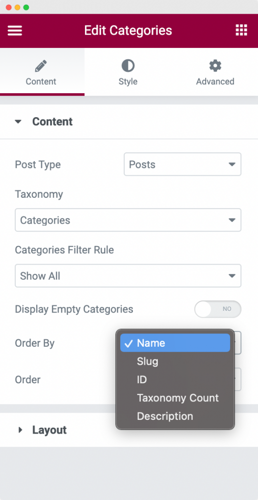
- Order By: As the name suggests, you can use the Order By option to order the categories by name, slug, ID, taxonomy count, and description of the category.
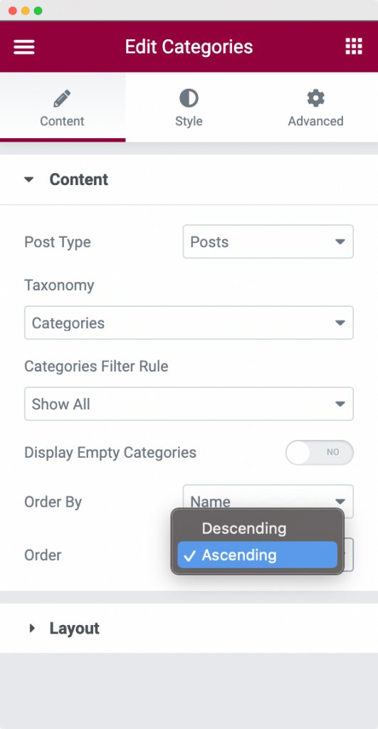
- Order: You can further use this option to order the categories in either Ascending order or Descending order.
To understand the "Order By" and "Order" parameters, have a look at this link - https://developer.wordpress.org/reference/classes/wp_query/#order-orderby-parameters
Layout#
The Layout section contains various options to set up a great layout for the Categories widget. Let us go through each of the options below:
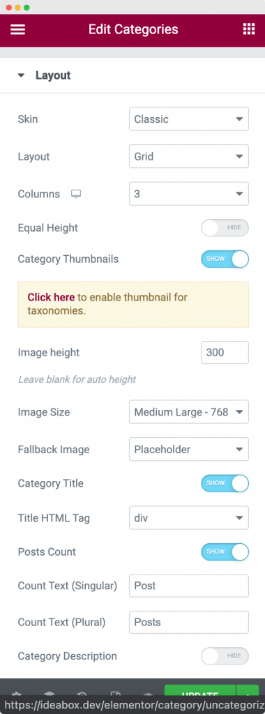
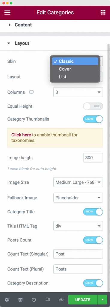
- Skin: PowerPack Elementor's Categories widget comes with 3 types to skin that you can use to customize the display of the Categories widget - Classic, Cover, and List.
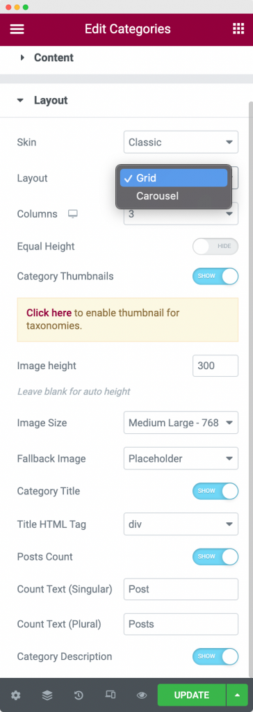
- Layout: As the name suggests, this option can be used to set the display layout of the Categories widget. You can either display the Categories in the Grid layout or display them in the Carousel layout.
- Columns: This option can be used to set the number of columns in a row of categories. Each column displays a single category. So, a row of 3 columns will display 3 categories in a row.
- Equal Height: This is a toggle option. As the name suggests, if this toggle is enabled, all the columns in a row will have equal heights.
- Category Thumbnails: PowerPack Elementor's Categories widget gives you an option to assign a featured image for all the categories. This feature of the Categories widget is known as Category Thumbnails. Here, you can use this option to enable or disable these thumbnails for the page on which you have added the Categories widget.
- Image Height: As the name suggets, you can use this option to set a custom height for the Category Thumbnails. If you leave this option as blank, then the Category Thumbnail will set a default auto height for the image.
- Image Size: Using this option you can set the size of the image. All the default size parameters of WordPress are available here and you can choose any one from them.
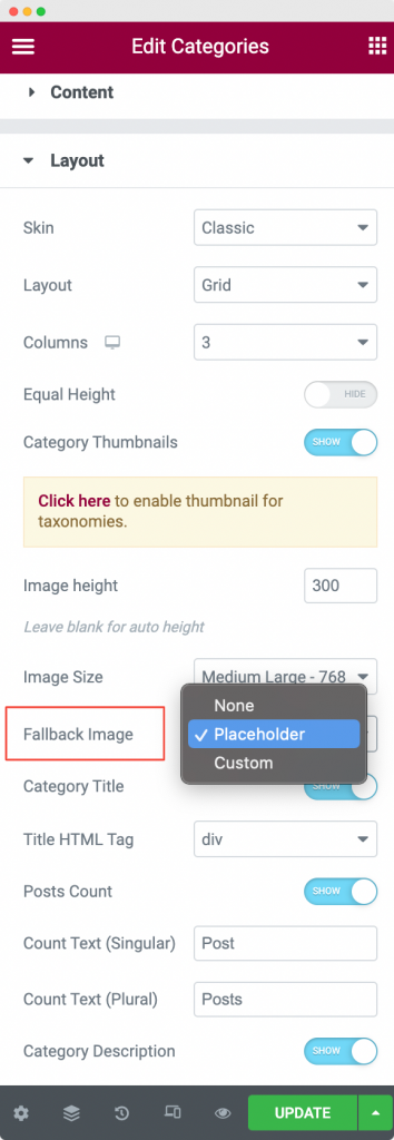
- Fallback Image: This image will be used in case you have turned on the Category Thumbnails option and there is no image assigned to a particular category. The Categories widget will then fallback to this image that you set here in case a category does not have a featured image.
The Fallback Image have 3 options that you can choose from: None, Placeholder, and Custom. If you select none, then no image will be displayed if there is no image assigned to a particular category. Next, if you select Placeholder, then a placeholder of a image will appear if there is no image assigned to a particular category. Finally, if you select Custom, then you have a option to upload a custom image which will be assigned to the category that does not have a featured image assigned to it already.
- Category Title: This is again a toggle option. As the name suggests, using this option you can either choose to display the title of the category or hide it.
- Title HTML Tag: You can assign a HTML tag like h1, h2, h3, h4, h5, h6, para, div etc. to the title of the category using this option.
- Posts Count: This option displays the number of posts that are assigned to each category that is being displayed on the page containing the Categories widget.
- Count Text (Singular): Suppose there is a single post assigned to a category. So, if the Count Text (Singular) is "Post", then it will be displayed as "1 Post". Similarly, if the Count Text (Singular) is "Item", then it will be displayed as "1 Item". This is the role of the Count Text (Singular) option.
- Count Text (Plural): Suppose there are 4 posts assigned to a category. So, if the Count Text (Plural) is "Posts", then it will be displayed as "4 Posts". Similarly, if the Count Text (Plural) is "Items", then it will be displayed as "4 Items". This is the role of the Count Text (Plural) option.
- Category Description: As the name suggests, using this option you can either choose to display the description of the category or hide it.
This was all about the Content Tab of the Categories widget. Now, let us go through the Style Tab of the Categories widget.
Style Tab#
There are 6 sections in the Style tab of the Categories widget:
- Layout
- Box
- Category Content
- Category Title
- Posts Count
- Category Description
Let us go through each of the sections one by one.
Layout#
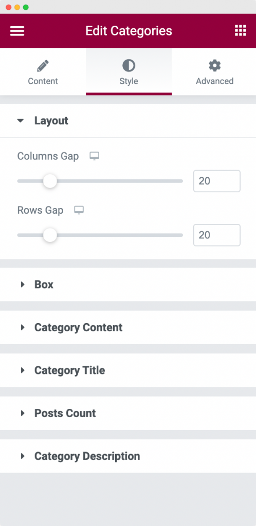
In this section, you can set the gap between each column and row of the Categories widget. You can set the gap between the columns using the Column Gap option and the gap between the rows using the Row Gap option.
Box#
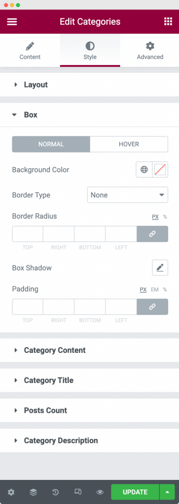
The Box section styling is used to style a particular Category box. You can set the background color of the box and border properties for the Normal and Hover modes. You can further set the padding of the box using the Padding option.
Category Content#
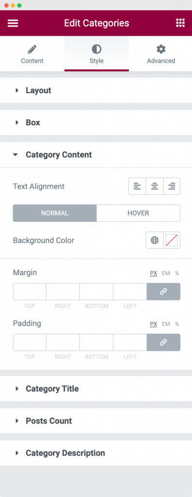
This section is used to style the Category Content. You can align the Category Content which consists of Category Title and Posts Count to either right, left, or center. Further, you can set the background color of the Category Content space for normal and hover modes. Next, margin and padding can also be applied to Category Content using their respective options.
Category Title#
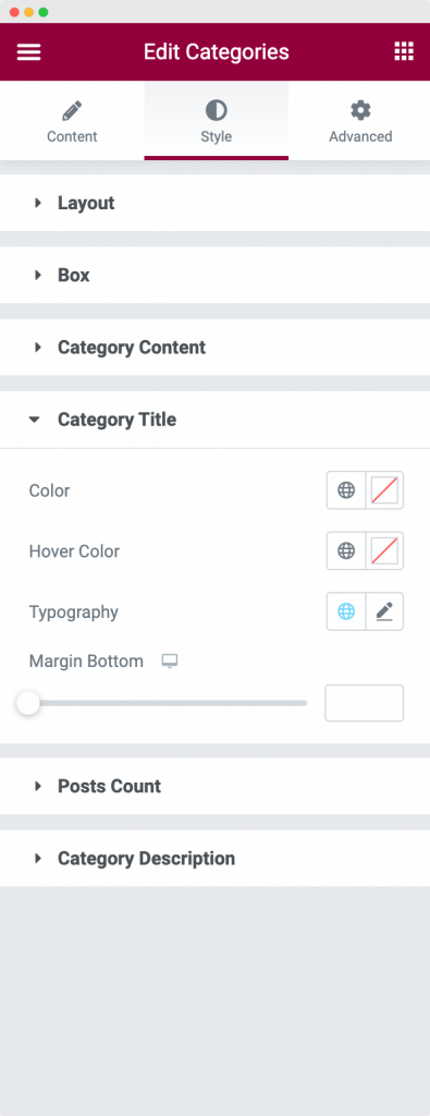
This section is used to style one part of the Category Content: Category Title. You can set a color for the category title, hover color for the category title, font family, font size, font weight, letter spacing, and line height using the typography option, and finally set the bottom margin for the Category Title.
Posts Count#
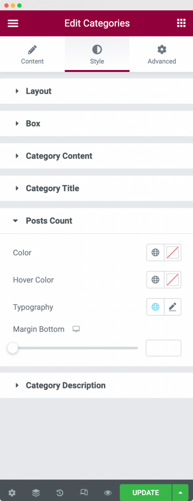
This section is used to style the second part of the Category Content: Posts Count. You can set the color, and hover color for the posts count, font family, font size, font weight, letter spacing, and line height using the typography option, and finally set the bottom margin for the Posts Count text.
Category Description#
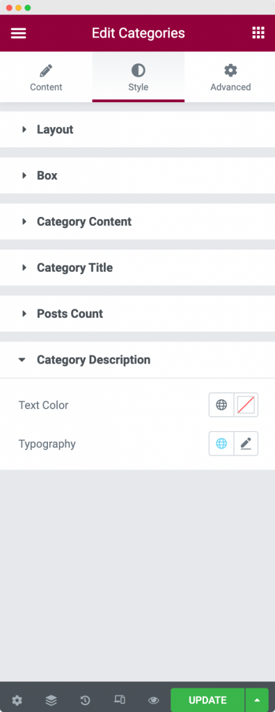
This section is used to set the text color of the Category Description. You can further set the font family, font size, font weight, letter spacing, and line height of the Category Description using the typography option.
This was the detailed overview of the Categories widget available in PowerPack Addons for Elementor. Feel free to get in touch with us in case of any queries or concerns. 🙂