PowerPack Addons Image Slider Widget for Elementor allows you to display multiple images in an interactive slider. You can showcase portfolios, product galleries, team photos, event highlights, featured images, and other content while creating a more engaging browsing experience for your visitors.
With support for slideshow and carousel layouts, thumbnail navigation, lightbox functionality, autoplay controls, and multiple navigation styles, you can create image galleries that match your website's design and user experience requirements.
Getting Started: Using the Image Slider Widget#
Follow these steps to add the Image Slider widget to your page:
- Open the page where you want to add the Image Slider widget in the Elementor editor.
- In the widgets panel, search for Image Slider.
- Drag and drop the Image Slider widget onto your page.
- Once the widget is added, you'll see two main tabs in the left panel: Content and Style.
Let's explore each setting available in the widget.
Content Tab#
Content tab allows you to add images and configure how they are displayed within the slider. This tab includes the following sections:
- Gallery
- Thumbnails
- Feature Image
- Additional Options
Let's look at each section in detail.
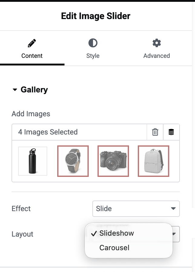
Gallery#
Gallery section is where you add images and define the basic layout and transition behavior of the slider.
- Add Images: Click the Add Images button to select images from the WordPress Media Library or upload new images.
- Effect: Effect option controls how slides transition from one image to another. Available options include:
- Slide: Displays images with a sliding transition effect. When users navigate through the gallery, images move horizontally from one slide to the next.
- Fade: Displays images using a smooth fade transition. Instead of sliding, one image gradually fades into the next.
- Layout: Layout option determines how images are displayed within the slider. Available options include:
- Slideshow: Displays one image at a time and allows visitors to navigate through the gallery using arrows, pagination, or autoplay settings.
- Carousel: Displays multiple images in a single slider and allows users to scroll through them.
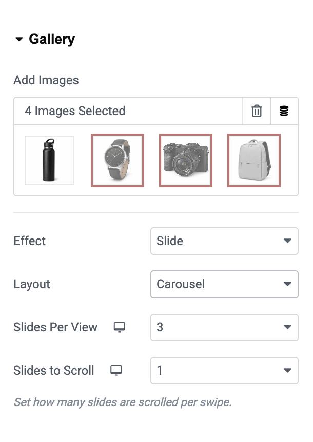
When Carousel layout is selected, additional settings become available.
- Slides Per View: This option lets you set how many images should be displayed in the carousel at once. For example:
- 1 slide displays a single image.
- 3 slides display three images side by side.
- 4 slides display four images side by side.
- Slides Per Scroll: This option determines how many slides move when users navigate through the carousel. For example:
- If set to 1, the carousel moves one image at a time.
- If set to 3, the carousel moves three images at a time.
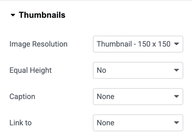
Thumbnails#
This section allows you to display image thumbnails below the main slider, making it easier for visitors to navigate the gallery.
- Image Resolution: Select the image size to be used for thumbnail images. Using an appropriate image resolution helps balance image quality and page loading performance.
- Equal Height: Enable this option if you want all thumbnail images to maintain the same height. Available options: Yes or No. When enabled, thumbnails appear more consistent, especially when images have different dimensions.
- Scroll to Top: This option automatically scrolls the gallery back to the featured image area whenever a thumbnail is clicked. Available options: Yes or No. Enabling this option can improve navigation on pages where the gallery appears lower on the screen.
- Columns: Use the Columns setting to define the number of thumbnail images displayed in a row. Adjust the value based on your layout and available space.
- Caption: Enable this option to display image captions below thumbnail images. This can be useful when showcasing products, projects, events, or galleries that require image descriptions.
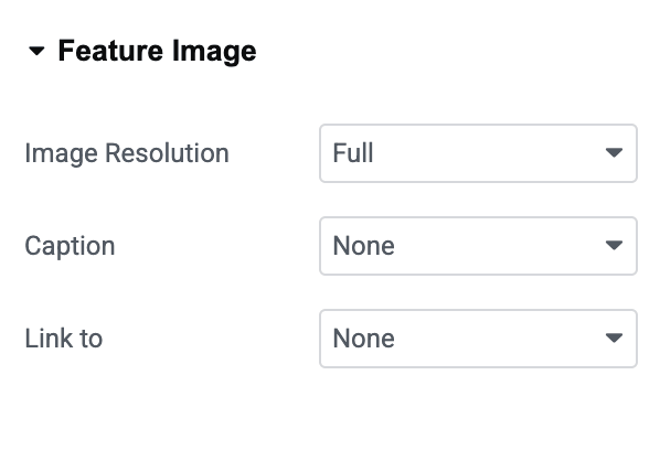
Feature Image#
The Feature Image section controls how the main image in the slider is displayed.
- Image Resolution: Select the image size to be used for the main featured image. For the best viewing experience, choose an image size that provides good visual quality while maintaining optimal page performance.
- Caption: Enable this option to display image captions for the featured image. Captions can help provide additional information about the displayed image.
- Link To: This option determines what happens when users click on the featured image. Available options include:
- None: The image remains non-clickable.
- Media File: Opens the original image file when clicked. When this option is selected, additional Lightbox settings become available, allowing visitors to view images in an enlarged popup window.
- Custom URL: Allows you to enter a custom link for each image. This option is useful when images need to direct visitors to specific pages, products, portfolios, or external websites.
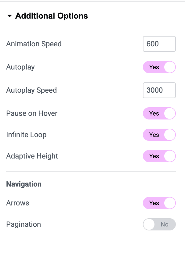
Additional Options#
The Additional Options section allows you to customize the slider's behavior and navigation settings.
- Animation Speed: Controls the transition speed between slides. A lower value creates faster transitions, while a higher value creates slower and smoother animations.
- Autoplay: Enable this option to automatically cycle through images without user interaction. Available options: Yes or No
- Autoplay Speed: When Autoplay is enabled, this setting determines the delay between slide transitions. Adjust the timing to control how long each image remains visible.
- Pause on Hover: Enable this option to pause autoplay whenever a visitor hovers over the slider.
- Infinite Loop: Allows the slider to continuously loop through images. When enabled, the slider restarts from the first image when it reaches the last.
- Adaptive Height: Automatically adjusts the slider height based on the currently displayed image. This option is particularly useful when gallery images have different heights.
- Navigation: The Navigation section controls how visitors move between slides.
- Arrows: Enable this option to display previous and next navigation arrows on the slider. Arrows provide a simple way for users to browse images manually.
- Pagination: The Pagination option adds visual indicators that help visitors understand their current position within the slider. Available options include:
- Dots: Displays clickable navigation dots below the slider. Users can click any dot to jump directly to a specific slide.
- Fraction: Displays slide numbers in a fraction format, such as: 1 / 5
Style Tab#
Once you customize the options in the content tab, move to the style tab. The style consists of:
- Feature Image
- Thumbnails
- Arrows
- Pagination: Fraction
Feature Image#
Feature Image section in the Style tab allows you to customize the appearance and positioning of the main image displayed in the slider. These settings help you control the image layout and improve the overall visual presentation of your gallery.
- Align: Use the Align option to position the featured image within the available space. Available options include: Left, Center, or Right.
- Stack On: Stack On option determines the screen size at which the thumbnail gallery and featured image stack vertically instead of appearing side by side. You can choose from different device breakpoints, such as: Tablet or Mobile
- Width: Use the Width control to adjust the width of the featured image. Increasing the value makes the image occupy more space, while decreasing it creates additional room for thumbnails or surrounding content.
- Spacing: Spacing option controls the gap between the featured image and the thumbnail gallery. Increase the spacing value to create more separation between elements, or reduce it for a more compact layout.
- Border Type: Border Type setting allows you to add a border around the featured image.
- Box Shadow: Use the Box Shadow option to add depth and visual emphasis to the featured image.
- CSS Filters: The CSS Filters option allows you to apply visual effects directly to the featured image without editing the original image file.
Thumbnails#
Thumbnails section in the Style tab allows you to customize the appearance of the thumbnail gallery displayed alongside the featured image. These settings help you create a visually appealing navigation experience while maintaining consistency with your website's design.
- Alignment: Use the Alignment option to control the position of the thumbnail gallery. Available options include: Left, Center or Right
- Images: The Images settings allow you to customize the appearance and spacing of thumbnail images.
- Column Spacing: Use the Column Spacing control to adjust the horizontal gap between thumbnail images.
- Thumbnail States: PowerPack lets you style thumbnail images separately for different states: Normal, Hover & Active.
- Border Type: The Border Type setting allows you to add a border around thumbnail images.
- Border Radius: Use the Border Radius option to control the roundness of thumbnail corners.
- Scale: The Scale option allows you to enlarge or reduce thumbnail images.
- Box Shadow: Use the Box Shadow option to add depth and visual emphasis to thumbnail images.
- CSS Filters: The CSS Filters option allows you to apply visual effects to thumbnail images without modifying the original image files.
- Image Filter: The Image Filter option allows you to apply predefined visual effects to thumbnail images.
The other styling options in the Image Slider widget are simple and easy to use.
Wrapping Up!#
Image Slider widget for Elementor makes it easy to create beautiful and interactive image galleries on your website.
With flexible gallery layouts, thumbnail navigation, lightbox support, autoplay controls, multiple pagination styles, and extensive styling options, you can customize every aspect of your image slider to match your website's design.