PowerPack Timeline widget for Elementor allows you to display content in visually appealing timelines effortlessly. You can showcase your product journey or highlight your company's achievements - all and without writing a single line of code.
With this widget, you have the flexibility to create timelines using custom content or leverage the Query feature to dynamically fetch post content from your website and display it in a timeline format.
Let's explore the key options available in the Content and Style tabs of the PowerPack Timeline widget.
Timeline Widget for Elementor: Overview#
Content Tab of the Timeline Widget#
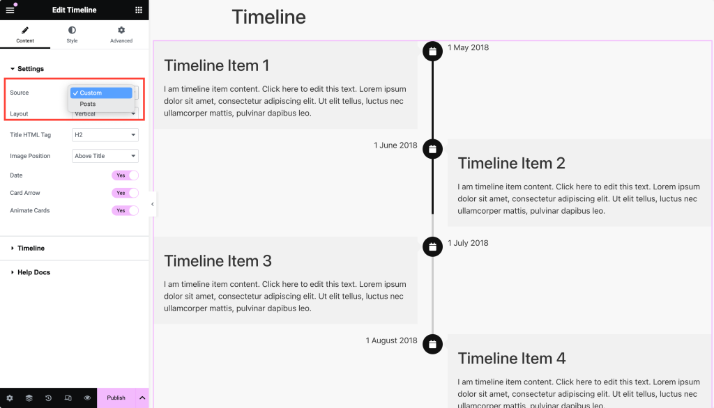
Settings#
The Settings section offers two main content sources:
- Custom: Create your own custom timeline content.
- Posts: Fetch and display post content from your website.
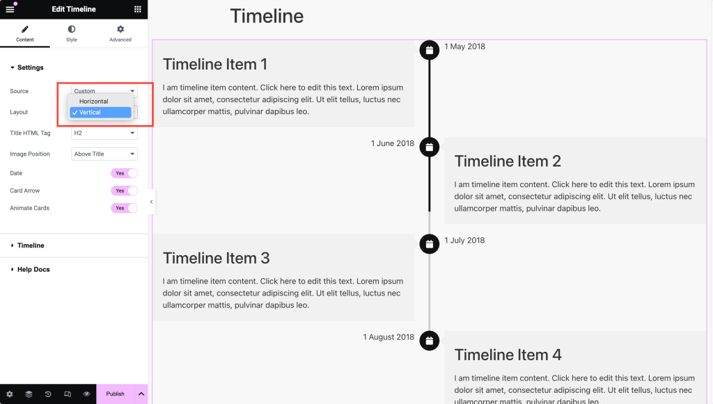
Below the source option, you can choose between two timeline layout styles: Vertical or Horizontal.
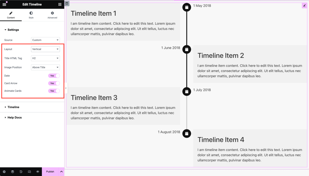
If you choose the Vertical Timeline layout, the customization options are:#
- Title HTML Tag: Choose an HTML tag for the title (h1, h2, h3, h4, h5, h6, div, span, p).
- Image Position: Decide whether the image appears above or below the title.
- Date: Enable to show the date on the timeline card.
- Card Arrow: Toggle the arrow on the timeline card on or off.
- Animate Cards: Choose to animate the timeline cards as the page loads.
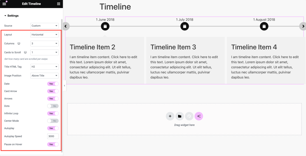
If you choose the Horizontal Timeline layout, the customization options are:#
- Columns: Set the number of columns for the timeline.
- Cards to Scroll: Define how many cards to scroll per swipe.
- Title HTML Tag: Select an HTML tag for the title (h1, h2, h3, h4, h5, h6, div, span, p).
- Image Position: Set the image above or below the title.
- Date: Enable this to show the date on the card.
- Card Arrow: Toggle the card arrow on or off.
- Arrows: Enable to show navigation arrows in the timeline slider.
- Dots: Show pagination dots for the timeline slider.
- Infinite Loop: Enable looping of timeline slides.
- Center Mode: Highlight the center item when swiping. This works only when Infinite Loop is enabled.
- Autoplay: Automatically cycle through timeline slides.
- Autoplay Speed: Set the speed for autoplay.
- Pause on Hover: Pause the autoplay when the user hovers over the timeline.
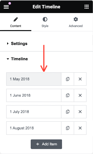
Timeline Content (If Source is Custom)#
To add custom content to your timeline:
- Click on the box where the date is mentioned.
- From here, you can customize the individual timeline card.
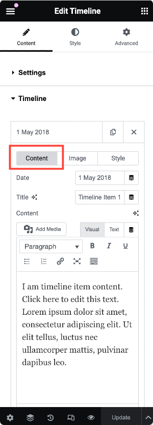
Content#
In the Content section, you can specify:
- Date: Set the date for the event.
- Title: Add a title for the card.
- Content: Include the description or details for that timeline event.
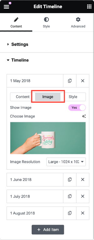
Image#
Enable the Show Image option to display an image on the timeline card. You can choose an image from the media library or upload a new one.
Style#
Style Options for Custom Timelines
Enable the Custom Style toggle to access customization options for:
- Marker
- Card
- Content
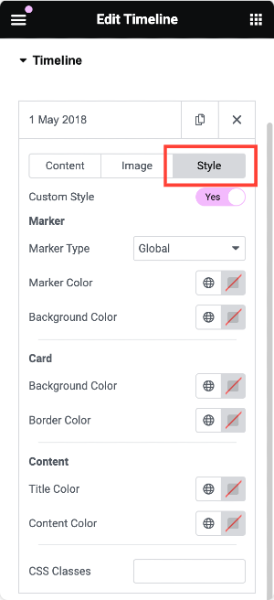
You can repeat this process for each timeline card to create a unique and visually consistent design.
Query Section (If Source is Posts)#
If you opt to use posts for your timeline, you can customize the following options:
- Query Type: Choose between "Main Query" (based on the default WordPress query) or "Custom Query."
- For the Main Query, provide the Query ID.
- Select the Post Type for Custom Query and filter content by categories, tags, authors, or custom taxonomies.
Other available options:
- Date: Display posts from a specific time range (e.g., past day, week, month, year, etc.).
- Order: Arrange posts in ascending or descending order.
- Order By: Sort posts by date, comment count, title, etc.
- Sticky Post: Display sticky posts at the top.
- Offset: Skip a certain number of posts before displaying content.
- Exclude Current Post: Omit the current post from appearing in the timeline.
Posts Section (Post-Based Timeline)#
When pulling post content for your timeline, you have the following options:
- Post Title: Enable the display of the post title.
- Post Image: Display the post's featured image.
- Image Resolution: Choose the image size (thumbnail, full, or custom).
- Post Content: Show the post content as an excerpt or limited content.
- Link Type: Add a link to the title, button, or card.
- Post Meta: Display meta information like author, date, etc.
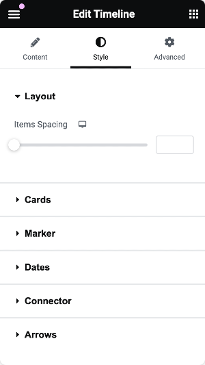
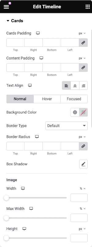
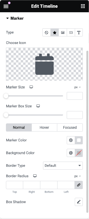
Style Tab of the Timeline Widget#
The Style tab provides seven sub-sections that allow you to customize every element of your timeline, from markers to content styling. Each section offers a range of settings, such as typography, colors, spacing, and more.
This is the complete overview of the PowerPack Timeline widget for Elementor! Hope this helps :)