PowerPack Progress Bar Widget for Elementor allows you to add interactive and customizable progress bars to your WordPress websites.
In this guide, we'll walk you through every option and setting available within the Progress Bar widget!
How to Use the Progress Bar Widget#
Using the Progress Bar Widget is simple and user-friendly. Drag and drop the widget onto your Elementor page. Once placed, you'll see two main tabs where you can start customizing the widget: the Content Tab and the Style Tab.
Let's dive into each section to see how you can configure the widget.
Content Tab of the Progress Bar Widget#
Content Tab is where you can define the content of your progress bars. You’ll find all the options for customizing the progress bar's layout, type, labels, and overall design.
Progress Bar #
This section lets you control how your progress bar looks and functions. Here's a breakdown of the settings:
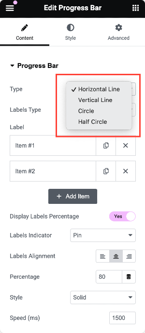
- Type: Choose the style of your progress bar. Options include:
- Horizontal: The traditional bar stretching across your page.
- Vertical: A vertical bar for a more unique presentation.
- Circle: A circular progress bar, perfect for a clean and modern design.
- Half Circle: A semi-circular bar for a sleek, minimalistic look.
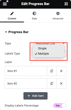
- Labels Type: Decide whether you want to display a Single or Multiple Labels.
Single Label Type Options
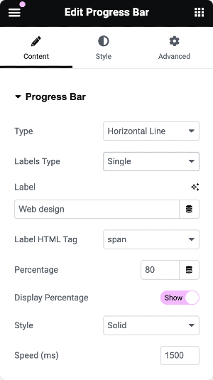
If you choose Single Label, you'll have the following customization options:
- Label: Enter the text or name you want to associate with the progress bar (e.g., "Goal Progress" or "Task Completion").
- Label HTML Tag: Choose the HTML tag for the label
- Percentage: Set the percentage value for your progress bar. This defines how "complete" the bar will appear.
- Display Percentage: Enable or disable the display of the percentage value on the progress bar.
- Style: Choose how the bar itself looks:
- Solid: A simple, clean bar.
- Striped: Adds stripes for a dynamic, textured look.
- Animated Gradient: A gradient effect that animates as the bar progresses.
- Rainbow: A fun and colorful gradient that gives a unique visual style.
- Speed: Adjust the speed of the animation when the progress bar loads.
Multiple Label Type Options
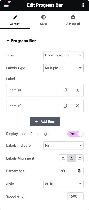
If you choose Multiple Labels, you can define multiple progress bars within the same widget. Here are the options available:
- Label: Define the content for each label. You can add more progress bars by clicking the + Add Item button.
- Display Labels Percentage: Choose whether to show the percentage value next to each label.
- Labels Indicator: Select how you'd like to visually indicate progress. Options include:
- None: No extra indicator, just the bar.
- Pin: A small pin or marker that tracks progress.
- Arrow: An arrow pointing to the current progress level.
- Labels Alignment: Adjust the labels' alignment—whether they appear on the left, right, or center of the progress bars.
- Percentage: Set the percentage for each progress bar you add.
- Style: Choose a style for each progress bar, just like with the single label type: Solid, Striped, Animated Gradient, or Rainbow.
- Speed: Control how fast each bar fills when loaded.
Style Tab of the Progress Bar Widget#
Style Tab is where you can refine the look and feel of your progress bars.
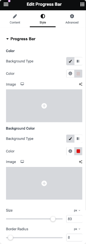
Progress Bar Section#
- Background Type: Choose the background type for the progress bar itself:
- Classic: A solid or single-color background.
- Gradient: Create a gradient background for a more modern look.
- Color: Pick the primary color for the progress bar.
- Image: If you want to add an image as a background to your progress bar, this option allows you to upload one.
- Size: You can adjust the progress bar's thickness or size.
- Border Radius: Control how rounded the edges of your progress bar are.
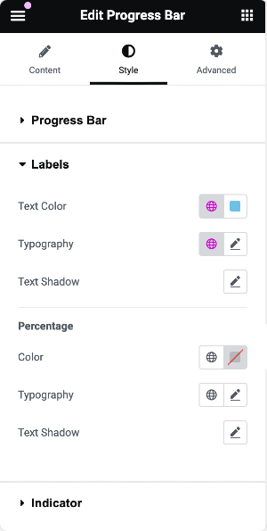
Labels Section#
The labels in your progress bar can be customized for both text and percentage values. Here are the styling options:
- Text Color: Define the color of the label text.
- Typography: Adjust the font, size, weight, and letter spacing for the label text.
- Text Shadow: Add shadow effects to your label text for extra emphasis.
- Color for Percentage: Customize the percentage color displayed on your progress bar.
- Typography for Percentage: Like the labels, you can adjust the font and size of the percentage display.
- Text Shadow for Percentage: Add a text shadow to the percentage.
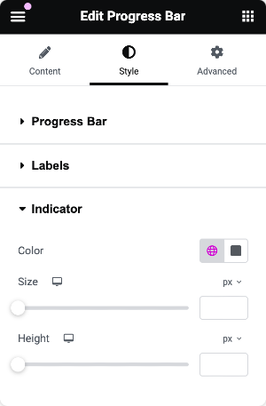
Indicator Section (For Multiple Labels Only)#
When you use multiple labels, you get the option to style the indicators (Pin or Arrow) that track progress. Here's what you can customize:
- Color: Set the color of the indicator.
- Size: Adjust the size of the indicator so it’s more or less prominent.
- Height: Control the height of the indicator
This was the detailed overview of the PowerPack Progress Bar Widget for Elementor.
Hope this helps!