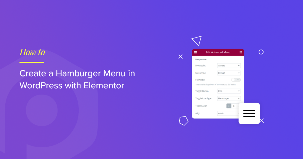
Are you looking for a simple way to create a hamburger menu in WordPress with Elementor?
The hamburger menu is also referred to as the three-line menu, hotdog menu, or menu button. This type of menu displays a button/hamburger icon on websites or apps that opens up into a side menu on clicking.
Hamburger menus are an ideal choice for small screen devices, which have a compact space and can’t display the whole menu on a single page. As website designs are evolving, many web designers also consider displaying hamburger menus on big-screen devices.
So in this article, we will provide a detailed step-by-step tutorial on setting up a hamburger menu on a WordPress website with Elementor page builder.
If you prefer watching a video tutorial on how to create a hamburger menu in WordPress with Elementor, you can consider watching this video.
Why Do Users Prefer to Display Hamburger Menus on WordPress Websites?
A simple & easy-to-use menu bar should be present on a website to provide smooth navigation to the website visitors.
Hence the actual menu bar looks huge and can’t be accessible on small screens, but the hamburger menu best suits this criterion.
Let’s have a look at some of its specifications & benefits that shows it’s the best match:
- It uses less space; hence best for compact space.
- It’s popular among users, and almost every user is familiar with its interface; hence never get confused about the navigation options.
- Not only to display the main menu bar, but it can be used to display some additional options in different areas of your website.
- It’s an organized way to display the menu bar categories, especially for websites that include multiple pages and contents.
Create a Hamburger Menu in WordPress with Elementor & PowerPack
Choosing the best tool isn’t easy when you have plenty of WordPress plugins on the market.
Our recommendation will always be – PowerPack Elementor Addons: the best addon for Elementor page builder.
The reason for recommending the PowerPack Elementor Addons is because it is easy to use, comprehensive, customizable, and has flexible styling features, mainly because it’s designed for non-coders.
With 80+ high-performance yet handy Elementor widgets, PowerPack Elementor Addons include more than 150 amazing templates. Every widget is unique in its own way, a super lightweight widget that perfectly synchronizes with your website performance without bothering its functioning.
PowerPack offers a dedicated widget to create fully functional and impressive menus on your WordPress websites using the Elementor page builder: PowerPack Advanced Menu.
Using the Advanced Menu widget, you can easily create a hamburger menu, plus it offers various menu layouts and everything in a package of one widget.
So, without further ado, let’s go ahead with the tutorial.
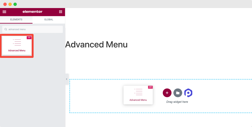
Drag and drop the PowerPack Advanced Menu widget
To create a hamburger menu on your WordPress website, first, you need to install and activate the Elementor page builder and PowerPack Addons.
So first of all, open the page using Elementor editor, then type ‘advanced menu’ in the search bar and drag & drop the widget on the page.
While dragging the widget, first make sure to check for the PowerPack ‘PP‘ sign on the top-right corner of the widget.
Once you add the widget to the page, you will get options to customize the menu bar.
The advanced Menu widget of PowerPack provides the flexibility to style the menu bar in several ways. You can get exceptional results with your hamburger menu by customizing the advanced menu widget’s content and style tab.
And the best part is that you can add a hamburger menu on any website page without worrying about embedding code.
Let’s check how we can use these functions to create a fantastic hamburger menu.
Content Tab of the Advanced Menu Widget
The first sub-section you’ll get in the Content Tab is “Layout.”
The layout section provides various features to customize the menu bar layout. Let’s take a look what all options you’re getting here:
Menu
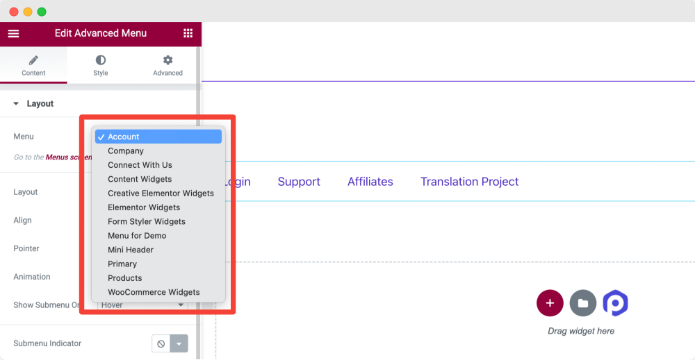
This option will display all your site menus. Select the menu that you want to display as the hamburger menu.
Layout
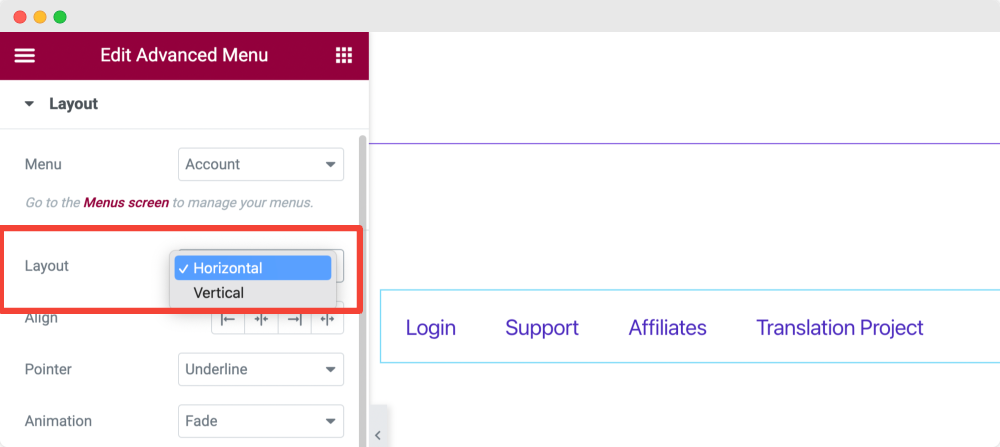
Choose the layout of your menu bar as Vertical or Horizontal.
Align
Set your menu’s alignment from the options for alignment, like Left, Center, Right, or Stretch.
Pointer
You can set the type of Pointer you want to display. You can check this feature by selecting the pointer type and hovering over the menu field.
Here, given multiple pointer options are Underline, Overline, Double Line, Framed, Background, Brackets, and more.
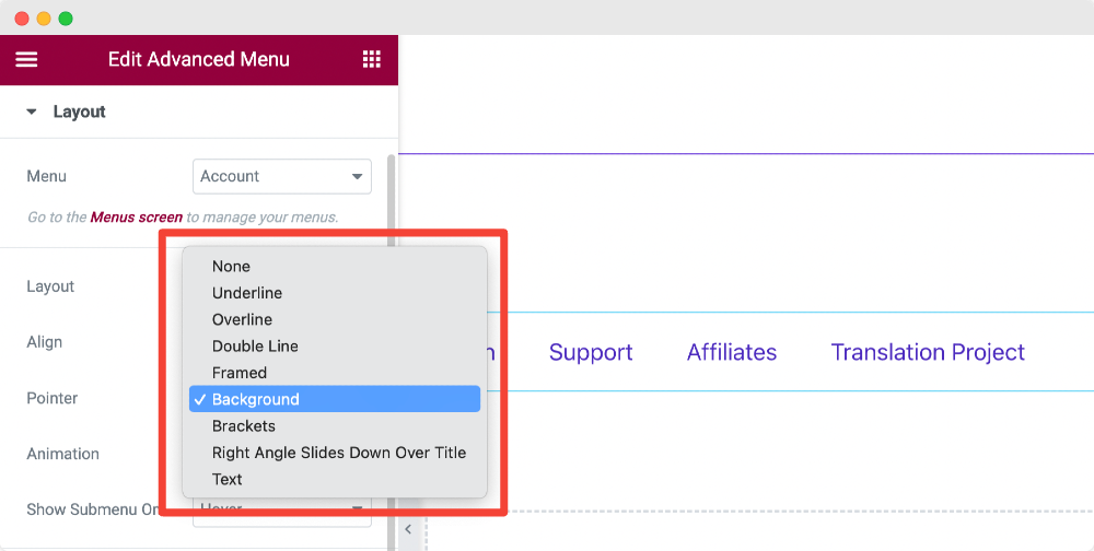
You can also select the None option if you don’t want to display any pointer.
Animation
If you further want to apply animations to the pointer, you can choose the animation type from here.
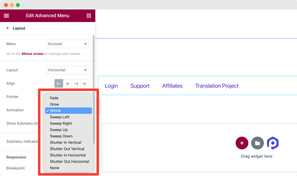
Animation options vary for different pointer options. Choose the one which suits your website look better.
Show Submenu On
You can choose to show the submenu on Hover or Click from this option.
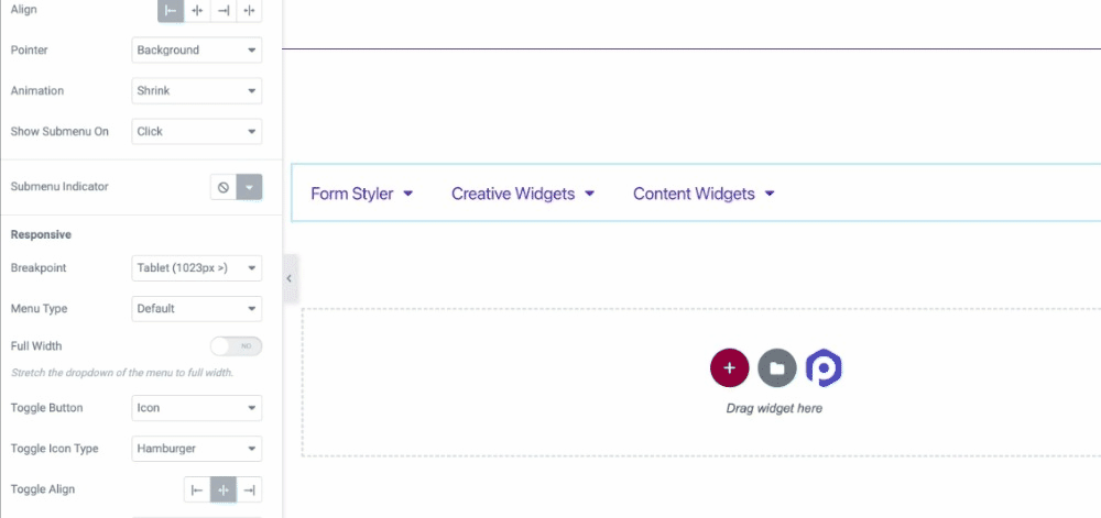
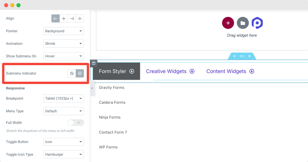
Submenu Indicator
You can choose a submenu indicator from the icon library or select the ‘none‘ option if you don’t want to show it.
Responsive
Site menus’ responsive properties play a vital role. On many sites, we have often encountered that their menus are not responsive, not working correctly, and breaking the site’s interface.
PowerPack Advanced Menu widget allows you to choose Breakpoint for different size devices. This will help you create a 100% responsive hamburger menu for small-screen devices, enhancing your site visitors’ navigation experience.
Let’s see what all options are available here:
Breakpoint
From this option, you can select the breakpoint for your menu bar. Because we’re creating a hamburger menu for our site, choose the Always for a Breakpoint option.
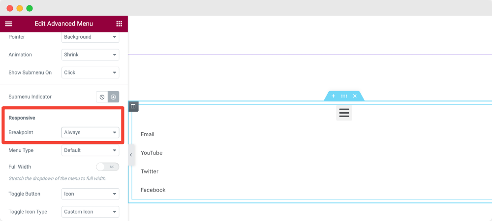
If you want to display the hamburger menu on only mobile or tablet, choose Mobile and Tablet in the Breakpoint option, respectively.
Menu Type
Next, you get the option to choose the menu type as Off-Canvas, Full-Screen, or Default.
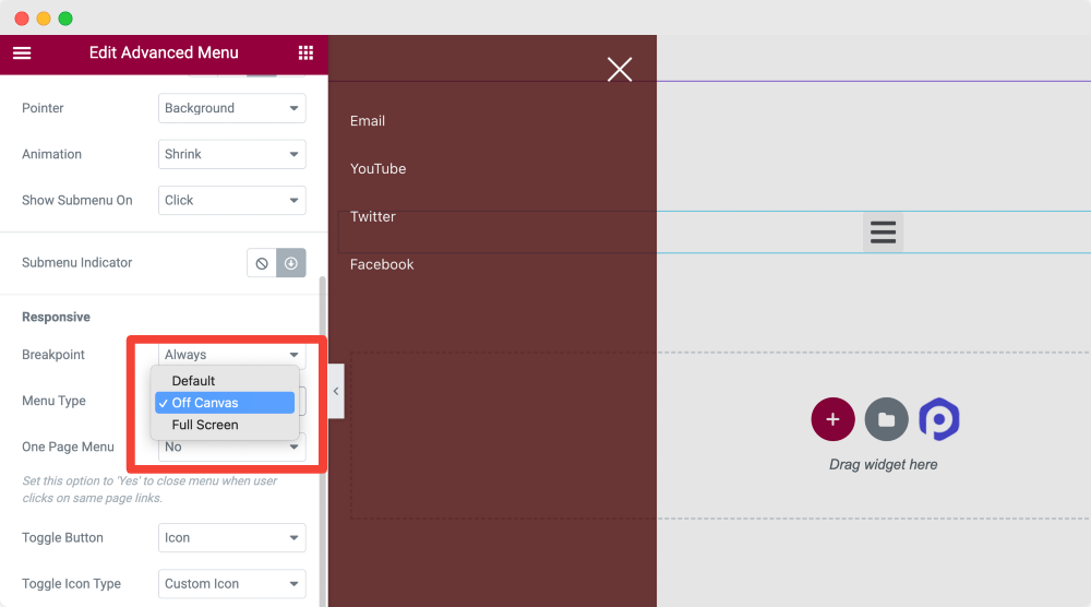
Also Learn: How to create Off-Canvas Menu to WordPress Website with Elementor.
Toggle Button
Next, you choose the toggle button for your menu.
Toggle Align
Set the toggle alignment to Right, Center, or Left.
Style Tab of the Advanced Menu Widget
In the Style Tab of the Advanced Menu widget, you get 4 sections:
- Toggle Button [Because we have chosen menu type as off-canvas in the content tab]
- Off-Canvas/Full Screen [Because we have chosen menu type as off-canvas in the content tab]
- Typography
- Submenu Indicator
Let us give a detailed look at these sections respectively.
Toggle Button
This section allows customizing the toggle button in all possible aspects.
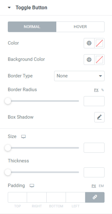
All Options for this section are available for both normal and hover mode. Let’s look at them in more detail:
- First, choose the color for the toggle button, and you can also set the background color for the toggle button.
- Select one border type from the solid, double, dotted, dashed, or groove options if you want to apply a border to the toggle button.
- Apply border radius if you want to display smooth edges to the borders applied to the toggle button.
- You can customize a box shadow for the toggle button and its position, blur effect, and many more.
- Set the size of the toggle button as per your choice.
- You can set the thickness of the hamburger lines on the toggle button icon.
- Set the padding for the toggle button to allow spacing between the border and the hamburger icon lines.
Off-Canvas/Full Screen
In this section, you get options to customize the full-screen Elementor hamburger menu or off-canvas menu.
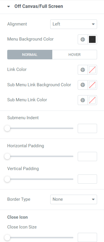
Let’s have a detailed look at all these options available in this section:
- Set the alignment of the menu to the left, right, or center.
- You can also choose a menu background color.
- Options to select a color for a link, submenu link, and submenu link background individually are available.
- You’ll have the flexibility to adjust the submenu indent and horizontal and vertical padding.
- Finally, apply a border type for the menu by choosing the border type available here: solid, dotted, doubled, dashed, and groove.
Close Icon
- You can adjust close icon size, horizontal position, vertical position, and padding.
- You can also select close icon color and close icon background color here.
- Select the border type, and once you do that, also apply a border radius to it.
Typography
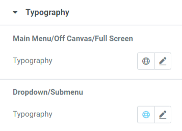
As the name suggests, this section allows you to customize the typography of the main menu/off canvas/full screen and dropdown/submenu.
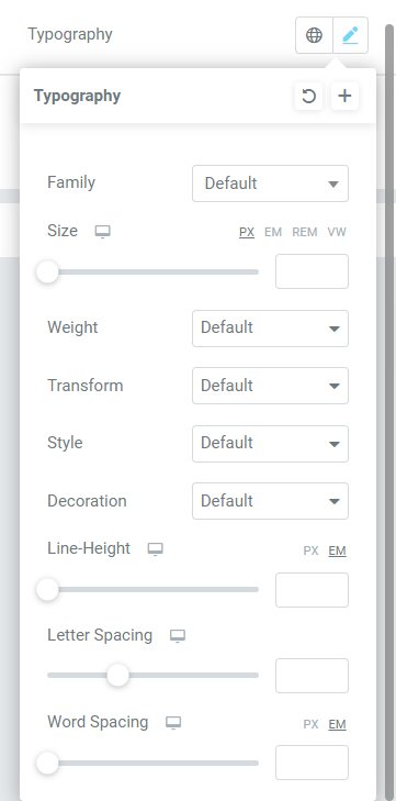
As you can see, typography customization options include features for choosing text font, size, style, word spacing, and many more.
All these wide ranges of options are available to customize the typography of the menu thoroughly.
Submenu Indicator
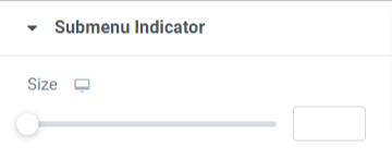
In this section, you’ll get an option to set the submenu indicator size. Set the submenu indicator size according to your choice.
So, we’ve seen how to utilize each option in all the sections provided by the content and style tab of the PowerPack Advanced Menu widget to customize the hamburger menu.
Apply all these changes to see the best results for both the interface and the functioning of the Elementor Hamburger Menu that we’ve just created using the PowerPack Advanced Menu widget.
When you apply all these changes we’ve just discussed, you’ll get a hamburger menu that will look something like this:

Wrapping Up!
A hamburger menu is an excellent way to display the menu bar and ensure visitors can access the complete list of categories on a smaller screen.
We hope this tutorial blog helped you create a fantastic hamburger menu for your website using the PowerPack Advanced Menu widget and Elementor.
If you’ve enjoyed reading this article, you’d also love to experience our other PowerPack Widgets. Checkout our popular articles on:
- Elementor Errors and How to Fix These
- How to Create a WooCommerce Product Carousel using Elementor
- How to Display Google Reviews on WordPress Websites Using Elementor
Click here to get the PowerPack Advanced Menu widget for Elementor.
Please feel free to drop your comments here; we’d love to receive your replies.

1 thought on “How to Create a Hamburger Menu in WordPress with Elementor [Step-by-Step Guide]”
This article offers a straightforward guide to adding a hamburger menu to WordPress using Elementor. With clear instructions and helpful visuals, it’s a valuable resource for users of all levels. By prioritizing customization and responsive design, it ensures a seamless experience across devices.