Album widget for Elementor lets you display a collection of images in an organized album layout. Visitors can view the album cover and open the complete image gallery in a lightbox with a single click. You can use the widget to showcase event photos, portfolios, travel albums, product galleries, team memories, and more.
In this guide, we'll walk you through all the settings available in the Album widget and explain how to use them.
Getting Started: Using the Album Widget#
Follow these steps to add the Album widget to your page:
- Open the page where you want to add the Album widget in the Elementor editor.
- In the Elementor widgets panel, search for Album.
- Drag and drop the Album widget onto your page.
- Once the widget is added, you'll see the following tabs in the left panel:
- Content
- Style
Let's explore all the settings available under the Content tab.
Content Tab#
Content tab contains all the settings required to create and customize your album. The available sections are:
- Album
- Trigger
- Album Cover Content
- Additional Options
Let's look at each section in detail.
Album#
This section allows you to add images to your album.
- Add Images: Click the Add Images option to select images from your Media Library.
You can:
- Select multiple images at once.
- Rearrange image order as needed.
- Remove unwanted images from the album.
- Add new images anytime.
The images added here will be displayed inside the album and opened in the lightbox when visitors click the album cover or button.
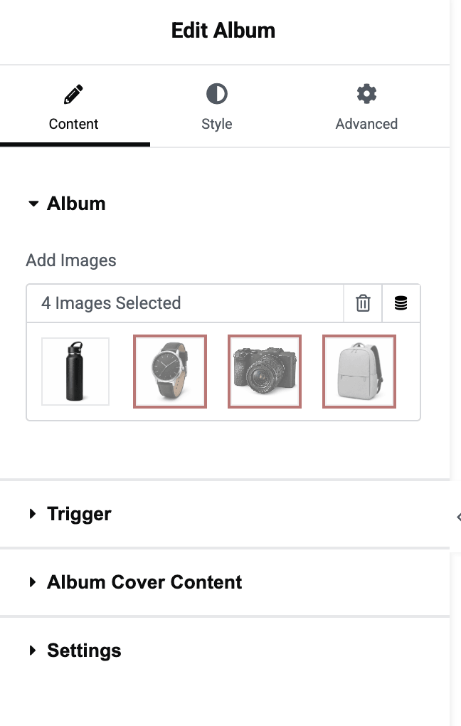
Tip: Use high-quality images with consistent dimensions for a better viewing experience.
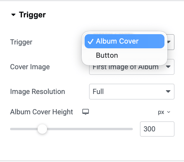
Trigger#
Trigger option determines how visitors open the album gallery.
- Trigger Types: You can choose between Album Cover or Button
Let's understand both options.
Album Cover: When you select Album Cover, visitors can click the album cover image to open the gallery. Additional settings become available:
- Cover Image: Choose the image that will be displayed as the album cover. Available options: Custom or First Image of Album
- Image Resolution: Select the image size used for the album cover.
- Album Cover Height: Set a custom height for the album cover.
Button: When you select Button as the trigger, visitors will click a button to open the album gallery. The following options become available:
- Button Text: Enter the text you want to display on the button.
- Button Icon: Add an icon to the button for better visual appeal.
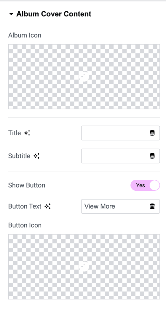
Album Cover Content#
This section is available when Album Cover is selected as the trigger. It allows you to display additional information on the album cover.
- Album Icon: Enable this option to display an icon on the album cover.
- Title: Add a title for your album.
- Subtitle: Add a subtitle to provide additional information about the album.
- Show Button: Enable this option if you want to display a button directly on the album cover. Once enabled, additional settings appear.
- Button Text: Enter the text to display on the button.
- Button Icon: Select an icon to display alongside the button text.
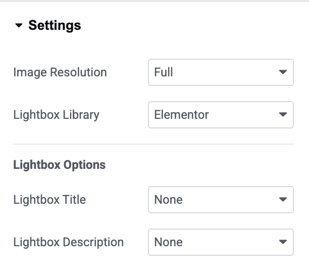
Additional Options#
This section includes extra settings that control image quality and lightbox behavior.
- Image Resolution: Choose the image size that will be used inside the album gallery.
- Lightbox Library: Choose the lightbox library used to display album images: Elementor or Fancy Box
Style Tab#
Style tab lets you customize the appearance of the album cover and overlay content. You can adjust borders, hover effects, image appearance, overlays, and more to match your website's design.
Album Cover#
Album Cover section lets you customize the appearance of the album cover image. This section includes separate styling options for:
- Normal state
- Hover state
The Hover state settings allow you to create interactive effects when visitors move their cursor over the album cover.
- Border Type: Select a border style for the album cover.
- Border Radius: Use this option to create rounded corners for the album cover.
- Image Scale: Adjust the zoom level of the album cover image.
- A value of 1 displays the image at its original scale.
- Higher values zoom the image in.
- Box Shadow: Add a shadow around the album cover.
- CSS Filters: Apply visual effects to the album cover image.
- Image Filter: Choose how the image should be displayed.
- Hover State Styling: Switch to the Hover tab to customize how the album cover appears when users hover over it.
Cover Overlay#
Cover Overlay section lets you style the overlay displayed on top of the album cover. Like the Album Cover section, it includes separate settings for:
- Normal
- Hover
This allows you to create different overlay appearances before and after hovering.
- Background Type: Choose the background style for the overlay. Available options include: Classic Background & Gradient Background.
- Margin: Control the spacing around the overlay.
- Hover Overlay Styling: Use the Hover tab to define how the overlay appears when visitors hover over the album cover.
Album Cover Content#
Album Cover Content section lets you control the positioning and appearance of the content displayed on the album cover, including the album icon, title, subtitle, and button.
This section helps you create visually appealing album covers that align perfectly with your website's design.
- Vertical Align: Use this option to control the vertical alignment of content within the album cover.
- Horizontal Align: This option controls the horizontal placement of the content within the album cover.
- Text Align: Set the text alignment on the album cover.
- Margin: Use the Margin option to control the space around the album cover content container.
- Padding: Padding controls the inner spacing within the content container.
Album Cover Button#
Album Cover Button section lets you customize the appearance of the button displayed on the album cover. These settings help you create a button that matches your website's branding and design style.
This section includes separate styling options for:
- Normal
- Hover
The Hover state settings let you define how the button appears when visitors hover over it.
- Size: Select the predefined size for the album cover button.
- Normal & Hover States: The button styling can be customized independently for both Normal and Hover states. This allows you to create interactive hover effects that improve user engagement.
- Text Color: Choose the color of the button text.
- Background Color: Set the button's background color.
- Border Type: Add a border around the button.
- Border Radius: Use this option to round the button's corners.
- Typography: Customize the appearance of the button text.
- Padding: Control the spacing inside the button.
- Box Shadow: Add a shadow effect around the button.
- Hover State Styling: Switch to the Hover tab to customize how the button appears when users hover over it.
Wrapping Up!#
Album widget makes it easy to create attractive image albums and display them in an interactive lightbox.
Simply add your images, configure the trigger type, customize the album cover content, and select your preferred lightbox library to create engaging photo albums on your Elementor website.