
Owning a website and grabbing better user interactions takes many creative efforts. But believe it or not, 90% of visitors make opinions about your website in seconds.
Adding multiple images will result in an exceptionally well-structured website that helps you get better user engagement.
There are many ways to display images on your website, giving an appealing look; Image Accordion is one of them.
In this article, we will show you how to create an Image Accordion Section on your WordPress website using Elementor and PowerPack Image Accordion Widget.
What Is an Image Accordion?
Image Accordion is an amazing and unique tool to display compact-style image galleries and banners with animation on user interaction like hover or click effects.
It’s the perfect way to showcase multiple images in an appealing way giving your website a fresh look. Several images can be added at a time in an Image Accordion, where the image expands when triggered by users.
These shortened versions of images can be displayed in two accordion directions; vertical or horizontal.

How To Create an Image Accordion With Elementor & PowerPack Addons
PowerPack Addons is one of the best addons for Elementor page builder.
With PowerPack Elementor Addon, you get 80+ creative widgets and 150+ pre-designed templates to add a beautiful touch to your WordPress website. And the best part of using PowerPack widgets is that it’s specially designed for non-coders.
PowerPack Image Accordion widget allows powerful customization options in vertical and horizontal patterns. In addition, it displays multiple images with interactive clicks and hover effects.
Using all the advanced features of the PowerPack Image Accordion widget, you can create amazing image accordions for your WordPress website.
To create an Image Accordion section on your website, first, you need to install and activate Elementor and PowerPack Elementor Addon.
If you prefer watching a video then here is a tutorial video on how to create an Image Accordion using Elementor.
So, without further ado, let’s move ahead to the tutorial.
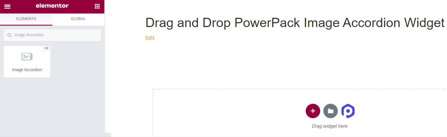
Drag and Drop PowerPack Image Accordion Widget
First, open the page in the Elementor editor, then type ‘Image Accordion’ in the search bar and drag & drop the widget on the page.
Make sure to check for the PowerPack ‘PP’ sign on the top-right corner of the widget.
Content Tab of PowerPack Image Accordion Widget
Navigate to the Content Tab of the Image Accordion widget. Once you navigate to the Content Tab, you’ll find two sections:
- Items
- Settings
Let’s see all the available features in this tab:
Items
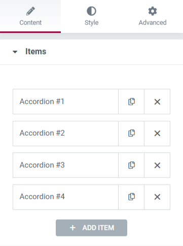
This section includes all customization options required for the content displayed in the Image Accordion widget.
Let’s see all the customizable features available in this section:
Content
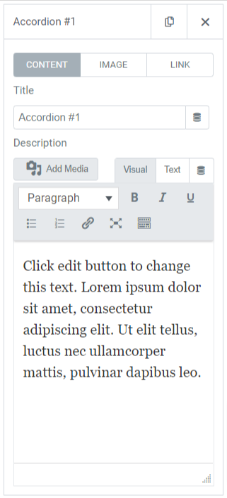
This particular subsection includes features like:
- Title: Add a title of the content to display in the image.
- Description: You can add a description of the content you want to display on the image. Features to customize the text are also available here, such as HTML tag, bold, italic, underline, lists, etc.
Image
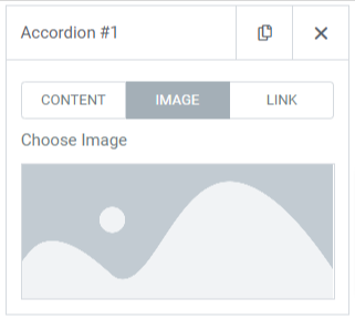
This subsection allows you to add beautiful images to your Image Accordion section. Simply click to “choose Image” and insert media from the media library.
Link
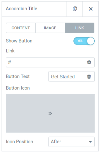
If you want to link the image to your other page, you can add a link to the content. So, let’s see the features available in this subsection:
- Show Button: Toggle on this feature to display a call-to-action button for the link.
- Link: Drop the link to where you want to redirect the user through the image.
- Text: Add the content you want to display on the call-to-action button.
- Button Icon: Choose a button icon from the icon library.
- Icon Position: You can choose the icon position after or before the button text.
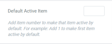
Default Active Item
Settings
This section includes all customizable options for the images displayed in the accordion widget.
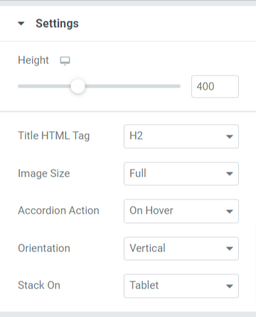
Let’s discover all the features available in this section:
- Height: You can adjust the height of the Image Accordion here.
- Title HTML Tag: Choose the title HTML tag here.
- Image Size: You’ll have a wide range of image size options here; select one of those for your image.
- Accordion Action: Customize the accordion action option here, such as ‘on hover’ or ‘on click.’
- Orientation: Select the image orientation from vertical or horizontal.
- Stack-On: You can also select stack among tablet, mobile, or ‘none.’
Style Tab of the PowerPack Image Accordion Widget
In the Style Tab of the PowerPack Image Accordion widget, you’ll get all styling options to customize your Image Accordion section.
This tab includes three sections.
- Items
- Content
- Button
Let’s see all the available features in this section:
Items
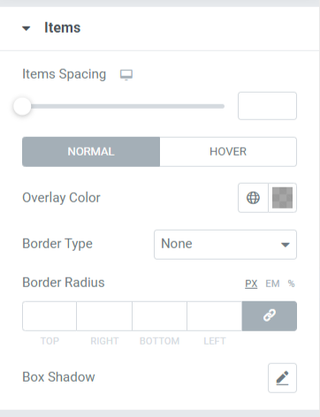
Let’s discuss the features available in this section:
- Items Spacing: This allows the spacing between the items displayed in the Image Accordion.
- Overlay Color: You can use this option to add an overlay color.
- Border Type: Add borders to the images displayed in the Image Accordion from the options given here, such as solid, double, dotted, dashed, & groove.
- Border Radius: You can adjust the border radius from here if you’ve applied the border. Using a border-radius will give soft edges to the items displayed in the Image Accordion.
- Box Shadow: To apply a box shadow, you can use this feature.
Content
This section includes all the styling features of the content part of the Image Accordion.
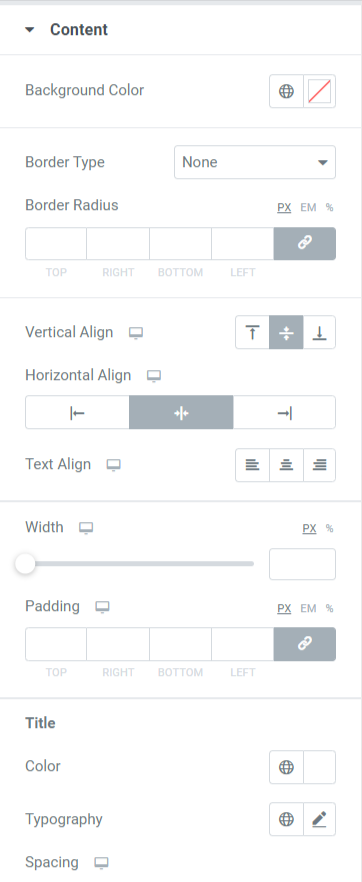
Let’s discuss the features available in this section:
- Items Spacing: This allows the spacing between the items displayed in the Image Accordion.
- Overlay Color: You can use this option to add an overlay color.
- Border Type: Add borders to the images displayed in the Image Accordion from the options given here, such as solid, double, dotted, dashed, & groove.
- Border Radius: You can adjust the radius from here if you’ve applied the border. Using a border radius will give soft edges to the items displayed in the Image Accordion.
- Box Shadow: To apply a box shadow, you can use this feature.
Button
This section gives the flexibility to customize the button thoroughly.
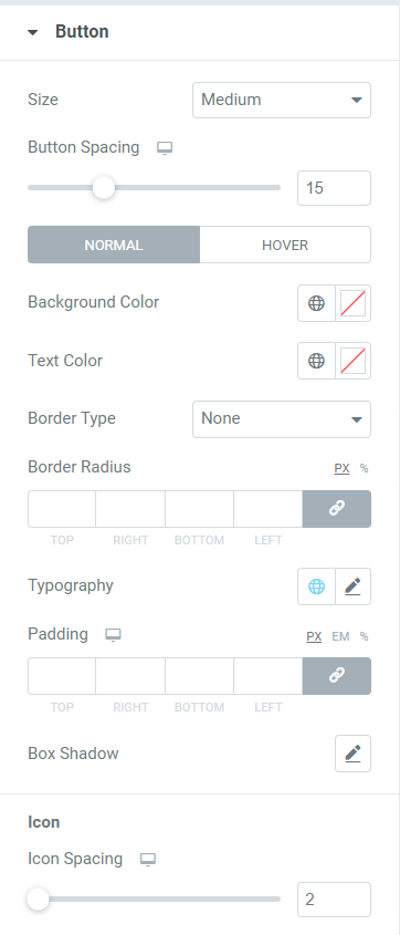
Let’s discuss all the features available in this section:
- Size: Select the button’s length from the given options, small, medium, and large.
- Button Spacing: It allows the spacing between the button text and button icon.
- Background Color: If you want to add a background color to the button, you can add it here.
- Text Color: Choose the button text color here.
- Border Type: You can select a border type for the button.
- Border Radius: You can style the button by adjusting the border radius in this option.
- Typography: Here, you can style the button text by customizing the typography.
- Padding: You can easily adjust the padding to customize the call-to-action button.
- Box Shadow: This option allows you to customize the box shadow in horizontal and vertical directions.
- Icon Spacing: You can create spacing between button text and the button icon with this option.
After applying all those changes, you’ll get something like this:

Get Your Image Accordion Section Ready Using PowerPack Image Accordion Widget
Displaying an attractive Image Accordion section to your WordPress website will add a beautiful touch to the overall look of your website. In addition, using the compact spaces on your website will leave your site organized and more attractive.
We hope this tutorial helped you learn how to use PowerPack Image Accordion Widget to create an interactive image section for your WordPress website. Click here to get an Image Accordion Widget for Elementor now!
If you’re looking for ways to easily display offers & sales alerts for your business product through promotional banners, you can check our post to learn how to create a promo box in WordPress using Elementor.
Please feel free to drop your comments here; we’d love to receive your replies.
