
Wanted to create a stunning team member section using Elementor?
A well-designed Meet The Team page helps you build trust and a personal connection with your site visitors. If you’re looking for the simplest way to create a team member section on your WordPress website using the Elementor page builder, then PowerPack Team Member Widget will be the best choice.
In this article, we’ll see a detailed step-by-step tutorial on how to create a team member section using Elementor and PowerPack.
Create a Team Member Section Using PowerPack Team Member Widget

To create a team member section on your WordPress website, you first need to install Elementor & PowerPack Elements.
PowerPack Elementor Addons include a Team Member Widget that helps you create an interactive team member section in a few clicks. From setting team members’ display picture to adding contact details to interlink the social media profile you get options for all.
Let’s see how you can use all these options to create a beautiful team member section on your WordPress website.
If you prefer watching a tutorial video on creating a team member section using Elementor, you can also refer to this video.
Without further ado, let’s move ahead to the tutorial.
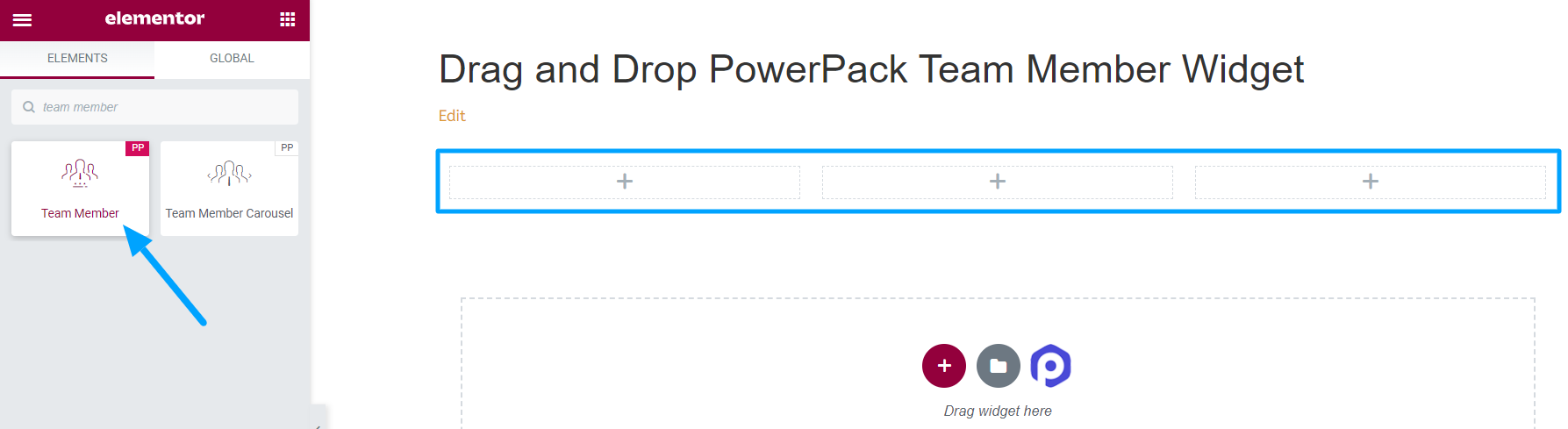
Drag and Drop the PowerPack Team Member Widget
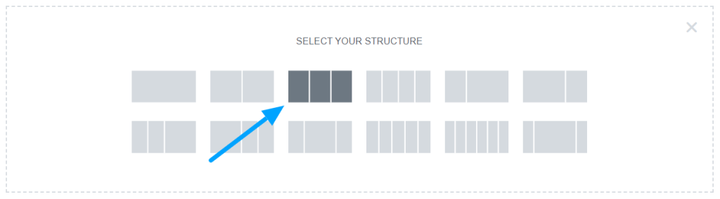
First of all, open a page in Elementor editor, add a new section then select the structure to create a team member section.
Once you’ve selected the layout, type “Team Member” in the search bar and drag and drop the widget on the page.
Make sure to check for the PowerPack “PP” sign on the top-right corner of the widget.
Content Tab of PowerPack Team Member Widget
First, navigate to the content tab of the Team Member widget. There you’ll find the following four sections:
- Image
- Details
- Social Links
- Settings
Let’s have a look at the functionalities that each section provides:
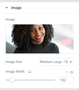
Image
The name itself describes the functionalities it offers. In this section, you can add your team member’s image.
Looking at the options this section offers:
- Image: Choose your team member’s image to add here in this section. You can choose an image from the media library or upload a file locally.
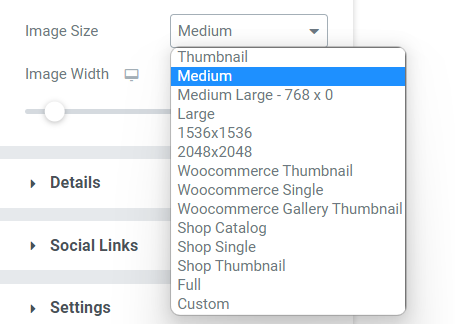
- Size: From a wide range of image size options given here, you can choose an appropriate size according to your preference.
- Image Width: Adjust the image width using this option.
Details
This section allows you to add all the details about your teammates. This section includes a few subsections where the entire content can be easily added.
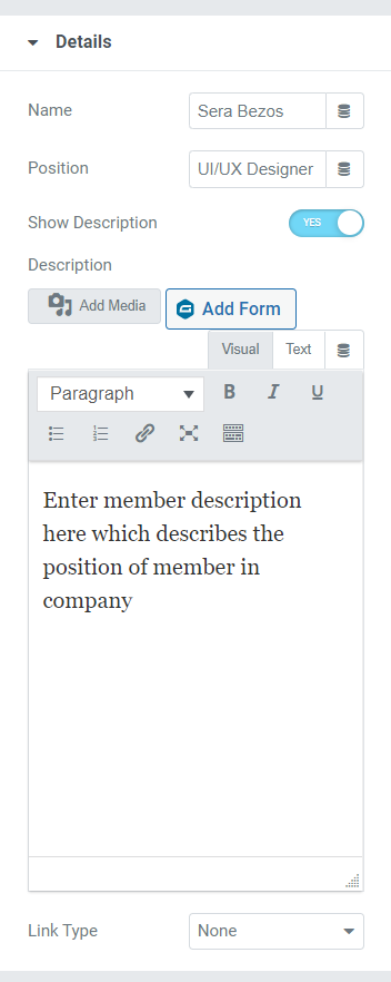
Let’s see the options available in this section:
- Name: Add the name of our teammate here.
- Position: Provide the team members’ job designation here.
- Show Description: Toggle on this feature if you want to show further details about your team member.
- Description: This option to add a description will appear only if you’ve enabled the “show description” button. And if you’ve enabled this feature, describe their role in the organization or any other thing they’re known for. You can customize the text in bold or italic format, convert the text in bullet/number list format, underline them, insert a link or add a media.
- Link Type: If you want to drop a link in the description to showcase their proven work, you can make these things done here in the form of an image or title.
Social Links
All social media profiles of a team member can be linked here. It’s as simple as that.
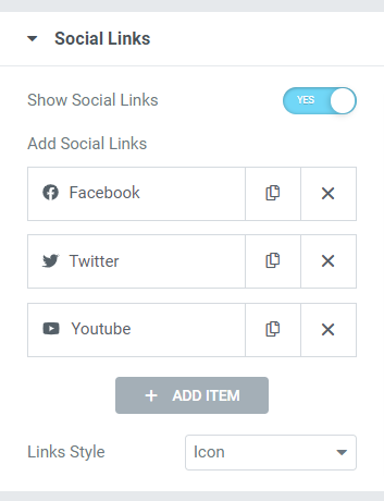
Simply, toggle on the “show social links” option given here. On the “add social links” portion, drop the URL of the given options for the social media platforms. You can add your teammates’ Facebook, Twitter, and Youtube profile links here.
Change social media icons in just one click from the icon library, drop the social media links in each section. Also, you can choose among the link style, either icons or a button.
Settings
All additional settings related to the team member section can be done in this section.
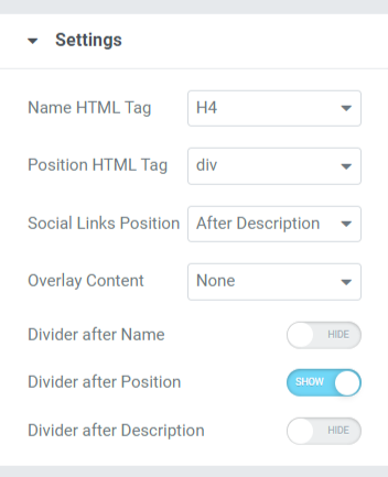
The settings section includes various options to customize and style the team member section. Let’s see each of them in more detail.
- Name HTML Tag: This option lets you choose the HTML Tag for the team member’s name displayed in the team member section.
- Position HTML Tag: The Team Member section displays HTML Tag for the employees’ positions.
- Social Links Position: Using this option, you can set the positioning of the social media links you’ve provided. This option provides two positions and a before/after description for social media links.
- Divider After Position: Enable this option if you want to display a divider or separator between team member’s position and description.
- Overlay Content: If you want to overlay content, you can choose options available here among social icons, description, or social icons + description.
- Divider After Name: Enable this option if you want to display a divider or separator between a team member’s name and position.
- Divider After Description: Toggle on this button if you want to display a divider between description and social media links.
Customizing the Style Tab of PowerPack Team Member Section
The Style Tab contains all the styling parts required to customize the team member section. This Tab includes the following six sections:
- Content
- Image
- Name
- Position
- Description
- Social Links
Let’s have a detailed look at these sections:
Content
Styling related to the whole content part of the team member section can be done here.
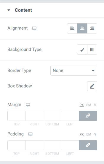
Let’s see all the styling options available here:
- Alignment: This allows to set the text alignment.
- Background Type: Using this option, background color can be added to the text. Select among gradient or classic to choose your background type.
- Border Type: You can choose any border type from the options given here such as solid, double, dotted, dashed, & groove.
- Box Shadow: Add a box shadow to the content part In the team member section using this option.
- Margin: With this option, you can adjust the border margin for the content part.
- Padding: Adjust the padding to allow enough spaces between the content and the border.
Image
Customize the image displayed on the team member section by utilizing the feature available in this section.
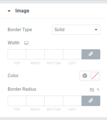
Features available in this section are:
- Border Type: You can choose any border type for the image from the options given here such as solid, double, dotted, dashed, & groove. You can choose “none” if you don’t want to cover the image with a border.
- Width: Adjust the width of the image using this option.
- Color: You can change the border color here.
- Border Radius: If you’ve applied a border to the image then adjust the border-radius here.
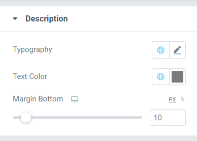
Name
Styling options related to the name of the team member are available here.
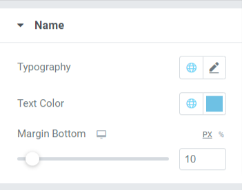
You can customize the name by changing its typography, text color, and margin at the bottom end.
- This margin allows space at the bottom part of the name displayed in the Team Member section.
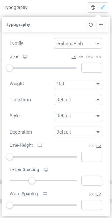
- Typography options of the name section include features like font style, font size, line height, letter spacing, word spacing, etc.
- Also, you can choose the text color here.
Position
This section includes multiple features related to the ‘position’ text displayed on the team member section. You can customize it here if you’ve allowed a divider on the bottom end of the ‘position’ text.
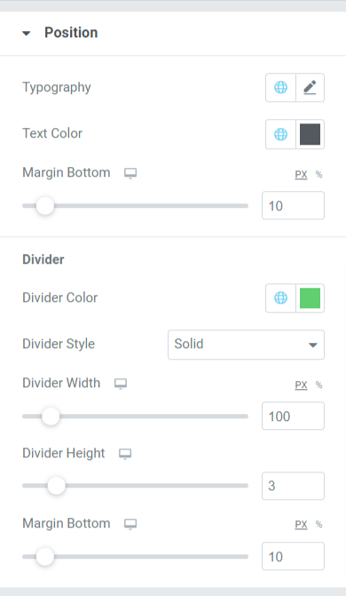
Let’s have a look at all those features available in this section.
- Typography: Customize the font style, font size, decoration, line-height, letter spacing, word spacing, etc.
- Text Color: You can choose any text color according to your preference.
- Margin Bottom: Allow space between the ‘position’ and ‘description’ text displayed in the team member section by adjusting the margin on your mouse click.
Divider
If you’ve allowed a divider or a separator between position and description text, then you’ll get these options to customize the divider.
- Divider Color: Choose a divider color using this option.
- Divider Style: Choose among solid, dotted, dashed, and double to style the divider.
- Width: Adjust the divider width using this option.
- Divider Height: Divider height can be adjusted with this option.
- Margin Bottom: Allow margin bottom to customize the space between position text and description text.
Description
This section allows customizing the description text in all aspects.
You can customize the description text displayed in the team member section in this section.
- Customize the Typography feature where you can get styling options like font style, font size, weight, transform, style decoration, etc.
- Text Color for description text can be chosen here.
- With the Margin Bottom feature, spacing between description and social media links can be applied. If you’ve chosen to display social media links above the description part, margin bottom will allow space on the bottom end of the team member section.
Social Links
Features related to Social Links are available in this section.
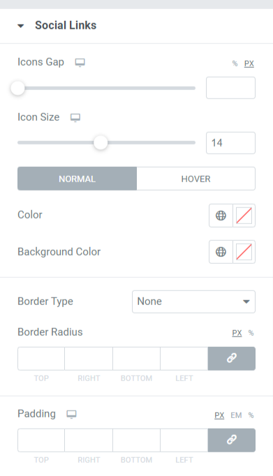
Let’s see all the features available in this section:
- Icons Gap: Using this option, you can allow a gap among the social media icons displayed in the team member section.
- Icon Size: Select the icon size here.
- Color: Choose a color according to your preference for the social media icons.
- Background Color: Allow a background color using this option.
- Border Type: Select any border type from the options available such as solid, double, dotted, dashed, or groove. You can select ‘none’ if you don’t want to allow a border to social media icons displayed in the team member section.
- Border Radius: If you’ve allowed a border to the social media icons, adjust its radius here. It helps display the smooth edges of the border applied.
- Padding: Adjust the padding to allow enough spaces between the social media icons and the border.
After customizing the entire Content Tab and Style Tab of PowerPack Team Member Widget, your final output will look something like this:

Get Your PowerPack Team Member Widget For Elementor
Using PowerPack Team Member Widget, you can easily get tons of features that help you create a stunning Team Member section with Elementor page builder.
We hope this tutorial blog helped you to create a Team Member section using Elementor for your Website page. If you’ve enjoyed reading this article, we’re sure you’d also love experiencing our other PowerPack Elementor Addons too.
Keeping your requirements in mind, we try to keep the functionalities of our products in a user-friendly way so that anyone can make use of them without even having a single experience of coding.
Get a professional touch on your website using PowerPack Elements for Elementor. Click here to get the PowerPack Team Member widget for Elementor.
Please feel free to drop your comments here; we’d love to receive feedback from you. Also, join us on Twitter, Facebook, and Youtube.
