
Welcome to our comprehensive guide on creating toggle buttons with Elementor, the popular page builder for WordPress.
This step-by-step tutorial will walk you through designing and implementing toggle buttons using Elementor’s intuitive interface.
Toggle buttons are essential elements in web design, offering an interactive and space-saving solution for various scenarios on your website.
By the end of this tutorial, you’ll have the knowledge and tools to create toggle buttons that enhance user experience and engagement.
What Is a Toggle Button in Elementor?
A toggle button is a type of button that you can add to your site to show or hide content with a single click. It works like a light switch that you can turn on or off.
Toggle buttons, also known as switches, are user interface elements that allow users to switch between two states. Toggle buttons are popular because they save space on the page while providing a seamless and interactive user experience.
When the toggle button is on, it shows the primary content; when it’s off, it switches the content again. It’s a helpful feature because it allows you to organize your website’s information in a more interactive and space-saving way.
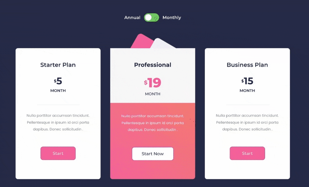
For example, you can use a toggle button to display a dual pricing table to display your multiple pricing packages interactively.
How to Create a Toggle Button With Elementor
Now, let’s see how you can create a toggle button with Elementor and PowerPack Addons.
PowerPack Addons is one of the best Elementor addons to add advanced features packed with 80+ creative widgets and powerful extensions that allow you to create your dream Elementor websites.
Whether you want to create a restaurant menu with Elementor or WooCommerce website or create an animated gradient background, you can do it all in just a few clicks with PowerPack Elementor Addons.
So let’s now create our toggle button with Elementor and PowerPack Addons.
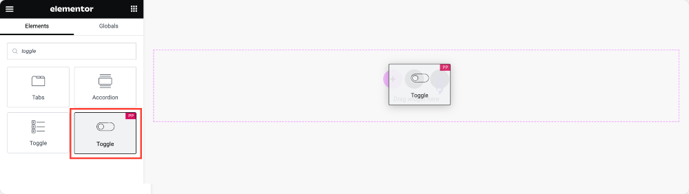
1: Drag and Drop PowerPack’s Toggle Button Widget
Start with opening the page in the Elementor editor and drag and drop the PowerPack Toggle widget on the page.
Don’t forget to check the “PP” icon on the top-right corner of the widget.
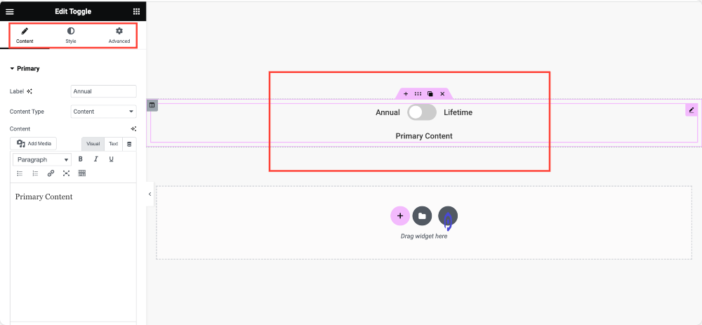
You’ll see a toggle button on your page as soon as you add the widget. And like every Elementor widget, the Toggle Button widget by PowerPack also includes 3 main tabs: Content Tab, Style Tab & Advanced Tab.
So now let’s see what customization and styling options you get in the Toggle Button widget.
2: Elementor Toggle Button Widget: Options in Content Tab
We’ll start with exploring options included in the Content Tab.
The Content tab consists of 3 sections:
- Primary
- Secondary
- Settings
The options are self-explanatory and easy to understand.
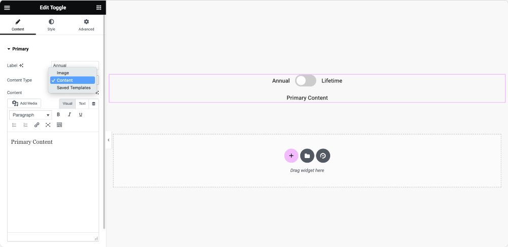
In the Primary section, you get the flexibility to change the Label name and choose your Content Type.
For the content source, you can add custom text Content, add an Image or choose from the Saved Template.
The Secondary section includes the same customization options as the Primary section.
So, let’s move to the Settings section.
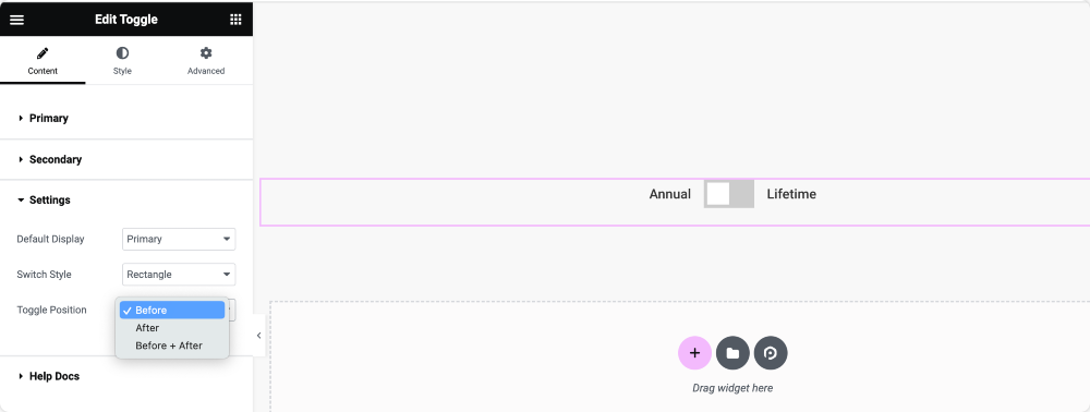
In the Settings section, you get options to:
- Set the Default Display of the toggle button. (Primary or Secondary)
- Choose your toggle Switch Style. (Round or Rectangle)
- Set your Toggle Position respective to the content. (Before, After, or Before & After)
3: Elementor Toggle Button Widget: Options in Style Tab
So, you get the content customization options in the Content Tab of the Toggle widget. Now let’s see the styling options included in the Style Tab.
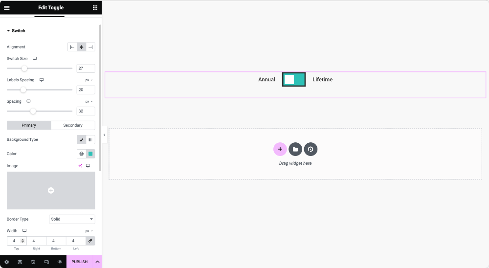
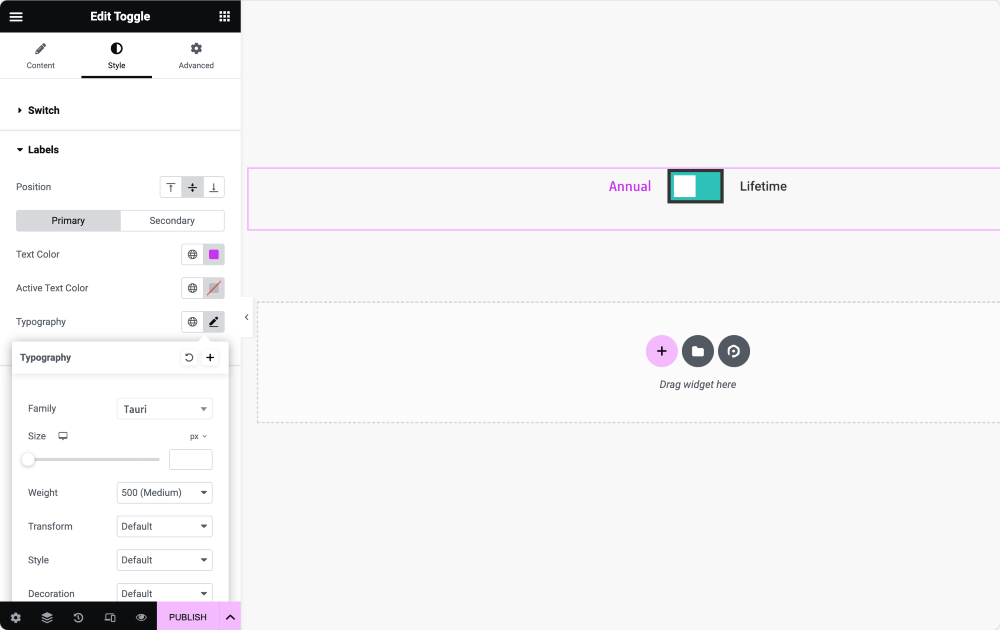
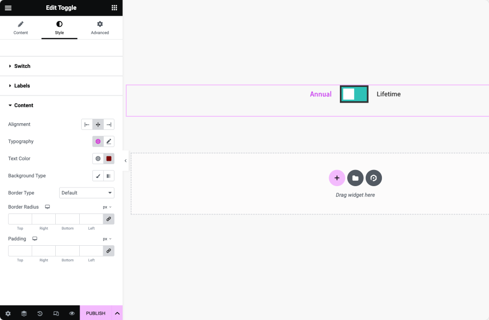
In the Style tab, you’ll find 3 sections:
- Switch
- Labels
- Content
Within all the sections, you get Position and Alignment options.
In the Switch section, you can define switch size, adjust label spacing, set background color/type, and more.
For Labels customization, you get complete control over the typography styling. For example, you can choose the font type, define the text size, set the text color, choose the text color for the active switch, and more.
Lastly, for Content Styling, you get options to alter typography, add text color, change background type, add a border, and define border-radius and padding.
Wrapping Up!
So, this is how simple it is to create a toggle button with Elementor. This guide will help you create enticing and eye-catching toggle buttons on your websites.
Including the Toggle widget, PowerPack offers more than 80 creative and advanced Elementor widgets to enhance your experience of building websites with Elementor. Check the complete widget list here!
PowerPack comes in Free and Paid versions; you can download the lite version from its official wordpress.org file and get the paid version by visiting the pricing page.
Please drop your comments here if you find this tutorial helpful; we’d love your replies.
