
Want to highlight trending news, events, the latest updates from your blog, and other content to grab your visitors’ attention on your website? If yes, then you’ve visited the right place.
In this article, we will talk about event and news tickers; later, we’ll see detailed step-by-step instructions to create an event and news ticker on the WordPress website using Elementor.
So, let’s get started!
In case you would rather like to watch a video, we have it all set for you!
What Is News & Event Ticker?
News and event ticker is a feature that displays a scrolling feed of the latest news and events related to the website’s topic or industry. It is usually located at the top or bottom of the website’s homepage or on a dedicated news page.
The ticker provides users a quick and easy way to stay up-to-date on the latest developments, breaking news related to the website’s subject matter, or recently published posts. News and event tickers can be customized to display specific types of news and events, such as breaking news, sports scores, stock market updates, or weather alerts.
They are a popular feature on news, financial, and other websites that provide timely information to their users.
Create News & Event Ticker in Elementor Using PowerPack Addons
PowerPack Content Ticker widget for Elementor comes with powerful features that can help create an interactive and stylish event or news ticker for your website.
Unlike other ticker widgets/plugins, the Content Ticker widget by PowerPack Addons provides you with dozens of feature-packed options for customizing and styling the content ticker without touching a single coding line.
It allows you to highlight content from different post types and customize them all by adding images and making changes in typography options to get stunning tickers for your website.
Features of PowerPack Content Ticker Widget for Elementor
- You can display posts using the News Ticker widget for Elementor from multiple sources on your website.
- In addition, you can specify the post’s date and time.
- There’s no need to rely on any specific category; you can add custom content according to your needs and preferences.
- You can link the ticker to any post, page, or product and easily create sales.
- An option for adding images is also available to make the ticker stylish and attractive enough to get click-through rates.
- Stunning effects of sliding or fading the ticker are also available.
- Content ticker allows cross-compatibility with tablets and mobile devices to enhance user experience.
1. Drag and drop the Content Ticker Widget
So first of all, open the page using Elementor editor, then type ‘Content Ticker’ in the search bar and drag & drop the widget on the page.
While performing the procedure, first make sure to check for the PowerPack ‘PP’ sign on the top-right corner of the widget.
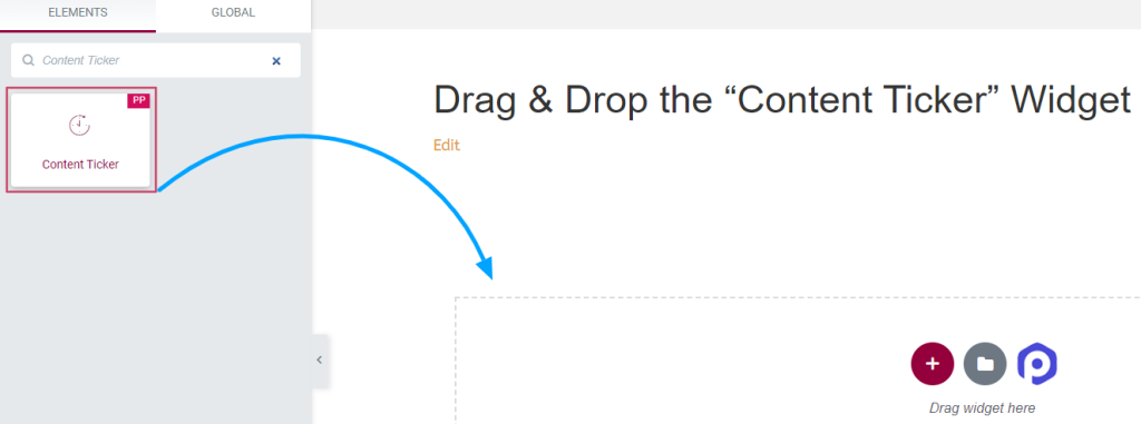
Once done, navigate to the content and style tab of the Content Ticker widget to perform further steps.
2. Customize the Content & Style Tab of the ‘Content Ticker’ Widget
The content and style tab of the ‘Content Ticker widget has multiple customizable options using which you can style the tickers to look more attractive and unique.
Content Tab of ‘Content Ticker’ Widget
The content tab of the ‘Content Ticker’ widget has a total of six sections:
- General
- Ticker Items (Available only if you choose ‘custom’ source)
- Post Meta (Available only if you choose ‘posts’ source)
- Query (Available only if you choose ‘posts’ source)
- Header
- Ticker Setting
Let’s see each of these sections in detail.
General
Options for this section vary according to the source type you select.
When you select the ‘custom’ source:
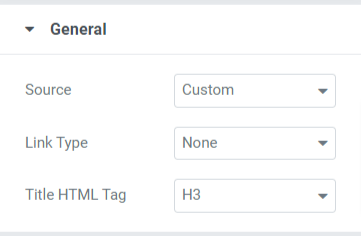
You can select the link type linked with title, image, or maybe with title and image. Also, you can customize the title HTML tags for the tickers.
When you select “posts,” source:
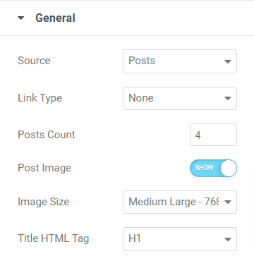
Options to this section, when you select “posts” as the source type other than link type and title HTML tag, are:
- Posts Count: Select the number of posts you want to display on the ticker.
- Post Image: Enable this option if you want to display the image on the ticker.
- Image Size: If you’ve enabled the “post image” option, you can choose the image size per your preference.
Ticker Items
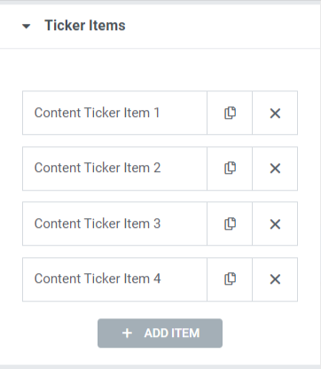
You can edit the title text for each item and drop a link.
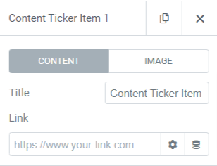
Toggle on the “show image” option if you want to display the image to the ticker.
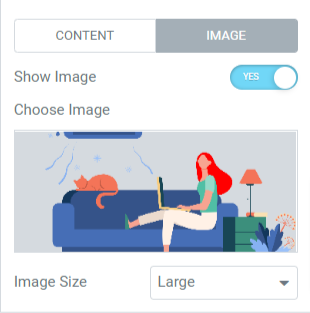
Once you enable the show image option, choose an image from the media library and select the image size according to your preference.
Note: This section will be available only if you choose a ‘custom’ source.
Post Meta
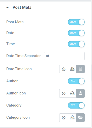
This section allows you to enable/disable various customizable options such as post meta, date, time, author, and category. For example, you can choose icons for date-time, author, & category from the icon library and add a date or time separator.
Note: This section will be available only if you choose ‘posts’ source
Query
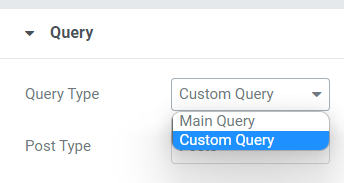
If you select ‘main query’ as the query type, you can fill in a custom query ID.
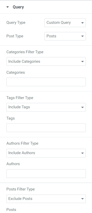
If you select ‘custom query’ as the query type, you’ll get a few options to customize the ticker.
- You can include/exclude filter types for categories, tags, authors, and posts.
- Select the post type from the given options, such as posts, pages, media, landing pages, my templates, products, templates, and related.
- You can select dates from available options like past day, past week, past month, past quarter, last year, or custom.
- Choose order ascending or descending and choose order by category from available options such as date, last modified date, random, comment count, title, post ID, post author, menu order, and relevance.
- An option for sticky posts is available; toggle on the “sticky posts” option if you want to display a sticky post.
- You can enable the “show only sticky post” option if you want to display only the sticky post on your website.
- You can use the “Offset” setting option to skip a few numbers of initial posts from the ticker.
- A toggle option, “exclude current post,” is available; enable this option to remove a current post from the query.
Note: Available only if you choose ‘posts’ source
Header
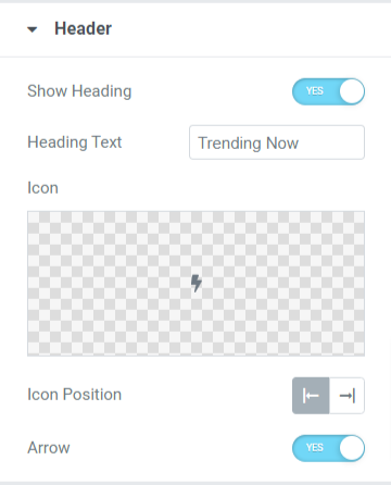
In this section, you’ll get some options to customize the header for the ticker.
- Enable the “show heading” option to display a header on the content ticker.
- You can customize the heading text manually as per your need.
- Choose an icon for the header from the icon library.
- You can adjust the icon position to either the left or right side of the header text.
- Toggle on the “arrow” option if you want to display an arrow bar on the header.
Ticker Settings
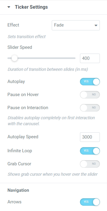
This section includes all additional options to customize the ticker settings.
- You can set the transition effect to the ticker by choosing either the fade or slide effect.
- You can enable or disable some options to the ticker, such as autoplay, pause on hover, pause on interaction, infinite loop, grab cursor, and arrows.
- You can adjust the slider and autoplay speeds for the ticker transition effect.
Style Tab of the ‘Content Ticker’ Widget
Once you’ve done customizing the content tab, let’s move to the next part to customize the style tab.
The style tab of the Content Ticker widget has four sections:
- Header
- Content
- Image
- Arrows
Let’s look at each section one by one:
Header
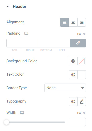
This section includes some options to customize the header:
- You can set the header alignment by using the alignment option.
- A customization option for the background and text color for the header is available. Also, you can customize the typography of the header text.
- You can choose a border type from available solid, double, dotted, dashed, and groove options. You can also select the “none” option if you don’t want to set a border to the header part.
- You can adjust the padding to allow spacing between the header text and border.
- An option to adjust the header width is available; you can use this option to set the width per your preference.
Content
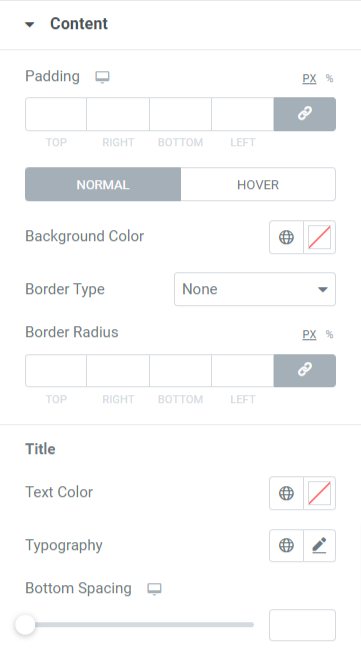
This section allows you to customize the content part shown in the ticker.
- You can set the background color for the header part.
- Choose among solid, dotted, double, dashed, and groove as the border type for the content section displayed on the ticker.
- Adjust the border-radius and padding using the ‘padding’ and ‘border radius’ options.
- You can also customize the text color, typography, and bottom spacing for the title text of the content displayed in the ticker.
Image
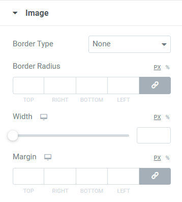
The image section includes options to customize the image set to display on the content ticker.
- You can choose a border type for the image and set its radius to display smooth edges to the border.
- You can also adjust the width and margin of the images that you’ve selected to display on the content ticker.
Arrows
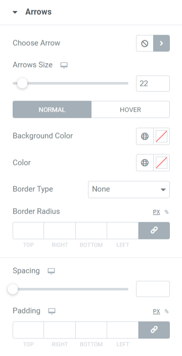
This section includes all the styling options related to the arrows you’ve chosen to display on the tickers.
- You can choose an arrow icon from the icon library.
- You can adjust the arrow size and spacing between both arrows.
- Use background color and arrow color options to customize the arrows.
- Choose a border type from available options such as solid, dotted, double, dashed, and groove.
- Set border radius and padding for the arrows to stylishly customize the arrows.
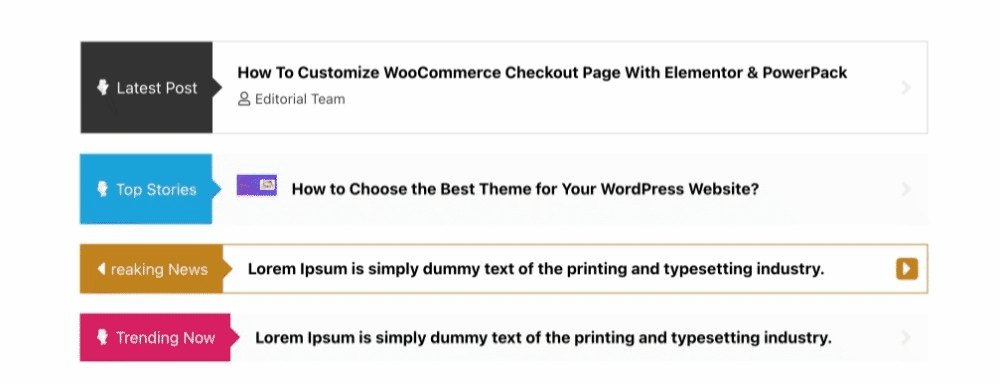
And this is how the PowerPack Content Ticker widget looks on the live page:
Get Content Ticker Widget for Elementor Now!
So this is how you can create an amazingly beautiful event and news ticker in the Elementor using the PowerPack Elementor Addons.
We hope this tutorial blog helped you create trendy “news & event tickers” for your website using Elementor and the PowerPack Content Ticker widget.
Click here to get the PowerPack Content Ticker widget for Elementor.
Please feel free to drop your comments here; we’d love to receive your replies.
