Looking for a simple way to create a video gallery in WordPress using Elementor?
In the era of mobile devices and the popularity of social media, visual contents are widely thriving. So, you can use images and videos on your website to flaunt some engaging content.
Using videos related to your content immediately grabs visitors’ attention and increases the click-through rate on your website. However, embedding a personalized collection of videos on your page can be challenging and may not look attractive.
The easiest way to create a video gallery on your WordPress website is by using a plugin where you don’t have to hustle with the codes.
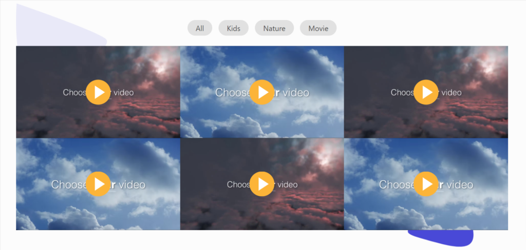
The PowerPack Video Gallery Widget is the best tool designed for WordPress and Elementor to create a video section that gives flexibility and total customization when building a gallery of your own.
Best Video Gallery Widget for WordPress & Elementor
There are dozens of plugins available to create a video gallery section on WordPress websites using Elementor page builder. But using the PowerPack Video Gallery widget is the best way to create a beautiful video gallery section.
PowerPack Video Gallery widget is a 100% responsive & compatible widget that requires no complicated instructions to create a beautiful video gallery section on your website.
Features of Using PowerPack Video Gallery Widget
PowerPack Video Gallery offers plenty of features to create a unique video gallery section leaving a premium look on your website.
Let’s see some key features that the PowerPack Video Gallery widget offers:
- It allows you to display videos from multiple video sources such as YouTube, Vimeo, and Dailymotion.
- It provides some advanced filtering options to customize the video gallery section beautifully.
- Options to customize the cover image or overlay style are available.
- It offers a wide range of options to customize the gallery interactively.
- It’s a mobile-friendly widget that is 100% responsive with multiple styling options.
- It provides stylish carousels and grid layouts for showcasing videos on your website.
- PowerPack Video Gallery widget is optimized for speed. Thus, it never impacts your website performance; instead.
Create a Video Gallery Section in WordPress using Elementor
In this blog, we will learn how to create a video gallery in WordPress using Elementor and PowerPack Video Gallery widget. To create a video gallery section on your WordPress website, you need to install and activate the Elementor page builder and PowerPack Addons.
So, without spending too much time, let’s see how to create a video gallery section on your website.
First, open the Elementor editor page, then type ‘Video Gallery’ in the search bar and drag & drop the widget on the page.
Make sure to check for the PowerPack ‘PP’ sign on the top-right corner of the widget.

Customize the Video Gallery Section on Your Website
Elementor provides default tabs for personalized customization for each widget, such as ‘content tab,’ ‘style tab,’ and ‘advanced tab.’ The advanced tab most commonly offers the same options for all the widgets you will use here, so we’ll discuss the customization options available in the Content and Style tabs.
Customizing the Content Tab of the PowerPack Video Gallery Widget
First, navigate to the Content Tab of the Video Gallery Widget, and once you navigate to the Content Tab, you’ll find five sections:
- Gallery
- Filter
- Play Icon
- Gallery Settings
- Carousel Settings (Only if you choose carousel layout in a gallery setting)
Let’s have a detailed look at their functionalities:
Gallery
The Gallery section of the content tab allows you to add a gallery of videos and customize it.
This section offers options to add as many videos as possible, whether from YouTube, Vimeo, or Dailymotion.
Click “Add Items” to add a new video to your video gallery section.
Once you add a video, click on the item you’ve added, and you’ll get many options to customize that.
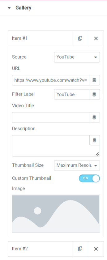
Let’s see the options available in this section to customize the video gallery content:
- Source: Select the video source from this option.
- URL: Enter the video URL here.
- Filter Label: Enter the filter label here.
- Video Title: Give your video a title; enter the name here.
- Description: Describe what your video is about in brief.
- Thumbnail Size: Select the thumbnail size from the given options, such as maximum resolution, high quality, medium quality, and standard quality.
- Custom Thumbnails: Toggle on this feature if you want to display your video with a personalized thumbnail.
- Image: When you enable the custom thumbnail feature, an option will appear to add a custom thumbnail. You can upload an image from the media library.
You can customize the video gallery section using all the options available in this section.
Filter
This section includes some customizable advanced filter options.
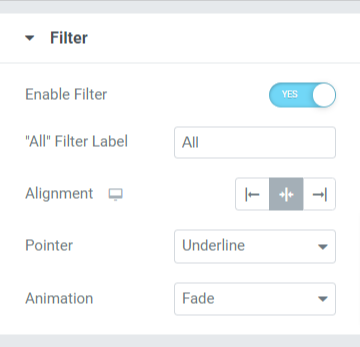
Let’s see all the options available in this section:
- Enable Filter: Toggle on this feature to enable the advanced filtering options.
- “All” Filter Label: Name the filter label displayed on the top of the video gallery section.
- Alignment: Set the alignment of the filter label displayed on the top of the video gallery section.
- Pointer: Select the pointer from given options such as underline, overline, double line, framed background, and text.
- Animation: Set the animation to the filter you’ve applied from the multiple animation options available here, such as fade, slide, grow, drop-in, drop out, and none.
Play Icon
This section provides the flexibility to customize the play button displayed in the video gallery section.
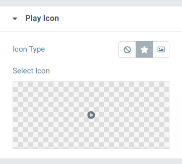
Let’s discuss the options this section offers:
- Icon Type: Choose the icon type to be an icon or image.
- Select Icon: Select the icon from the icon library.
Gallery Settings
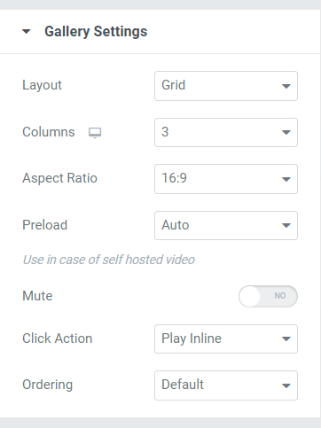
The gallery settings section offers all additional options required to customize the gallery.
Let’s discover the options available in this section:
- Layout: Choose the layout for the video gallery from the grid and carousel.
- Columns: Select the number of columns for the video gallery.
- Aspect Ratio: Choose the appropriate aspect ratio from the ratio options given in the option.
- Preload: Use this option in case you’ve used a self-hosted video.
Carousel Settings
If you choose the video gallery layout as the carousel layout, this section will appear to you.
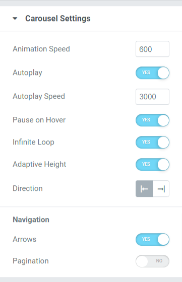
Let’s discuss the available options in this particular section:
- Animation Speed: Use this option to set the carousel animation speed applied to the video gallery.
- Autoplay: Toggle on this feature to set animation autoplay to the video gallery.
- Animation Speed: Use this option to set the carousel animation speed applied to the video gallery.
- Autoplay: Toggle on this feature to set animation autoplay to the video gallery.
- Autoplay Speed: You can set the autoplay speed here.
- Pause on Hover: Enable this option to apply the pause animation on hover over the video gallery.
- Infinite Loop: Enable this option to apply an infinite loop to the video gallery section.
- Adaptive Height: Toggle on this feature to apply adaptive height for all the videos displayed in the video gallery.
- Direction: Set the direction of the animation either left or right.
Navigation
- Arrows: Toggle on this feature if you want to display the arrows on either side of the video gallery.
- Pagination: Enable this option if you want to display the pagination on the bottom side of the video gallery section.
- Pagination Type: Choose the pagination type from the given option, such as dots and fractions.
Note: This section will appear only if you choose the carousel layout in a gallery setting.
Make these changes to your Content Tab of the Video Gallery widget to see incredible changes in your video gallery section.
Customize Your Video Gallery Section Using Style Tab
The style tab of the Video Gallery Widget gives the flexibility to customize the video gallery section in all possible ways. Using all the features provided by the style tab, you can design the video gallery section creatively.
Style tab of Video Gallery widget includes the following seven sections:
- Layout
- Overlay
- Play Icon
- Content
- Filters (If you choose grid layout)
- Arrow (If you select carousel layout)
- Pagination (If you enabled pagination in carousel settings)
Layout
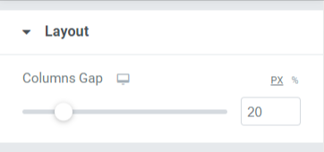
You can customize the layout of the video gallery section by adjusting the columns gap.
Overlay
This section gives the flexibility to customize the overlay feature.
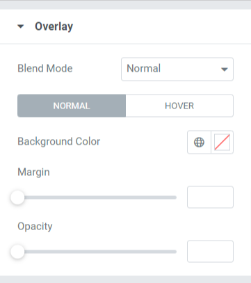
Let’s see the options available in this section:
- Blend Mode: You can choose the overlay blend mode for your video gallery section from a wide range of options given here.
- Background Color: You can customize the background color for the video gallery section here.
- Margin: Adjust the overlay margin using this option.
- Opacity: Adjust the overlay’s opacity that you’ve applied to the video gallery section.
Play Icon
You can customize the play icon by using the options given in this section.
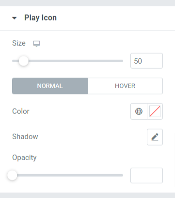
Let’s see the options available in this section:
- Size: You can adjust the size of the play button by using this option.
- Color: Choose a color for your play button icon.
- Shadow: Use this option if you want to apply shadow to the play icon. You can also choose the color of the shadow and apply a blur effect to it.
- Opacity: Adjust the opacity of the play icon button here.
Content
This section includes all styling options for the content part displayed in the video gallery section.
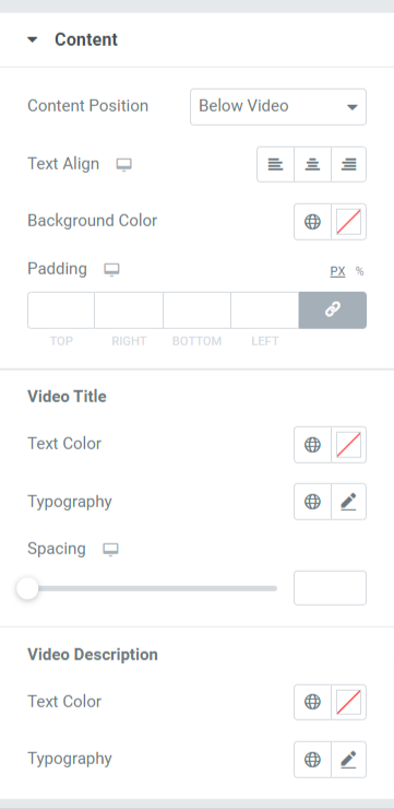
Let’s see all the options available in this section:
- Content Position: Choose the content position from the given options, such as over thumbnail or below video.
- Text Align: Choose the text alignment here.
- Background Color: Select the background color for the content part displayed in the video gallery section.
- Padding: You can adjust the padding for the content here.
Video Title
- Text Color: Choose the video title text color here.
- Typography: Customize the typography of the video title using this option.
- Spacing: Using this option, you can apply spacing between the words in the video title.
Video Description
- Text Color: Choose the video description text color here.
- Typography: Customize the typography of the video title using this option.
Filter
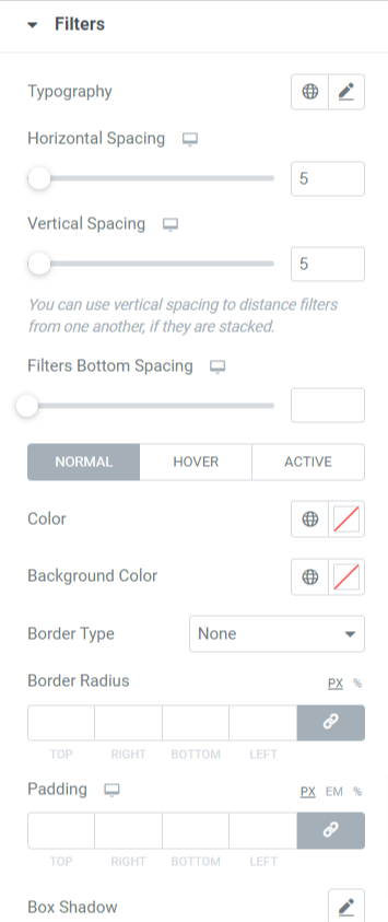
Let’s see the option available in this section:
- Typography: You can customize the typography of the filter text of the video gallery section.
- Horizontal Spacing: You can apply horizontal spacing to the filter text using this option.
- Vertical Spacing: You can apply vertical spacing to the filter text using this option.
- Filters Bottom Spacing: You can apply bottom spacing to the filter text using this option.
- Color: You can choose the color of the filter text here.
- Background Color: Apply background color to the filter text with this option.
- Border Type: Apply a border to the filter text using this option.
- Border Radius: Using this option, you can apply border radius by giving smooth edges to the border.
- Padding: Use this option to apply the space between the border and the text.
Note: This section will appear only if you choose a grid layout in a gallery setting.
Arrows
This option will appear only if you’ve chosen the carousel option as the layout of the video gallery section in the gallery setting of the content tab of the Video Gallery widget.
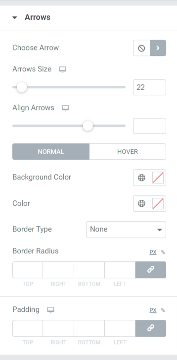
Let’s discuss the options available in this section in detail:
- Choose Arrow: You can choose the arrow icon from the icon library.
- Arrow Size: Adjust the icon size with this option.
- Align Arrows: Set the alignment of the arrows here.
- Background Color: You can do it here if you want to apply a background color to the arrows.
- Color: Select the arrow color using this option.
- Border Type: Choose the border type using this option here.
- Border Radius: You can apply a border-radius here.
- Padding: Adjust the border padding here. This will maintain space between the border and the text part.
Note: This section will appear only if you choose the carousel layout in a gallery setting.
Pagination: Dots
This section will only appear if you’ve enabled the pagination option in the carousel setting section of the content tab of the Video Gallery widget. You can customize the pagination feature. Options for pagination such as Dots and Fractions are available. Let’s see Pagination: Dots first.
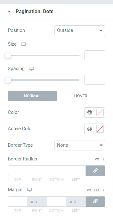
Let’s see all the options available in this section:
- Position: You can select the position of the pagination from the given options available in this subsection.
- Size: Customize the pagination size here.
- Spacing: Using this option you can allow the spacing between the dots.
- Color: Select the color of the dots using this option.
- Active Color: You can customize the color of the active dot using this option.
- Border Type: Choose the border type with this option.
- Border Radius: Adjust the border-radius to apply smooth edges to the border used.
- Margin: You can adjust the margin on either side of the dots using this option.
Note: This section will appear only if you enable pagination in carousel settings.
Pagination: Fraction
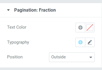
Let’s see all the options available in this section:
- Text Color: You can choose the text color for the pagination fraction using this option.
- Typography: Customizing options for pagination fractions are available here.
- Position: You can select the pagination fraction position using this option.
Note: This section will appear only if you enabled pagination in carousel settings.
Get Your PowerPack Video Gallery Widget for Elementor
PowerPack Elementor addon is one of the best addons for Elementor that has more than 80 powerful widgets and 150+ stylish templates to enhance your website’s look.
Using the PowerPack Video Gallery widget, you can flaunt many videos in one single section without utilizing a huge space on your website.
We hope this tutorial blog helped you to create a beautiful Video Gallery for your website page. If you’ve enjoyed reading this article we’re sure you’d also love experiencing our other PowerPack elements too.
Keeping your requirements in mind, we try to keep the functionalities of our products in a user-friendly way. So that anyone can make use of them without even having a single experience of coding.
Click here to get the PowerPack Video Gallery widget for Elementor.
Also. if you’re looking for a simple way to display your twitter feed on your Elementor website, checkout the blog post on how to add a twitter feed to WordPress using Elementor.
Please feel free to drop your comments here; we’d love to receive replies from you.
Also, join us on Twitter, Facebook, and Youtube.
