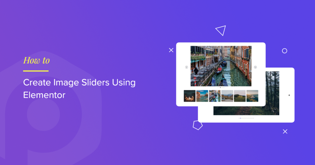
If you have a WordPress website built with Elementor and are looking for a simple way to showcase your images in a slider or carousel format, a dedicated Image Slider Plugin or Image Slider Widget will help.
Image sliders display multiple images one after the other in order, either in a row or a column. Add beautiful images to your website via image sliders, which can help you grab your visitors’ attention quickly.
In this tutorial blog, we’ll provide you with detailed instructions on how to add an interactive image slider or carousel using the PowerPack Image Slider Widget and Elementor.
PowerPack Image Slider Widget for Elementor
PowerPack offers 80+ creative widgets and 150+ pre-designed templates to help you design your Elementor websites effortlessly. Its Image Slider widget is 100% responsive & compatible, which requires no complicated instructions.
If you prefer watching a video, here is a tutorial on how to create an image slider using Elementor.
Add an Image Slider Section on Your WordPress Website Using Elementor
Let’s see how you can use the PowerPack Image Slider widget to add image slides to your WordPress website. So, without further ado, let’s move straight ahead with the tutorial.
Drag and Drop PowerPack Image Slider Widget
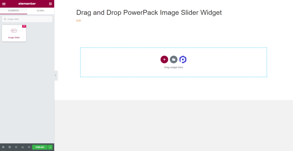
To add an image slider, open the page using the Elementor editor, type ‘image slider’ in the search bar, and drag & drop the widget on the page.
Make sure to check the ‘PP‘ sign on the top-right corner of the widget.
Content Tab of Image Slider Widget
Navigate to the Content Tab of the Image Slider widget, and you’ll find four sections:
- Gallery
- Thumbnail
- Feature Image
- Additional Options
Let’s have a detailed look at their functionalities:
Gallery
Gallery section of the Content Tab allows you to add and customize a gallery of images.
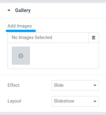
This section includes three subsections to customize your page’s images displayed in the Image Slider widget.
Let’s see each of them and the options they offer:
- Add Images: You can add as many images as you want to be displayed in the image slider. Upload files through local or media libraries.
- Effect: This feature will provide you with two options to choose the effect you want to apply to the set of images: slide & fade.
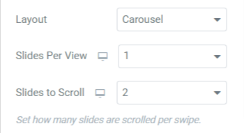
- Layout: Here, you’ll get two options to choose from for the slider layout. Select ‘Slideshow’ or ‘Carousel.’ Choosing the carousel option will allow you to customize two more options. You can set the number of slides per view and the number of slides to scroll.
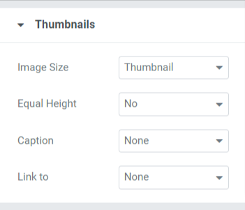
Thumbnails
This section includes four subsections, where you’ll get options to customize the thumbnails of the PowerPack Image Slider Widget.
Let’s have a quick look at these options:
- Image Size: Using this option, you can adjust the image size of all images. Here, you’ll get a wide range of image size options; select the size according to your preference.
- Equal Height: Choose among the options given here to equalize the heights of the images. If you select yes, an option to adjust the “custom height” of the images will appear.
- Caption: This feature allows you to add captions to the images. You can choose ‘none’ if you don’t want to display any content. Among the caption, title, and description, choose which one you want to get displayed over the image.
- Link to: Here, you can add links to the images. Choosing each option will give you additional options to link the images to your other product/page.
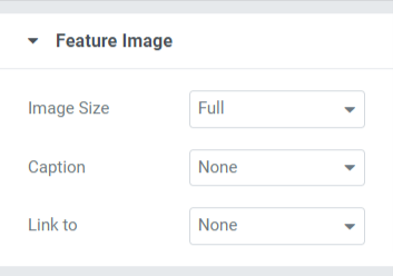
Feature Image
This feature will allow you to customize the feature image in all aspects.
Let’s have a quick look at the Feature Image options:
- Image Size: You can adjust the feature image size using this option.
- Caption: This option allows you to add a caption, title, or description to the images. You can select the ‘none‘ option if you don’t want to display any content.
- Link to: Add links to your other products/pages to your image with this option.
Note: You can set a featured image to your Image Slider if you choose the Slideshow layout in the gallery section of the Image Slider widget.
Additional Options
This feature includes a wide range of styling options with enable/disable options.
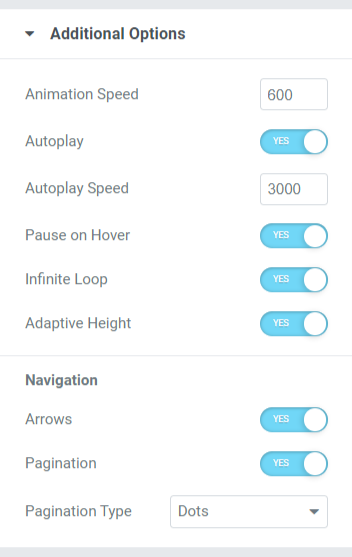
Let’s see all these features that the additional options section contains:
- Animation Speed: This option allows you to set the animation speed of the Image Slider. You can set any custom speed according to your preference.
- Autoplay: Toggle on this option to set “autoplay” to your Image Slider.
- Autoplay Speed: If you’ve enabled the autoplay option, you can adjust the “autoplay speed” here.
- Pause on Hover: If you don’t want to pause the slider, disable this option.
- Infinite Loop: Enabling this option will allow you to create an infinite loop for scrolling.
- Adaptive Height: Enable this option to set a responsive height for all the images in the slider.
- Navigation: This feature is used for navigation purposes; options like “arrows” and “pagination” are given for styling the slider.
- Arrows: To display an arrow bar across both side edges of the slider, enable this arrow option.
- Pagination: Enable this option to display “dots/fractions” for your slider.
- Pagination Type: Here, you’ll get options to choose from the pagination type: dots or fractions.
Style Tab of the Image Slider Widget
The style tab contains all the styling parts of the Image Slider widget. This tab includes four sections:
- Thumbnails
- Thumbnails Caption
- Arrows
- Pagination: Dots
Let’s explore each section containing styling options thoroughly.
Thumbnails
This section contains two subsections: Images & Overlay. Let’s see each subsection in more detail.
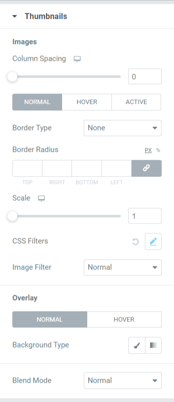
- Image: All styling options related to images can be done here. This subsection includes styling options like:
- Column Spacing: Adjust the scale to allow column spacing between the images.
- Border Type: You can choose any border type from the options, such as solid, double, dotted, dashed, & groove.
- Border Radius: If you’ve applied the border, you can adjust its radius here.
- Scale: Here, you can scale your slider’s image in a perfect ratio.
- CSS Filter: This feature allows you to adjust the CSS filter in various ways, like blur, brightness, contrast, saturation, and hue.
- Image Filter: Choosing from a huge variety of filters available in this option, you can change the Image Filter.
- Overlay: You can use this feature to apply an overlay to the images. This feature includes one more styling option:
- Background Type: Here, you can set a background type for the images. Choose between gradient or classic to apply a background type.
- Blend Mode: From a variety of options available here, you can blend the slider’s images by applying any one according to your preference.
Thumbnails Captions
In this section, you’ll get all styling options related to the content part displayed over the image.
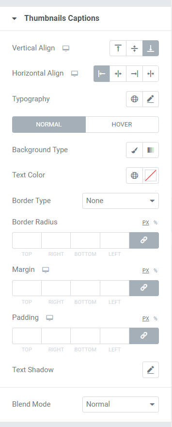
Let’s look at the options available in this section for styling the content part of the images.
- Vertical Align: As the name says, you can align the images vertically using this option.
- Horizontal Align: As the name says, you can align the images horizontally using this option.
- Typography: This feature allows you to customize the typography of the text in every possible aspect. You can choose the font type, size, letter spacing, and word spacing.
- Background Type: Here, you’ll get the option to select a background type for the text part displayed on the image.
- Text Color: The color of the text can be chosen here.
- Border Type: Select any border type from available options, such as solid, double, dotted, dashed, or groove.
- Border Radius: If you’ve allowed a border to the content part, adjust its radius here. It helps display the smooth edges of the border applied.
- Margin: Using this option, you can adjust the border margin for the content part.
- Padding: This allows space between the border and the content. Adjust this option to display smoothly organized content on the Image Slider.
- Text Shadow: You can use this option to apply a text shadow. You’ll get options to choose the color and blur the shadow. Also, customize the text shadow horizontally and vertically.
- Blend Mode: From a variety of options available in the blend mode, you can blend the captions displayed on the slider’s images by applying any one according to your preference.
Arrows
In this section, you’ll get all the options to solely style the arrow displayed in the Image Slider.
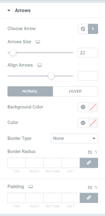
Let’s see all the options available in this section in detail.
- Choose Arrow: This option allows you to choose the arrow. Choose the arrow from the icon library according to your preference.
- Arrow Size: Arrow size can be adjusted here.
- Align Arrows: Set both arrows in alignment using this option.
- Background Color: This option allows you to choose a background color for the arrow.
- Color: With this option, you can change the color of the arrow.
- Border Type: Choose the border type from the options available here, such as solid, double, dotted, dashed, & groove.
- Border Radius: If you’ve applied a border type to the arrow, you can adjust a border radius to display a soft-edged border.
- Padding: Adjust the padding to allow enough space between the arrow and the border.
Pagination
This section includes options to style the pagination you’ve applied to your slider.
After making your choice among ‘dots‘ or ‘fractions‘ in the “Pagination Type” subsection > Additional Options > Content Tab of the Image Slider widget. You’ll get multiple options depending on the choice you’ve made.
If you’ve allowed the fraction pagination, then the options offered in this section will be like this:
Fraction
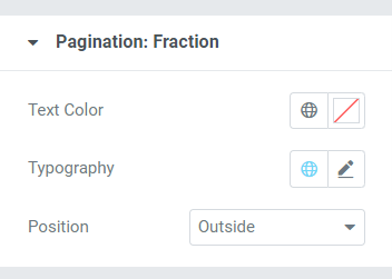
- Text Color: Choose the text color for the fraction pagination that you want to get displayed in the slider.
- Typography: With this option, you can set the font style, font size, line height, letter spacing, word spacing, etc.
- Position: Positioning of the fraction pagination can be done here.
If you’ve allowed the dots pagination, then the options offered in this section will be like this:
Dots
This section allows you to customize the Pagination: Dots features.
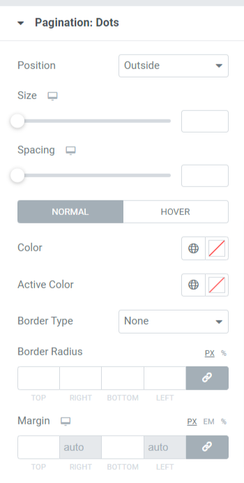
Let’s see the available options in more detail.
- Position: You can use this option to position the dots.
- Size: As the name says, you can set the size of the dots here.
- Spacing: Using this option, you can allow space between the two consecutive dots.
- Color: Choose the color for the dots.
- Active Color: Choose the color for the dot currently displayed in the slider.
- Border Type: Set the border type from the available options such as solid, double, dashed, dotted, & groove.
- Border Radius: Here, you can adjust the soft border edges.
- Margin: This allows space between the bottom slider and the dots. Adjust the margin as per your design preference.
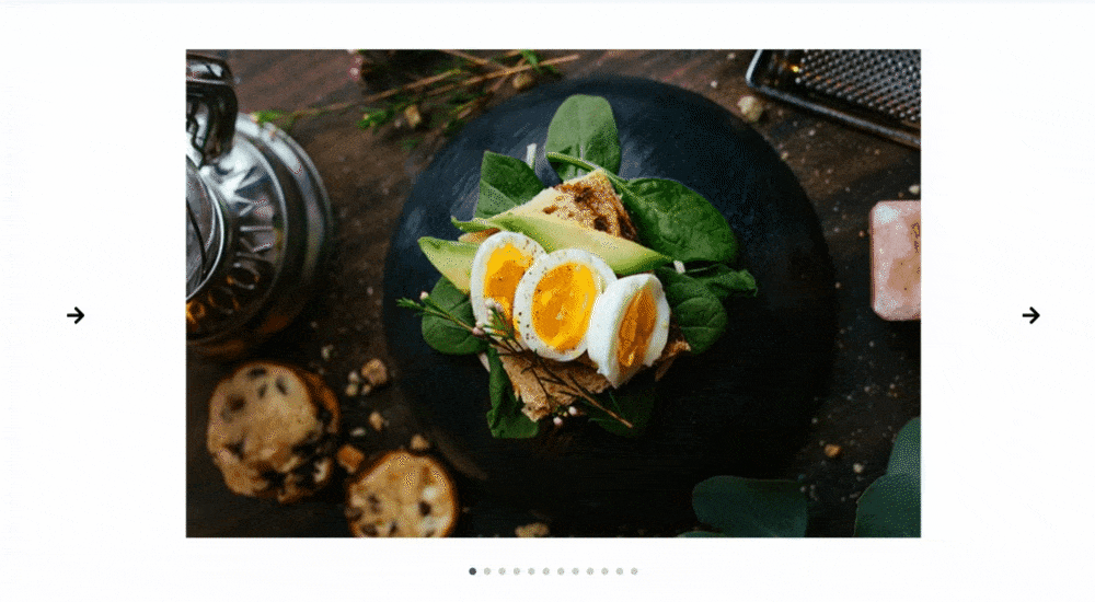
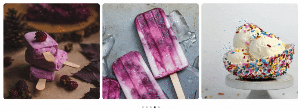
After applying all those changes in the content & style tab of the PowerPack Image Slider widget, you’ll get an image slider section like this:
Wrapping Up!
We hope this tutorial blog helped you create your image slider for your WordPress website page. If you’ve enjoyed reading this article, we’re sure you’d also love experiencing our other PowerPack widgets.
You might also be interested in learning how to create a Promo Box using Elementor on the WordPress website.
Please feel free to drop your comments here; we’d love to receive your replies. Also, join us on Twitter, Facebook, and YouTube.

1 thought on “How To Add an Image Slider/Carousel in WordPress Using Elementor”
nice article was very helpful to me